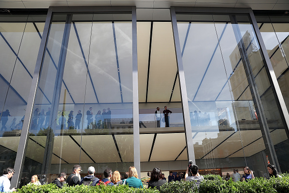
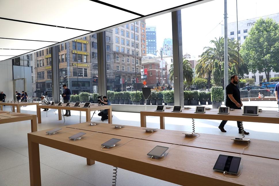
The new Apple Store in San Francisco: bigger glass windows, larger wooden tables and a Genius Grove!
Apple apparently did not sit and wait until its stores got boring or stopped being surprising playgrounds with the most excitement per square foot than any other store in the universe.
Instead, Apple commissioned Angela Ahrendts to get to work on rethinking how the Apple Store experience could be different, more fulfilling, and perhaps more fun? How can that be possible?
I, for one, often stop at an Apple Store especially the one on Fifth Avenue, or the one at Grand Central station that sits as in a throne overlooking the throngs of commuters zig zagging through the grand hall of the historic building. Even when I am not buying anything, I just play with a tablet or a phone, take a look at the accessories on the wall, or do people watching. It is always interesting to see how little kids get lost there, playing with the fun gadgets as if in the corner playground.
Apple Stores are playgrounds, indeed, which is part of the lure, and why Apple attracts so many customers to its doors.
How can Apple improve on this great product?
I admit I was surprised to read about the opening of the new San Francisco store and inquired about the changes: bigger glass doors, more plants (Apple goes green), a more spacious Genius Bar which is now called a Genius Grove. Along the way, and emerging from the plants, I guess, “creative pros” to advise customers with all things Apple technology.
That’s a lot of new for a product that is still very fresh and even futuristic in our minds.
It makes me think that I have often been called to “redesign” a newspaper that, in my view, was quite fine as it was and did not need to be taken urgently for a makeover. One that comes to mind was our engagement with Colombia’s El Tiempo in 2010.
El Tiempo was doing quite well with readers and advertisers, and the look & feel of our last redesign was still fresh and intact.
The management of the editorial group, however, wanted to think what could be new.
The results were interesting and fascinating, and you can read all about them here.
Can’t wait to see the new Apple Store in San Francisco, and, for all of us in the design business, the remaking of a product that does not quite need it, can be a lesson about constant innovation and thinking ahead.
For more about the new Apple Store design:
http://www.apple.com/retail/unionsquare/
http://www.macrumors.com/2016/05/16/apple-store-union-square-sf-opens-may-21/
http://www.apple.com/retail/unionsquare/
More about El Tiempo’s big remaking of 2010
El Tiempo launches new concept today
https://www.garciamedia.com/blog/articles/el_tiempo_launches_new_concept_today
El Tiempo :selling the concept to editors, readers, advertisers
El Tiempo at 100: a fresh proposition journalistically, visually, digitally