TAKEAWAY: Huffington and the art of amazing simplicity, cool aesthetics and some lessons along the way for storytelling in the tablet.
My friend and colleague Bob Newman says it all in his recent review of Huffington, glowing over this wonderful iPad app and describing it as “ a powerful example of original tablet publishing.
Only this week, I, too, was showing during a tablet workshop with clients.
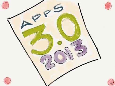
Huffington is a real 3.0 (perhaps 3.2?) iPad app, and, yes, it is attractively designed, full of interesting content, easy to navigate and all those other qualities that one would expect from the brand Huffington, not to mention the magazine app’s creative director, Josh Klenert.
What makes it a 3.0 app? That is what I think is important to highlight here. In fact, only yesterday, during a live conversation with Tyler Brulé in his Monocle 24 Radio, he asked me what I saw in my crystal ball for 2013 and I said, among other things, that it will be the year when tablet editions of newspapers and magazines move to the 3.0 version.
What exactly does that mean, and how does Huffington qualify?
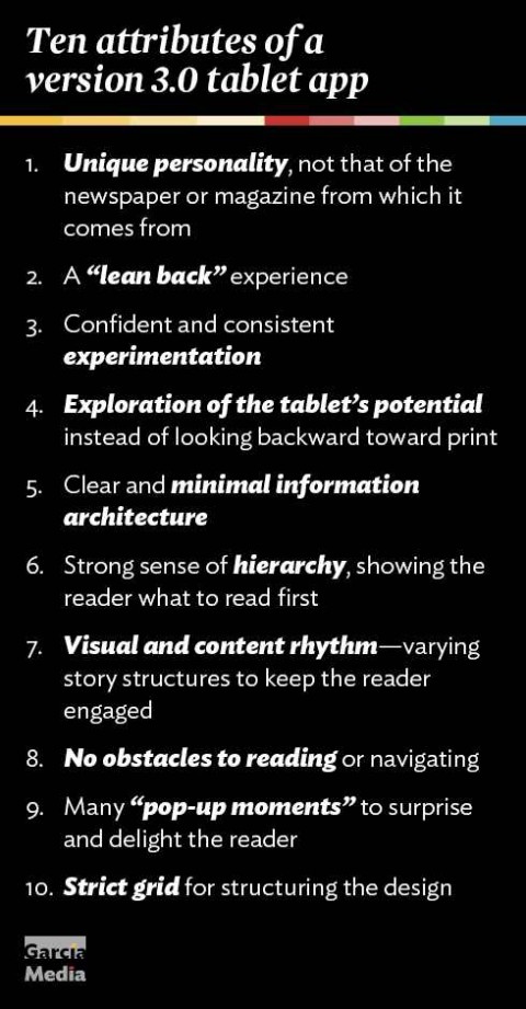
1.The app adopts its own personality, NOT trying to mimic the newspaper or magazine from which it inherited its name and DNA. In the case of Huffington, the magazine as such did not exist, but The Huffington Post brand does carry a lot of weight.
2.The emphasis is on providing a lean back experience that keeps the users coming back for more.
3.It shows no traces of nervousness as it experiments. In the case of Huffington, one can tell that each issue brings in something new, but, like a well choreographed dance, we feel that the editors and designers are having a lot of fun, not a lot of angst. This makes Huffington cutting edge, as a 3.0 app should be.
4. It is forward looking in terms of exploring the tablet’s potential as opposed to looking back to get “tips and hints” from a printed notion of how we read. (It helps that Huffington did not have a long lost print relative).
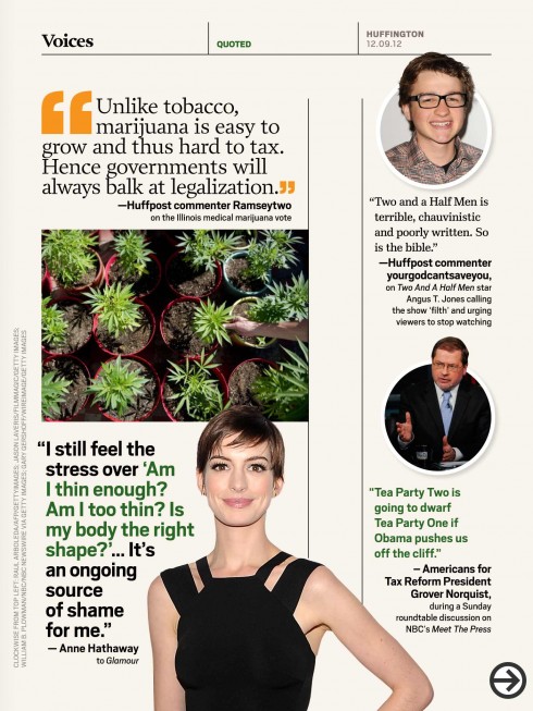
5. It offers the most minimalist of information architecture, which facilitates navigation, invites discovering. In the case of Huffington, the table of contents is a true map to the journey with only THREE baskets of information: Enter, Voices, Exit. (Please please please, all those newspaper apps in the making: take a page from this book. Abandon the old departments that strangle you and delay movement, and adopt some simple but intuitive segments)
6. Give me a sense of hierarchy: if I am going to lean back for 10 minutes during a lunch break, just me and my tablet, what should I read first. Huffington does not overwhelm, it is usually three lead pieces.
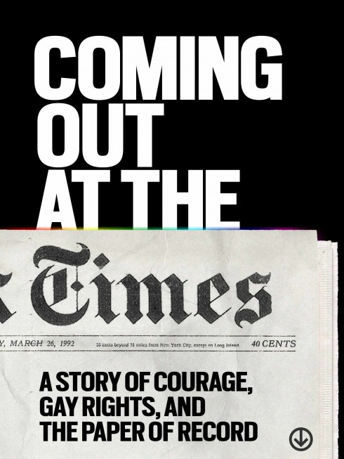
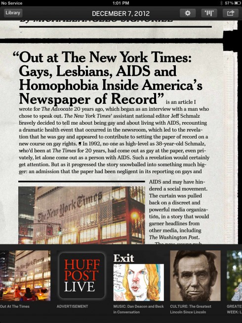
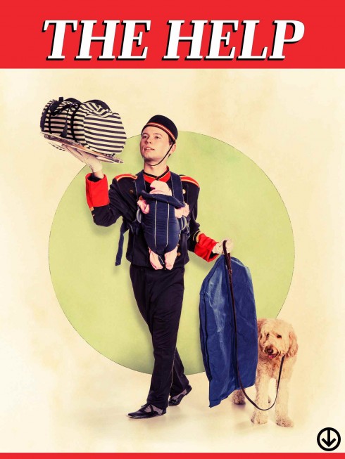
7. Visual and content rhythm: this is where storytelling visits story structures and turns into recognizable, easy to template units. For Huffington: there is the long narrative (not too long, which is good), the mini stories (which are plentiful and well written), and photo stories.
8. Along the way: no obstacles to reading, no obstacles to navigating and moving from here to there, and quite a lot of visual surprises thru type attacks, illustrations, and all in such a simple way that it makes it look like it was too easy to carry out (we know it ain’t so!).
9. The 3.0 tablet app should perhaps include more pop ups and video moments than Huffington does to date, but, here, too, Huffington’s team is showing us that the days of “Look, Ma, here is all that I can do on the tablet,” are over. The 3.0 tablet app is not 100% Disney, Las Vegas and the Macy’s Parade all wrapped up in an issue. Huffington seems to feel good in its skin, even without excessive use of pop ups. It has restraining power. A good thing.
10. Finally, the 3.0 tablet app for a newspaper or magazine follows a grid (for Huffington, it is all vertical mode and variations of wide single column for article starts, and two columns for article read screens. Typography, superb art direction and photo editing, and white space and color do the rest.
If we are going to start thinking tablet app 3.0 for newspapers and magazines in 2013, taking a look at Huffington can be a great start.
More than cutting edge, I would describe Huffington’s approach as a common sense, aesthetically beautiful way to tell stories in the tablet: 3.0 made easy.
The Huffington. visual team:
Creative director: Josh Klenert
Art director: Andrea Nasca
Photography director: Anna Dickson
Designers: Martin Gee, Troy Dunham, Eve Binder, Susana Soares
Associate photo editor: Wendy George
Production director: Peter Niceberg
Of related interest
Our earlier blog post about Huffington
https://garciamedia.com/blog/articles/huffington_a_must_see_magazine_app
Joe Zeff: In defense of tablet publishing
http://www.joezeffdesign.com/jzdblog/in-defense-of-tablet-publishing
Of interest today
Media Post Publications “Financial Times” Offers Free Tablet with Subscription
http://www.mediapost.com/publications/article/189040/financial-times-offers-free-tablet-with-subscrip.html#axzz2ErLZ6XMp
Take advantage of our iPad Design/Ad Lab workshops
Do you want to take your brand to the next level by creating a tablet edition? Garcia Media can help. We now offer one- to two-day iPad Design Lab workshops on demand to jumpstart your presence on this exciting new platform. We also offer iPad Ad Lab workshops to develop engaging advertising models for your app. Contact us for more information.
Purchase the book on the iBookstore
The EPUB version of book is HERE:
Now available: The EPUB version of iPad Design Lab: Storytelling in the Age of the Tablet, ready for download via Amazon.com for Kindle:
http://tinyurl.com/8u99txw.
Take a video tour of iPad Design Lab
“iPad Design Lab” trailer on Vimeo.
Read the Society of Publication Designers’ review of The iPad Design Lab here:
http://www.spd.org/2012/10/must-read-ipad-design-lab.php

Keep up with Mario Garcia Jr.. via Garcia Interactive: helping transform online news since 1995.
www.garciainteractive.com
Here’s a gift you don’t have to wrap!

It’s official. The Christmas/holiday shopping season is here.
Here is a suggestion for someone on your list: my digital book iPad Design Lab: Storytelling in the Age of the Tablet. No need to stand in line nor buy wrapping paper. Just send it to someone you think might enjoy a book about this magnificent new platform we call the tablet and how to maximize its potential for storytelling.
Here is how you can get the book:
The original version of the book is the multitouch textbook version available on the iBookstore for iPad (iOS 5.0 and up): https://itunes.apple.com/book/ipad-design-lab/id565672822. This version includes video walkthroughs, audio introductions to each chapter, swipeable slideshows, a glossary and a sophisticated look and feel.
Apple only sells multitouch textbooks in certain countries at this time, unfortunately. Copies are available in at least the following countries: Australia, Austria, Belgium, Canada, Finland, France, Germany, Great Britain, Greece, Italy, Latvia, Luxembourg, The Netherlands, Poland, Portugal, Romania, Slovakia, Spain, and the United States.
For those in other countries and without an iPad, we have made the book available in a basic edition for other platforms. This basic edition includes the full text of the original, along with the images and captions, but lacks the other features such as audio and video. It is available on the following platforms in many countries:
Amazon Kindle: http://amzn.to/SlPzjZ
Google Books: http://bit.ly/TYKcew