This is the weekend edition of TheMarioBlog and will be updated as needed; the next blog post is Monday, September 16
TAKEAWAY: It’s an argument we have heard before—in a different context, but based on the same principles. The “word” people stating their case and defending the presence and power of text over visuals that aim to obliterate it. Multimedia storytelling has taken this subject to the next level.
There will always be a little tension between words and visuals. Better yet, even if the words and visual images are happily coexisting with each other, there will be those who will feel they must assume the role of defenders for either side.
In the 1980s, when design began to make its presence felt in newspapers, the so called “word” people took to the front of the room at seminars, workshops and assemblies of all types, to state their case with the following arguments:
—too much design is dressing up the pages, much to the detriment of the story
—we are turning into a design-driven group of newspaper people, more interested in how it looks than how it reads
—designers have gained such power in the newsroom that they feel entitled to cut text simply to accommodate a larger photo or illustration
We were all listening attentively. At The Poynter Institute for Media Studies, my colleague Dr. Roy Peter Clark and I built seminars around the WED (Writing/Editing/Design) philosophy: promoting the marriage of words and visual images, making every word and every image count, and making them live harmoniously on the page forever.
As we took to the stage, we tried to have some fun assuming the roles of the “word” person and the “visual” person. Dr. Clark, the world’s most famous writing guru to this day, would wear a gray suit and pretend to be Perry Mason, all seriousness and gravitas. In turn, I would stop short of wearing a Carmen Miranda tutti fruti hat, to represent the vibrancy and spontaneity of visuals. The crowd would love it. The message was conveyed: gray and serious Perry could join colorful and giddy Carmen, and all would work well.
Thirty years later, some of the same arguments are resurfacing in the digital age.
Nobody has presented this case better than Bobbie Johnson, who recently wrote a piece titled Snowfallen: Just because you can, it doesn’t mean you should highly critical of what happens when the razzle dazzle of the piece is more important than the substance of it.
Snowfall was a good story, but it felt as if getting you to read it was the story’s secondary ambition. When I did it, I was constantly interrupted or distracted. And while the multimedia elements provided atmosphere, in all honesty they didn’t mean much. As a reader they drew me away from what I was there for. I came away from it thinking “ooh, lovely design”?—?not “this story is amazing”.
Do words suffer in multimedia storytelling projects?
The question some ask: Is the new design trend in visual storytelling good for telling stories?
Beginning with The New York Times’ much praised and spectacularly presented Snowfall, we are seeing “a combination of full-screen images, elegant use of good typography, chaptered navigation, odd grids and fancy micro interactions form a new trend in digital journalism.”
It is deja vu for me and for my colleague Dr. Clark. In fact, we now discuss iWED—“integrated Writing, Editing, & Design”—as the logical progression of our 1980s creation. We are discussing a possible Poynter seminar to address the issue in the digital world. Some issues to consider:
Are the words suffering when we create multi-sensory noise with videos, sound, special effects, which tend to compete with the narrative as expressed in the text of the story?
Are users/readers getting sidetracked by the special effects to the detriment of the story?
What comes first, the text or the visuals?
Almost every example of “snowfalling” that I’ve seen in action puts reading second to he razzle-dazzle.
All of this is material for discussion. I think that it is fertile ground for academics to research, providini us some answer .
In the 1980s, we were convinced that design, the actual visual presentation, that first impression, is what seduced us to read the story. I still believe this is so. Granted, ultimately, it is the content, the way the headline and story are written, that determine if we stay.
In the 2000s, I believe that the multimedia and multi-sensory approach to storytelling is necessary and wanted by the readers. When well executed, the multi media elements actually enhance the story. I have found this to be the case with Snowfall as well as with the This Land feature from the Times.
The videos and the sounds will definitely have to come first, as they should, inviting us to read. Once we start reading, however, it is best to allow the reader to do just that. Perhaps our task should be to study how to program the activities we expect the user /reader to pursue and then design the storytelling accordingly.
It is only a matter of time before we accept that words and visuals belong together in these new multimedia productions. In the hands of scrupulous editors and designers, the two can have a successful (and even vibrant) marriage. The WED approach proved that to be the case in the 1980s.
iWED should help us accomplish the same as more newspapers and magazines embark in the creation of multimedia storytelling.
It was all about the story in the early days of design as a protagonist, it is still the same in the Snowfall era. Bobbie Johnson expressed it best:
In the end, no matter how much window dressing you give it, a story about cake is still just a story about cake
Let’s take a look at three recent multimedia stories.
Firestorm in The Guardian
http://www.theguardian.com/world/interactive/2013/may/26/firestorm-bushfire-dunalley-holmes-family
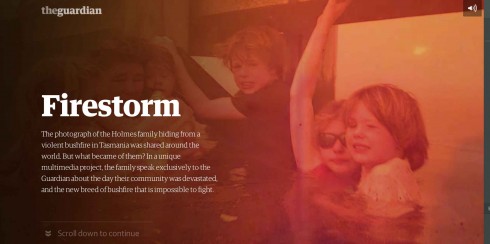

Here is a piece from The Guardian following up on a family in Tasmania, Australia, that had been first profiled as they tried to survive a fire that threatened their home.
The text and the images work together well here. With each scroll the narrative continues, but there is also a change of imagery. The two motions work in parallel.
This is the closest one can come to reading the way we are accustomed to in printed publications, but with the benefits of multimedia storytelling. Simple but impactful.
For more background: 10 things we learned making Firestorm
http://www.theguardian.com/info/developer-blog/2013/jun/07/10-things-we-learned-making-firestorm
Perhaps the most important (in my view) of the 10 lessons learned about Firestorm:
Try to break your design:
Firestorm is a linear experience, and one of the key aspects of design was to work out how the user would move through it – what we came to call the ‘advance mechanic’. The hope was that we could keep this mechanic consistent throughout. After trying out many options, we eventually settled on an approach that would allow a user to scroll through a series of scenes organized into chapters, but there were still lots of questions to answer: how was a user prompted to advance to the next screen? Was it possible to scroll within scenes as well as between them? What did the transitions feel like? Did transitions differ depending on the media type within a scene? As the design evolved, we realized that a useful approach was to simulate every possible constellation of scenes, and ask: did the design break? Was it always possible to advance in an intuitive, elegant way? At first, the design broke all the time. (For instance, the advance prompt originally only appeared on arriving at ‘scene bottom’, but that became a problem for non-scrolling scene types like A-roll video.) Bit by bit, however, we refined the design so that it could handle every type and sequence of media assets in a way that felt consistent.
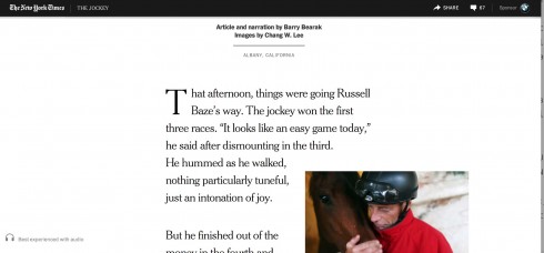
The Jockey in The New York Times
http://www.nytimes.com/projects/2013/the-jockey/?_r=0#/?chapt=introduction
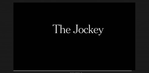
The Jockey is a good narrative. It starts with emphasis on the text (which I don’t think is as visually effective as the way The Guardian handled Firestorm, where powerful visuals are there from the start).
The Times allows user to skip the video, which, in my way would probably defeat the purpose of having. I don’t think that the video, an integral part of the storytelling, should be skipped the way we may do an ad, for example. But readers might lose patience waiting for the video to finish—so there is an important discussion to be had as to how much control we grant the reader.
While all the storytelling elements are present in The Jockey, I did not feel that they flowed together as organically as they could.
Chasseurs du temps (Time keepers), L’Equipe (France)
http://www.lequipe.fr/explore/chasseurs-de-temps/#CHAP04
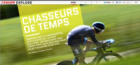
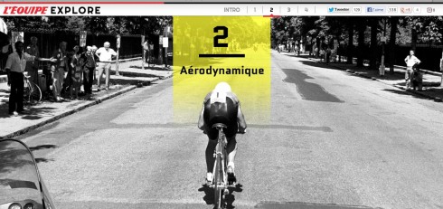
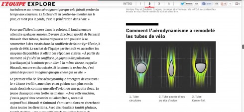
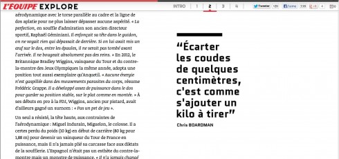
A sports story in France’s sports daily, L’Equipe, that goes in depth into the lives, obsessions and struggles of those cyclists who live for keeping an eye on the clock and how it measures their performance. Photos, videos and text coexist well here.
Take a look.
What works for multimedia storytelling?
Perhaps what truly works in these multimedia storytelling extravaganzas is to produce a final version of the project that shows that from beginning to end the piece was meant to be multi-sensory and multimedia. There should not be a sense that the text was there first in all its glory, then multimedia elements added to give it that “Snowfall” feel.
Readers should not be aware of what came first. Better yet, they should conclude that it all started with an idea, and the rest followed naturally.
Of related interest:
Snowfallen: Just because you can, it doesn’t mean you should
https://medium.com/inside-matter/66b9060333ad
A Google Spreadsheet of Snowfall-type stories:
https://docs.google.com/spreadsheet/ccc?key=0AnWYxsUNHS4FdGVYMnpkdGdTNTU0RS1SXzktcnZwRWc#gid=0
More about WED
Redefining the WED concept for today’s multi platform media world
https://garciamedia.com/blog/articles/predefining_the_wed_concept_for_todays_multi_platform_media_world_p
The WED philosophy in a multi platform media world
https://www.garciamedia.com/blog/articles/the_wed_philosophy_in_a_multi_platform_media_world
Pages we like
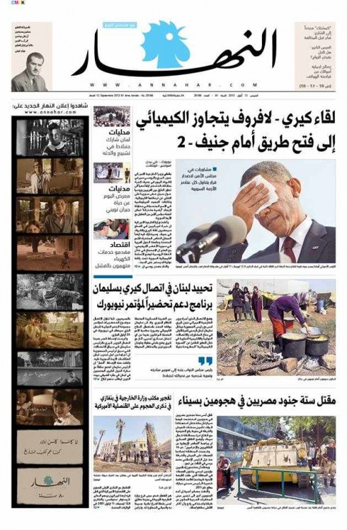
An Nahar, Lebanon
Here is an interesting front page from An Nahar of Lebanon, a newspaper that we are honored to have been involved with in the recent past when it underwent a major redesign/rethink.
Design director Ziad Kassis sends me their page from this week in which, as part of An Nahar’s 80th birthday celebration, they are running photographs of current politicians, giving the age each one was at the time of the photo, and then a caption that reads: An Nahar was already reporting history when you were a kid.
I happen to like the selection of President Obama’s photo for the Syrian crisis story. You don’t have to know the language to get the message of the story.
Our previous An Nahar blog posts:
https://garciamedia.com/blog/articles/two_garcia_media_projects_launch_tuesday_an_nahar_lebanon_hindustan_india
https://garciamedia.com/blog/articles/an_nahar_one_week_later_follow_up/
https://garciamedia.com/blog/articles/an_nahar_and_hindustan_one_day_after_launch_of_new_look
Future of Storytelling
Here is a conference that has the right title and that I wish I could attend if my schedule permitted. Perhaps you can!
http://futureofstorytelling.org/
For magazine lovers
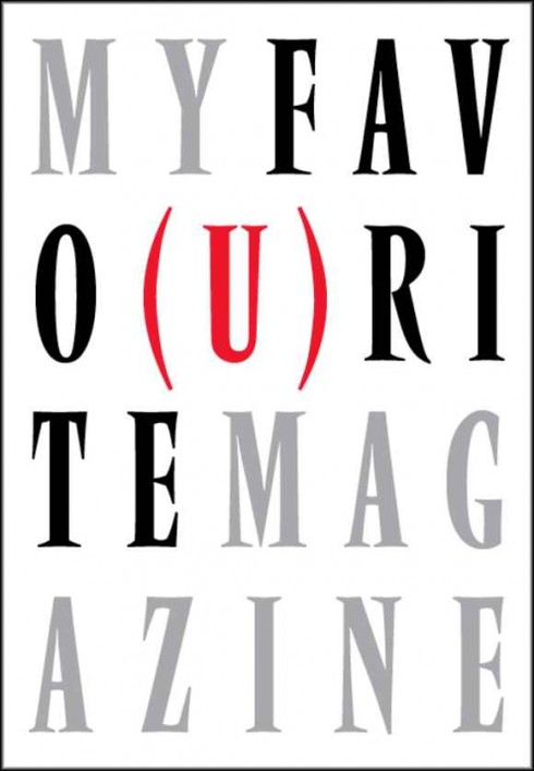
Here is a publication that will delight all who love magazine and magazine design, not to mention that you will be helping one of this industry’s most talented designers and a personal best friend.
Last May, after former SPD President and design icon Bob Newman was hospitalized after suffering a severe head trauma, the design community came together to help. An online fund was established to assist with his mounting medical bills and now some of the top creatives in the world have teamed up and create a magazine to help raise additional funds.
It is great to report that our dear Bob is making steady progress, but it is a long road ahead till his full recovery. He still needs our support.
Jeremy Leslie of MagCulture and Andrew Losowsky of The Huffington Post gathered together 88 magazine makers from around the world to create My Favo(u)rite Magazine.
Go here for a preview, and details of how you may get this wonderful collection:
http://www.spd.org/2013/09/my-favourite-magazine-launches.php
Related links:
The Society of Publication Designers has a selection of excerpts on their website:
http://www.spd.org/2013/09/an-excerpt-from-my-favourite-m.php#more
In addition, Magculture.com is running a weekly excerpt, as well as posting additional favorites that weren’t included in the original publication:
http://magculture.com/blog/?p=18844#more-18844
Creative Review covered the project here:
http://www.creativereview.co.uk/cr-blog/2013/august/my-favourite-magazine-publishes
Eye magazine did too:
http://www.eyemagazine.com/blog/post/a-mag-for-bob
En español:
http://arq.clarin.com/diseno/revista-Bob-Newman_0_973703016.html