TAKEAWAY: In one of our current projects, De Telegraaf in the Netherlands, we come face to face with a newspaper with a distinct and unique personality. What’s the role of a new design to preserve it and to enhance it?
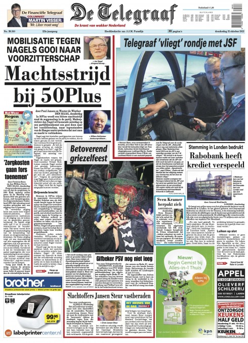
This is today’s front page of De Telegraaf: take a look and you see a newspaper that is packed with headlines, text, summaries and photos. Hardly any stories are contained in “modular” rectangular packages. What prevails is columns of text that cuddle up around each other, the so called “dog legs” of another era, but which are such a distinct part of De Telegraaf’s personality. As we consider options to make this iconic Dutch newspaper a tabloid: how much of this personality does one transfer to the new format?
The other day, exchanging views with Christian Fortanet, one of Garcia Media’s art directors who has worked closely with me for over 20 years in dozens of projects globally, we were discussing our current project together, the Netherlands’ De Telegraaf.
Christian is in residence at De Telegraaf’s newsroom for an extended period as we begin the process of working closely with design director Hans Haasnoot on the creation of models for a possible format change from broadsheet to tabloid. While the management has not decided officially if the change of format will take place, the possibility exists, so we are translating the broadsheet De Telegraaf to some early tabloid format concepts for internal discussion.
As readers of the blog know, we at Garcia Media have already been working with De Telegraaf as the Weekend supplement became tabloid in 2012.
De Telegraaf, like many other iconic newspapers, is full of traditions, legacies and a particular “retro” look that has not changed much over the decades. De Telegraaf’s front page stands out (better yet: jumps out) in the kiosk, or on the coffee table, because its look is peculiarly “dated” with details such as no modular design, a mixture of type fonts, a color palette that mixes cold and warm hues, and the total absence of white space. Pages are busy. Stories grab the reader from every corner. Columns of type blend with photos, with lines, with colors.
It is De Telegraaf. Period. Whether you like it or hate it. It is what is. For De Telegraaf it works, and how!
Personality, emotion and design
Here is where my discussion with Christian comes in, as it coincides with my reading of a book which will be on the reading list of my upcoming Columbia University course for spring semester.
The book is Designing for Emotion by Aarron Walter,and while Walter writes primarily about the design of websites, I find a lot of it all quite appropriate. Design is design. Emotions are emotions. As I have read through the book, I have recalled so many instances where, for decades, we have, indeed, designed for (and with) emotion.
Disclaimer: designing for emotion does not mean that we as designers incorporate OUR own personality or emotions into the work. Quite the contrary: we design for people, and, thus, we deal with personality and emotion, but it is more about the personality of the publication we are designing and the emotions we wish to evoke from the audience.
Back to my chat with Christian Fortanet: from the start of this project, I had discussed with both Christian and Hans that the new De Telegraaf tabloid could NEVER be another clean, modular version of a contemporary printed tab—that we had to capitalize on those “chaotic” visual elements of De Telegraaf that readers know so well, and translate them to the new.
Our first series of models coming through the pipeline show that.
Christian tells me that we have “interpreted” what De Telegraaf is. Yes, we have listened to the editors in a variety of meetings. We have also concentrated on preserving the “personality” of this iconic daily newspaper. In the process, we have thought extensively about the “humans” who consume it daily, both in print and digitally.
In his book, Walter writes that:
If your website were a person, who would it be? Is it serious, buttoned up, all business, yet trustworthy and capable? Is it a wise-cracking buddy that makes even mundane tasks fun?
I can’t recall one of my own projects where I was not asking myself this question. Sometimes, in the midst of a workshop discussion, I would ask the participants to relate their newspaper or magazine to an animal: is it an elephant, an ostrich or a lap cat?
Those discussions, silly as they may appear, yield wonderful insights into how those inside an organization see themselves and their product.
From one person to another
Another point in Walter’s book to which I have adhered since my early days designing publications: don’t design for the masses.
It is important to think of one person who fits the profile you are designing this publication for and then make it your muse as you design every detail.
Here is how Walter writes about it:
Personas are a standard tool in the design process, but they only provide a partial picture of the relationship we’re building with our audience. We know who they are, but who are we? Earlier in the chapter I mentioned that products can be people too. Following that line of thinking, shouldn’t our design have a persona that serves as the foil for our user personas?
At De Telegraaf, we are designing for a reader who trusts his newspaper as authoritative and informative, but that does not take itself too seriously. We may have friends or relatives who are just like that.
Perhaps this is not so much designing for emotion as it is designing with a specific focus, personalizing the newspaper, if you will, and in the project injecting it with a tone of voice, a look and feel and enough that is memorable so that we will include it in our daily routine and, like with good friends with great personality traits, that we will be excited to come back to.
In this era of fleeting audience loyalty, non stop information flow and many products that look exactly alike, that may be the one element that will make a difference.
About Designing for Emotion:
Walter, Aarron. Designing for Emotion. A Book Apart, 2011-10. iBooks.