TAKEAWAY: Simple and elegant design never goes out of style. This is demonstrated in the work of Luke Hayman and his team at Pentagram as they created the look for Vanity Fair 100 Years.
Spreads from Vanity Fair 100 Years. Photos from pentagram.com
Pure design, defined
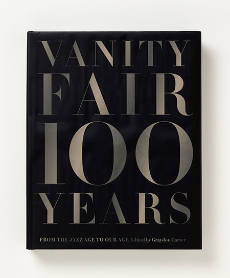
What a pleasant surprise to see the celebratory Vanity Fair 100 Years, a collection of the best of Vanity Fair, with a design by Luke Hayman and his team at Pentagram that surprises with its elegance, minimalism and visual impact.
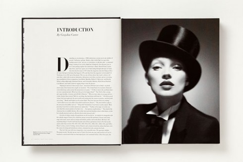
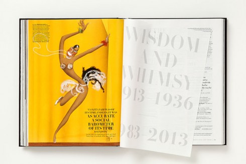
From the typography, to the grid, the generous but functional use of white space, it is all here. Most importantly, it reflects the content that the design packages and the visual DNA of one of the world’s most iconic magazines.
When we imagine “pure design,” this Vanity Fair centennial should be what we picture.Students of design can learn valuable lessons about elegant functionalism here.
I asked Luke about his process as he tackled this project:
Mario: Could you summarize what inspired you with this project?
Of course we were inspired by the rich heritage of Vanity Fair although we are sure to also acknowledge the visual language of the current magazine. The use of the Didot for the display text was an obvious choice. Futura and a proprietary cut of Times are the support typefaces for captions and longer texts. These classics supported our goals of giving the book a timeless elegance. The design and display text is lively and engaging however we make sure to allow the tremendous illustrations and photographs to be the stars of this book.