TAKEAWAY: It’s one of Germany’s best read newspapers. Now Süddeutsche Zeitung has finally entered the world of “redesigned” newspapers. It is a minimalist, typographic-influenced design, with a new customized font that carries the name of the newspaper.
Updated: Tuesday, July 10, Tampa, Florida, 11:00
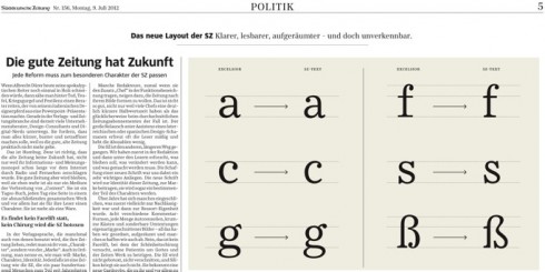
New Fonts. Before the relaunch the SZ used 3 different main fonts: Helvetica, Excelsior and Times. Now, the SZ has created its own corporate fonts designed by Henning Skibbe and Nils Thomsen:
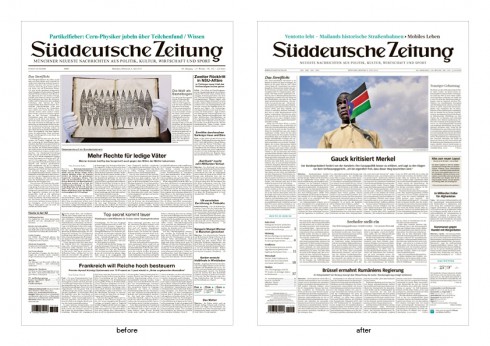
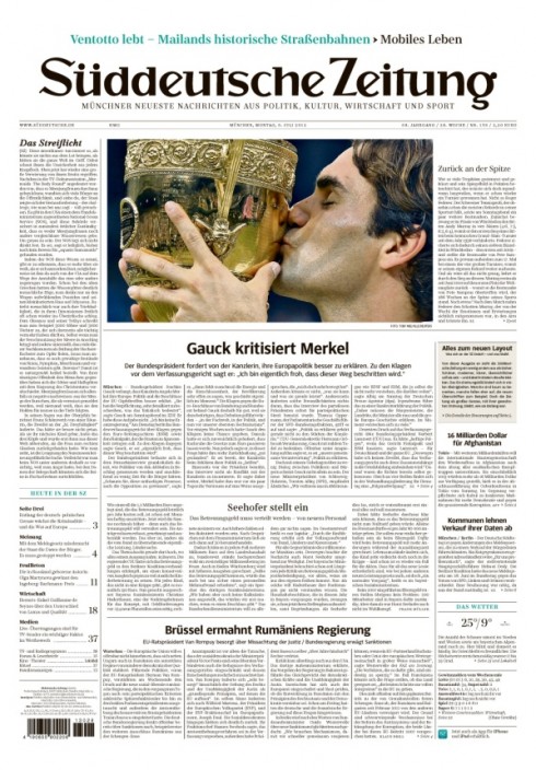
It is not a change that jumps at you in those first 10 seconds. Indeed, one of Germany’s best read dailies, the Munich-based Süddeutsche Zeitung has a new look, but don’t expect bells and whistles or a change of tune. When the editor says that “nobody will be shocked”, he is quite correct. Obviously, I have only seen the front page, and not the entire newspaper.
The big change is typographic. And, if, as we know, a newspaper’s visual content is 75% typographic, then this is a redesign of major proportions. It would take a German newspaper to concentrate on the typography as the major change in the look of the title.
The SZ has said goodbye to its familiar mix of Helvetica, Times, and Excelsior, which it had embraced since 1965.
It has now welcomed its own font, SZ-Text, SZ-Sans. Created by the ErlerSkibbeTönsmann studio, in Hamburg, the new “Suddeutsche Zeitung”, also includes an exclusive corporate font.
I find the new font to be quite appropriate for this solid and robust newspaper, which is very structured. The new “Suddeutsche Zeitung” fonts allow for the power of the bold, sans to come through on the front page (the only page I have seen), while the body text renders high legibility and elegance, a balance that obviously the editor of the SZ wants to make sure is part of the new look. For many readers, the nuances of the new font will probably not be immediately recognizable, which is why I think that perhaps some other changes and/or touches on the front page would have been welcome. For me, the key would have been to hint at the modern with a more dramatic presentation of that navigator at the bottom left column of the front page.
Just think, at a time when photos, graphics and videos rank so high at the top of the readers’ list of preferences, the SZ front page includes only ONE photo. It better be a good one, a showstopper everyday.
And perhaps the editors will come out with a more visual front page for Sundays. We must wait and see. This is the model than the SZ’s competitor, Frankfurter Allegemeine, has applied to visual perfection.
There is nothing wrong with a contemporary newspaper showing a little leg, even the mega conservativeSüddeutsche Zeitung .
The Süddeutsche Zeitung is one of Germany’s national newspapers and one that did not follow the trend for a complete redesign during the go-go design years of the 1990s.
In fact, at gatherings of journalists and designers in Germany, the conversation usually turned to the look of the Suddeutsche and how it remained visually static, while everyone acknowledged its good quality journalism and excellent national coverage.
It is 2012 and, finally, the Süddeutsche Zeitung takes some steps in the direction of graphic changes, a good move. The fact that the redesign is primarily typographic is not surprising, not for a German newspaper and specifically for the visually conservative Suddeutsche Zeitung.
Kurt Kister, chief editor of Süddeutsche Zeitung has said: “The content should be new every day, but not the package.”
This is a feeling that many editors with whom I work share. Used to be that editors wanted their newspaper front page to look different everyday. If the emphasis was vertical on Tuesday, then let’s go dramatically horizontal on Wednesday, used to be the editor’s mantra. More and more today, and perhaps as a result of the influence that digital platforms exert, editors believe that their readers like the familiarity of a more static look. I must note that this is not at all new for Süddeutsche Zeitung, as you can see in the quick historic view of its front pages below.
In one of the German language pieces written about the redesign, the editor in chief of the Süddeutsche Zeitung, editor Kister is quoted saying: “The SZ was redesigned without the help of any Spanish or Austrian experts.” The writer of the article adds that “this is a dig at Mario Garcia and Lucas Kircher”
For the record, I am NOT Spanish (although my family roots are in Spain). But colleague Lucas Kircher is, indeed, Austrian.
Take a look at a history of the SZ front page
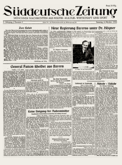
The front page of 1945
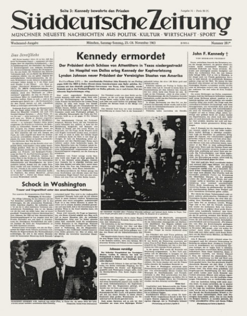
The front page of 1963
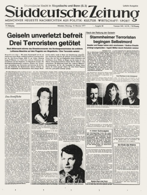
The front page of 1977
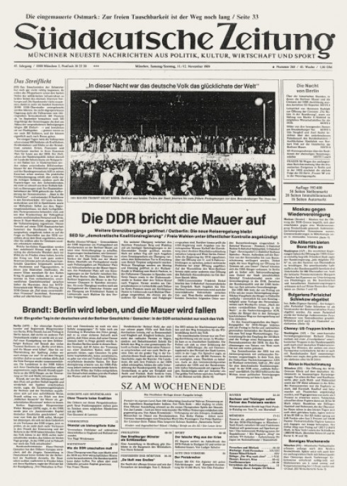
The front page of 1989
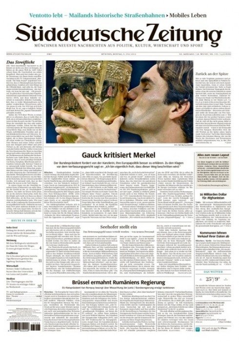
The front page of 2012
Some SZ redesign facts at a glance
I asked Constantin Eberle, of our Garcia Media Europe office, to gather information and comments from the media for this blog post. He provides us some highlights, and I will include links below for those who read German:
-1,3 million read the Süddeutsche Zeitung every day.
•“The SZ is pure, cheerful and more structured, but it feels, that the new SZ is still the same… “
• Some comments on the new fonts are that the font sizes of the new bodytext and the Infoboxtext are too small.
• The SZ team considers this as a “soft relauch.” First they asked their own editors what the changes should be or if the SZ should stay as it was. Then they asked their readers what should be changed.
• Responsible for the launch was “SZ”-Art director Christian Tönsmann. Together with deputy art director Stefan Dimitrov, he steered the redesign effort.
What the press in Germany is saying about the SZ relaunch
These are German-language articles:
The SZ”s own report of the relaunch: the fonts
http://www.sueddeutsche.de/medien/neue-schriften-in-der-gedruckten-sz-grundrauschen-1.1406251
The SZ”s own report of the relaunch: the layout for the newspaper of the future
http://www.sueddeutsche.de/medien/neues-layout-fuer-die-gedruckte-sz-die-gute-zeitung-hat-zukunft-1.1406243
TAZ.de
http://www.taz.de/Layout-Relaunch-der-Sueddeutschen/!96984/
KRESS.de
http://kress.de/tagesdienst/detail/beitrag/117036-kurt-kister-wettert-gegen-berater-und-digital-nerds-die-gute-zeitung-wird-bleiben.html
SLANTED.de
http://www.slanted.de/eintrag/redesign-der-sueddeutschen-zeitung
HORIZONT.net
http://www.horizont.net/aktuell/medien/pages/protected/Sueddeutsche-Zeitung-erscheint-ab-sofort-in-neuem-Layout_108675.html
TURI2.de
http://www.turi2.de/2012/07/09/heute2-sueddeutsche-zeitung-bekomt-neues-layout-14070886/
(Mentions designers Mario Garcia & Lucas Kircher)
FONTBLOG.de
http://www.fontblog.de/suddeutsche-mit-neuer-typografie
Of related interest
– Germans buck trend with love of newspapers
http://in.reuters.com/article/2012/07/09/us-media-survey-idINBRE8680GD20120709
Of special interest today
– Australia: SMH and The Age tablet apps launch on Android
http://panpa.org.au/2012/07/09/smh-and-the-age-tablet-apps-launch-on-android/
– Young tablet owners more willing to pay for news
http://paidcontent.org/2012/07/09/young-tablet-owners-more-willing-to-pay-for-news/
The iPad Design Lab: Storytelling in the Age of the Tablet
Video walkthrough of the iPad prototype of iPad Design Lab