It was a casual mention in one of my blog postings of last week: I simply urgerd the Financial Times to consider using a larger text size for readers of a certain age—-specifically the over-50 set, or closer to me, the over-60 generation of readers who still love their newspapers in print. No, I have not heard directly from the Financial Times, but I have heard from plenty of you who write me emails showing great interest in text type choices.
Here is a sampling of my mailbag of the past three days:
“I am always puzzled when it comes to making good text type choices,” writes a designer from Canada. “Is this normal?”
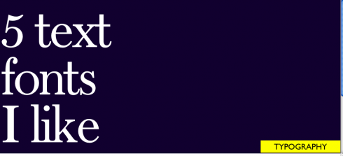
Defining normal is always difficult. However, most designers do struggle with the choice of a good, legible, utilitarian and elegant font for text. Newspapers that print different editions in various geographic settings, with different presses, must also test that the chosen for text is adaptable to various conditions and presses. No matter how you look at it, the choice of text font is crucial: remember that 85% of what appears in a newspaper is text type. There is more type than headlines, photos, illustrations and even color.
In our TheMarioClassroom series, coming soon, I will answer the usual questions about type selection, and will hope to learn from you as well. Typography provides a lifetime opportunity for learning.
Here are some other comments taken from your emails:
“Can an entire newspaper be designed using only sans serif fonts, including for text?”
Sure thing. This was first tried in the US when Frank Ariss designed a very vibrantly contemporary Minneapolis Star Tribune in the 1970s. With the advent of such wonderful sans fonts as Retina, this is not only possible, but would probably provide a better elegant design. Try it.
“Do you think that the old sans like Helvetica and Franklin Gothic are likely to disappear?”
Not at all. Has the classic Coco Chanel black dress go away? Classics are just that. You can’t go wrong with Helvetica for an elegant, minimalist and serviceable font; Franklin Gothic will always strong landings on the front page of that tabloid that sells in the streets of a busy metropolitan city. And Frutiger, let’s not forget this one, will grace newspapers and magazines for years to come. Don’t hold the funeral for any of these legendary sans fonts yet.
![]()
TheMarioClassroom series: I am preparing SIX videos devoted totally to typography in segments titled: The basics; Type for Look & Feel; How I chose that font; Type and newspaper logos; Type for Text and Display; When the alphabet is non-Roman. I will make an announcement when the type series is about to start.

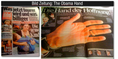
Leave it to Germany’s colorfully vibrant Bild am Sonntag to find a new angle on a tired story. In this case, the Sunday story about Barack Obama is dealt a new hand, as in a double-page spread titled “The Hand of Hope,” in which Bild editors asked four experts to study Obama’s hand and offer their comments. It was Sunday’s showstopper for sure, and that is no small feat, considering that Bild’s Sunday editions is one major display after another.
COKE AND HAPPINESS: OLYMPIC STYLE
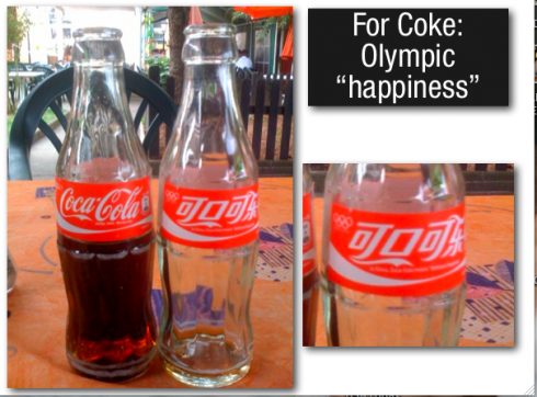
While the Beijing Olympics continue to capture the attenion of millions worldwide, all over Europe the Coca Cola company benefits from Olympicmania and introduces bottles with a Chinese logo, and in small type: In China, Coke means “delicious happiness”. But, alas, this is only found in bottles of regular Cokes, and not Diet Cokes, or Cola lights as they are called in Europe. So delicious happiness comes with added calories in this case.
![]()
FROM IFRA’S EXECUTIVE NEWS SERVICE FOR AUGUST 11, 2008
– Are small-town newspapers thriving because they’re better, or because
they happen to be located in small towns?
http://time-blog.com/curious_capitalist/2008/08/are_smalltown_newspapers_thriv.html
– How Newsrooms Throw Away Value by Not Linking to Web Sources
http://seekingalpha.com/article/89911-how-newsrooms-throw-away-value-by-not-linking-to-web-sources