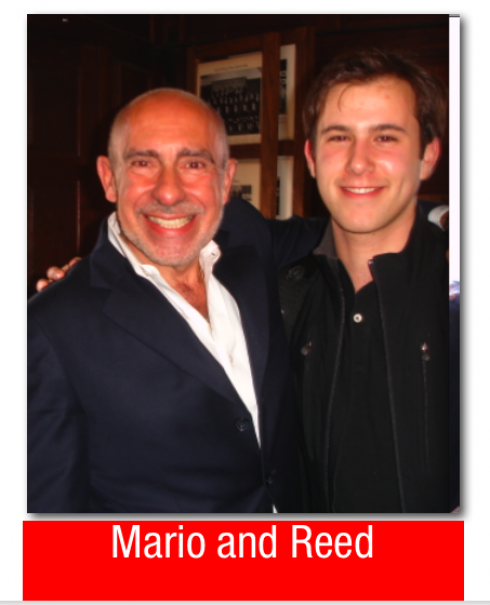
Oh, the advantages of having a smart, well -informed and thought -provoking intern in our midst this summer!
His name is Reed Reibstein and he is a rising Yale University sophomore, a member of the Yale Daily News staff –a newspaper that Dr. Pegie Stark Adam and I are assisting with the creation of a new look to unveil in early fall. Reed has a keen interest in typography and design, a sharp eye for visual detail, and a voracious appetite for consuming that ever expanding banquet of blogs
Part of what his internship with us involves—-in addition to designing pages of the YDN—-is to have daily mini encounters about design topics of interest. So, it is through looking at design through the eyes of Reed that I come across Michael Bierut’s blog entry, “How to be Ugly” (http://www.designobserver.com/archives/entry.html?id=27719), a fascinating analysis of Mike Meiré’s design for 032C magazine (http://www.meireundmeire.de/).
Michael Bierut confesses that he is a purist when it comes to graphic design, and proceeds to describe how Meiré violates the last taboo in graphic design: the vertical and horizontal scaling of type.
By now, I am curious, and I want to see some pages of 032C magazine. All along I am thinking about the definition of “ugly” in design. God knows that anyone who, like me, has taught graphic design at the university level, has seen tall stacks of ugly, and graded students accordingly.
Rarely a day goes by when we, as designers presenting project, don’t hear someone in the group referring to a page or concept as “ugly”. Some don’t dare say the word, and quickly dispatch other phrases to let you know that this UGLY page simply will not do it:
Have you ever heard any of the following?
“…..not quite right”
“needs work”
“too much”
“too little”
“lacks oomph”
But you know that they mean just plain ugly.
And, of course, nobody refers to the design on a page as “pretty”, not that we care, since the “pretty” page is usually accepted, so we move on to fix the “ugly” duckling that needs work.
Ugly hurts. A needle in the arm. That pinch in your left ankle after finishing the marathon. And while two Advils can take care of the latter, it takes longer to recover from the former.
Bierut’s piece makes me think of the definition of beauty, and how we arrive there.
BEAUTY WHERE ARE YOU?
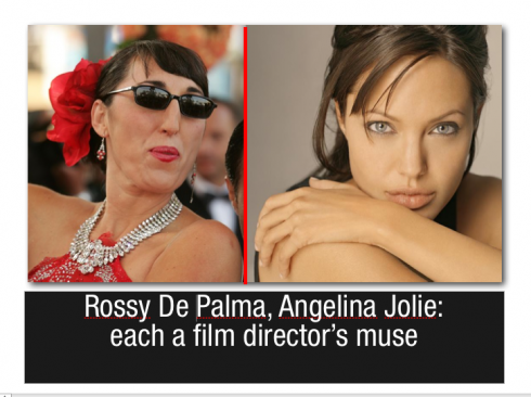
Everywhere, say some, if you find it. And, indeed, beauty is in the perennial eye of the beholder. There is no doubt that everyone agrees the actress Angeline Jolie is, indeed, beautiful from any angle, even when six months pregnant with twins. But to famed Spanish film director, Pedro Almodovar, actress Rossy De Palma was and continues to be beautiful, too. I put their photos side by side and let you contemplate two phases of beauty. Or is Rossy the “new ugly”?
The same applies to the work we do.
Our concept of beauty if deeply rooted on definitions set forth by Greek philosophers, architects and artists who defined beauty in terms of symmetry and proportion. I think Plato had it right when he concluded that beauty cannot be defined. He believed that relative beauty exists only when one compares objects to each other—-we rate the beauty of a page, for example, based on our preconceived idea of how “ other” beautiful pages look. Anyone who doubts this has only to visit the ample and dynamic design blogs where the comparisons never end, with statements about ugly and beautiful dropping like confetti from a huge piñata.
BEAUTY AND NEWSPAPER DESIGN
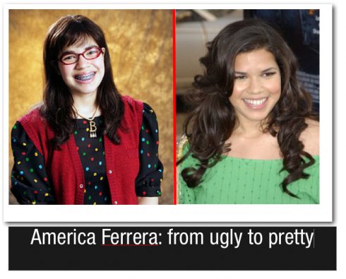
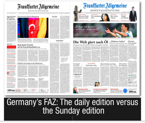
Sometimes, even within one newspaper, the standards of ugly and beautiful are incorporated into one same publication. Take the example of German’s leading and most respected daily, Frankfurter Allgemeine: its daily edition is discreet, but on Sunday the FAZ goes through a dramatic and impressive transformation, with dynamic use of color, including a blue logo, larger and bolder headlines, and turns, indeed, beautiful in front of our eyes, sort of as it if the actress America Ferrera, star of the hit sitcom, Ugly Betty, would take off her glasses, remove the braces and walk the catwalk as a hot chick at the end of each episode.
The FAZ editors know that the two editions are quite different, but can we refer to the daily, gray one as “ugly”?
Is stylish, traditional classic “ugly”? Is that kind of “ugly” good for Monday through Friday, but never on Sunday?
And, of course, is “beautiful design” that fails to attract readers still beautiful? I believe so, and someone could write a book, or a never ending blog, on the subject of “ugly” newspapers that have succeeded and continue to thrive, versus the number of “beautiful” ones that fill the halls of newspaper nechrology. Remember The Chicago Daily News?
The National Observer?, not to mention German’s Die Woche.
O32 MAGAZINE
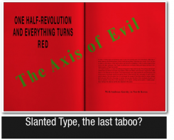
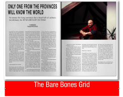
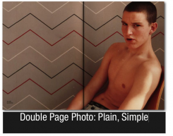
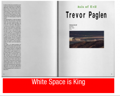
Returning to Michael Bierut’s analysis of 032 magazine’s design: I visited Mike Meiré’s site and flipped through the pages of 032. The word ugly never came into mind. I saw elegance, a sense of minimalistic design, if you will, and page after page of well edited photos, some surprising ample landscapes of white space (too much?), and, at times, the skeletal architecture of type elements hanging on the page as slinky dresses waiting for the actresses of Sex and the City to get into them——-but with less flash. Also less flesh.
Ugly? No.
Anorexic? Perhaps.
But we better stop here, since I would hate for the term “anorexic” to penetrate the vocabulary of designers.
The poet John Keats wrote that “a thing of beauty is a joy forever”.
Much of the work we do becomes a joy to someone, or at least we hope so. Forever is a long stretch, so we settle for the now. And, the older we get in this profession the more that we stop defining ugly and beautiful, the less we care how others see these qualities in our work, and the more that we remember the words of Paul Rand in “Paul Rand: A Designer’s Art” (1985): “Rarely has beauty been an end in itself.”
REED TAKES A LOOK AT 032 MAGAZINE:
As part of his assignment for today, I asked my intern Reed Reibstein to do a quick evaluation of 032 Magazine. Here is what he wrote:
The text under 032c’s nameplate reads “CONTEMPORARY CULTURE,” and that is what Meiré’s design aims to reflect. With the ubiquity of word processing software, the Internet, and e-mail, people have more opportunities than ever before to be graphic designers—often without realizing that they are. The “Microsoft Word” aesthetic, of a limited palette of typefaces, unadorned photos, and simple, wide columns of text, is more the visual voice of today’s society than complex grids or gorgeous book types. So perhaps, to capture the zeitgeist, one must delve into forms that have some ingrained disharmony. Besides, who doesn’t want to shake things up a bit?
WE SEND YOU:
http://www.designobserver.com- Always appealing and informative; look at their Summer 08 suggested book reading.
http://paul-rand.com/
—- Of special interest, “Thoughts on Design”
http://www.creativereview.co.uk/crblog/the-new-ugly/
http://buzzfeed.com/buzz/The_New_Ugly
WHERE IS MARIO: Sitting in the back of a car that takes me to the airport in the midst of chaotic rush hour traffic in Lagos, with a five-tempo symphony of cars beeping their way thru as police cars and ambulances compete for attention with music of their own. It is dark and I struggle to find the letter “m” on the keyboard of my laptop and realize that even though I am a fast typist I have never really learned where that letter is. Something to think about on the long flight to Frankfurt then Goteborg, Sweden.
eanwhile I say goodbye to Lagos and by orning should arrive in Sweden.