We apologize for the malfunctioning of our website at the start of Friday. The technical problem has been resolved. We are happy to restore the service and look forward to continued normal publishing without further interruptions. Thanks for your patience.
This is the weekend edition of TheMarioBlog and will be updated as needed. The next new blog post is scheduled for Monday, July 30
Update 2, Saturday, July 28, Luxembourg, 12:33
The Guardian’s front page
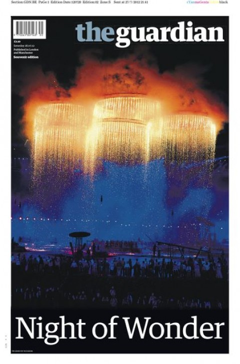
As the London Summer Olympics opened last night, The Guardian captured it all in this very stylish and celebratory front page.
The Bild Zeitung app and the Olympics
Here is this pop up Frank Deville send us: Bild takes us to the London Olympics.
Creating a type palette for a variety of projects
From time to time, a dream project comes along. It is usually rather serendipitous how the project appears at your doorstep, rings the bell and, suddenly, one is thrust in the midst of a pleasurable, thought-provoking activity that was not there 24 hours before. You know you have little time for in the middle of a busy schedule, but it is too tempting to pass up.
That is what happened to me a few months ago when I received an email from James Fooks-Bale, Marketing Communications Manager at Monotype.
James’ note was the invitation of a lifetime, if you like type and experimenting with its use: Would you like to join a select group of designers from around the world to curate what you would consider fonts from our Monotype collection for use in editorial publishing?
Right then and there I knew that this was something I would do, busy as we were at the time. Next step: tell our art director/project manager, Reed Reibstein, the ultimate type aficionado, about it and invite him to do this in collaboration with me.
He, too, said yes immediately, and together we set out to map out this type curation journey. Fun it was.
After 40 years in this business, making type decisions for over 600 newspapers, magazines, websites and now tablet apps, I know the important role of type, and how careful we must be when selecting what constitutes 75% or more of the visual elements of a newspaper or magazine. There is more type on a page or screen than anything else.
Monotype offers such a vast selection of well-crafted fonts, that the most difficult part of this assignment was choosing a few.
Finding a theme
From the start, Reed and I thought we had to create multiple sets of typefaces centered around a theme. In my seminars and workshops, and throughout my university teaching career, I have always said that creating a type palette for a project is like orchestrating a “typographic symphony”. There must be violins (soft strokes), trombones (bold touches) and the occasional drum (the auditory “wow”). The designer becomes the conductor, arranging the typographic instruments in search of harmony.
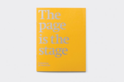
The Page is the Stage
That motif fits so well with the title of our curated collection: The Page is the Stage.
Indeed it is, and, as in all good theatrical presentations, symphonies and choreographies, variety is what makes it all more interesting.
Not two projects are alike.
So I figured that we would create a palette of “type characters” within the world of newspapers: the classic look, the boulevard (down market tabloid) look, the font for the entertainment weekly, or the Russian or Arab newspaper, and, how could we leave out the regional American newspaper?
Once we had that outline created, then it was a matter of reviewing the Monotypecollection and selecting which font would be most adequate for each style of newspaper. Reed writes that he spent a great deal of time browsing Monotype’s typefaces in the Monotype/Linotype/ITC specimen book and in the FontBook iPad app. On selecting typefaces, he writes:
The unique challenge of this project was developing type palettes. Each set of type families had to make sense for the hypothetical publications we proposed. But the families in each palette also had to complement each other: in finish, attitude, or historical reference. It was not about selecting interesting typefaces, but choosing those that could work as part of a system. Even though the publications we describe are imaginary archetypes, Mario and I wanted to make their typography really work.
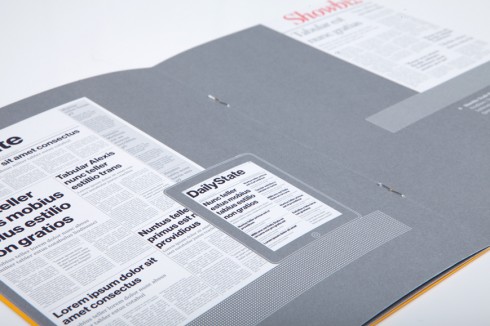
We show you several pages from the document here.
Now our contribution becomes a part of the Monotype Collections, packaged as 12 booklets.
We are incredibly honored to have been chosen to express our type choices here, and we hope that many of you will get your hands on the documents, designed by the SEA team in London.
Here are our type choices:
In each of the following scenarios, we have created a typographic newspaper design concept for a variety of genres: the Berliner (classic, elegant newspaper), the downmarket European tabloid, the Scandinavian contemporary tabloid, the Russian and Arabic dailies, the Showbiz trade journal, the financial newspaper across platforms. Then we imagined which type from the Monotype extensive collection would suit the specific look & feel of that special newspaper.
I hope you have as much fun looking at these choices, as we had creating them.
American Regional daily/Showbiz trade journal
“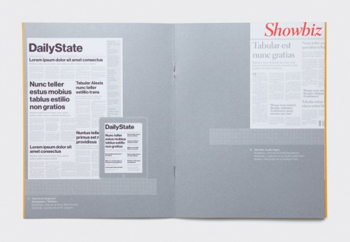
Here is the page for the category: American Regional
Headline/text set in Neue Haas Grotesk
Subheads/quotes set in ITC Charter
On the right Showbiz Trade Paper
Headlines/Text set in Parkinson Electra
Subheads/Captions set in Trade Gothic Next
Quotes/Drop Caps set in Stempel Elan
Multi Platform Financial Newspaper
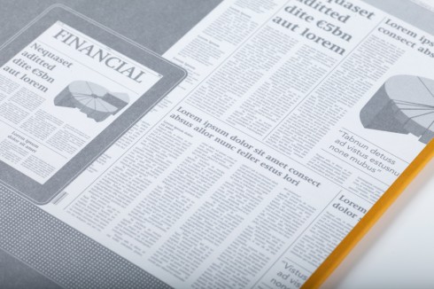
Headlines/Text set in Neue Swift
Captions/Quotes set in Avenir Next
Berliner Newspaper/European (down market) Tabloid
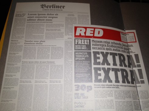
Headlines set in ITC Galliard
Subheads/quotes set in Slate
Text set in Malabar
European (down-market) Tabloid
Headlines set in Soho
Accessories set in Soho Gothic
Text set in Times Ten
Interior Design Tablet App/Russian Sports Magazine
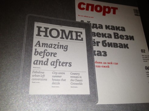
Headlines set in Egyptian Slate
Text set in Ginkgo
Features set in Carter Sans
Russian Sports Magazine
Headlines set in DIN Next
Features/Quotes/Text set in Really No. 2
Parallel Arabic/English Magazines
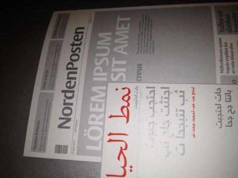
Headlines set in Frutiger Arabic & Neue Frutiger
Features/Text set in Palatino Arabic & Nova
Arabic and English text set in Tanseek Traditional
Scandinavian Tabloid
Headlines set in Big Vesta
Features/Quotes set in Frutiger Serif
Text set in Vesta
About the The Monotype Collections
Here is Monotype’s official description of the Monotype Collections:
“The Monotype Collections are a series of personal font selections curated from the Monotype library by leading figures in the print and digital design worlds. Each one takes a theme that corresponds to real-life briefs or trends, such as Heritage, Publishing, Branding or Web Fonts, and all fonts selected by our curators are available to license from Monotype.
“Packaged as 12 booklets by SEA, the Collections are a mine of inspiration. The sheer volume of font options now available to designers and creative directors can be daunting and time-consuming to explore, leading designers to settle for tried-and-trusted go-to fonts. The purpose of the collections is to widen their palette, and offer a range of entry points to the Monotype library, which contains thousands of fonts covering every application, and has its origins in the late 19th century. The Collections contrast contemporary alternatives and reveal hidden gems from the archives, and invite designers to delve deeper.”
Which designers are represented in the Monotype Collections?
Collaborators on the first dozen collections include Pentagram (Made in the USA), Rankin (Fashion) and veteran newspaper and magazine designer Mario Garcia (Publishing), plus: SEA’s Bryan Edmondson (Made in Britain); Monotype’s own Robin Nicholas and Dan Rhatigan (Unseen); Creative Review’s Patrick Burgoyne (Heritage); art director of Eye, Simon Esterson (Contrast); leading web developer Aral Balkan (On-screen fonts); Senior Lecturer from the University of Reading’s Typography Department Gerry Leonidas (Essentials) and Akira Kobayashi and Nadine Chahine from Linotype (International); and Interbrand’s chief creative officer Andy Payne (Branding).
Why the Monotype Collections?
Here is how Dan Rhatigan, Type Director, UK Monotype, explains the rationale behind the Collections:
“The best moments with customers are always the ones where we have good conversations. These are the meetings where we talkabout typefaces we like, and teach each other a little bit about our respective areas of practice in order to collaborate on something better than either company could do on their own. And often, the first follow-up question to a good meeting will be: “What font would you recommend?”
“We’re trying to capture those kinds of conversations in this new series of brochures. In each, we have asked a collaborator — sometimes a customer, sometimes a partner, sometimes on outsider, and sometimes a fellow designer — to think about what typefaces from the combined Monotype libraries they would recommend for certain kinds of work, or held together by a certain theme. We also ask how those choices could bebest illustrated. The resulting collections all offer just a taste of the many choices that are worth considering, and always include some surprises that might have been overlooked if not for the back-and-forth between the people involved.
For more information about the Monotype Collections
To find out more contact james@monotype.co.uk
Weekend reads of interest
The iPad that never was: kickstands, curves, and “highly confidential” Apple prototypes revealed
http://www.theverge.com/2012/7/26/3190849/court-documents-reveal-multiple-ipad-iphone-prototypes-kickstand
Charles: the Tiffany iPad magazine that wasn’t
http://www.jesseragan.com/projects/charles/
The iPad Design Lab: Storytelling in the Age of the Tablet
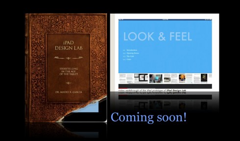
Video walkthrough of the iPad prototype of iPad Design Lab
Mario Garcia’s upcoming speaking engagements:
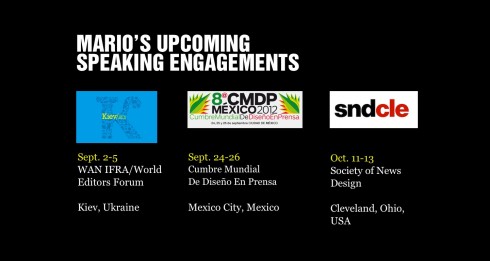
WAN-IFRA World Editors Forum, Kiev, Ukraine, Sept. 2-5
http://www.wan-ifra.org/events/64th-world-newspaper-congress-19th-world-editors-forum
Cumbre Mundial de Diseño en Prensa 2012: Mexico City; September 24-26
http://www.cmdprensa.com/mx2012/
SND (Society of News Design) Cleveland; Oct. 11-13
http://cle.snd.org/