Update #5: Tuesday, 06:08EST
This blog post will be updated throughout the day Tuesday as we make further progress in our work with Al Shabiba and Times of Oman here in Muscat
TAKEAWAY: How the logo creation shapes up as we countdown to the Sunday launch of Oman’s Arab language daily, Al Shabiba. During the weekend we held a “blogathon” updating you and letting you participate as we crafted revisions of the logo for Al Shabiba. Read what well known Arab type designer Nadine Chahine tells us about the logo. Today we must finalize it, plus continue the work on pages to ready them for the launch April 4. TOMORROW: Introducing the Times of Oman redesign.
We are almost there………the version we like MAY still win!
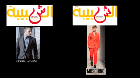
Which one will it be Armani or Moschino, to use the CEO’s analogy about the two logo finalists?
The CEO Mr. Ahmed shows up, and we have two finalists on the table: one with the flame, one with the three dots. Of course, the CEO is telling us: The three dots are an Armani suit, the public sees us as classy, elegant, serious, while the one WE ALL LIKE, the modern one with the flame is, he says, a Moschino—-much younger, not so classic.
I know that when you are four days away from launch, and when you have gone thru 136 plus versions of a logo or page, it is time to have the final showdown. I tell that to the team, which, being young and idealistic, are still fighting for their choice of logo with all they have: full steam ahead. I remind them that we present our argument, emphasize what we recommend, but, at the end of the day, WE are consultant and advisor, NOT the ones in charge.
I repeat that the “flame” logo is modern, it is our creation, not off the rack, not something that any Arabic font might offer. We repeat that we think it is the way to go. Nadine’s opinion carries a lot of weight, so, again, I refer to her emails.
Then, as lawyers do, we rest our case.
The CEO has now retrieved with both finalists to contemplate.
We will do lunch and see what happens.
NOTE: One cannot get attached to an idea or concept to the point of being blinded to the other side’s best argument. But one states his opinions firmly, and must know when to say, now I leave it to you, who know your publication and your audience better, to decide. That is where we are right now.
Here we are in HOT Muscat, going out for a quick lunch, and hoping for the best.
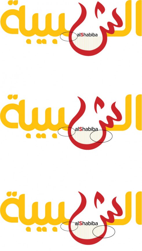
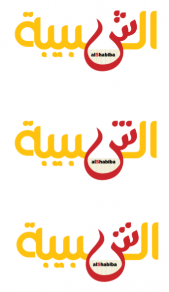
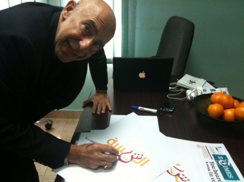
Could this be the final Al Shabiba logo?
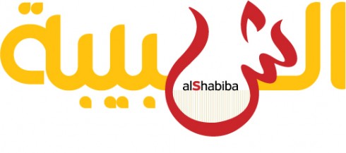
We will present this “final” version to the CEO before lunch today: we hope this is it, as “sheen exhaustion” begins to settle in.
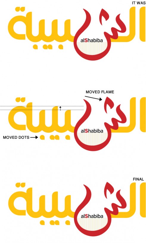
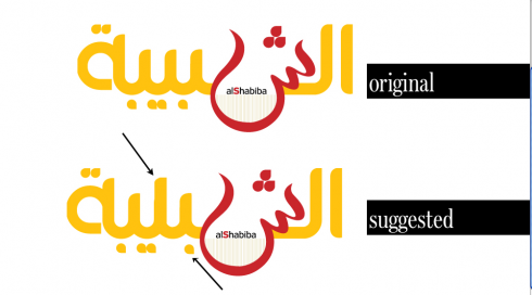
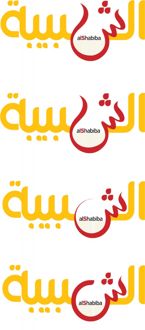
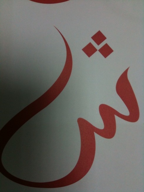
This diagram shows the logo we considered finalist last night, with corrections suggested by Nadine Chahine and Prof. Kinaan. Nadine wanted the flame moved slightly to the right, while Prof. Kinaan asked for raising of the “ascender” in one character. Both Nadine and Kinaan agreed that the dots at the bottom needed to be moved slightly to the right
All of us involved with this project are so into it that we were up extremely early this morning, communicating with each other, looking at reactions, and putting together ONE more version of the logo: paying attention to those sheens and flames and dots, moving things around, but quite inspired by the comments of Arabic type creator and expert, Nadine Chihene, whose encouraging words come with the backing of someone who is a devoted student of Arabic calligraphy, with much respect for tradition, but a keen eye for what is modern and may appeal to younger generations of Arab.
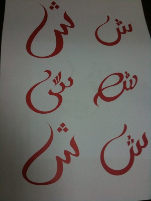
Now our calligrapher Osama brings in a “final” (is it ever a final here?) of how he would do the logo using Nadine’s suggestions (she asked to have the flame moved closer to the right of the sheen, plus suggestions from Professor Kinaan (see below), to have one of the characters become a sort of ascender.
Back to the logo after gala dinner
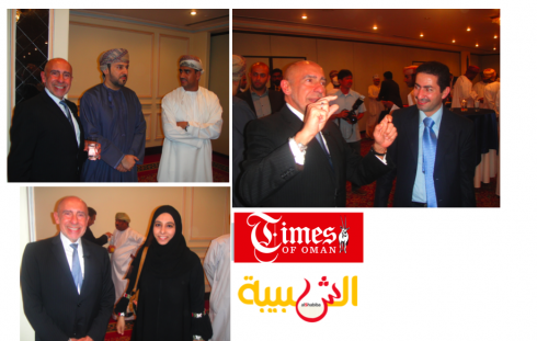
Scenes from dinner to introduce Al Shabiba and Times of Oman redesigns last night in Muscat
Making the point:” hope you like the new logo and the elegant sheen,” I found myself telling the audience.Photos by Times of Oman photographer: Jun Estrada
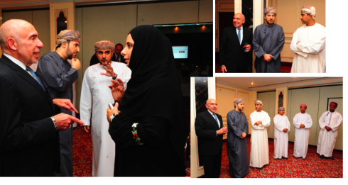
Last night at dinner reception to introduce new look of the newspapers. Photos by Times of Oman photographer: Jun Estrada
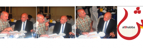
Professor Kinaan discussing why we need to make changes in characters other than the sheen for the Al Shabiba logo.
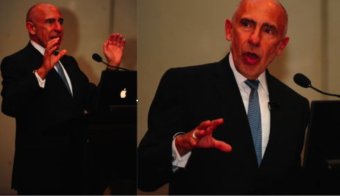
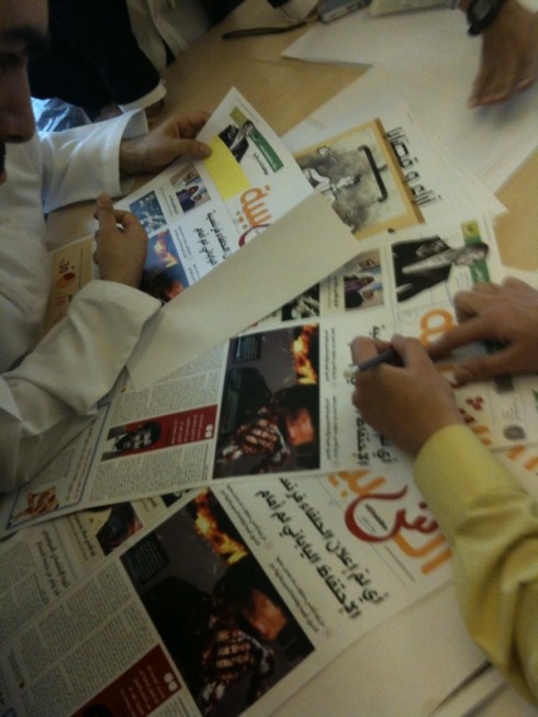
Last night we introduced the new design of Al Shabiba and Times of Oman to the world, and we got applause for it. A group of more than 150 gathered at the Intercontinental Hotel Muscat to see my presentation. Among the group: dignitaries from government, academics and some of their students, advertising and media managers.
On the issue of the Al Shabiba logo: we presented the two finalists, one with dots, one with “flame”, and several in the audience spoke up, telling us that they liked what they saw, but, in some cases taking case with characters OTHER than the sheen on which we have worked so feverishly for days.
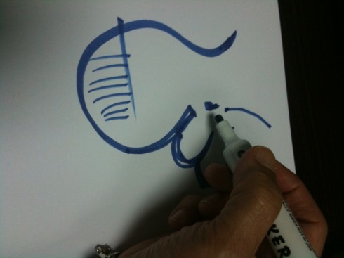
One member of the audience, a professor, Dr. Basheer Kinaan, and a self-proclaimed expert on Arab calligraphic forms (although a dentist by profession) spent a good chunk of time with me and calligrapher Osama Aljawish making his point. In this case, he feels that the dots would do better than the flame, but the important thing is to raise one of the letters with an ascender (see my sketch), and move one of the inferior dots slightly to the right. Unless the letter has an ascender, it will be read as one sound and not the three that it needs to be, said Dr. Kinaan.
Dr. Kinaan feels passionate about staying closer to classic Arabic characters: “Your logo reads, of course, but it forces readers to do a little extra work to get the meaning of the word. Why do that? This is an Arabic calligraphy with years of tradition. The classic way always works, you read it quickly, never goes out of style. Why modernize it and make people try harder to read it. I like the design of what you have here, but make sure you make it legible as well.”
Here is my rough sketch of how the logo would look if we adapted the changes Professor Kinaan suggests, which Nadine Chahine does not feel are necessary (see below)
Enter Nadine Chahine
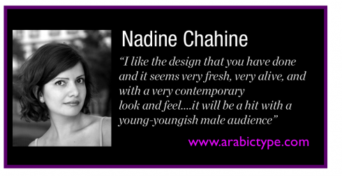
However, Arab type typographer and font developer, Nadine Chahine, whom we much respect for her creation of Arabic fonts such as Frutiger Arabic and Neue Helvetica Arabic, among others, feels differently:
Hi Mario,I would highly recommend that you stay with the original design. The suggested version has serious legibility issues. By the way, how come the dots are not underneath the vertical strokes? That would be much easier on the eyes and less confusing.
I specifically asked Nadine her views on the two logo finalists we had going into the dinner (scroll down to see them), and she felt that we should stay with what we had there, and not go for further alterations:
I would highly recommend that you stay with the original design. The suggested version has serious legibility issues. By the way, how come the dots are not underneath the vertical strokes? That would be much easier on the eyes and less confusing.
I think that you’ve reached the best solution with the Sheen with connected dots. It reads perfectly well (though dots could be shifted to coincide with the verticals) and has the right dynamic form. The unconnected dots are still ok though. The suggested version reads Ashibliah. The stroke of the Yeh is high enough to be read as an ascender.
Much appreciated comments. It is now Tuesday morning and we will see if we can get the final logo realized by lunchtime, as much work must be done with branding, creation of templates, etc.
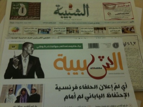
The design of Al Shabiba
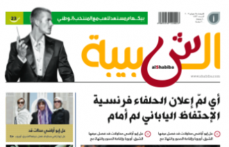
I show you here assorted pages from Al Shabiba, starting with the Page One, so that you get to see the design beyond the controversial logo.
Front page, business section front, sports section front
The Opinion Page
TAKEAWAY:Tuesday report: How the logo creation shapes up as we countdown to the Sunday launch of Oman’s Arab language daily, Al Shabiba. Also, the changes for Times of Oman. During the weekend we held a “blogathon” updating you and letting you participate as we crafted revisions of the logo for Al Shabiba. Read what well known Arab type designer Nadine Chahine tells us about the logo. Today we must finalize it, plus continue the work on pages to ready both newspapers for the launch April 4.
Dots and flames: what the books tell us
It is morning in New Haven, Connecticut, and our Reed Reibstein (Yale University ‘11) wakes up to our blog and the “dots versus flame” controversy of the day as we finalize versions of the Al Shabiba logo.
Here is what Reed reports:
“Well, I just took look in my Arabic calligraphy books and resources online to find support for the “flame.” But I was surprised to find extremely few examples of this effect, which originates as a written shorthand (much like the ñ in Spanish, originally written as two n’s). The only example I could find was in the recent typeface Massira—but here, it is only used in the highly informal version (http://www.29letters.com/new/files/fonts.php?type=font&typec=commercial&id=12#desc), while the more formal version has defined dots (http://www.29letters.com/new/files/fonts.php?type=font&typec=commercial&id=10).
So, although I like the “flame,” perhaps this suggests that there is not enough precedent for this style in standard letterforms—but I would love to be wrong!
And, Reed, this time WE here at the Al Shabiba design department would LOVE for you to be wrong on this one too. We feel that the spirit of the flame goes more with the rest of the logo, as well as with the new look of Al Shabiba, which, if you look at the pages, will undergo one of the most dramatic design transformations for any Arab language daily that I know.
Thanks for the update and, all of you, come back to the blog. I may Tweet the results from the gala tonight.
Dot or flame, which will it be?
We keep you posted.
After lunch: sheens and dots and flames
Calligrapher Osama Aljawish, of Al Shabiba graphics/design team, shows four versions of the “sheen” logo
It was lunch in the office as we toil away preparing for tonight’s gala dinner in which Oman’s VIPs and dignitaries will take a first peek at how Al Shabiba and its English-language sister paper, Times of Oman, will look starting this Sunday.
The logo discussion has subsided, thank God, and we are now down to two choices: the sheen shown below, and just a matter of deciding “dots” (which I am told are more traditional and classic), or the “flame” as we call it, which is playful and youthful.
Our calligrapher Osama Aljawish just entered the room holding a strip with FOUR versions of the famous logo, as he is still working with thin and thick areas of the sheen. However, we have told him that the VIPs tonight are NOT calligraphers, so they don’t have to get involved in the thick and thin discussion, only dots versus flame.
With three more hours before the dinner, just stay tuned.
Concentrating on the thick or thin of it all with sheen
Omar now shows me various versions of the “sheen” where you can see the degree to which the body of the sheen gets thinner or fatter. Follow the circles in the illustration above.
On the final decision front: Just met with the CEO Mr. Ahmed and we are down to the two choices you see below, and we will present them to the gala dinner guests tonight and have the audience help us decide. Says the CEO: “The dots are more classic Arabic calligraphy, and, although people read the non-dotted version, it may strike some as too modern, so we must be careful.”
Careful we continue to be. Stay tuned.
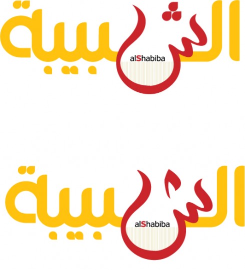
These are the two finalists now but it will be tonight at the gala dinner when we will know! Guests include academics, politicians, advertising agency directors, and Muscat VIPs
Turning attention to those “dots” on top of the “sheen”: a new challenge arrives
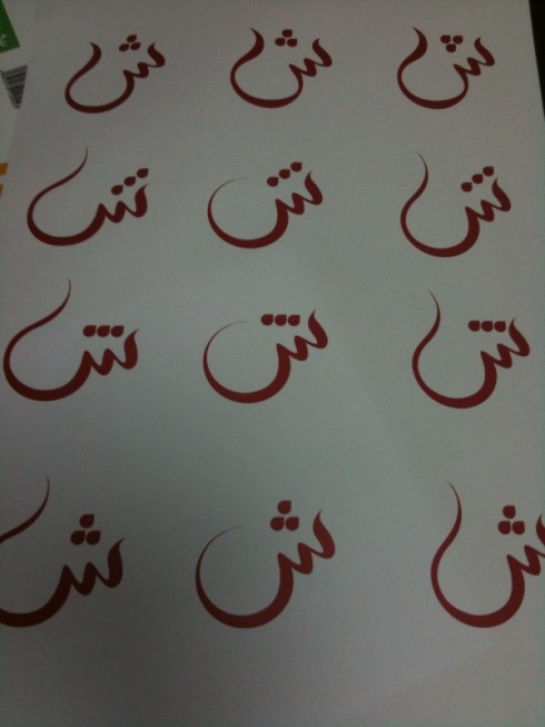
Image 1: New twist for the “dots” appearing over the sheen.
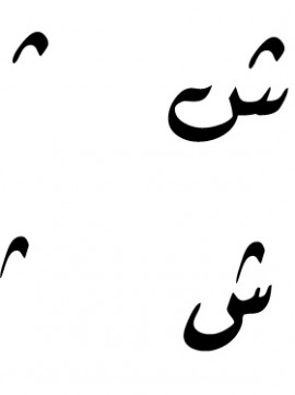
Image 2: The calligrapher shows me some “sheens and dots” from well used Arabic fonts from which he draws his inspiration
Talk about connecting the dots. We are doing it here, actually.
So now it is mid morning Monday. We have the gala tonight to show the two publications to the world——including, presumably, the new logo of Al Shabiba. Talk about down to the wire, or down to the sheen, in this case.
Osama , our calligrapher in residence, says that the CEO would like him to make the “three dots” at the top of the sheen a little bit more modern. So, inspired by how dots can be transformed from dots to a mere checkmark, or what looks to me like the Nike logo, Osama shows me his handiwork here.
Image 1 shows the “finalist” so far, and below, the one with the “dots” modernized. Image 2 shows you how the dots can be transformed and still translate the same meaning.
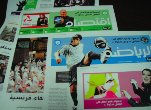
To be continued. But enjoy some of the prototype pages here for Al Shabiba, showing you how all the elements come together on the page.
New sports and business section fronts for Al Shabiba
A page of culture
An inside page of news
Down to the wire and dreaming of sheens
It should be no surprise to anyone reading this blog over the weekend, that I would see me drawing sheens in my dream last night. Not that I came out with any winning formulas.
Today we finalize things here and I plan to show you some of the full pages for both Al Shabiba and Times of Oman as the day progresses.
Tonight: gala dinner here to introduce the new look of both newspapers to advertisers, ministers, intellectuals and selected readers. Obviously, THEY will be the final arbiters of how our Al Shabiba logo looks, and we will see how the “sheen” plays with the distinguished guests at the gala dinner.
Come back and check with us throughout the day!
Of special interest:
The designer of Frutiger Arabic (and Palatino Arabic and Neue Helvetica Arabic), Nadine Chahine, wrote on her blog that she has been enjoying our blog on Al-Shabiba.
We are happy and have written back to Nadine with some questions that should be of interest to anyone curious about Arabic alphabets and fonts. We are hoping to hear from her today!
Visit Nadine’s website here:
http://www.arabictype.com/blog/2010/03/28/great-case-study-about-designing-with-arabic/.
Lost in a sea of sheens, some with evil connotations!
Here we show various scenes of our two-hour discussion all about the “sheen” in Al Shabiba logo today Sunday with CEO Mr. Ahmed (dressed in white at right in most photos)
Sheens by the dozens come out of the calligrapher’s brush!
This is still our favorite by Sunday early evening here: tell us what you think
For those now joining thie weekend-long blog conversation: a sheen is the “sh” sound in Arabic, and represented by this character that resembles an upside down C in the Latin alphabet.
We have spent TWO hours today discussing the “sheen” and the calligrapher has gone back to draw many versions, although we still have our heart on the favorite, the one that many of you also say is your favorite. The most conservative elements here think it is too young, that the sheen dances into the page (anything wrong with that?) and that some older, more conservative readers might have an issue with it. We listen and we continue to work on this.
But, as I keep mentioning, the name of this newspaper, Al Shabiba, means The Youth, so a little young dancing on the page may not be a bad idea.
A fascinating aside: we had one version of the “sheen” drawn that, when seen by two Arab readers in the room, appeared to have what one described as a “connotation of evil” simply by the shape of the sheen. We quickly evolved from that one, but it goes to show that dealing with an Arab alphabet presents challenges we never have to worry about with a Latin alphabet, for example. Of course, I have seen Latin fonts where the “q” has connotations of evil, but mostly to the eye. (That’s another story, for another blog, for another day).
To be continued.
What’s in a sheen? What the CEO says….
It takes many hands to create a sheen that hits the spot, as you can see here
I put today’s Al Shabiba behind the prototype front page, to see how the new logo would play.
Shakespeare asked “What’s in a name?”
I am ready to ask “What’s in a sheen?, as in the Arab alphabet “sh” character.
We have spent two hours talking mostly about the sheen and how Arab readers may perceive it.
Of course, changes of logo are never easy, in any alphabet.
Here, we must make sure, as the CEO reminds me “that ministers, intellectuals and older readers don’t think that we have a punky version of the newspaper logo. We want it to be modern, but not to dance”.
So, during the course of the meeting, with Osama the calligrapher going back and forth, we toil away, and come up with one that may fit all the requirements: young, modern, classic, easy to read, liked by all.
Tall order.
Time for lunch. More to come.
We think we’ve got it
Wow, we think this is it: working around the clock, we now feel confident that this may be it.
These are the finalists presented, from which we all picked the top one: but the last two had something to offer as well. Oh, decisions, decisions
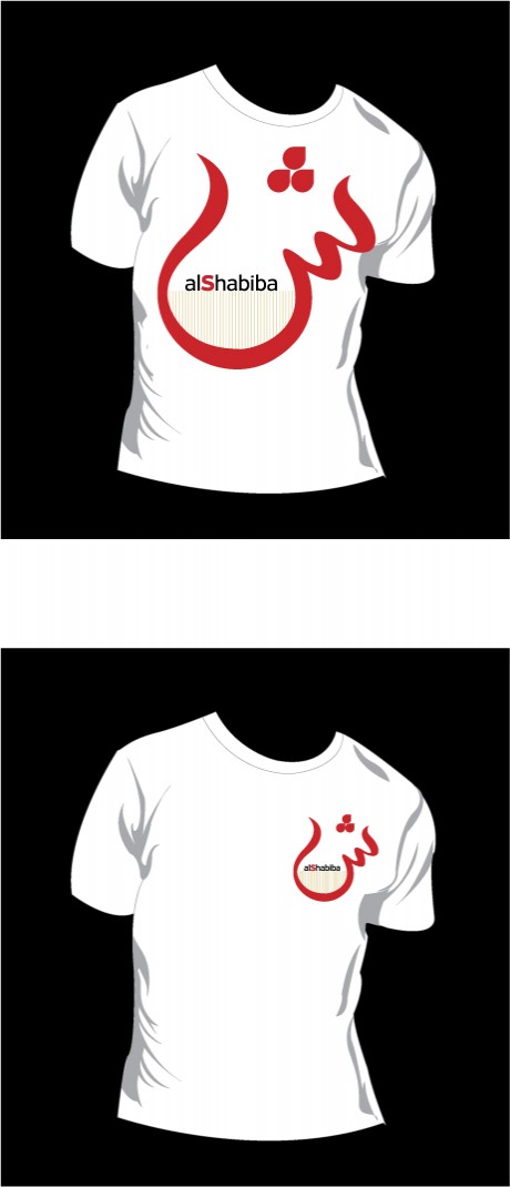
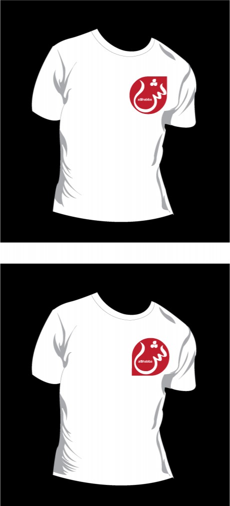
Thinking ahead: a logo becomes a brand that needs to have legs to go beyond the page. How would the logo look on a t-shirt?
Now the calligrapher, Osama Aljawish, returns with refinements of the one “sexy” version of the sheen that we all like. “It is now very easy to read for an Arab reader, but it is also interesting because it could be the stroke of a brush or pen, and that makes it natural,” he says proudly.
But Jan Kny, our Garcia Media art director (Garcia Media Europe) points out that the dots are too close to each other , so we ask him to separate him. Jan asks the question: “In Latin alphabets we don’t want characters to touch, is that the same in Arabic?”
Osama says that, indeed, characters should not touch, so he goes back to the drawing board and separates them.
I have a feeling we are almost there: this is it. But, of course, the CEO may have a different idea. Stay with us.
Presenting the latest version of the logo to the CEO
It is Sunday and we do final tweaking to the logo as we shall present it to the CEO in two hours.
Designers are busy printing latest versions.
Meanwhile, as we came into the building thru a backdoor today, I noticed a very old Al Shabiba logo still sitting at the top of the door. Here it is. A lot has happened since this version appeared.
We hope to emerge with a very modern one today.
Also, I give you a glimpse of the section fronts for Al Shabiba: opening of Local, Sports, Entertainment, all color coded.
More to come as the day progresses.
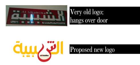
Old logo sits at the top of a backdoor; new version (latest one, anyway) below
Prototype pages of Al Shabiba’s section fronts: soon to be launched
Reworking the Al Shabiba logo, one stroke at a time—-come join us
Final three versions of the day for logo of Al Shabiba: read below for progression of events and how we got here.
Time to close the shop this Saturday, and go for a run on the beach. Here is our final work of the day. The differences here are in the positioning of those dots, or whether they are looking up or down, bunched up or separated. I am told that there is flexibility on how they are utilized.
The calligrapher shows up with a variety of new “sheens” for us to see

Sheen 1 carries a lot of visual impact; but some of the Arab calligraphy experts in the room say: not easy to read
Sheen 2, sexy, but I am told that it is not “Arabic” enough in terms of legibility
So it is 5 pm Saturday and the CEO orders the calligrapher to offer more versions of the “sheen” or SH. We think we like what we already have, but apparently the big boss wants to see other versions. Along the way, we discover at least two that we like out of the various offerings from the calligrapher. See the sheet with all the new “sheens” and then the two we have singled out as having something special. What I call Sheen 1 is , well, sexy——a snake that appears all of a sudden, ready to attack or seduce; Sheen 2 has a sense of order. But, again, my western sensitivities are not what is important here. We continue to consult with the others. Stay tuned.
As we are doing final retouching of the Al Shabiba logo, six days prior to launch, we invite you to come to the blog during the weekend and see where our work takes us
Not easy to recreate Arabic characters, but we give it a try
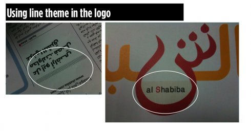
It is 4:40 in the afternoon, and as I look at the Al Shabiba logo I see that it is 90% of the way there, but something is missing: if we are going to use the “sheen” as a branding visual icon, then we have to tie it back to some element that appears consistently thru the design of the daily. So I take a good look and I see that we have a system of dividing lines. Working with the designer/calligrapher, we go back to the drawing board and add the lines to rest in sort of the bowl or oasis of the sheen, where the name Al Shabiba is spelled in Latin letters. It seems to work, but this is still work in progress.
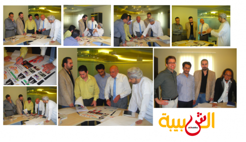
It is Saturday in hot (try 42C) and sunny Muscat, but we only see the sun thru the windows, as we are diligently working on doing final tweaks to the logo of Al Shabiba. Working with our art director, Jan Kny, plus Adonis Durado, design director for Times of Oman/Al Shabiba, and Nasser Othman and and Osama Aljawish, we sketch, execute, look at it, and go back to the drawing board. The making of the logo involves heavy duty calligraphy, so it is good to have the calligraphers sitting next to us.
I take a long time to draw one Arab character, but I find that it is the best way for me to convey to the calligrapher what I have in mind, and how I wish to proceed.
Then comes the issue of how to take that key letter in the logo, the “sheen” which is sort of like an sh sound, to use as a branding element throughout the newspaper later on. How can one go modern, but not sacrifice the charm of the Arab character in the alphabet. We compromise, we go back to the drawing board. At the end, i ask the Arab language readers in the room to take a look and see what reaction they have in 10 seconds.
We are still going at it, and will keep you updated.
Good news on the Arab font development front
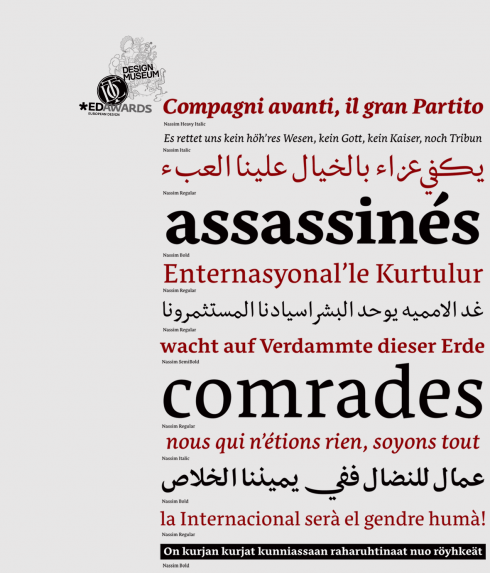
The days when a designer facing the task of redesigning an Arab language newspaper got quickly frustrated over the lack of typographic variety are over. Of course, there are still not as many designers working exclusively on Arab alphabets as we have for Latin fonts. But progress is tremendous, and we now have choices, including for Arab versions of fonts that we are well familiarized with, such as Palatino and Frutiger, among others. This does not mean that one cannot call the local calligrapher to create a customized font. That, I think, will always be a trademark of Arabic language publications generally.
We have had a good, although exhaustive experience, in recreating the logo of Oman’s Al Shabiba, which is a project we are currently finalizing to get it ready for an early April launch, the first major graphic/design and typographic change for this daily in decades. Al Shabiba, which means Youth, wants to be truer to its name: it wants to appeal to younger readers member of the Google generation. In our design work, we have not only concentrated on modern and faster navigational tools for each section, but also the creation of a softer, more modern color palette, and, a logo that is more clearly visible and says 2012 at a glance. The font utilized for headlines: Frutiger Arabic (see details below).
But getting here was not easy, and it has taken almost two years (a long, long time for a redesign by today’s standards, where a potential client calls and asks if the final product can be delivered four months from today). For Al Shabiba, time has been well spent. This week we give Al Shabiba its final touches, and I plan to blog from here part of the week, with more details about our work on the change for the newspaper’s brand, which was done thru the creation of a hand drawn logo. Adonis Dorado , design director for both Al Shabiba and the English-language Times of Oman (which we are also readying for a new design) is working hard on the new logo concepts along with designers Nasser Othman, and Osama Aljawish. I now join them with our Garcia Media Europe art director, Jan Kny, to give it all its final touches.
Discussions of logos such as Al Shabiba are more difficult than when one is looking at the logo in a Latin font. I personally must rely closely on the opinion of the locals here; what do the characters say? Is making one character bigger, or colorizing it, as we do here, going to somehow change the meaning or the perception? Here is one instance when “designing by committee” may be the best idea. We hope that by the end of Monday, we should have agreed on the final Al Shabiba logo!
![]()
Evolution of a logo for Al Shabiba, and still tweeking it
One almost final version of the Al Shabiba logo: still work in progress
How logo would fit at the top of Page One in this prototype page
What’s new in Arab font development
Our intern, Reed Reibstein (Yale University ‘11) is quite interested in Arab language fonts. He and I often discuss the topic, especially now that he knows I am deeply involved with the launch of Al Shabiba here in Muscat. To that effect, I asked him what he had read recently about the subject of Arab font development. His report is, as usual, complete and with his opinions, which I always find refreshing.
There are many fewer professional Arabic type designers compared to those who work on the Latin script. So while dozens of exquisitely-designed Latin typefaces appear each year, only a small fraction of that number are designed for Arabic. Despite the slower pace of development, several typefaces complete with advanced typographic features, complemented by multiple weights, and suitable for book, poster, and, thankfully, publication design have emerged over the last few years. For the first time, re-thinking a Middle Eastern newspaper or magazine need not mean commissioning custom type—though custom type will often remain the mark of quality Arabic publications for years to come.
Here are a few relatively recent releases that could be of use in a contemporary newspaper or magazine:
Nassim: adapts well to use in small sizes; created for Tasmeem, the plug-in for InDesign ME
Nassim (http://tntypography.com/nassim.html): Nassim was designed to work in small sizes, in a dictionary, say, or newspaper columns—a rare achievement. With five weights and perfectly matched Latin letters, it’s almost too good to be true. Perhaps the most exciting aspect of Nassim, however, is that it was designed for Tasmeem, the remarkable plug-in for InDesign ME that brings traditional Arabic calligraphic refinement to typography. Tasmeem really has to be seen to be believed: http://www.youtube.com/watch?v=g-1Y2yndUZQ. Even if implementing Tasmeem in newspaper text is too much to hope for, I would love to see Tasmeem-enabled fonts make an appearance in headlines, a modern version of the calligraphic handwritten headlines that some newspapers once used.
![]()
Remember Palatino? Not many designers use it these days, but it may have a vibrant renaissance in Arab language newspapers
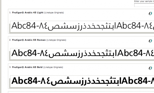
Frutiger: the Swiss font that many tabloids of the 80s loved for front page headlines. We use it for Al Shabiba
Palatino Arabic (http://www.linotype.com/286269/palatinoarabic-family.html) and Frutiger Arabic (http://www.linotype.com/270925/frutigerarabic-family.html): While their Latin complements have been around long enough (I have used them repeatedly over the years myself, but not much nowadays), to the Arabic reading world these are brand new looks. And of course the designs themselves are new, designed in the last several years by Nadine Chahine at Linotype in collaboration with both Zapf and Frutiger. “While many newly-designed publications have embraced Kufic-style type for its boldness (akin to a Latin sans-serif), I would love to see the elegant touch of Thuluth that would grace any page set in Palatino Arabic,” writes Reed. Chahine recently released her newest face, Neue Helvetica Arabic (http://ilovetypography.com/2009/12/04/neue-helvetica-arabic-wishing-on-a-typeface/).
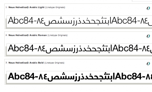
Neue Helvetica Arabic: the minimalist classic conquers new worlds
Reed says that this begs the question: Who will become the Frank Ariss of the Middle East by designing a grid-based newspaper set entirely in Neue Helvetica Arabic? Ariss, as some may know, revolutionized newspaper design in the late 60s when he created a version of the Minneapolis Tribune that was entirely done in Helvetica. It is still one of my favorite newspaper design experiments. And, who knows? Ariss himself may join forces with a young Arabic designer and create the Arabic version of his legendary US product.
One thing is for sure, many Arab language newspapers are NOW very ready to make design a part of their culture. Much has happened in the past five years in this regard, and I know of several other Arab language dailies considering design changes.