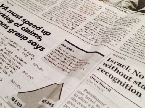
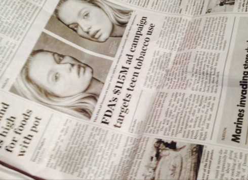
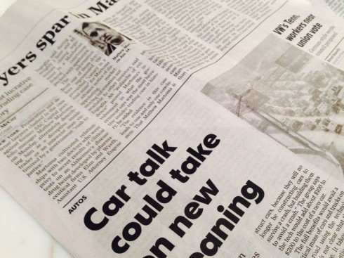
TAKEAWAY: Can someone please decipher the USA Today type palette for me? What is serif? What is sans? When? How? Thanks for your help.


What, may I ask, has happened to the design of USA Today?
True, I am looking at the international edition of it while traveling through Europe a few days ago.
But, it is a mixture of serif and sans serifs, nothing wrong with that, but it is how it is used that confuses me a bit?
What is what? When is the sans (a custom Futura) assigned to a story? Or the serif (Chronicle Text)?
While the mixing of fonts is not just desired, but a good way to provide contrast on a page or screen, I believe there must be a criteria for how the fonts are used, based on story structures, hierarchy, etc..
As I have studied three days of USA Today editions, I still cannot define what the criteria is here.
So, is this just a matter of one of each down the page?
Just wondering. Maybe some of you have figured the type palette puzzle for USA Today. If you do, will you please chime in with your comments?
At least in the European editions, this is NOT the USA Today that we used to know as an example of ‘what to do’ in terms of page design.
In my view, some of the inside pages I am seeing are highly disorganized, lacking a sense of hierarchy, a situation which is aggravated by how the type palette does not seem to harmonize.
I am open to your comments.