
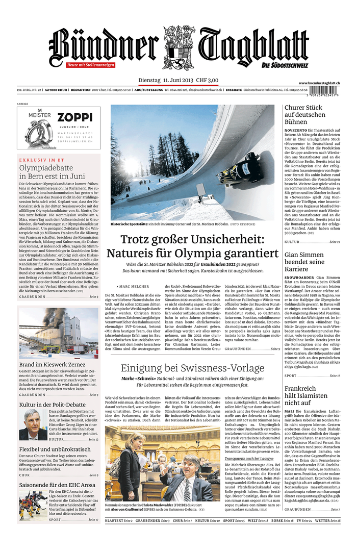
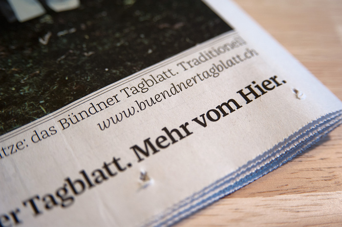
Būndner Tagblatt: new design by twotype (Hamburg), typography is Franziska by Jakob Runge
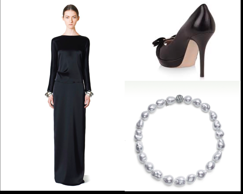
In fashion: classic design could be the Balenciaga dress, the Mikimoto pearls, the Ferragamo shoes
For those who like to reminisce about how the classic newspaper design looks, here is an example, fresh off the press. It's the redesign of Būndner Tagblatt. It follows the three magical Cs: clean, crisp and classic. A fourth C could be conservative.
So, please, step back and take a look starting with the newspaper's logo and coat of arms, but also pay attention to the fonts utilized.
The design is purely classic, in the Germanic sense of the term: the use of type, space, lines and accessories.
Through this look, it is as if the newspaper's editors are telling us: this is how a serious and respectable newspaper should look like. In fashion, this would translate to a lady wearing a Balenciaga black dress, a string of Mikimoto white pearls, the black Ferragamo shoes, which means she will appear elegant and recognized as respectable anywhere. (See my composite here).
Take a look here for a case study of how coat of arms was redesigned, based on the original:
http://jakob-runge.de/typedesign/zeitungskopf-buendner-tagblatt?lang=en
The typography
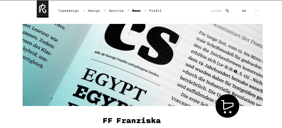
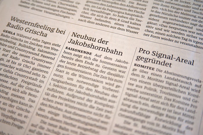
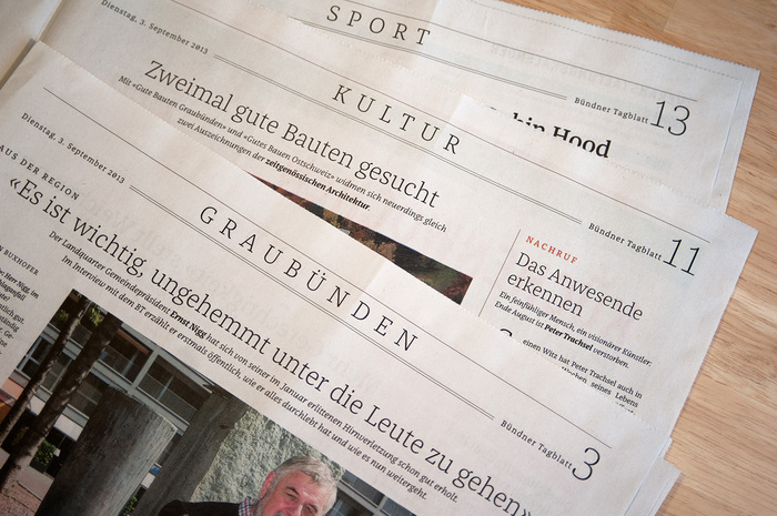
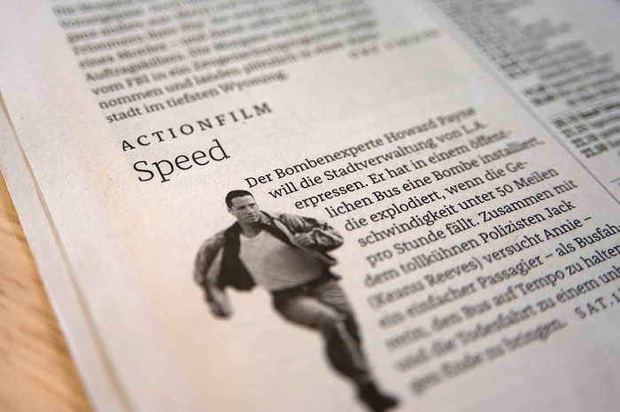
For the redesign of Bündner Tagblatt, the designers at twotype design, of Hamburg, Germany, gave the Swiss paper a look using one typeface family only: Franziska by Jakob Runge.
Read more about this here:
http://fontsinuse.com/typefaces/32069/ff-franziska
http://jakob-runge.de/typedesign/franziska