TAKEAWAY: It is a new look for the Norwegian regional daily Hallingdolen. We talk to its designer, Jarle Stanes about it, plus the creating of the newspaper’s Jubilee 75th anniversary edition.
“Our goal was to create a clean, sober look”
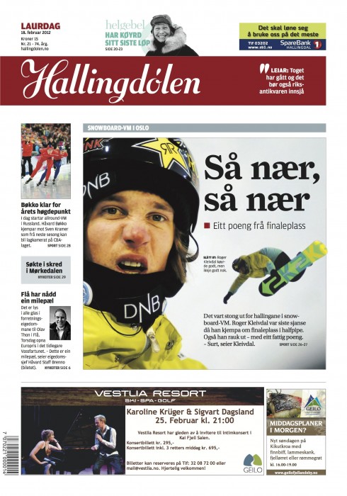
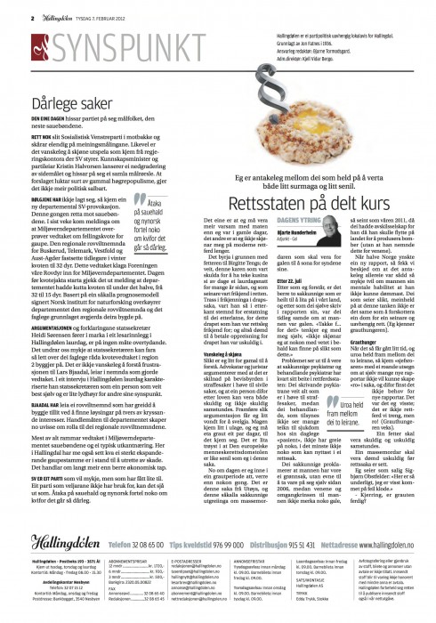
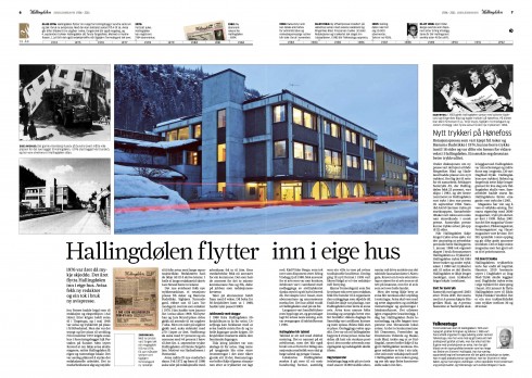
The newly redesigned Hallingdolen
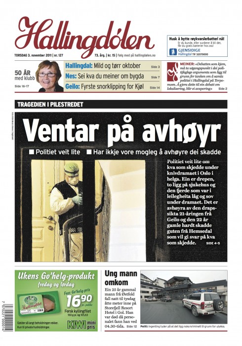
Here is front page BEFORE the redesign
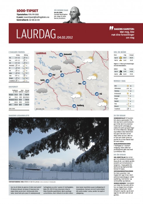
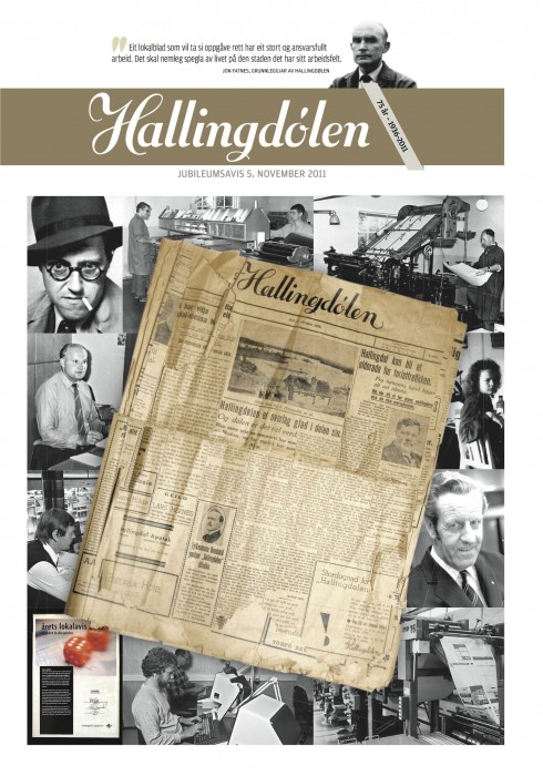
The Hallingdolen 75th Jubilee Special Edition
I met the young Norwegian designer Jarle Stanes during the SND (Society of News Design) conference in Denver in 2010. At the time, Jarle was attending the conference to get ideas as he had two major assignments ahead:
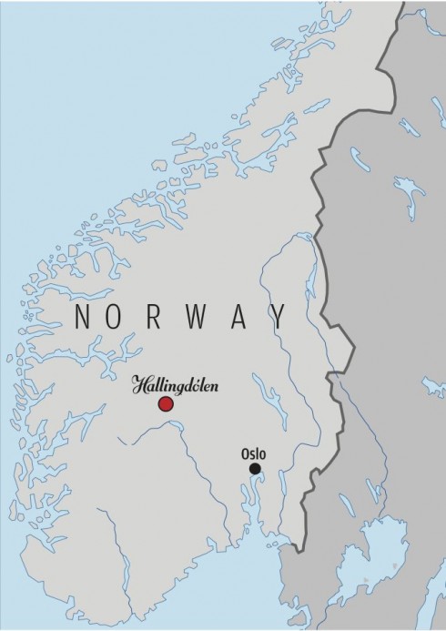
1. To redesign his newspaper, Hallingdolen, published in Hallingdal, in a mountainous region of Norway,halfway between Oslo and Bergen
2. To design his newspaper’s 75th Jubilee edition.
Now the redesign has been launched and the Jubillee edition has been published. So I have taken the opportunity to chat with Jarle about his experience, and to ask him for some pdfs of his pages, which he has gracefully contributed so we can share them here.
Jarle and I kept in touch through the course of the redesign, as he had questions, particularly about typographic choices.
The results are interesting: I like very much how the typography, clean design and architecture come together. By the way, the typography chosen is as follows:
Farnham is used for headlines on the front page, news pages and culture section.
Amplitude is used for sports, features and the weekend section.
Utopia is the text font.
My interview with Jarle Stanes, designer for Hallingdolen:
Mario:
What prompted the redesign of this very well received regional newspaper?
Jarle:
After seven years with heavy Interstate headers in the paper, we wanted to take a step backwards and become a little less tabloidy in our look. We went back in time so see how the paper used to be, and wanted to create a sober and clean look. Hallingdal is a place with down-to-earth-people who don’t like too much noise, and we wanted to bring this in to the local paper. At the same time I have tried to give the pages more white space, and we have tried to make them delicate but not boring. Each section has a signal-color, but it is at light blue, kind of sterile color that we use in different elements all over the paper.
Mario:
I remember that when you first showed me your newspaper in Denver, I made some comments about the logo.
I see that it has changed. How was that process in a conservative newsroom?
Jarle:
You did react to our logo when you saw it for the first time. This made us contact Geir Goosen (logo designer). We wanted him to see the original logo from 1936, and think of ways to give it a modern look. I think he did at great job, and made it way more elegant. And on the red ribbon I think it looks nice on our front page, and gives the paper a clear profile.
Mario:
What was the biggest challenge?
Jarle
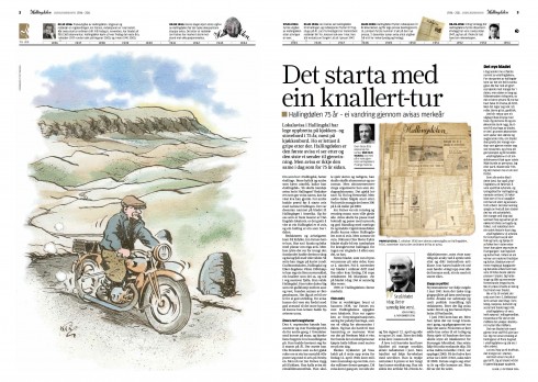
The biggest challenge at first was how to build the front page. My editor wanted to go back to the original black logo on the front pages, and it took a while before we made him change his mind on this. I tried several times to make a front page with the black logo, but I felt it was boring, and also collided with the main header on the front page. After a meeting with Walter Jensen and Arne Edvardsen in Bergens Tidende (they are in charge of the layout in Bergens Tidende), he also wanted to go for the red ribbon. When this was decided, the front page also was much easier to build up. And with the use of white spaces i think it has become quite nice. But the challenge for å small newspaper like Hallingdolen is to have a good picture each day.
Mario:
How about designing the inside pages with ads?
Jarle:
The inside pages I just wanted to tone down from the old layout, and at the same time separate the main case and the adds with some extra white space. We also use a lot of quotes and facts to make something happen on the pages. As I already have mentioned, it is a challenge to make the innside pages interesting in the new layout. But I think the desk—after a couple of months== have become more comfortable with the new look, and know which effects work.
Mario:
How did readers like it?
Jarle:
In the start some people complained that it was harder to read the new fonts in the new layout. I think that first of all was because it was different. But we did a couple of adjustments, and I haven’t heard anyone complain after that. On the overall layout we haven’t heard much. I hope that means people are satisfied. But people have also been busy complaining that we started taking charge for our web-site at the same day that we launched our new layout. This has – by the way – calmed down.
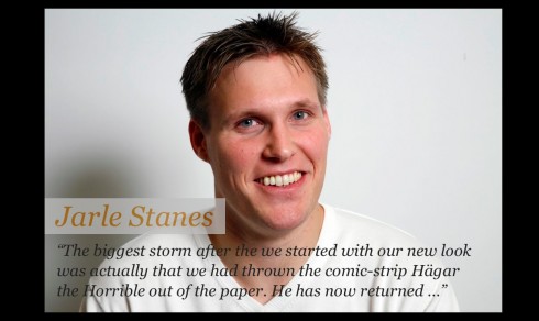
The biggest storm after the we started with our new look was actually that we had thrown the comic-strip Hägar the Horrible out of the paper. He has now returned …