Update 3, Monday, April 23, Buenos Aires, 07:53
TAKEAWAY: Those magazine apps are evolving nicely and swiftly. Take a look at this week’s TIME special edition. Also, two new apps from the Joe Zeff Design studio for Fast Company and PC Magazine PLUS: Taking detours during the D&AD judging in London to admire independent magazines that dare, plus package design that seduces AND: Pages We Like—Goteborgs Posten front page continues to evolve.
TIME’s special shows the evolution of its app
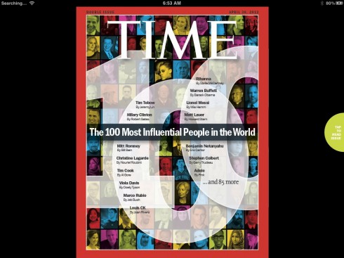
Cover of this week’s special edition of TIME Magazine
Here is a short video to show you the highlights of this week’s TIME special edition
There are some interesting, greatly visual and interactive developments in the evolution of magazine apps.
We are happy to see such evolution as we know that when it comes to the iPad, it is a high learning curve and a matter of time to make the fullest use of the platform’s potential.
This week’s TIME, a special edition devoted to The 100 Most Influential People in the World, is a major breakthrough for the magazine in terms of presentation, visual surprises and making the finger extremely happy.
We applaud the efforts and here are some highlights:
The cover is still not interactive, but it is, as expected, well designed and does exactly what it should in those first 10 seconds when we approach the publication: lure you in.
As this is a special issue devoted to people, one can easily navigate through the 100 persons honored, click on text buttons, read mini stories. One can also swipe through the various pop up moments that give us short blurbs about people and moments that shaped our culture the past year.
It feels good to travel through this issue of TIME and I am hoping that the regular issues of the newsmagazine aim in this direction as well.
It is also becoming obvious that magazines are advancing faster than newspapers in their effort to become more tablet friendly. Of course, with less frequent publication, it is much easier to tackle pop ups and greater interactivity, but we expect newspapers to advance a little bit from the turn the page mentality that prevails in so many apps. We are watching some progress, however, and that is good.
Two must-see new magazine apps
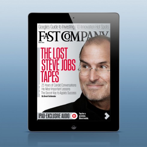
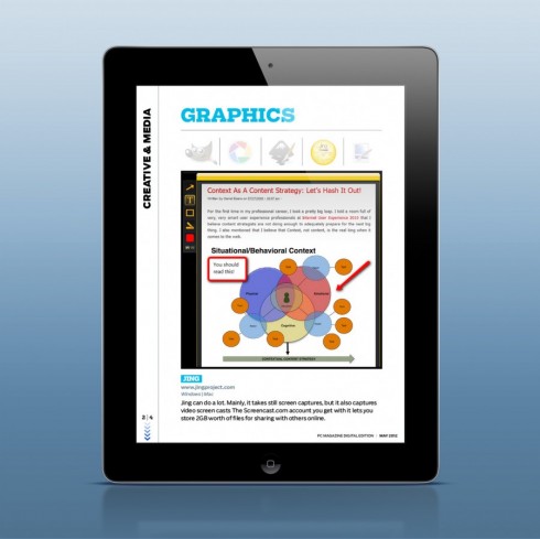
From the Joe Zeff Design studio: two new magazines in the the iTunes App Store — issues of Fast Company and PC Magazine. Two more examples of the “evolution” of the magazine as app. Joe’s team never stops to surprise.
Here are some highlights for these apps:
Fast Company: the cover seduces instantly with the headline, “The Lost Steve Jobs Tapes,” which include more than 40 minutes of exclusive audio from journalist Brent Schlender’s recorded interviews with the late Apple founder.
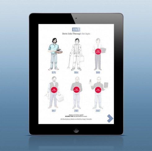
In the interactive department: a play button that lets you hear Jobs’ voice before opening the magazine, and an animated portrait of Jobs by digital fingerpainter Jorge Colombo
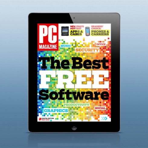
PC Magazine: The May issue of PC Magazine also hit the App Store last week, with a cover story downloadable software that’s absolutely free.
The animation and fun start with the cover.
The entire issue is interactive, with literally hundreds of buttons unlocking layers of content.
We are used to see top of the line, slick and very functional apps out of the Joe Zeff studio. These two publications take all of this to the next level. I also like that the design here is there to facilitate how the excellent content of these magazines comes to the front. There is NOT one single item of decoration here, and plenty of fun to be had while consuming those well written and edited stories. I like the Steve Jobs graphic a lot. You can tell they had fun designing it, which translates into the same for the user. Lots for the finger to do.
Try them.
And, while on the subject of magazines….
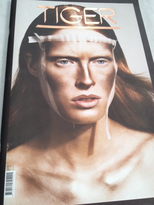
http://www.tigermagazine.com/
Tiger magazine #3 from Folch Studio on Vimeo.
See video of the current edition here
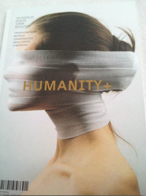
h+ Magazine is a new publication that covers technological, scientific, and cultural trends that are changing human beings in fundamental ways; http://hplusmagazine.com/
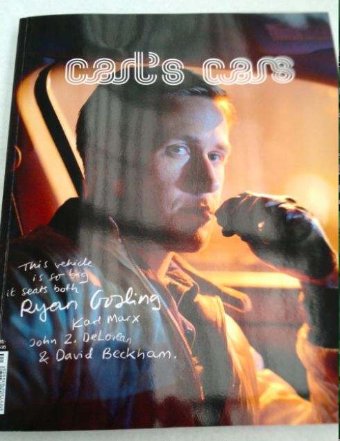
A magazine about people——and cars! http://carlscars.blogspot.com.ar/
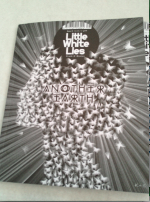
All about film reviews, movie blogs and interviews with cinema’s best directors and actors; http://www.littlewhitelies.co.uk/the-magazine
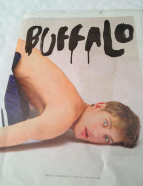
From Australia: all about art, film, fashion, words and experiences; http://buffalozine.com/
Last week, while judging hundreds of entries, mostly magazines, for the D&AD’s 50th annual contest, I was surprised to see the number of seemingly new publications that are doing interesting things, or indulging their readers in storytelling that is out of the mainstream.
The samples here do not necessarily represent winners of the contest, just covers and concepts that caught my eye. In each case there is either a visual, format or concept that reminded me that print magazines can still surprise. It shows that independents magazines thrive.
And all of it through the medium of the printed magazine!
Package design going at it, too
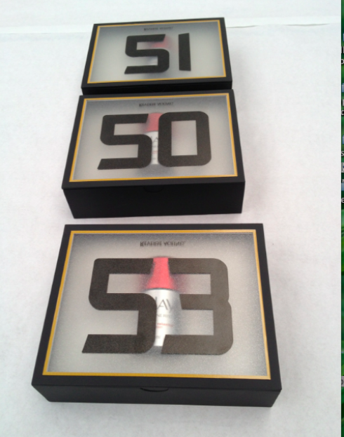
An anti age cream: do the numbers imply the age at which it should be started?
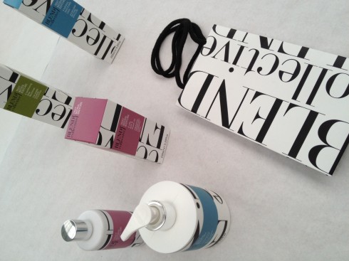
Body lotion: big and elegant type, says upscale with every squirt
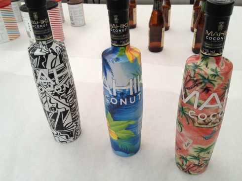
Coconut liqueur: the tropics land on the bottle
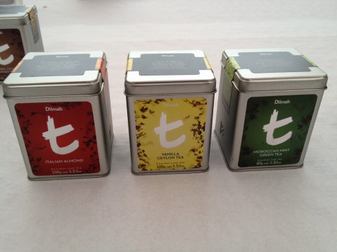
T is for Tea
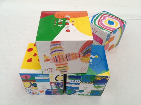
Grabbing tissues from these colorful boxes could be fun
During breaks at the D&AD judging, my roving eye would move from one table to the other, and sometimes to the Package Design judging entries to the left of us in the huge Olympia Hall site of the judging. This is an aspect of design of which I know nothing, but I admit to be inspired often by the design of a package or just from brand visuals. My tour around the several tables full of interesting packages was the mini vacation of last Wednesday.
Look at some of these. Wonder what the challenges are for those package designers. Probably same as for those of us in graphic design of publications in various platforms: grab the eye, make them grab the product, and, of course, visual sustainability: make sure that we don’t get tired of looking at that container of hand body lotion or tea tin can, and always knowing, as we do so well, that a competitor may have a better idea.
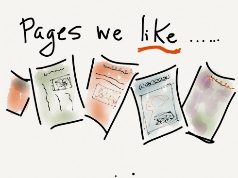
Pages we like
_thumb.PNG)
Recent front page from the Goteborgs Posten
Goteborgs Posten front page continues to surprise as the editors look at visuals and content in a different way: letting the best visual come to the front, while, of course, allowing for the best journalistic headline to be the lead. A win win situation for the readers. And a process that seems to be working well for the editors, according to news editor Anders Goliger.
Our previous post on the GP:
https://garciamedia.com/blog/articles/goteborgs_posten_a_month_after_redesign_revisiting_the_front_page
From the Sunday Bild Zeitung
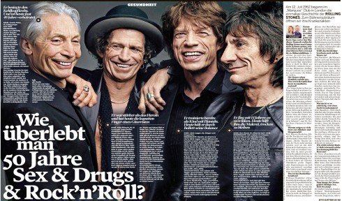
Headline reads: “How can anyone survive 50 years of drugs, sex and rock and roll?”
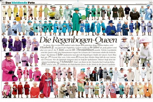
Basically, all the “Queen’s colorful dresses”
How can anyone resist these double page pages from Germany’s most colorful and irreverent newspaper, Bild?
Our Europe blog correspondent, Frank Deville, definitely did not resist them and send them along.
They are pages we like, which definitely seduce, and where the storytelling is purely visual and entertaining.
A trial in Norway
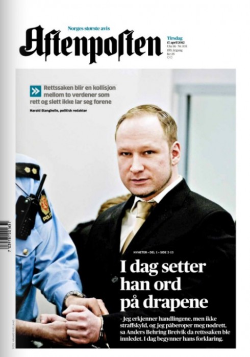
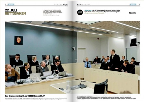
Last week’s trial of Anders Behring Breivik, the man accused of killing 77 in a shooting rampage at the ruling Labor Party’s summer camp last July has captured the attention of newspaper editors globally. In Norway, some have called the coverage “fatiguing”.
Here we see how the Norwegian leading daily, Aftenposten, covered the event.
From Norway, designer Alexander Schindler sends us these images of the Aftenposten pages with this note:
“…this Aftenposten frontpage has an impact. Its not often the old aunt (as Aftenposten is called in Norway) spends its entire frontpage on one picture. Refreshing to see the big pictures in page 2-3 as well. “
But, adds Alexander, ” more interesting than most print pages concerning this story, online is showing its worth. Norwegian broadcaster NRK has a great looking online section called 22.7. These pages have continuous coverage from the court proceedings, as well as background, timelines etc. The section works very well on both desktop, smartphones and tablets. The best example of multi platform design work I have seen in Norway yet.”
Alexander also suggests taking a look at Dagbladet.no, which features a “no terror-coverage”-button on the homepage, in case the user is, indeed, fatigued by the coverage.
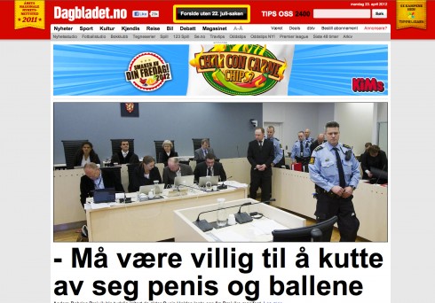
Here is the Dagbladet.no website WITH terror coverage
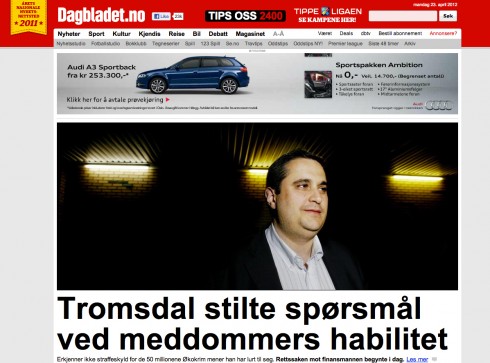
…and WITHOUT terror coverage
Today’s pop up: Bild honors its founder Axel Springer in a photo gallery that is easy to flip through.
The faxed newspaper lives
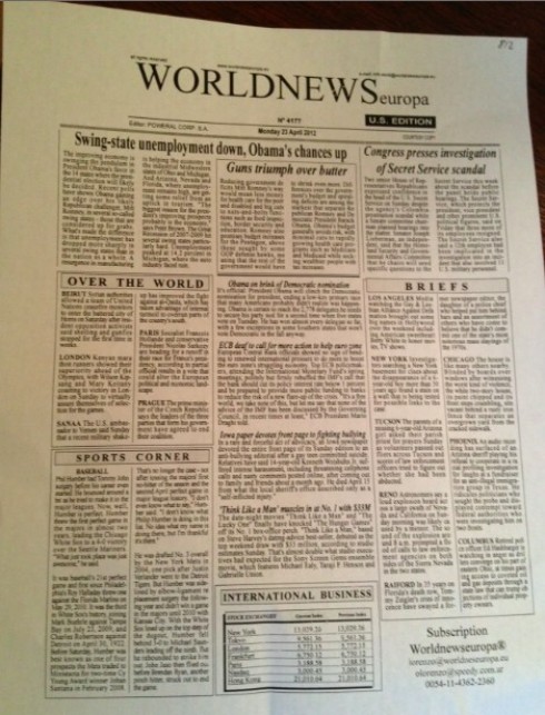
It has been a long time since we saw of these one-page faxed newspapers appearing under the door of our hotel room.
But, alas, here it was this Monday morning in Buenos Aires, my own copy of World News Europa: a one page white sheet with only typography on it (and not the nicest typography, I may add).
For the traveller who may only read in English, the World News provides an overview of the news with sections like Over the World, Briefs, Sports Corner. And for those who would like a subscription, it is available from Worldnewseuropa.
With so many digital platforms available to today’s traveller, I have the feeling that the World News Europa seems a bit anachronistic, but, perhaps not. The one sheet news summary includes 21 items, leading with a headline that reads: Swing-state unemployment down, Obama’s Chances Up
Forgot to mention that the World News Europa falls out of my copy of La Nacion, one of Argentina’s leading dailies, although I imagine that the sheet is inserted in whichever newspaper a guest chooses to receive in the morning.
Garcia Media Latinamerica: making the move

Building (center) where our Garcia Media Latinamerica office will be relocating to soon
It was good to take a tour of Puerto Madero in Buenos Aires this weekend with Paula Ripoll, our Senior Art Director in the office there, to see the building, presently under construction, where the offices of Garcia Media Latinamerica will be making the move as early as December 2012. With a view of the Rio de la Plata, the new office on the 13th floor will sit in one of Buenos Aires’ most trendy and chic neighborhoods.
The New York Times Company in 2015
http://www.cjr.org/the_audit/nyt_2015_numbers.php
First paragraph:
Will The New York Times Company survive as a stand-alone firm past 2015?
Where in the world is Mario?
It is an interesting week ahead for me, moving across two continents, but engaging in some good programs.
April 20-23, Buenos Aires—catching up with Garcia Media Latinamerica team; plus enjoying one of my top five favorite cities in the world.
http://www.garcia-media.com.ar/
April 25, Santiago de Chile—speaking to the WAN-IFRA America Latina 2012 Congress; my topic: Designing for the 21st century, across platforms.
www.wan-ifra.org
April 27, Rochester, NY—speaking at Digital Reading Symposium at RIT (Rochester Institute of Technology). I am honored to be in this gathering which explores the art and science of reading on screens .
http://www.rit.edu/cias/readingdigital/
The iPad Design Lab: Storytelling in the Age of the Tablet
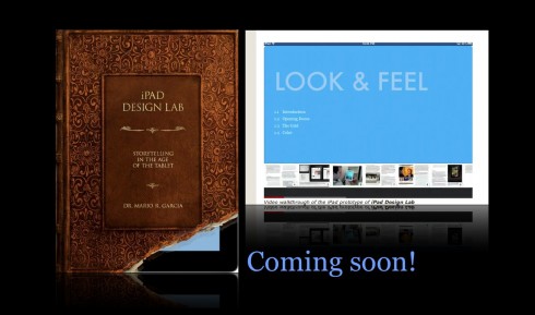
Video walkthrough of the iPad prototype of iPad Design Lab