
The Photo Composite

Sometimes the editor can’t find only ONE image that tells the story well, so, instead, he pulls together several photos and creates a photo composite, showing various images.
The idea is to create a rectangle on the page with the various photos, which offer the optical illusion of a larger image, as seen here on the front pages of the International Herald Tribune and The Washington Post.
The Photo Attack

When the editor finds that one definitive photograph that tells the story in ten seconds, then the approach is what I call The Photo Attack, one single image displayed generously across the page, communicating one aspect of the story, and seducing the reader into the page. We see this treatment here from London’s The Guardian, plus Chosun Ilbo, of Seoul, Korea.
The Photo Lead versus the Journalistic Lead
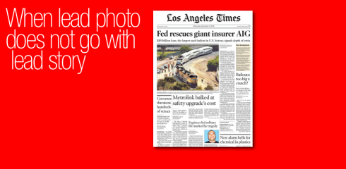
Here we see what happens when two stories compete for attention, as in the case of Los Angeles Times’ front page: a train accident in the city a few days ago is still front page news, but the financial crisis is a definitive lead. What to do? Well, the financial crisis story commands lead status, but the photographic lead and secondary story are also on the page. It is a good decision to lead with a local photo/story, while not downplaying the financial crisis story. Good solution.
The Infographic Lead

The Hartford Courant’s front page shows that sometimes, as in the case of this enourmous financial crisis story, it is infographics that should lead the page visually. I personally believe that infographics usually do not constitute the best visual for page one, as they need to be studied and analyzed, which most readers don’t do on a page one, but, here, it works, presenting the information quickly.
The Over the Logo Headline Lead
![]()
The Orlando Sentinel’s editors decide that the story will get top of the page headline teaser treatment, but no text on page one. Here we have the “over the logo” treatment, with red background and white letters, and a tease to the inside, where the story can be found. The rest of the page is devoted to a centerpiece on how the two presidential candidates would handle the economy, plus assorted other stories. Some may think that this financial crisis story deserves more than a teaser on page one, I tend to agree. However, the placement of the headline at the very top grants the story its importance.
The Concept Cover Lead
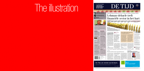
For the editors of the Belgian financial daily, De Tijd, the best way to present the story was through what may be referred to as a “concept cover”—an illustration designed to take the concept of the story and present it visually, in this case the falling dominoes. Effective and eye catching, also time consuming in terms of production, but, with good planning, it can work well, as we see here.
The Type Attack
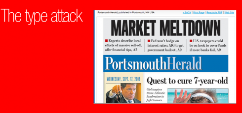
The Portsmouth Herald, of New Hampshire, USA, displays the ultimate type attack—-the big, bold headline, with three summary heads, right above the fold. Especially if street sales are emphasized, this is an effective way to convey the magnitude of the event, allowing the rest of the page to offer more standard news fare.
The Type Attack Over Illustration
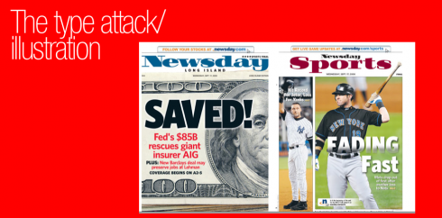
Newsday’s front page shows the combination of a strong headline or type attack, over an illustration; both capture the spirit and importance of the story. This is a combination that works best for compact/tabloid newspapers, as seen here.
The Secondary Lead Treatment
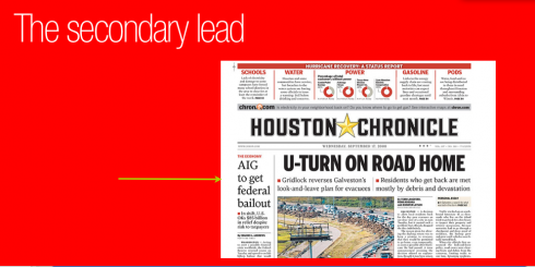
For the Houston Chronicle editors, the decision is not a difficult one to make: the financial crisis is, indeed, a major story, but they have their hands full with an even more major, hard hitting and highly local story—-the path of Hurricane Ike through their circulation area. So, here, the financial crisis story becomes a secondary lead, while the rest of the page is, as it should be, devoted to the aftermath of the hurricane. Great solution. Wonderful treatment.
The Photo/Infographic combo
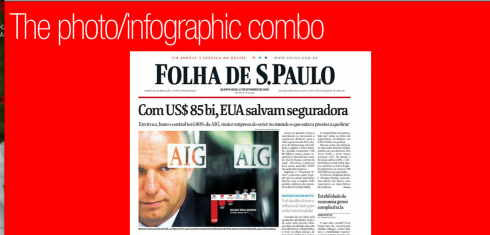

Folha de Sao Paulo creates impact on its front page by using the tried and tested combination of a photograph over which is placed an infographic. To me, this is one of the best solutions. The photo is always a sure magnet to attract readers, the placement of infographic on it provides the more textual information. The combination is a winner.Good way to go, Folha.
And, in Austria, the financial daily Wirstschaft Blatt, published in Vienna, went across the page six columns with headlines, plus photo/info graphic treatment as well; also includes headlines and summaries for four main stories related to the financial crisis inside the newspaper.
![]()
In Vienna the rest of the week. The sun shines today over this historic and always beautiful city. A good run around the Danube River starts the day, then meetings with Wirtsschafts Blatt, as we discuss front page strategies, and continue to conduct workshops with the online/print teams in what is one of the most strategically planned “fusions” between the two media for the path of the story. One central theme of our discussions: how is the reader of the financial daily different from the general newspaper reader? (I say there are some common patterns of readership—-such as the desire for good navigation on Page ONe; however, that is where the comparisons may end; the reader of the financial daily is more focused, usually more educated, and more likely to read online news).
What is the impact of street sales for a financial newspaper, if any?
Even though financial dailies, such as The Wall Street Journal and the Financial Times, are not designed to sell in kiosks, I believe that every newspaper should make an effort to create enough Page One attraction to be able to lure some occasional readers who may see the page displayed on kiosks or other public places; it is up to the marketing/distribution teams to guarantee that all is in place for successful street sales of the newspaper. More on this tomorrow.

On the Path of Hurricane Ike
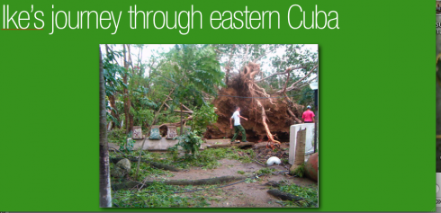
My cousin Mary Larios, who lives in Camaguey, eastern Cuba, sends me this image today of a huge, very old tree, the so called Ceiba Milenaria, which was hit by the wind force of Hurricane Ike last week as it passed through the island, on the way to the western United States, landing in Texas. “Notice that this tree, which could be close to five hundreds years old was toppled, and it landed next door to us, incredible the wind we felt here, rattling windows and breaking glass, a real mess,” Mary wrote in an email this morning.
TheMarioBlog posting # 96