TAKEAWAY: This is part of our occasional series, The iPad Lab, and today we discuss the importance of look and feel, using The New York Times’ app as an example of a functional news app that we think is ready for its next big evolutionary step.
Here is how the basic NYT app grid looks: four columns and swipe navigator for each section

Same grid for opening of Business Day section

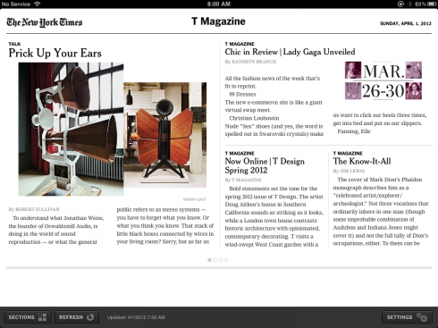
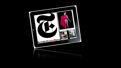
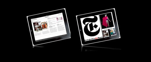
Here is the opening of the T Magazine section as it appears today: no distinction from any of the other sections in the app
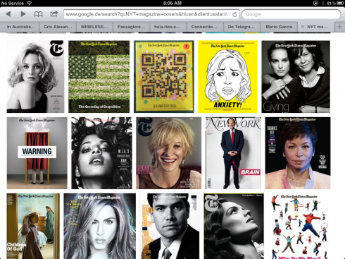
Here is a sampling of how T Magazine covers look: great display of photography and typography
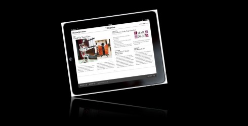
This is opening of The New York Times Magazine section, exactly like all other section openers
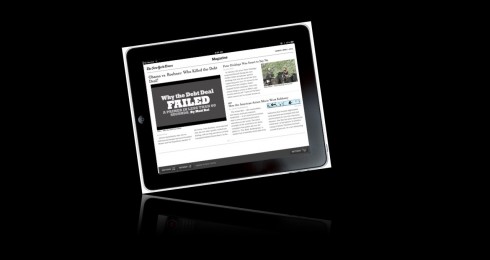
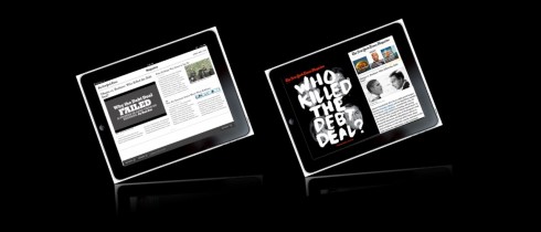
Here is my quick sketch of how I would like It to be, reflecting the great visuals, look and feel of the print edition
T Magazine opening screen as it appears now
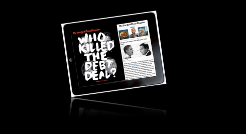
Here is my quick sketch of how I would like It to be, reflecting the great visuals, look and feel of the print edition
As Sunday morning arrived, and as I followed my ritual of updating my New York Times app, which I consider a real treat if you figure that no matter where in the world I am, I can wake up Sunday to the marvelous and necessary content of the world’s best journalistic product.
I am aware that reading habits and our own personal routine guide us through the process of how we approach a publication, whether it is print, online, or an app. In that regard, I am as familiar with the navigation and the nuances of my NYT app as I am with my own running shoes.
Hoping for a little more visual excitement here
However, this Sunday I made an observation again that has made me pause and wonder for months now about the NYT’s app: while it is easy to navigate, familiar and informative, it lacks visual excitement, and, more importantly, visual brand identification for its various sections.
Take Magazine, for example. The print version of Magazine is sumpuous, elegant and always a treat to the eyes—-with excellent content, of course. In print, the NYT’s Magazine seduces.
In the app, as I find out each Sunday, it is just another four column grid, with wimpy headlines and NOT one visual hint that this belongs to that other gorgeous piece that those who read it in print get.
But, does it have to be like this?
Moving forward: start with T Magazine and Magazine?
It is 2012, the NYT has been successful with its paywalls and with its tablet subscribers.
Isn’t it time that, at least the Magazine section be more than refreshed, and be given a total and definitive app treatment? Why not transfer some of the gorgeous typography, the sumptuous photos, and, indeed, maybe more pop ups and videos?
Overall, the NYT app is very satisfying for the information it presents and the order and functionality with which it offers it. In fact, I would not change much in the way the news sections are presented.
However, especially those of us who may read the Times’ Sunday edition somewhere in a far flung corner of the world, with no access to its printed version, we would welcome the type of look and feel that takes us to the originals.
I am sure I am not the only one of their loyal and fervent fans who are itching for the next big step. I am also certain that the Times’ management must have their reasons for not introducing these long overdue changes in their app, since the Times has one of the best design teams anywhere.
It should begin with the the T Magazine and Magazine
Of related interest
T magazine website:
http://www.nytimes.com/pages/t-magazine/index.html.
Recent quote from the Sunday Magazine’s editor, Hugo Lindgren:
http://www.capitalnewyork.com/article/media/2012/03/5432532/nyt-magazine-editor-hugo-lindgren-thinks-he-possibly-blew-it-ipad
“At the moment we have a real problem: we do not have a separate iPad app, and our presentation on the New York Times app is not good enough … When I got there, we had a budget to create our own app. Literally, we were about to hire our own people and the budget disappeared. And I got pretty focused on the magazine, on the print magazine, because that’s where we needed a lot of attention. And I probably kind of blew it a little bit not fighting that hard enough, and we’re going to get that restored.”
He said timetables say the app will be ready in two years.
“And you’re like, two years? Oh my god.”