
I was waiting eagerly to see the newly designed website of the venerable The Wall Street Journal. It is a newspaper that I have worked with several times over the years, and a house that I know quite well, I think. We at Garcia Media had been involved in previous discussions and changes of its website. That is why I was so positively surprised when I saw the unveiling of the new wsj.com last week.
If what constitutes a good newspaper website are the following criteria, then wsj.com has it in abundance:
1. Good navigational tools
2. A consistent and easy to follow grid
3. Excellent information architecture
4. Design that is clean and appropriate to the “look and feel” of the newspaper that it represents.
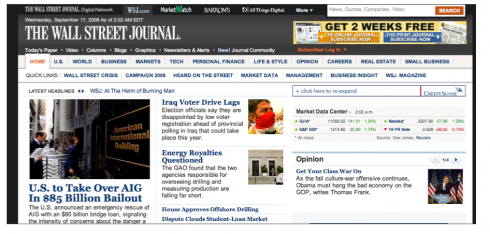
Navigation: All of these qualities are present here, starting with the horizontal navigator, set in two levels, that allow the eye and the cursor to travel across the screen to seek the one department of interest. By freeing the left hand side of the screen, where the usual navigator appears, the screen has a sense of cohesiveness, and the lead item appears more prominently displayed.
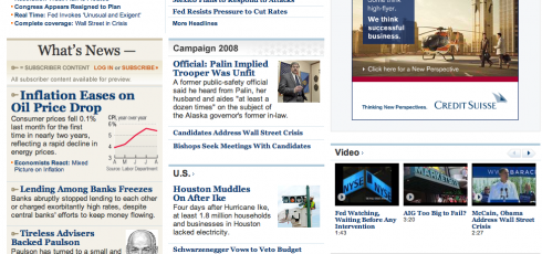
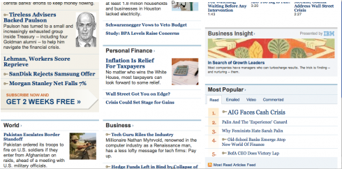
The grid: Here we have a clean grid that offers two columns to the left of the screen, followed by a wider, and very utilitarian column on the right—used for additional information plus advertising. This structure is followed throughout. There is generous space between items, and also between the columns themselves.
Information architecture: If one is a habitual reader of the printed Wall Street Journal, this is familiar territory. However, the way information is presented does not necessarily follow the same order as in the printed newspaper. One of the happiest surprises was to see that the legendary What’s News column, which I remember we had to keep at the very top of the screen in previous versions of this website, now moved down slightly. It is still a trademark of the WSJ, but it now occupies a less prominent spot on the screen. Good thing.
More importantly, the What’s News stands, as it does in the newspaper, as a sort of “mini newspaper within the newspaper” unit, with its own lead piece under the header, What’s News. Rethought, not abandoned, good advice for those web designers who have to struggle with “permanent furniture” and have no clue what to do with it and still maintain it viable and interesting. Bravo to the wsj.com team.
Another salute to the past is the use of those pencil sketches, or ‘hedcuts” as they are internally referred to at the WSJ.
The Design: I think this is the most contemporary design ever used by the WSJ website. The name of the newspaper against a dark gray background gives it a modern style that I am sure sets the mood for the rest of what one sees here. The use of blue lines and blue backgrounds gives the overall design a sense of elegance.
This is not cutting edge web design, thank you. It is, indeed, functional, easy on the eyes, very Wall Street Journal without replicating the print design. But, for the Wall Street Journal, it is a radical departure from tried and tired formulas that attempted too hard to be “the newspaper” online. This is its own medium: inspired by the parent newspaper, but not tied to it in a hard embrace.
And, in my view, it anticipates what we may see more in the print design of The Wall Street Journal—-including the possibility of some playfulness with the logo of the newspaper, a rethinking of information architecture for print, and even more use of graphics and photographs throughout. One begins to see these little changes in the printed WSJ already, but I think it is only the beginning of what ‘s to come.
![]()
In Vienna, the rest of the week, working with the online/print team of the Wirtschafts Blatt, the financial daily here; an interesting project to continue to further integrate online/print editions. Subject of this week’s workshop and discussions: how to avoid cannibalization of print/online. Establishing good working rules in the newsroom. We began this process six months ago at the WB, and now I visit periodically to monitor progress, and to concentrate on specific case studies. Editors of both online/print gather and discuss how a certain breaking news item was covered by both online and print editions, evaluating results and establishing criteria and strategies for the future.
TheMarioBlog posting #95