I have mentioned earlier in this forum that readers create their own perception of a publication or website in about ten seconds; it is during that short period that they decide what this publication or website is all about: playful, serious, downmarket. Many elements contribute to creating that perception. It is all visual, but it is mostly the result of how typography is used.
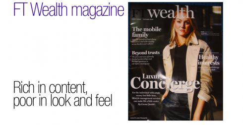
The Financial Times’ glossy magazine supplement, FT Wealth, is an example of a publication that misses the mark in those first ten seconds. While the content is interesting and lives up to the expectations that we set for the magazine: a cover story in today’s edition is about the “Luxury Concierge” (for the individual with ample money but little time, lifestyle management services can make life a little easier), “Healthy interests” (About philanthropic pursuits of the rich), “Wealthy Families” (in this issue: The Pritzkers of Chicago), and tons of advice tips: Who to bank with (good advice these days of collapsing bank institutions!), Ask the Expert (family limited partnerships), The Idea Column and, of course, the inevitable Wine advice column (beware the pitfalls of investing in wine).
I found the content to be solid, interesting and just on target for its desired audience.
However, for anyone who ever wondered about the importance of DESIGN to accommodate, to enhance, and to package content in a way that sends the right “perception” message in those crucial first ten seconds, here is a textbook case study of the design NOT catering to the content.
What is it all about?
Don’t take me wrong: This design is functional. There are no horrors of chamber here. There is a good Contents page, with all the page numbers matching where the stories are! The text font utilized is easy on the eyes, and the page architecture (mostly four columns) is easy to maneuver around.
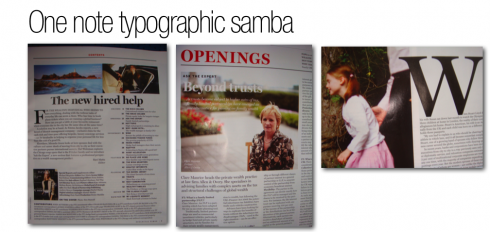
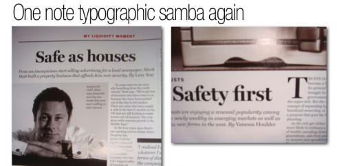
What is NOT right is the font used for almost every display item. I cannot tell what font it is, but it is one of those bold serif utility fonts that could look on one page, but not on every page of a magazine.
There is no contrast here: it is bold serif for the headline, an italic version for the summary under the headline, the same identical italic style, size and weight for highlights and quotes. On top of each quote, a VERY THICK black border.
Initial letters to break up text (I would recommend subheads that advance the story better) are in the same bold serif font as the headline.
The only relief one gets here, with a sans serif, is for the name of columnists, period.
This is a design that implores to have more sans serif to provide contrast, and to cushion the effects of too much bold serif.
Why not use a Sans Serif for those Headers inside the magazine, which are, by the way, set in the same font as the headlines.
It takes a very distinguished, special, attractive font to be the sole protagonist in the design of a newspaper or magazine. Yes, Helvetica can pull it off, and we have seen the 1969 Minneapolis Tribune design created by Frank Ariss, doing just that.
However, the one font used in FT Wealth is too clunky, unattractive and boring to be given the prominence it has here.
The magazine’s good content deserves better packaging. It is always easier to create a design that accommodates good content, than the other way around. So the task for the FT Wealth editors/designers would not be such a challenge.
Something to think about.

The case of one font used for an entire design of a newspaper: Minneapolis Tribune, 1969
https://garciamedia.com/blog/articles/classic_design_as_good_today_as_it_was_in_1969_minneapolis_tribune/
The other new financial magazine targeted to the wealthy, WSJ, by The Wall Street Journal
https://www.garciamedia.com/blog/articles/in_the_lap_of_luxury_the_new_wsj_magazine_is_here/
![]()
Sara Quinn, of The Poynter Institute for Media Studies honors me with an interview: all about TheMarioBlog, and my thinking behind it.
Thanks for the opportunity to share this with you, Sara.
http://poynter.org/column.asp?id=47&aid=150746
![]()
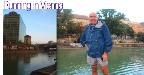
In Vienna, staying in Austria through the weekend, to attend the wedding of the daughter of good friends Dr. and Mrs. Hans Gasser. Dr. Gasser is general manager of the Wirtschaft Blatt, the financial daily here. My own daughter, Ana, has joined me here for the wedding. Here I am running on the edge of the Danube river. As one runs here, the view of the river is always breathtaking, cutting like a snake right through the middle of Vienna; however, the graffiti on the walls to the left provide for much amusement as well.
NOTE : Now in Gamlitz, outside of Graz, Austria, where connections are erratic, so perhaps it may be difficult to update TheMarioBlog during weekend. Enjoy yours.
TheMarioBlog posting #97