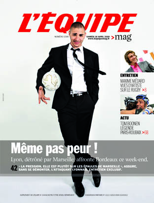
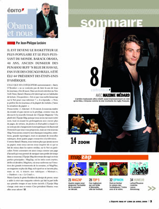
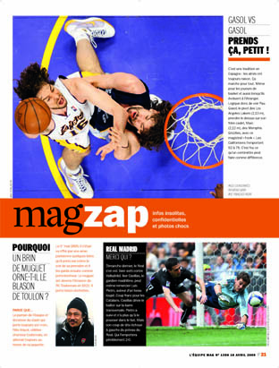
Updated with new images Monday, April 20, 13:46 EST
::: GO HERE TO SEE PAGES FROM THE REDESIGNED L’EQUIPE MAG
[+] enlarge and see hereissuu.com
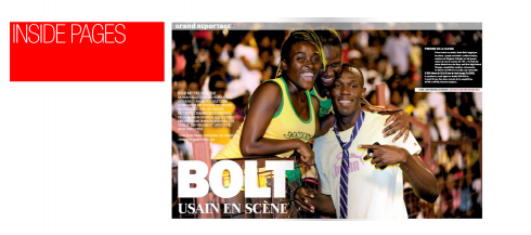
::: PAGES OF LEQUIPE BEFORE THE REDESIGN
[+] enlarge and see here issuu.com
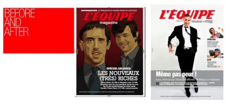
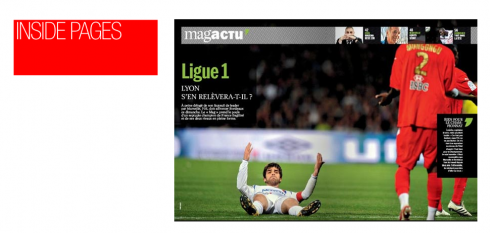
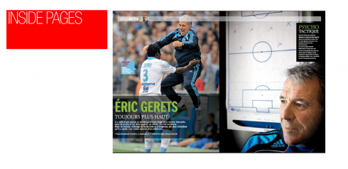
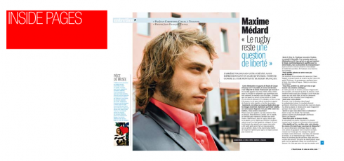
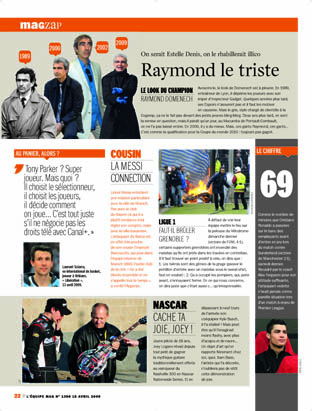
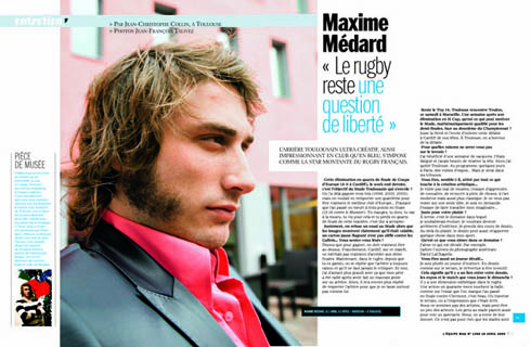
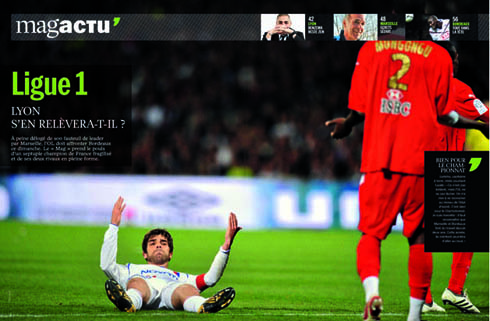
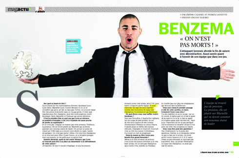
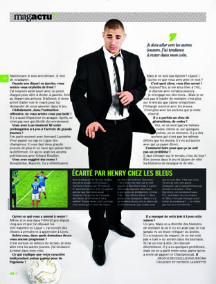
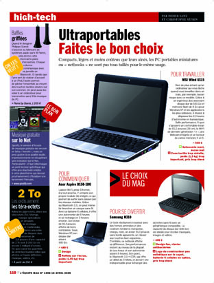
Additional pages after the redesign of L’Equipe Mag
First, the discussion turned to how to make the magazine easier to navigate. True, the majority of L’Equipe Mag’s readers are true sports fans, and they devour their magazine, and all the research we had going in, and the focus groups done during the process, told us the same thing: these diehards love the Mag as it is. They love that their magazine, as does the L’Equipe newspaper, covers every sport, no matter how small or insignifcant—-did we dare say that about judo or rollerblading? Well, we only said that once, in a meeting, and the editors quickly corrected us: at L’Equipe no sport is too small or insignificant.
We offered our pardons and turned our attention to navigation, again.
True, these diehards probably read every page, flipping them furiously and anxiously, waiting for the next big reportage, or the photos of the game they saw and filmed. The Mag is full of surprises. However, we had to make sure that the new magazine afforded fans with little time (isn’t that almost everyone?) the way to look at the cover and find more than ONE story there. Perhaps I am not interested in the cover story, but I see that there is Formula One, or Tennis, and I go directly there.
Remember, it is an impulsive audience for every publication. So we have worked hard on two contents page which present the new organization of the magazine.
The tempo follows my usual symphony concept: violins, trombones, and flutes and clarinets in between. Readers open to some very nice photos with mini stories. The photo is protagonist, the text is an accompaniment to enhance and report, period. Then there are the “read me” sections: great reportages, where sports journalists with long standing traditions and following go for the long story, but, these, too are intercepted with photos and graphics.
After that, we have the nice Godiva chocolates in the box, what the editors call “bon bons”, and these are destination pages, single topics, that break the tempo, offer a couple of high pitch flutes here or there, and allow for short, finger readings.
At the end, a nice magazine within the magazine concept, Mag Plus, with its own cover. Yes, good symphonies, and good novels, usually pick up at the end, the trombones let you hear them, and the result is that the reader keeps hoping for more, and returns the following week.
Editors Jean-Philippe Leclaire and Jean-Denis Walter had a clear focus of what they wanted for the new Mag from the start——yes, it was not easy at first to keep the two Jeans straight in my head, but eventually time took care of that. Not to mention that we had Jean Baptiste Isaac in charge of Mag Plus. Three Jean somethings, each capable, very involved, and once I knew what each was supposed to do, the name and the face and the task all assumed strong imagery for me.
The Mag is part of the newspaper on Saturdays, so this magazine does not sell by itself, although one sees its cover on kiosks all over France.
Other details:
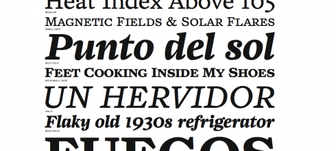
Typographically, we used two fonts that compliment each other extraordinarily well, Zocalo and ITC Franklin Gothic, both from the Font Bureau.
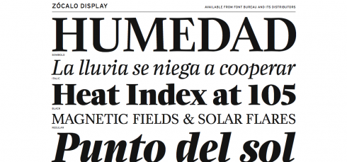
Some of the headlines are set in Zocalo display
Why choose Zocalo? : We wanted a contemporary feel for headlines, in a serif font. Zocalo Display has it. It is perfect as an accessory to the strong ITC Franklin Gothic. We used it for decks under main headlines, or in the headlines of mini stories in the Zoom photo section. And, of course, all texts for major narratives are set in Zocalo. To me, Zocalo, created by the talented Cyrus Highsmith, is reminiscent of texts found in old books. In fact, I was passing thru one of those markets on the side of the Seine River one afternoon, and picked up an original of Emile Zola’s Nana and the text in that 1880 version, which I bought, by the way, reminds me of the strength we find in Zocalo. For a sports magazine, just perfect.
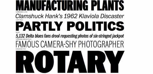
The majority of headlines are set in the strong. visible ITC Franklin Gothic
Why ITC Franklin: This is a font that is a sort of workhorse. The team and I never had a second thought about Franklin for this magazine. It has the strength one seeks in headlines that will deal with the drama of sports. It could very well be seen on the scoreboard at the top of a stadium. Franklin Gothic also has a rich history, introduced in 1902 by American Type Founders. In 1979 Victor Caruso, International Typeface Corporation, increased the series to four photocomp weights, Light, Medium, Bold and Black, all with italics. In 1991 David Berlow added Condensed, Compressed and Extra Compressed widths. Berlow has completed his definitive revision, a single new series, ITC Franklin; FB 2008
The team: Our Garcia Media art directors for the magazine included Rodrigo Fino, Paula Ripoll and Christian Fortanet, working with Mag design director, Francois Lolichon, and his deputy, Pierre Bayle, along with great cooperation from designer Frederic Plå


My thoughts turn to Cuba, my country of birth, from where I left for the United States in 1962, at the age of 14. Forty seven years later, I am overwhelmed by recent news that perhaps there will be a thaw in this long (for me almost a lifetime) political impassé between the two countries I love—-the one where I was born, and the one that opened its arms to me—-and to millions of Cuban refugees—- and which is, in essence, my country, the country I love, and where my children and grandchildren were born. Are we truly at the doorstep of change? If so, this will open tremendous opportunities for all of us in the media to offer our expertise and to create a great renaissance for the media in Cuba——only if it is free, of course. More tomorrow.
TheMarioBlog post #242