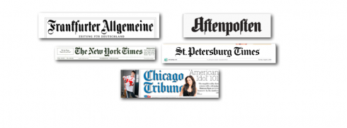
Many newspapers worldwide still maintain their Old English/Fraktur style lettering for nameplates and branding: it spells respectability
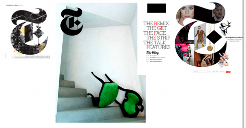
The Times’ Style Magazine uses Old English throughout, all the way to photo credits and bylines. A glimpse of the old in the midst of the grand and modern.
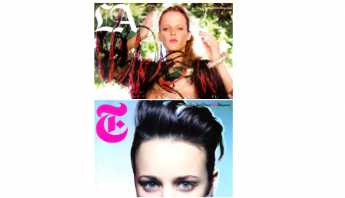
Imitation is flattery, they say: The LA Times magazine treats its logo a la Times.
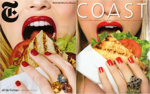
Ooooops! In the “imitation” department, was Coast biting more than it could chew?
Irony of ironies: there was a time, in the 1970s, at the start of my career in newspaper design, when we would jump at the opportunity to take a newspaper nameplate set in those highly decorative and stylized Old English letters, and transform it to something new, skeletal (think Helvetica), to make the newspaper “young, with it”.
The one project of mine that stands in my mind as a perfect example was The St. Cloud (MN) Daily Times, redesigned in the late 1970s, and where the change from a very archaic Old English nameplate to a modern sans font became a cause celebre in journalism, with even a research study by the American Newspaper Publishers Association commissioned. The study set out to gauge reader reactions to the dramatic change of a newspaper’s nameplate (Results: many of the readers never noticed that the old nameplate, which resembled a spiderweb, truly, was gone, and a new one had replaced it!).
Now, it seems Old English is back. Don’t ask me why, and perhaps it is not important. Ironically, at a times when many newspapers have more important things to worry about than the typographic components of their nameplates, a sense of nostalgia is setting in and we all seem to love to go into the attic, open up that huge, dusty trunk, and presto, get the Old English alphabet out, dust it off and put it everywhere……
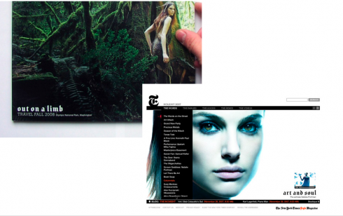
Everywhere it is for the Style Magazine of The New York Times: from the T on the logo (beautiful, I must say), to inconspicuous little corners as in photo credits or bylines; to intros in summaries, to even headlines. This magazine is must reading for me, the perennial design student. It is a weekend pleasure that is always there, regardless of the weather. Study it for its subtlety, for design that becomes protagonist while playing a secondary role.
Here, the use of Old Ehglish works. In a magazine about style, this Old English renaissance renders the magazine nostalgic, elegant. After all, this is the typeface that still conveys formality: think high school graduation announcements, not to mention the setting of your name on your college diploma, and, yes, THE wedding invitation.
Old English says formal, serious, traditional. Don’t show up in shorts and sandals, please. Take the tux to the cleaners, that sort of thing.
A little bit of the history
While we in the United States call the old forms Old English, the Germans and other Europeans refer to it as Fraktur. By any name, it is the same type of alphabet. Blackletter, also known as Gothic script or Gothic minuscule, was a script of the Latin alphabet used throughout Western Europe from approximately 1150 to 1500. It continued to be used for the German language until the twentieth century. In fact, the German daily, Frankfurter Allegemeine used Fraktur for the headline of its front page editorials until very recently. I wonder if the FAZ editors now will reverse and put the old style back in!
Fraktur is a notable script of this type, and sometimes the entire group of faces is known as Fraktur. Blackletter is sometimes called Old English, but it is not to be confused with the Old English language, despite the popular, though mistaken, belief that it was written with Blackletter. The Old English (or Anglo-Saxon) language pre-dates Blackletter by many centuries, and was itself written in the insular script.
Characteristics of Fraktur letters: The left side of the small letter o is formed by an angular stroke, the right side by a rounded stroke. At the top and at the bottom, both strokes join in an angle. Other small letters have analogous forms.The capital letters are compound of rounded c-shaped or s-shaped strokes.
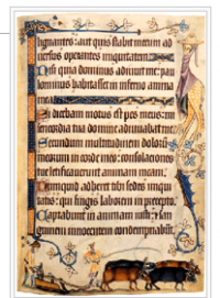
Books of the 14th and 15th centuries usually displayed textualis, with its dozens of ligatures—-and an inspiration to Johannes Gutenberg
And, of course, Johannes Gutenberg carved a so called textualis typeface with tons of ligatures and common abbreviations using this style of letters when he printed his 42-line Bible. However, the textualis was rarely used for typefaces afterwards. According to Dutch scholar Gerard Lieftinck, the pinnacle of use for blackletter was the fourteenth and fifteenth centuries. Mostly those letter forms were used for text in book publishing.
Newspapers from the beginning adopted Old English styles for its nameplates, and many continue to do so to this day. Not all newspapers succumbed to the temptation to modernize by changing fonts for their brands.
Today, Old English is still here, and, for some, it is the elegant way to make a statement on a page. Like an old Coco Chanel or Balenciaga dress, always classy, always timely when the desired effect is gravitas.
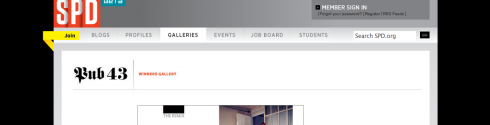
Notice that even the Society of Publications Design (SPD) uses the Old English as a header on its website!
Follow Mario on Twitter

Seminar for Newspapers, Magazines in Paris: last day for Early Bird special
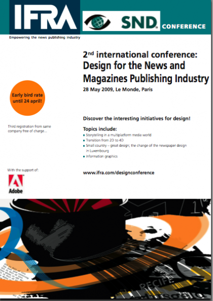
IFRA is sponsoring a one-day seminar May 28 in Paris titled “Design for the News and Magazines Publishing Industry”.
I will be one of the speakers, addressing the topic of Storytelling in a multiplatform media world. Other topics include: Transition from 20 to 40; Small country, great design: the change of the newspaper design in Luxemburg, and informational graphics.
Those interested should go to www.ifra.com/designconference.
Early bird rate until today April 24.
TheMarioBlog posting #247