When readers of Handelsblatt opened the print edition of this business newspaper with a tradition of journalistic greatness, they saw the familiar Handelsblatt logo and the orange color that has identified it for decades. However, almost everything else changed. As editor-in-chief Sven Afhüppe described it:
The optics help the readers identify sections better and to get through the newspaper faster.
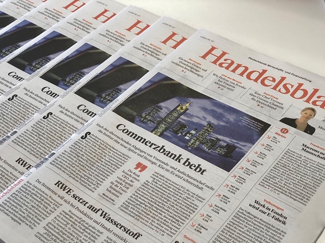
For the record: I am honored to have Garcia Media involved for the fourth time with a Handelsblatt project. Previous engagements had me work with the Handelsblatt team to reduce its size from broadsheet to tabloid, or to add more color, and as of November 2019 I began to work with Handelsblatt on a major transformation that includes the rethinking of the print design which launched today, as well as the upcoming projects for digital and mobile.
Why this project matters: From the start of our collaboration with Handelsblatt in October 2019, the idea was to refresh the important and still viable print edition, while also taking a total look at how the digital edition and, specifically, mobile storytelling, would be advanced. The digital/mobile segments of the project are continuing for launch in 2021. While it is my project #728, it is the first for which I was not present for its launch, and in which we did the last four months of preparations and final design changes long distance. I worked closely with two very talented designers, acting design director, Michel Becker, as well as with digital designer Henrik Balzer during the entire project.
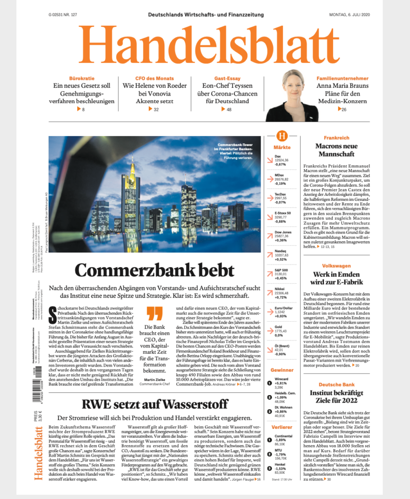
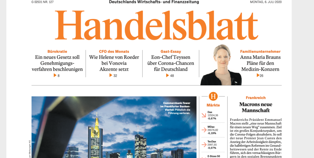
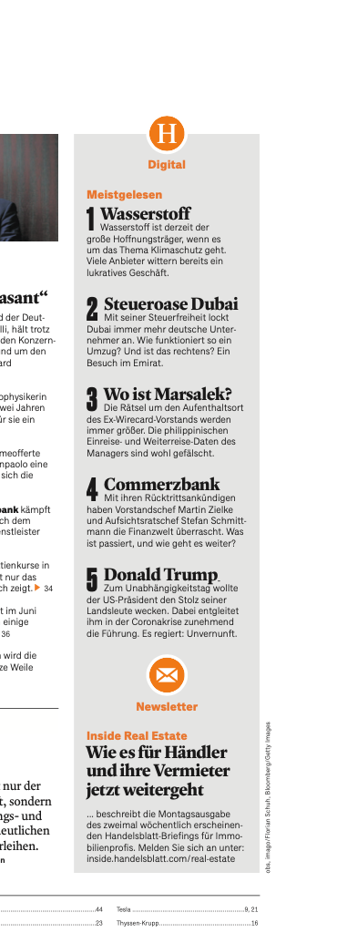
The front page: Much work, thought and dozens of prototypes went into the creation of this front page. Our aim was to give it a newsy appearance, while also utilizing the power of this page to showcase digital content, which you can see in the narrow column where you can also see how the circle with the H becomes an icon that will accompany various features, but especially digital content.
The brand and brand icon: As newspapers and magazines move across platforms, it is important to create icons of the brand that are optically effective for small mobile devices. Notice our use of the H in the circle, which world well at various sizes.
The content summary page: This page is inspired by all things digital, offering a very thorough guide to what is inside, and placing major emphasis on the digital offerings of the day, again, highlighted with the H in the circle.
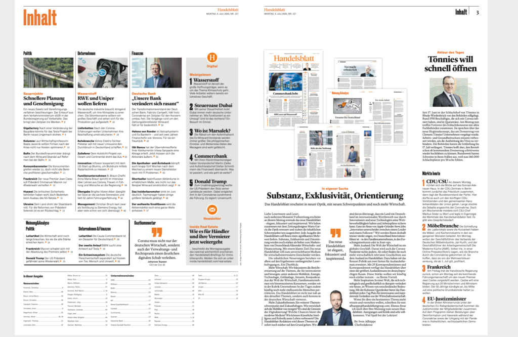
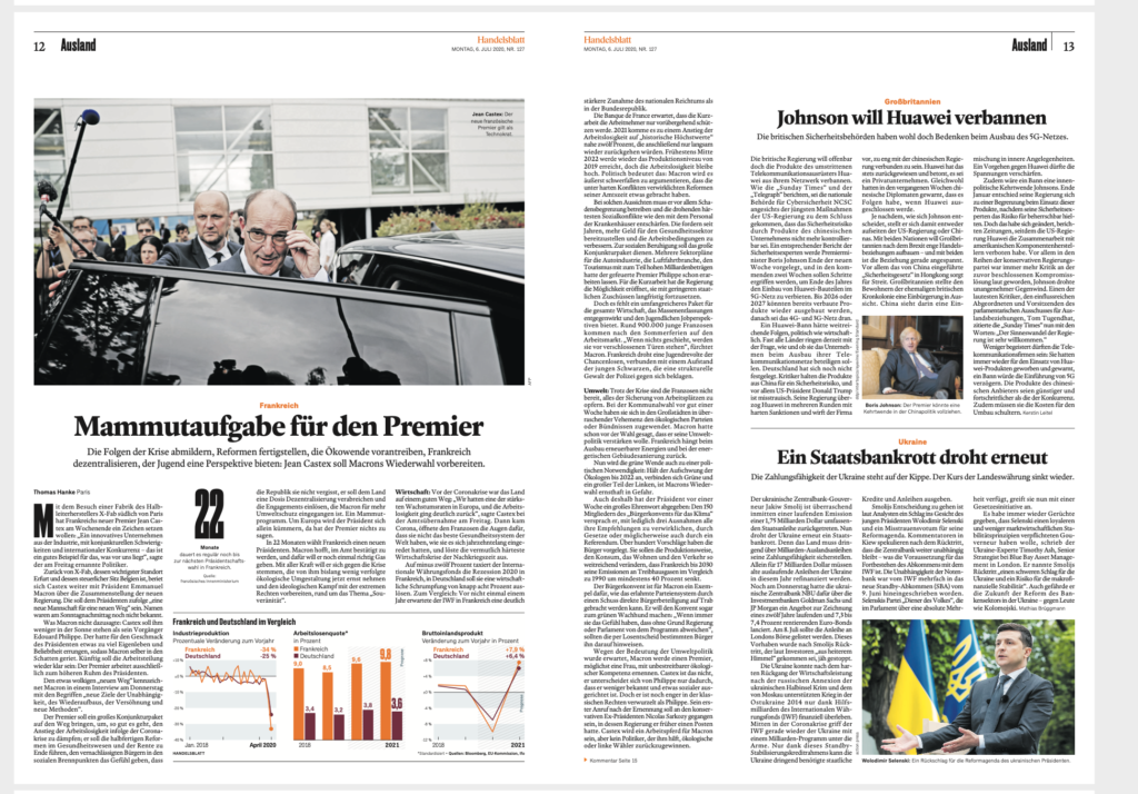
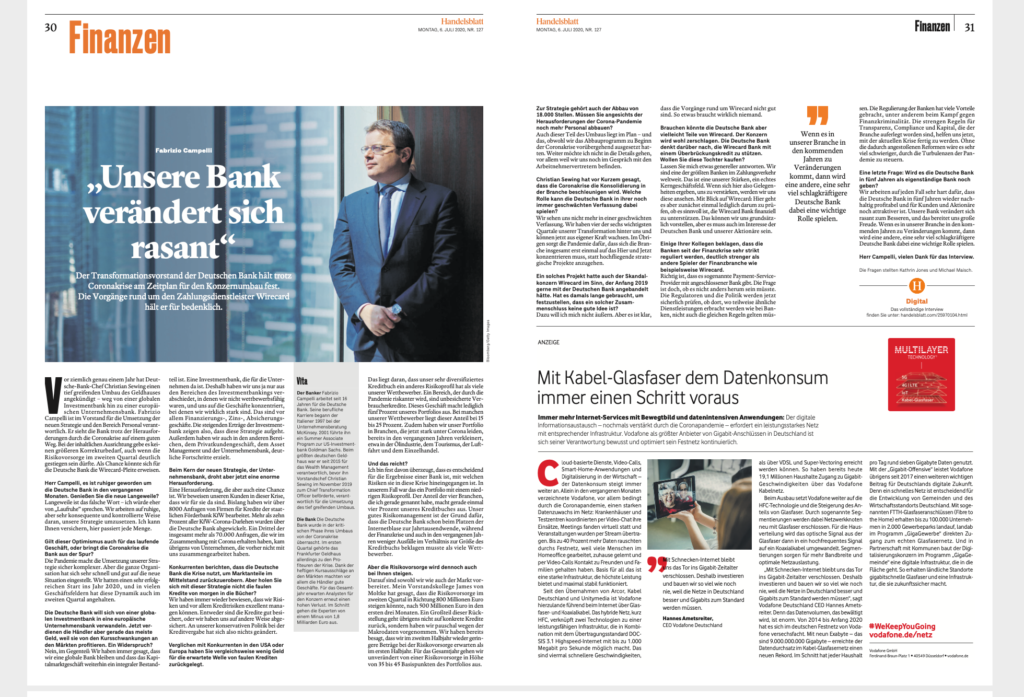
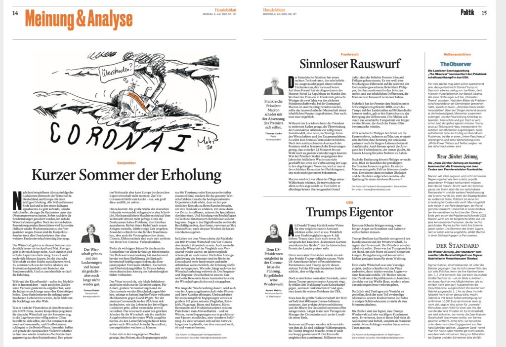
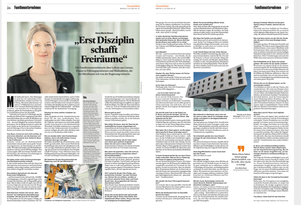
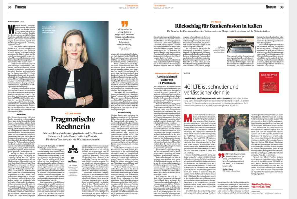
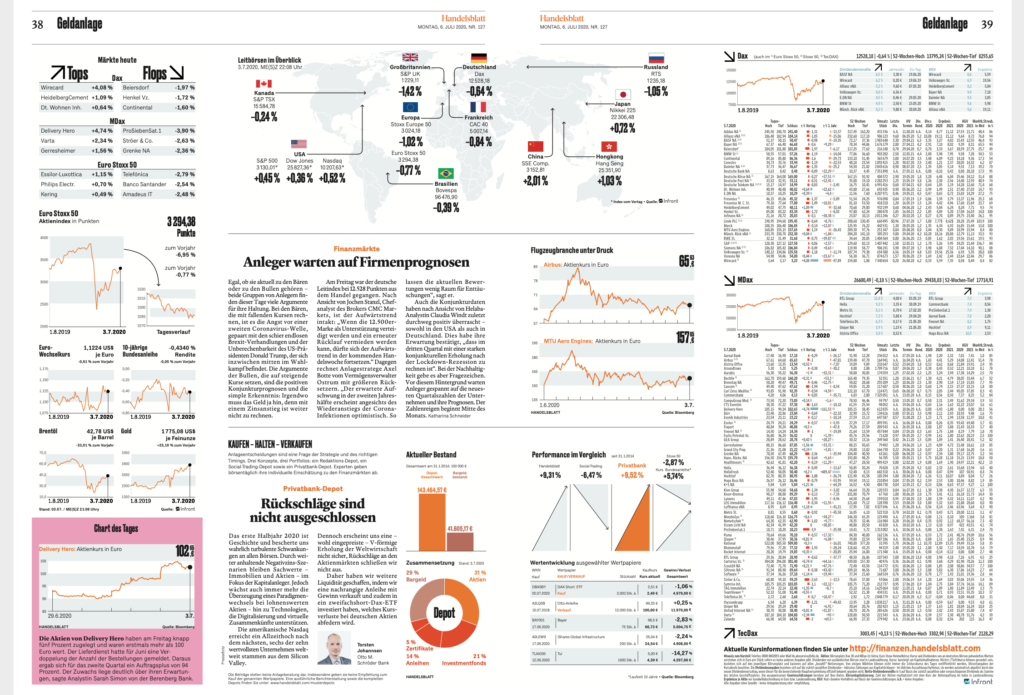
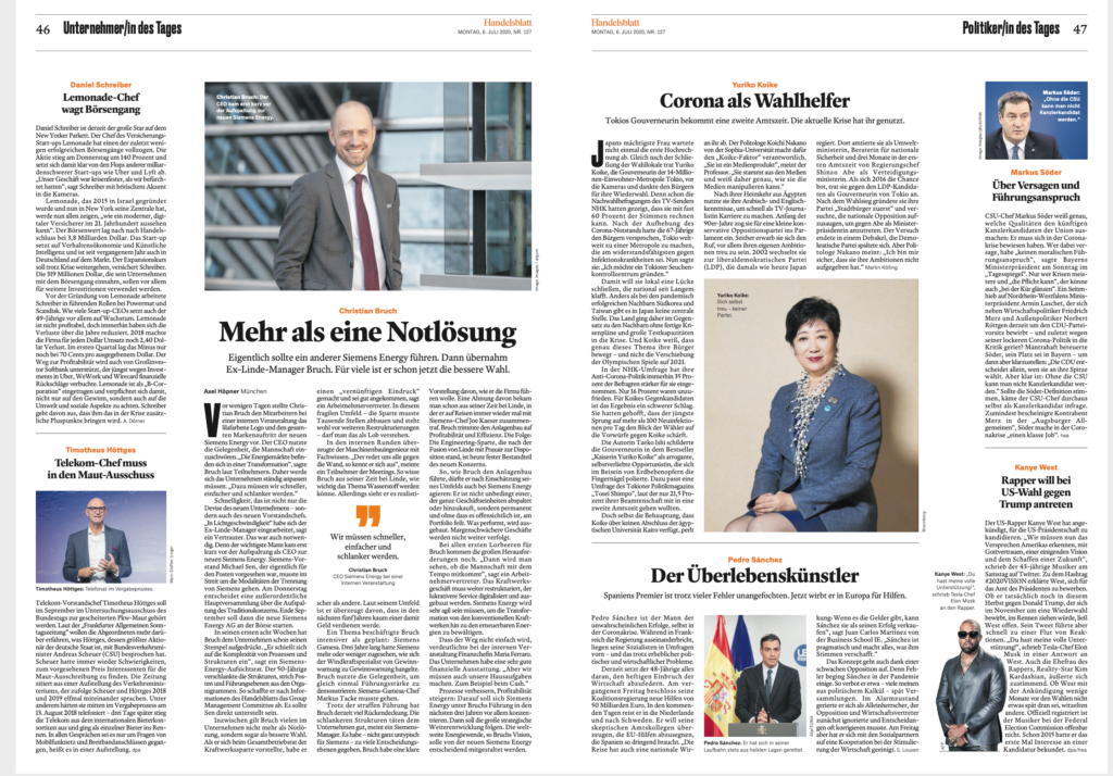
Sectioning becomes more visible: It is no secret that readers today bring a digital mentality to print, and navigating through the sections becomes important. To that effect, we have created a more prominent signaling of sections, emphasized by the use of the color orange.

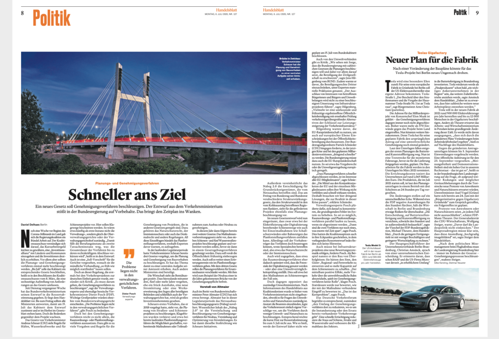
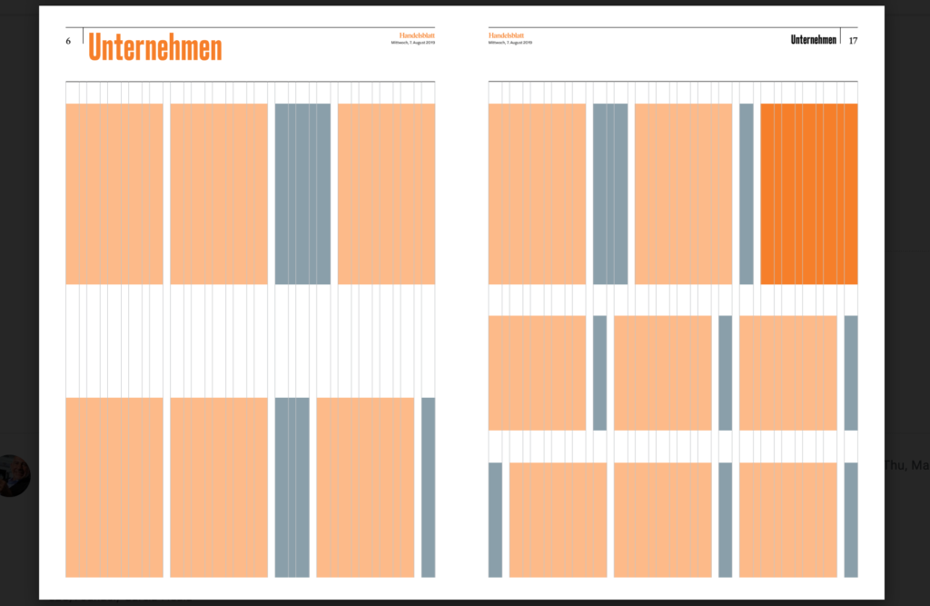
More focused use of white space: Part of what lends better optics and elegance to the new look of Handelsblatt is how we have incorporated white space as punctuation, separating elements, providing relief for the eye, allowing for news modules to stand on their own. While NOT giving Handelsblatt a magazine look, we have managed to bring functional use of white space to what are very newsy pages.
Large photos, more news: A mark of a modern design for a print newspaper today is that we must emphasize what print can do better than digital: the display of large photos. We have incorporated large photos on almost every page. Also, there are no brief items as such. We have created a set of story structures that emphasize text. People come to a printed newspaper to read. Briefs are the territory of mobile/digital.
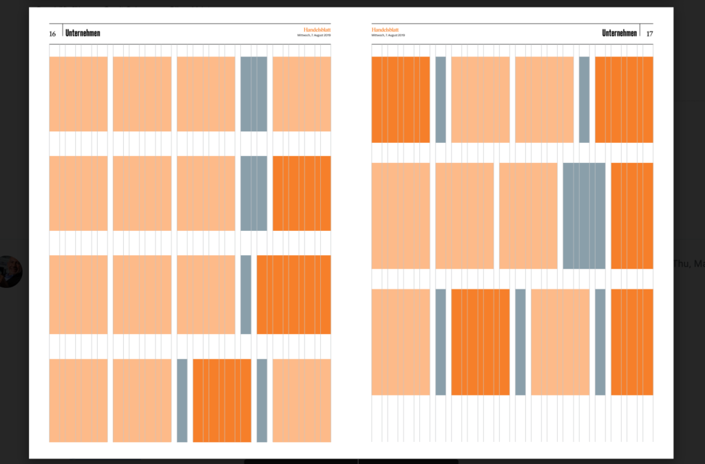
The grid system: Created by acting design director, Michel Becker, this phenomenal grid is what makes the design work so well, allowing for texture and context through the use of different column widths, as well as facilitating the use of white space as indicated above.
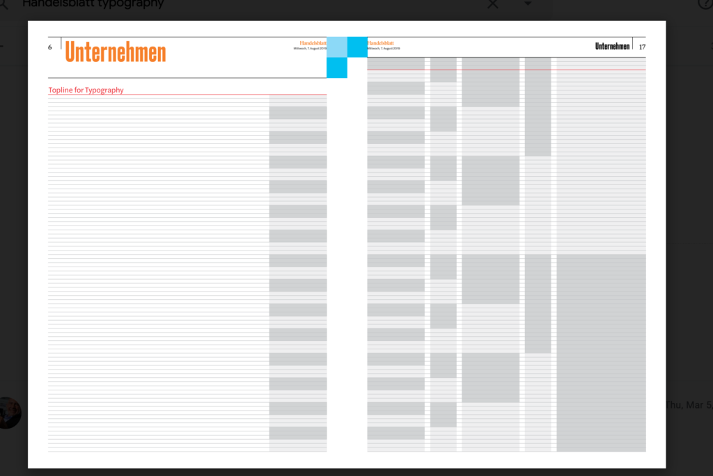
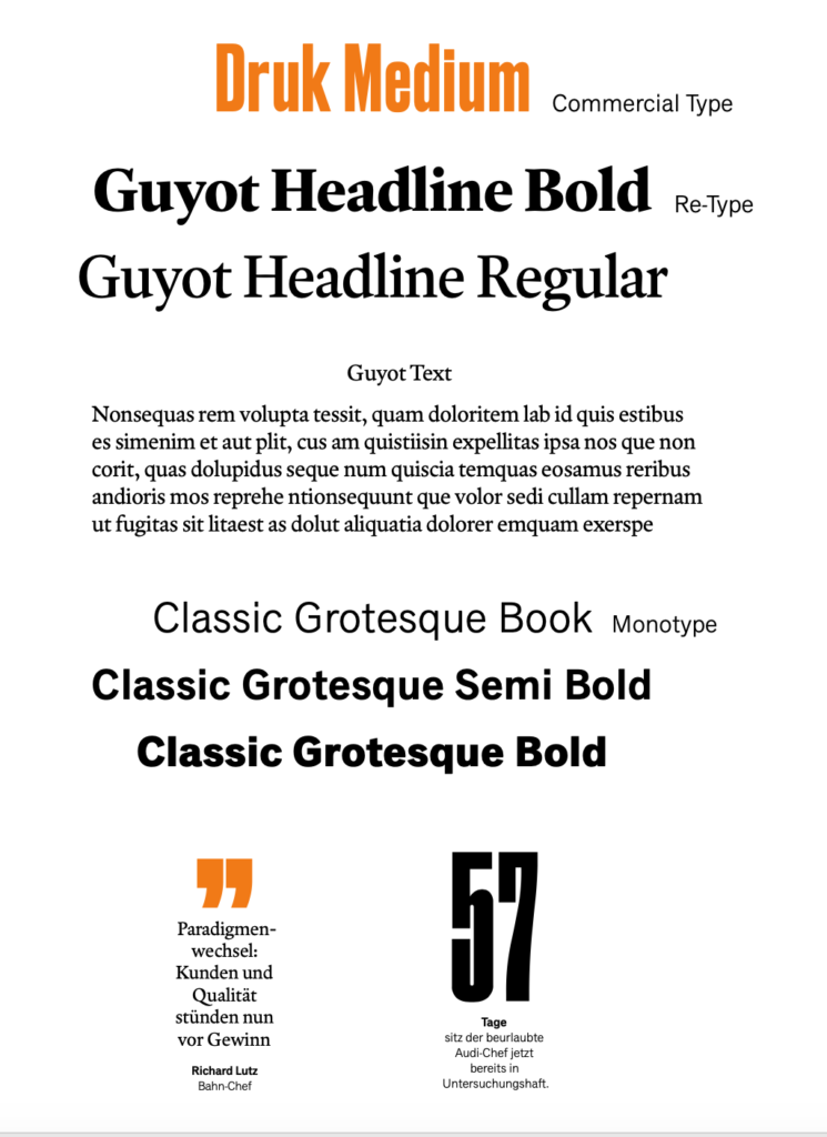
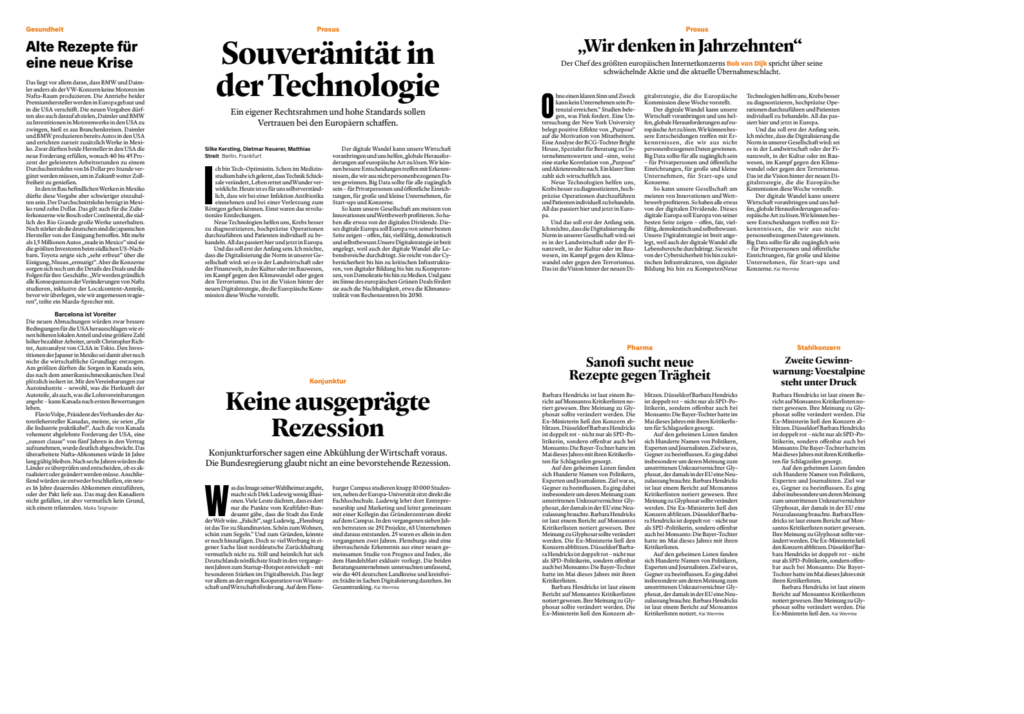
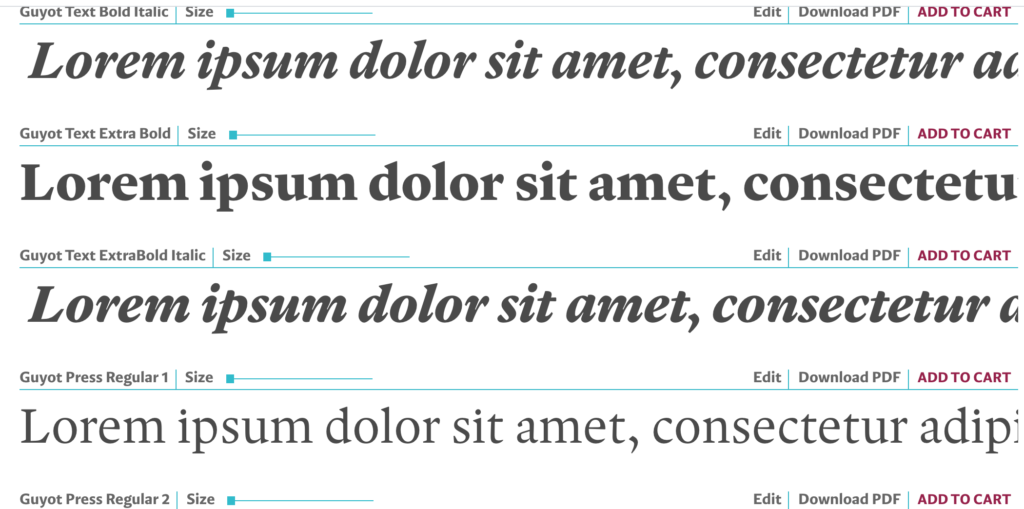
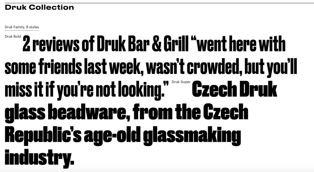
Type palette: The main fonts utilized are Guyot for headlines and text and also Druk as an accessory font. You may see how type is used in these story structures that define how various type of stories are presented. Guyot, is a type family inspired by the work of the punchcutter François Guyot, during the sixteenth century. Ramiro Espinoza got acquainted with the work of Guyot while attending the Expert Class in Type Design at Antwerp’s Plantin Institute for Typography. Ramiro decided to give Guyot a modern interpretation aimed at the editorial market. Druk features the narrowest, widest, and heaviest typefaces in the Commercial Type library to date. “Druk was intentionally designed without a normal width, nor lighter than medium weights. Berton Hasebe, the designer, wanted to avoid shifting the focus of the typeface away from its most emphatic styles toaccommodate more general-purpose usage.”
We built upon a solid foundation
It is worth mentioning that when we discuss the design history of Handelsblatt, a very important contribution came from its design director Regina Baierl (currently on leave), and the team from Bodara, a design agency in Zurich. Led by Tobias Peier, the team had a heavy hand in the original type palette and grid system creations.
We are very appreciative of this work carried out in 2018 which contributed to make the
Let The Story guide your mobile first strategy!
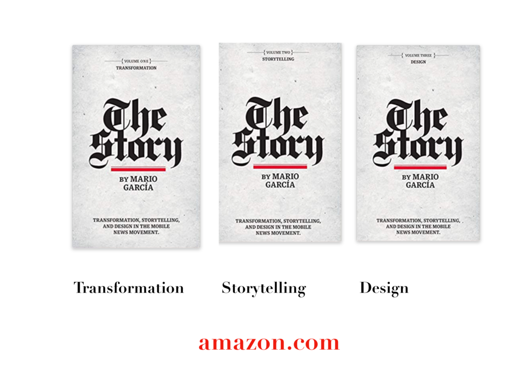
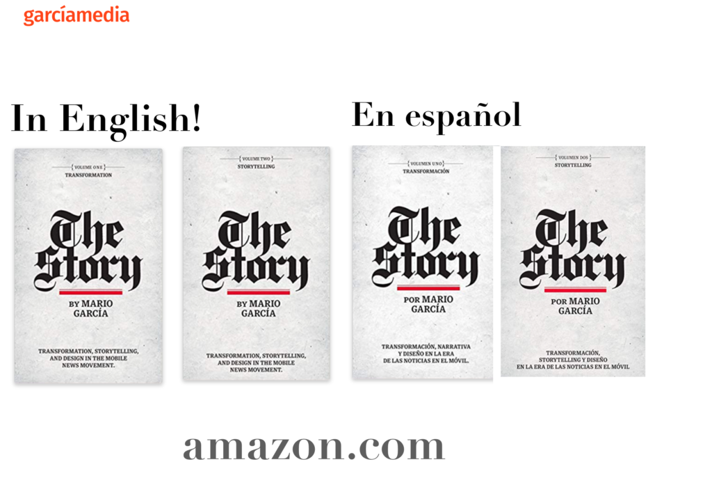
The full trilogy of The Story now available–3 books to guide you through a mobile first strategy. Whether you’re a reporter, editor, designer, publisher, corporate communicator, The Story is for you! https://amazon
TheMarioBlog post # 3250


