This is the weekend edition of TheMarioBlog and will be updated as needed. The next blog edition if Monday, April 22.
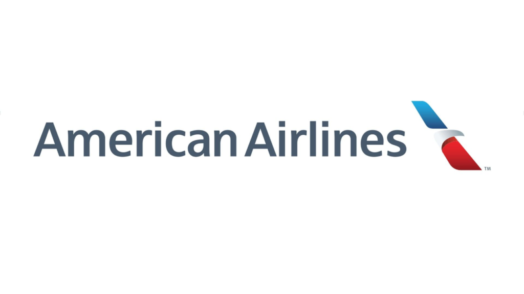
No matter where you move, you see Helvetica everywhere. American Airlines and Lufthansa, among others, have chosen Helvetica for their brands:

It is the “diva” of typographic fonts. I mean, how many fonts have had a movie made to celebrate them? Helvetica has. The film premiered in 2007.
Take a look at the trailer:
However, at age 62, and like many real divas of the world of theater, film, song and dance, Helvetica has gotten a few tucks here and there to “refresh it” and make it look younger—and perhaps more functional.
What’s new?
This piece from WIRED reports that some typographers who are NOT real fans of Helvetica decided it was time to improve on what they considered to be the font’s weaknesses. Charles Nix, the director of Monotype, the world’s largest type company, which currently owns the licensing rights to Helvetica, had this to say:
He doesn’t like that the letters scrunch together at small sizes, that the kerning isn’t even across the board. Designers have gotten used to all sorts of magic tricks to make Helvetica look more legible, like changing the size of punctuation marks to balance the letters. “We jokingly refer to it as Helvetica Stockholm Syndrome,” says Nix.
So, fans of Helvetica and art directors using the Helvetica Now version will see the following:
Helvetica Now restores some of the original characteristics of the font that have been lost along the way—a single-story lowercase “a,” a capital “R” with straight legs. And, says Nix:
It is kind of like visiting the Metropolitan Museum of Art with an easel and canvas and painting a Rembrandt,” he says. “You’re following clearly what the master has done before you, and the big difference in our case is that we’re looking to make the type, the artwork, more suitable to the age in which we live.”
Of related interest: cool Helvetica slide show
https://www.highsnobiety.com/p/helvetica-now-new-font/#slide-8
The morning after the Mueller Report
Mario’s speaking engagements
Here are places where I will be taking the message of mobile storytelling in the weeks ahead:
April 24, United Nations, New York, Mobile Storytelling workshop for Corporate Global Communications team
May 15 INMA, New York City International News Media Association’s Mobile Storytelling Workshop
May 25, Milan, Italy, EidosMedia Annual Customer Meeting, Keynote: Mobile First Strategies for Publishers
June 12, NEC Media City, Bergen, Norway, Storytelling workshop for Editors
June 13, Fortellingens kraft 2019, Bergen, Norway, Long form Mobile Storytelling for Writers
July 11, Florida Media Conference, St. Petersburg, FL, Keynote for editors: The mobile first newspaper strategy.
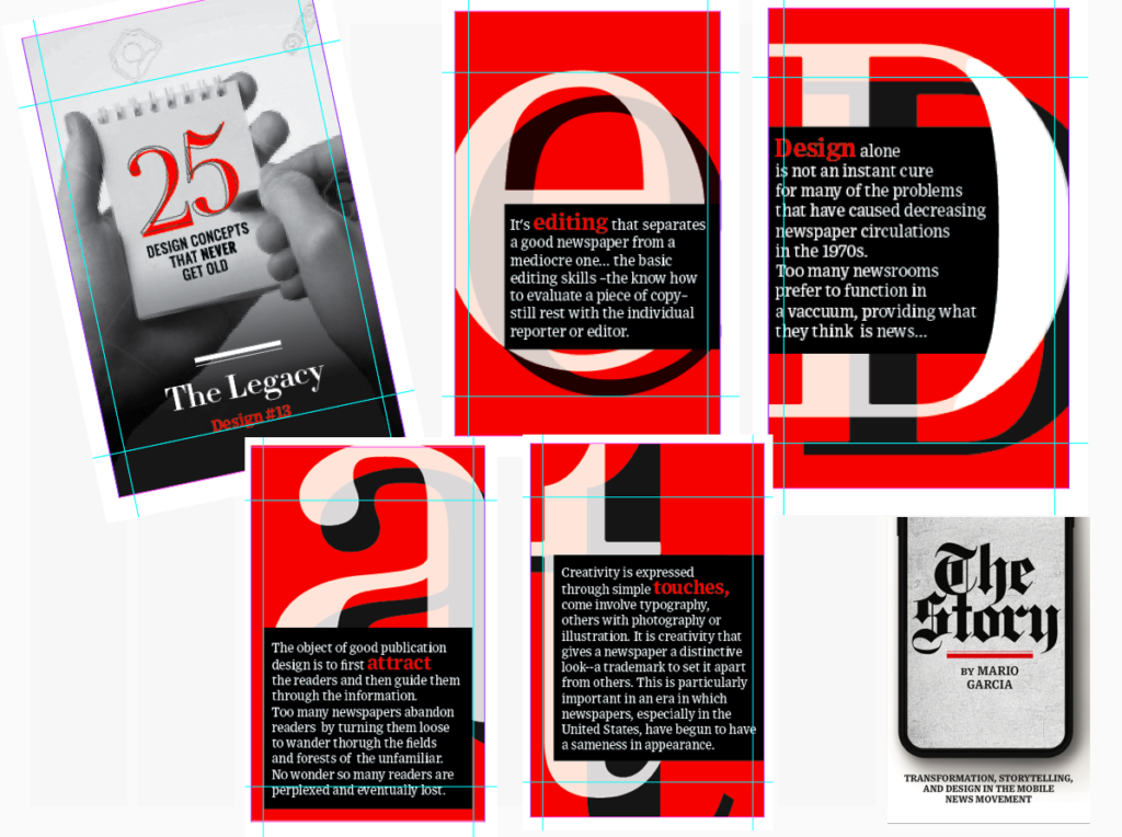
Pre-order The Story
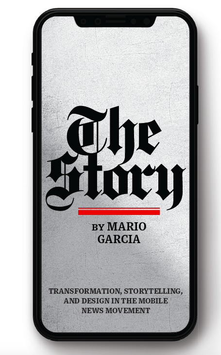
The newspaper remains the most powerful source of storytelling on the planet. But technology threatens its very existence. To survive, the Editor must transform, adapt, and manage the newsroom in a new way. Find out how, pre-orderThe Story by Mario Garcia, chief strategist for the redesign of over 700 newspapers around the world.
Order here:
https://thaneandprose.com/shop-the-bookstore?olsPage=products%2Fthe-story
An interview of interest
http://www.itertranslations.com/blog/2019/3/11/fd60ybflpvlqrgrpdp5ida5rq0c3sp
TheMarioBlog post #3035