I like red, although I admit that it is a color that a news designer needs to consider properly before using.
Red is the color of passion, of things bold and dramatic.
Red is also a color that demands attention.
Put it on a logo, and it will shout at the press kiosk, or at your doorstep. Take a look at these:
The red logos
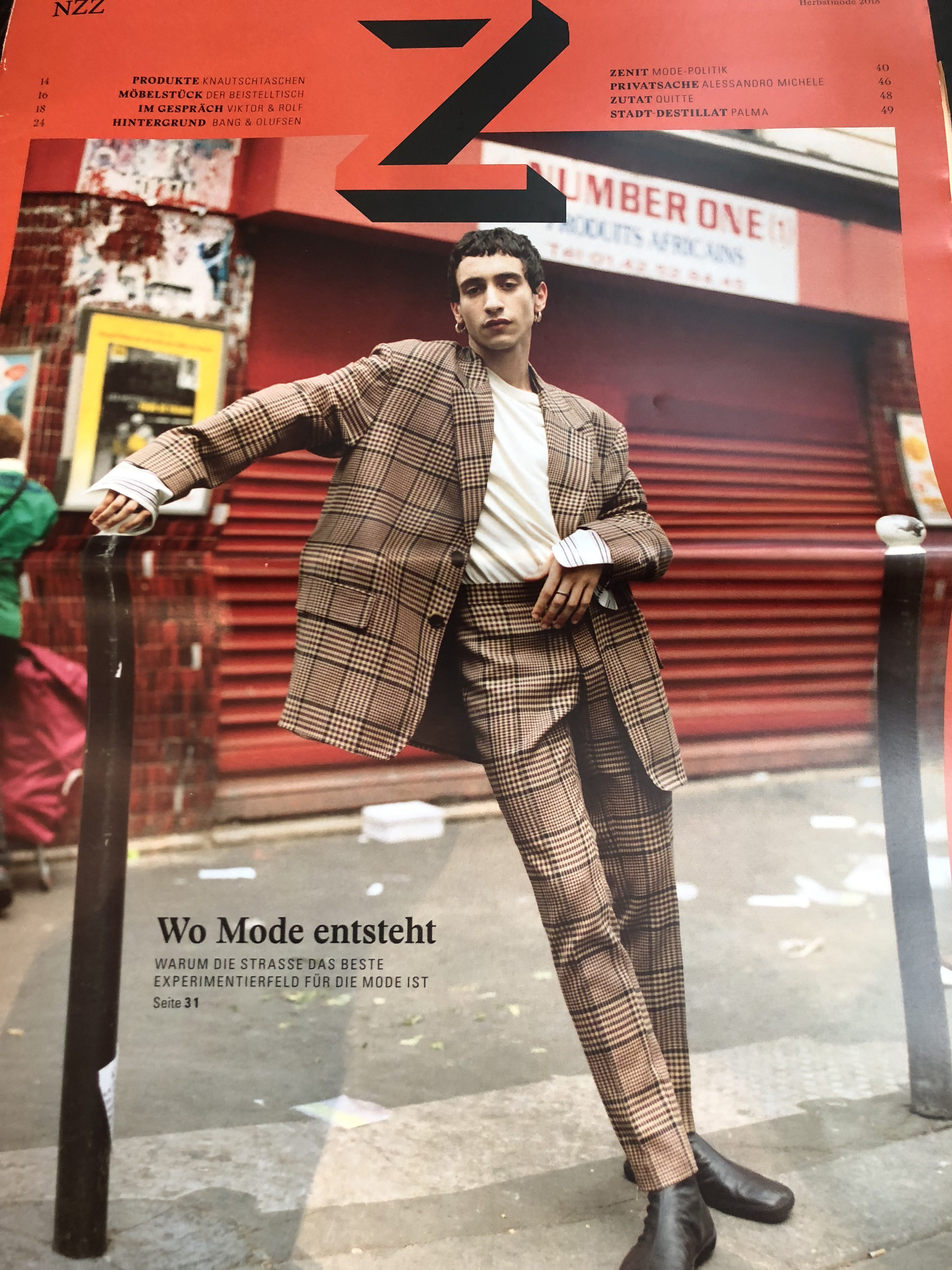
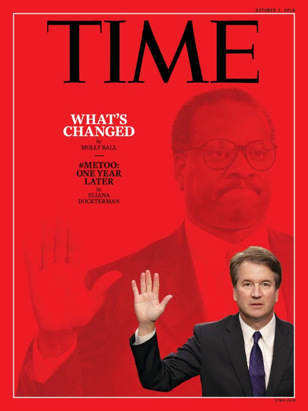
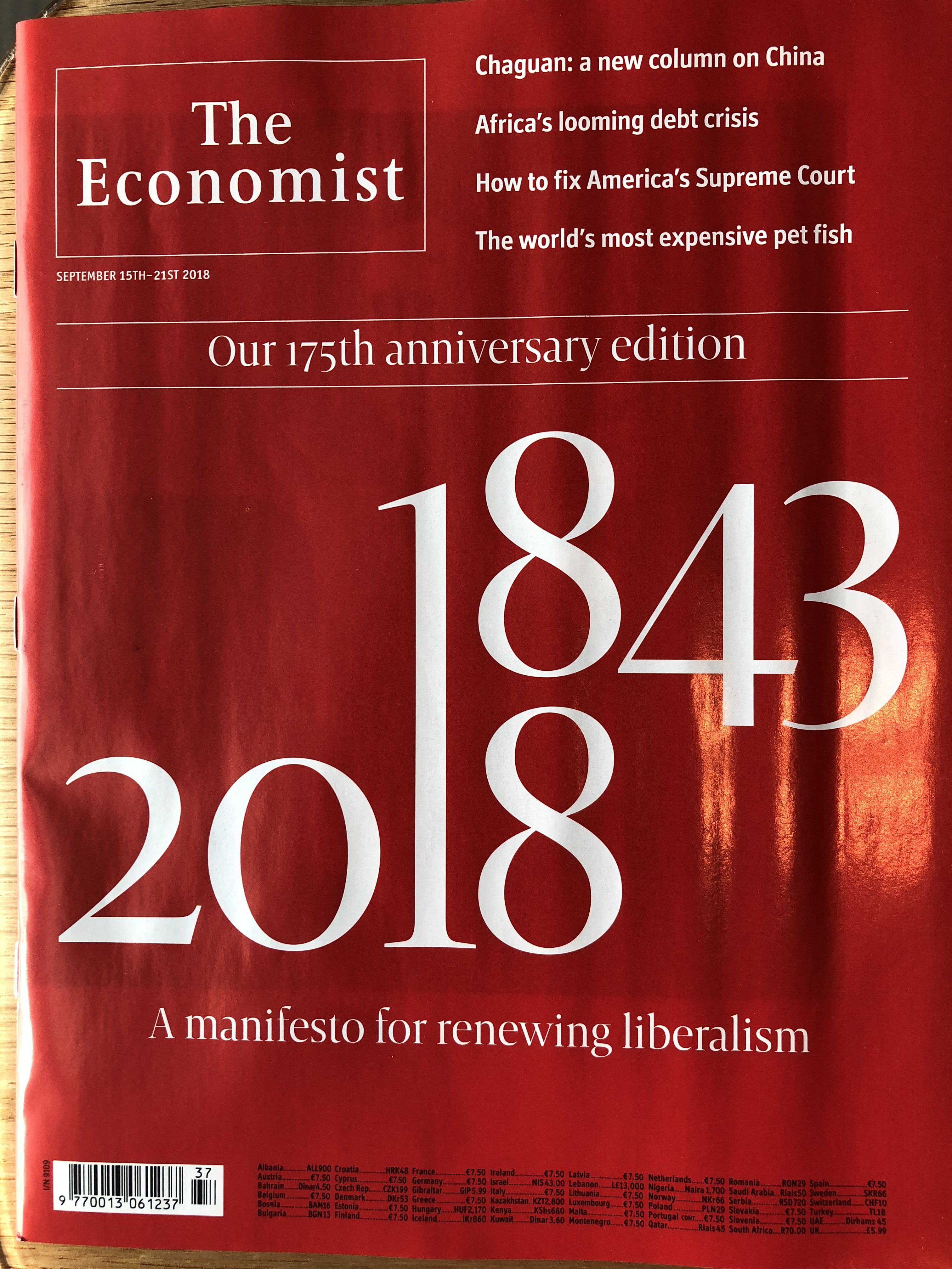
Red as background
Use it as background and the content better match the intentions of the news designer going for red.
In fashion terms, while most of us would not hesitate to pick any blue ol’ thing from our closet to wear, we do a double take before we pick a red outfit.
Alas, but who can forget Julia Roberts in that red dress in the classic movie, Pretty Woman, which is now a musical on Broadway, and the scene with the star wearing the red dress is, I understand, a show stopper.
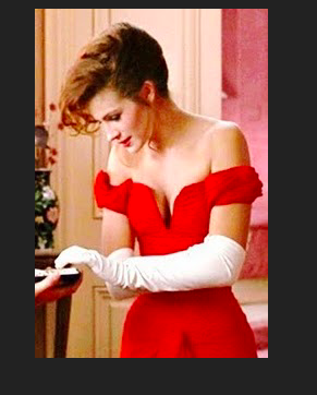
Photo from Pinterest.com
Here are my latest encounters with red:
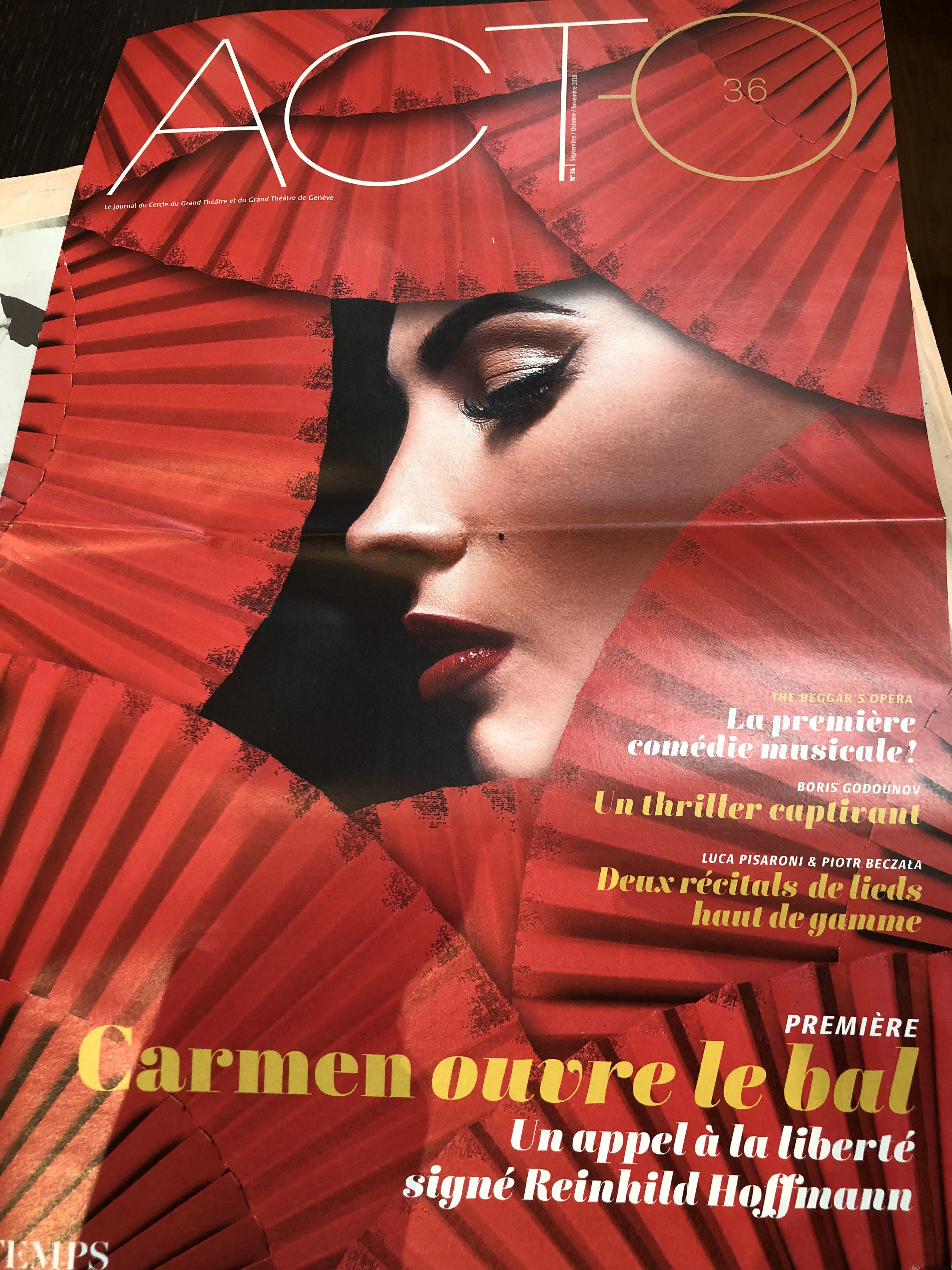
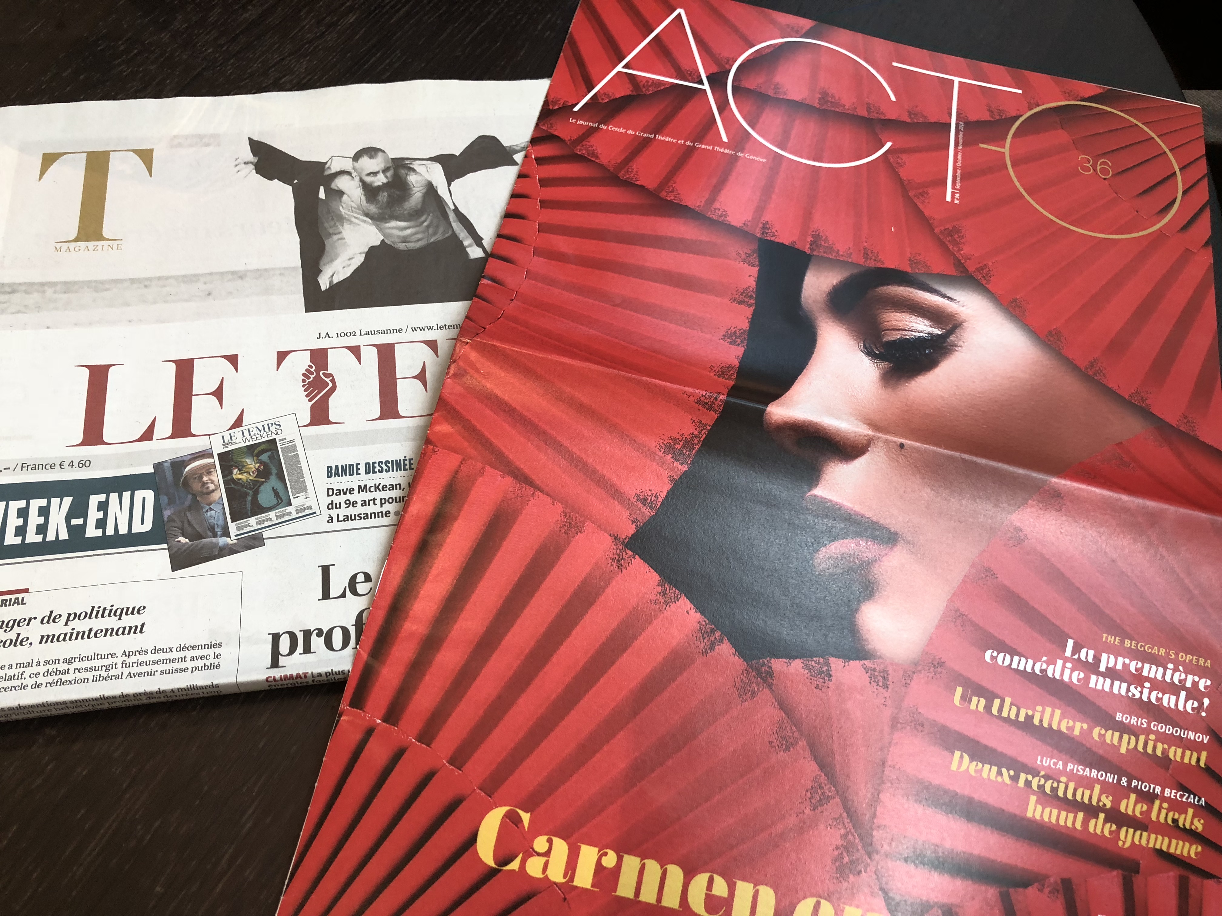

Red as “staircase” color
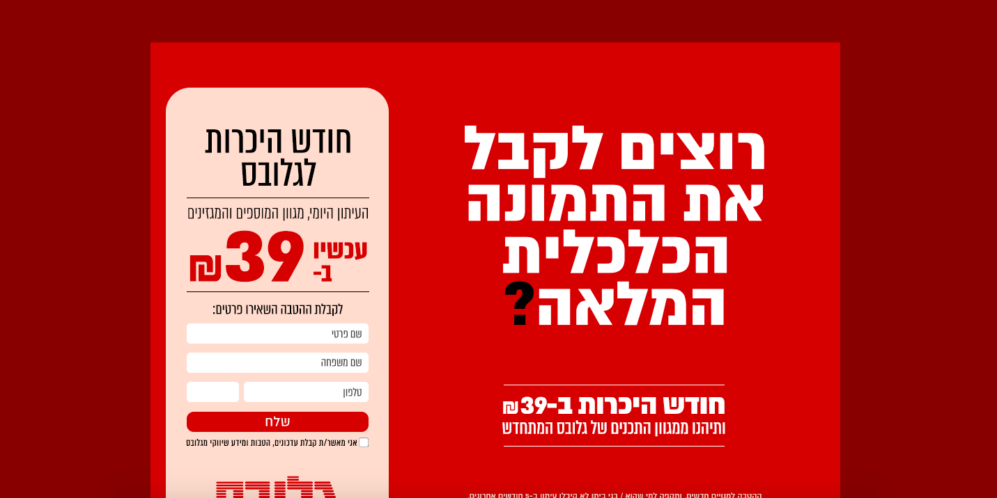
Not only do we see color here, but, for me, this is a discovery of Globes, a financial newspaper from Israel, printing on peach color a la Financial Times.


TheMarioBlog post #2811