This is the weekend edition of TheMarioBlog and will be updated as needed. The next blog post is Tuesday, January 17 (it is the Martin Luther King holiday in the US Monday), reporting from Dubai, United Arab Emirates
In with the new seems to be an appropriate way for us at Garcia Media to welcome 2017.
We have hit the reset button and here is our new website which we hope you will enjoy. Working with our art director, Andy Rossback, we have come up with a site that we feel represents the way to communicate information today. Practicing what we preach in our own workshops with clients, our readers want information to be presented with speed and clarity. Yet, storytelling is key. How can we, then, tell our story as simply as possible?
Redesigns are never easy. Redesigns imply change. Redesigns are all about disruptions, both big and small. Sometimes one small disruption can become the centerpiece of a redesign. I remember many of those centerpieces, including one from my first redesign of The St. Cloud (Minnesota) Daily Times in 1979. An eagle.
When eagles fly high
To be specific, it was an American eagle with wings expanding about 8 columns across the top of the page. In my notes, I wrote: “…the front page nameplate displayed a spreading and graphically overwhelming eagle, which became the greatest source of irritation and delays as we proceeded with our redesign efforts.”
And, in many ways, that eagle is our story. It’s the story of change in newsrooms in America and worldwide. For nearly 40 years, we’ve been driving it. For us, change is normal.
Every redesign is preceded by a decision to change. Around 1978, the young staff of the Daily Times, led by news editor John Bodette (recently retired executive editor), had formed a committee which spent months meeting, analyzing the newspaper. But they soon realized that their in-house efforts to redesign were hampered by a lack of direction. This prompted them to seek an outside opinion and I became involved with the Times as a design consultant.
First on the menu: what to do about that eagle?
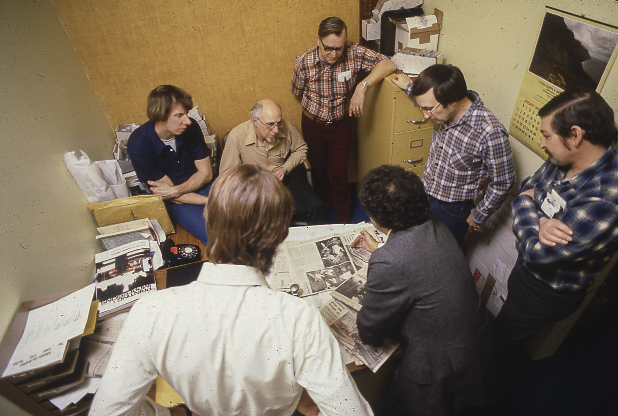
So the meetings began and the photos show how much (or how little?) newsrooms have changed since then. In this one, Bodette (white shirt) and I (center with back to camera) meet with members of the composing room to discuss the new design for the newspaper. The printers (clockwise) Don Schmidt, Don Lauderman, Bob Ahles and Dave Schindler.
Working with the very energetic and young team, I started sketching a modern version of this eagle on napkins, business cards, and anything that I could get a pencil image on. And I began making my case to the editors.
It became a crusade for me. How do you begin a project — your first! — by informing the editors that you want to change the nameplate, and, furthermore, remove a patriotic symbol as strong as an American eagle? Which, by the way, I found out later, was a major nameplate staple of newspapers across the country.
The entire project became centered on the eagle. Some in the newsroom had suggested that traditional readers would be shocked. Extra operators we even added to take the expected calls from angry customers. Eventually, the old eagle disappeared.
On March 17, 1980, the new eagle flew into the front page of The St. Cloud Daily Times. There were no canceled subscriptions, no angry calls coming into the hot lines. No drama, just a new eagle. The editors had sweated it during the process, but the readers welcomed change.
Hundreds of experiences, to this day, have taught me that audiences are always more ready for change than the journalists creating it. The lessons learned here have served me well: the best consultants believe in their ideas, present them clearly and enthusiastically and promote them with passion and conviction. I continue to do this.
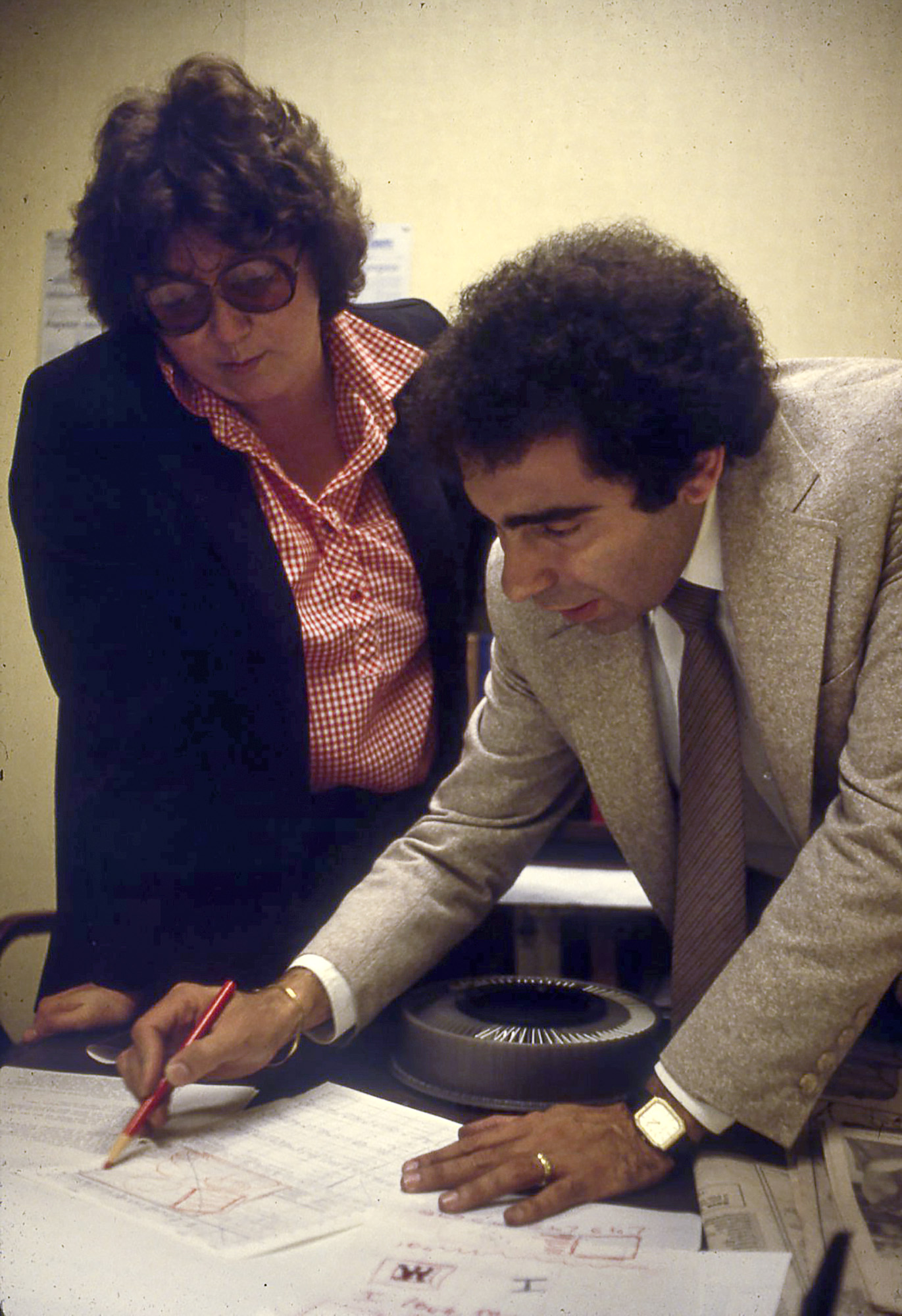
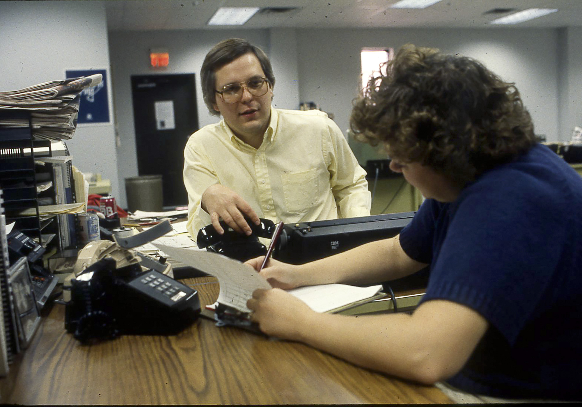
For some context of the changes taking place in newsrooms, this project was carried out before the advent of desktop publishing. Designs were sketched on paper and the composing room staff used them as a guide to “paste up” the pages. In this image, Times Copy Editor Peggy Moran and I discuss one of those pages.
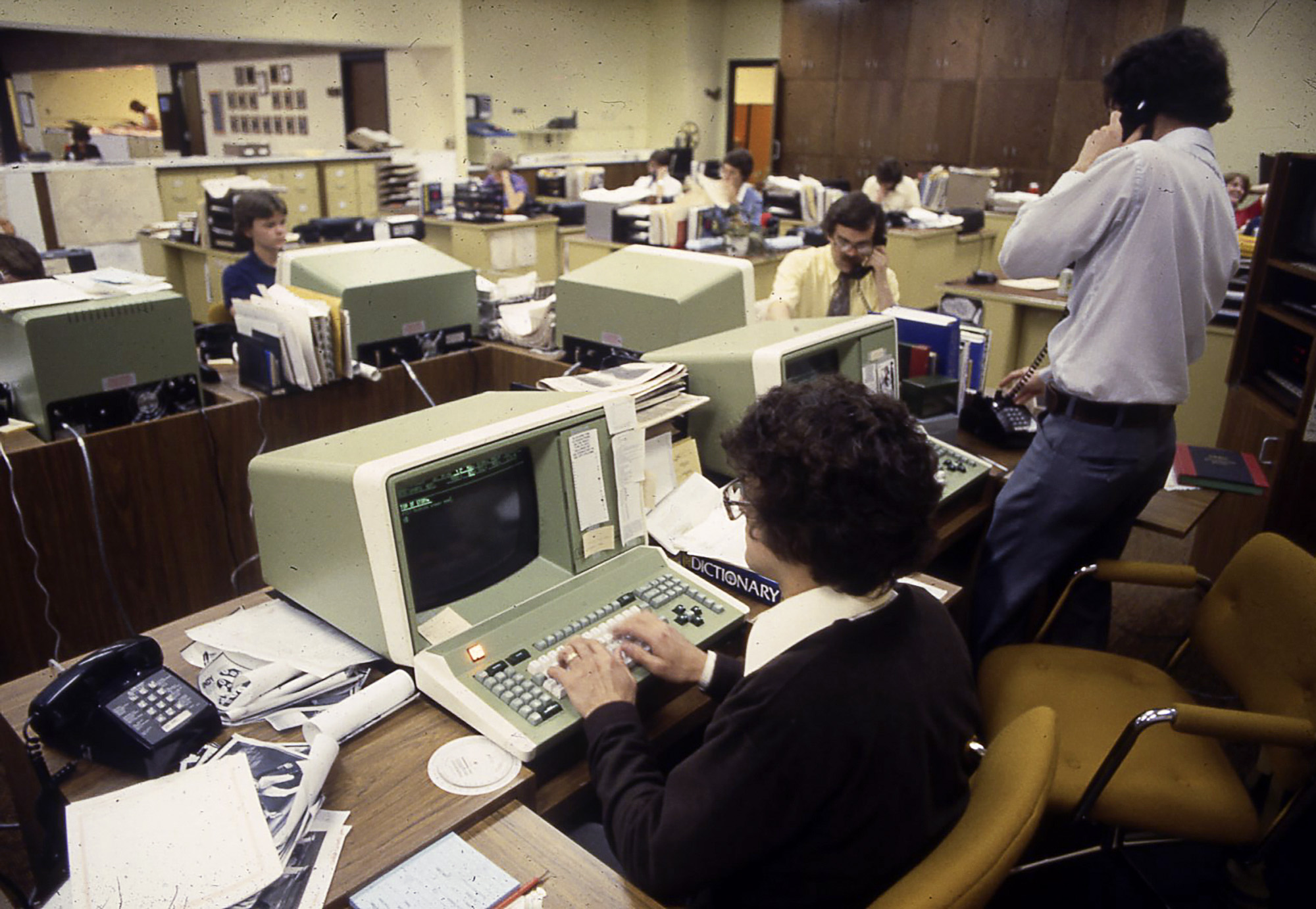
Change happens quicker today. But still not fast enough. The newspaper industry has always been slow to embrace change. If you look at the computers in the newsroom of the St. Cloud Daily Times of the late 70s, they were revolutionary, but late arriving there. Businesses had already incorporated computers into their midst long before newsrooms did (around 1974).
One can say that publishers were dragged screaming and kicking into the world of those “video display terminals.” But typewriters continued to be found in the corner of the newsroom for the occasional reporter who simply did not adapt to the computers. By the early 1980s, the Daily Times copy desk had adapted to use computers in their editing work.
While print newspapers may have opted for a redesign every 10 years or longer, the design of apps and websites occurs frequently. Changes are made with the audience in mind. That audience changes habits quickly, with technology speeding up the process.
Rapid change is no longer a choice for publishers, editors and designers.
I have witnessed the fear and the aversion to change not just to the introduction of computers in the newsroom, but also to the introduction of color in the pages of newspapers, then the acceptance of the Internet.
Design, in the era of the journalism of interruptions and mobile platforms, is that which lures us to content, allowing us to pace ourselves by leaning forward to get the first blast of a story, but also taking us to the lean back that so many of us go for when the time allows and we are ready for the more explanatory, narrative version of the story.
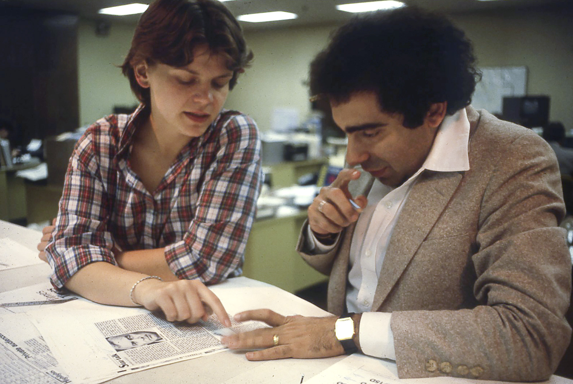
We are no longer just manipulating and presenting content but also helping to imagine new types of ways to deliver it and new ways to make money. All of this for the same old goal: reach the audience and compel them to give a damn. No different than our goal in St. Cloud. That’s Copy Desk Chief Rene Kaluza and I working on strategy for one of the Times sections.
Why change our website?
That brings us to our decision to change the website you are experiencing today.
The demands have never been higher for clarity, directness, simplicity and, I’d add, a minimalist approach to what we do. We wanted to keep this in mind but also stay true to our Latin roots and also incorporating the history of Garcia Media. Andy and I hope that we have accomplished just that with this new concept.
I guess I have been called a disruptor, an agent of change, which means it was not easy to be at the receiving end of proposals for change this time. When our Andy started showing me the early drafts of what would be our website, I admit I jumped back and heard myself saying something like: “Andy, I am not a T-shirt guy designing in my garage. In fact, I often wear bow ties.” While Andy smiled, I recoiled in a little bit of horror, sounding like the many editors and publishers to whom I have made design proposals over four decades. In the end, however, I listened carefully, I adapted my thinking, and, while I still wear my bow tie with pride, I am also quite proud of how the new Garcia Media rebranding and website have turned out.
As a veteran, I always remind myself that these are the best times to be a storyteller. We have more ways to tell our stories — as well as a variety of platforms. But the challenges have also never been greater or seemed more insurmountable.
I see a bright future for journalism — regardless of how you define that term. To me, it is always been about the story. Thanks for reading ours.
—
Sign up to stay updated about Garcia Media.
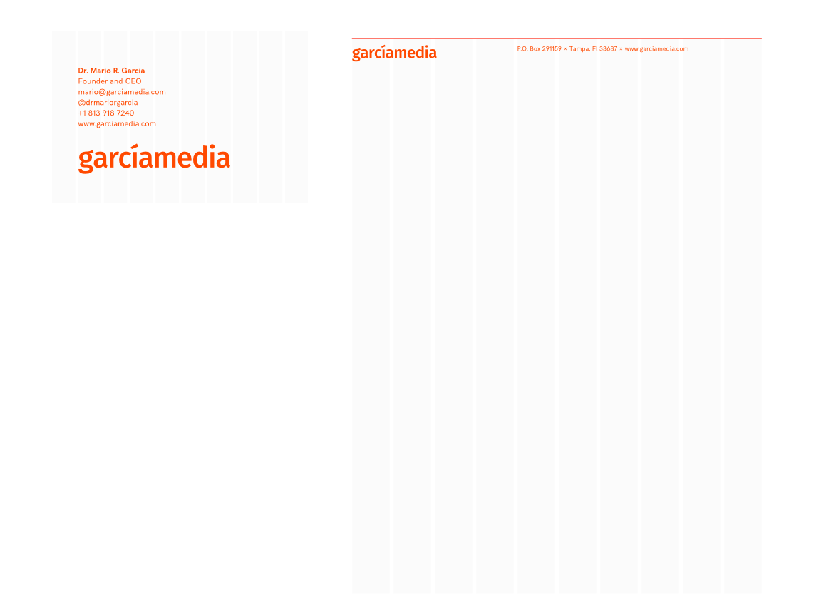
Our styleguide
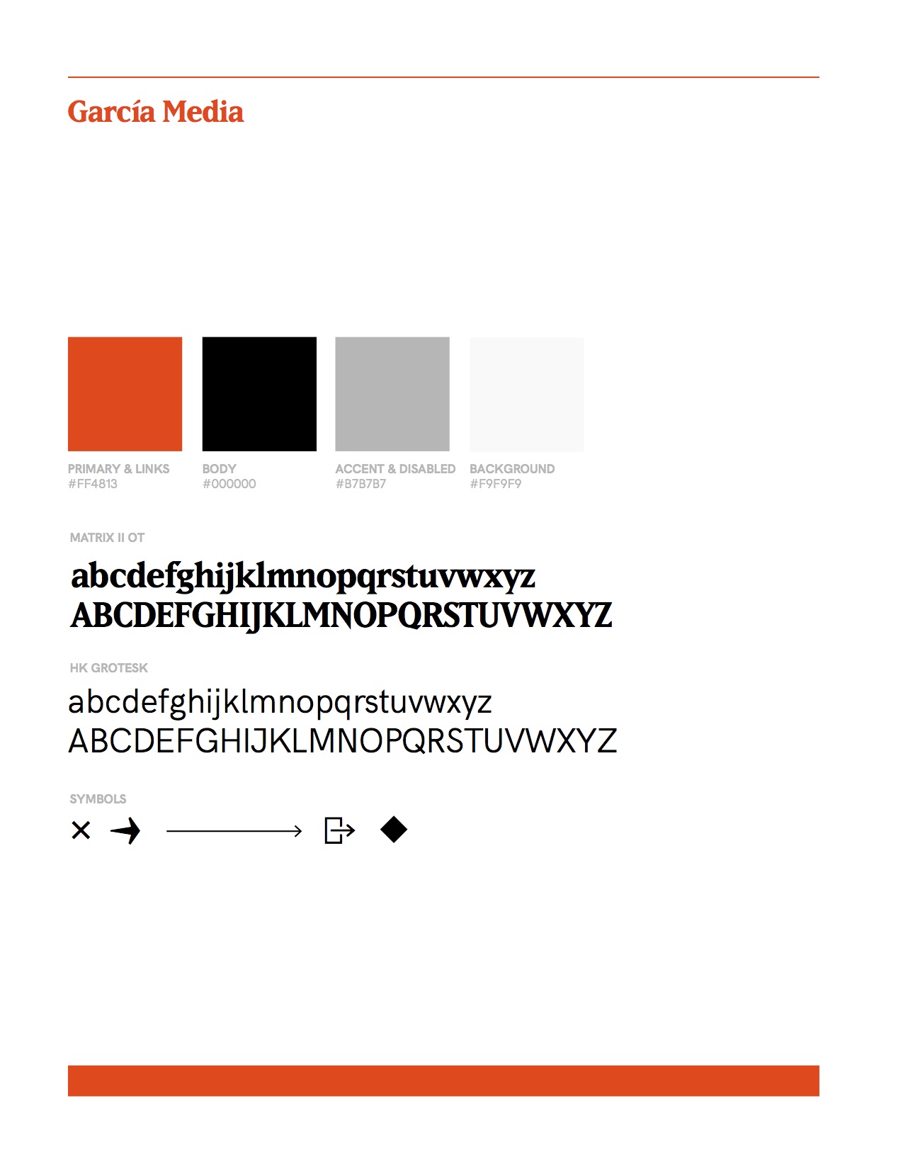
The rebranding elements for Garcia Media
Let us know what you think of our new Garcia Media website & rebranding
Send me your comments to my email: mario@garciamedia.com
Thanks.
Of related interest: St. Cloud Daily Times’ 1980 redesign
For those who wish to read the research around the St. Cloud eagle:
Mario Garcia, J.W. Click and Guido H. Stempel III, “Reader Response to Redesign of St. Cloud Daily Times,” Newspaper Research Journal 2, no. 2 (winter 1981): 36-41.
Subscribers’ Reaction to Redesign of the St. Cloud Daily Times [and] Understanding the Research Process. ANPA News Research Report No. 32.