This is Part One of two

It’s a new book about newspaper design in the market as of June 28.
This time one of the authors is the revered Spanish designer, Javier Errea, in collaboration with Gestalten, the German publisher.
As I would like to do justice to the extensive catalog of examples and profiles here, I have decided to break this “review” of Newspaper Design into two parts. Today, I am presenting the case studies of the 10 newspapers profiled in depth throughout the book. Thursday, I will deal with the profiles of five designers.
“Today, the digital shift continues to shake up the news industry, forcing both journalists and designers to question their methodologies to date. But, despite this shift, newspapers are still in play, with even the most local technocrats acknowledging that print is here to stay.”
Case studies
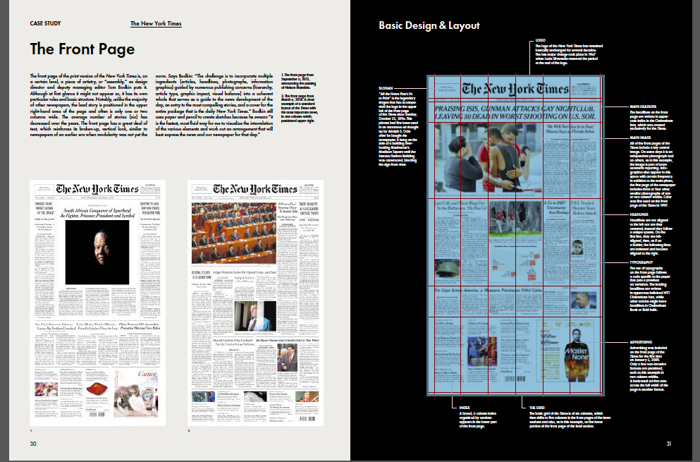
1. The New York Times (USA)
Newspaper Design: “Today, the New York Times is a veritable factory of innovation where new ways of telling stories are continually developed and tested.”
From Newspaper Design, Copyright Gestalten 2018
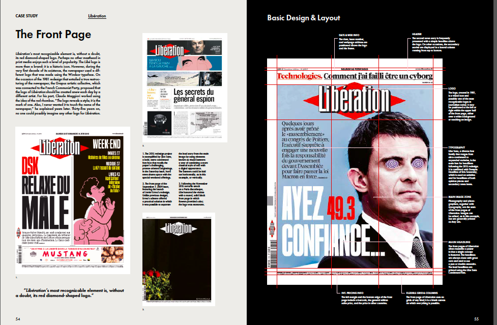
2. Liberation (France)
Newspaper Design: “….of all the world’s newspapers, Liberation is possibly the one that gives the greatest amount of coverage to culture and lifestyle trends: at least 20% of all stories on the front page are cultural, and its criticism of music, film, and books is among the most respected in Europe.”
From Newspaper Design, Copyright Gestalten 2018
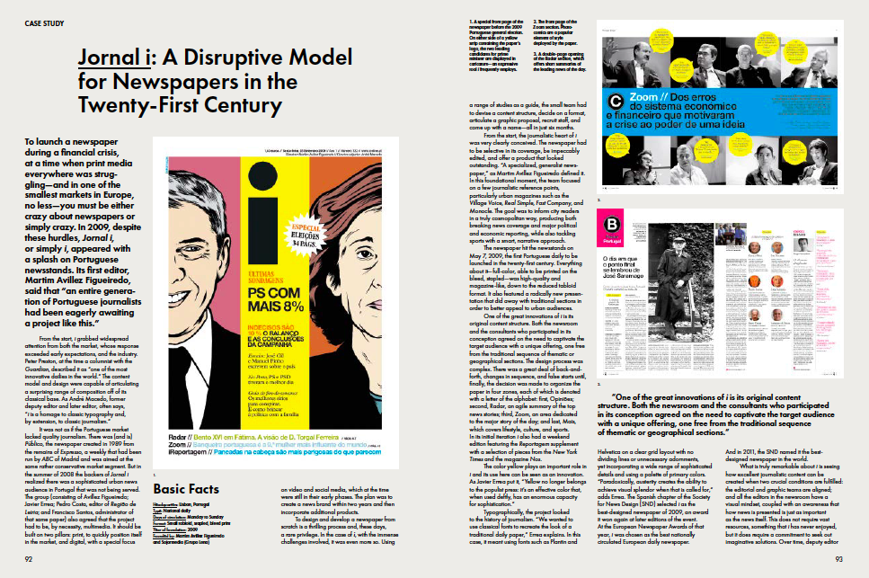
3. Jornal I (Portugal)
Newspaper Design: “What is truly remarkable about i is seeing how excellent journalistic content can be created when two crucial conditions are fulfilled: the editorial and graphic teams are aligned; and all the editors in the newsroom have a visual mindset, coupled with an awareness that how news is presented is just as important as the news itself.”
From Newspaper Design, Copyright Gestalten 2018
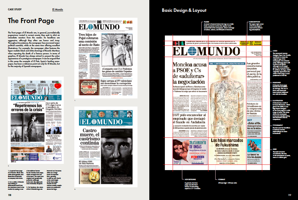
4. El Mundo (Spain)
Newspaper Design:“Opinion is one of El Mundo’s signature elements and is an original contribution to Spanish journalism.”
From Newspaper Design, Copyright Gestalten 2018
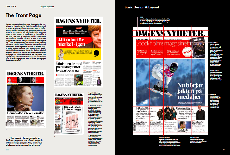
5. Dagens Nyheter (Sweden)
Newspaper Design: “From the point of view of content, Dagens NYheter decided to target a younger, more urban audience. The business section was merged with the main news section, and a new local news section was added, giving the newspaper a three-section structure: News, Stockholm & Sports, and Culture.
From Newspaper Design, Copyright Gestalten 2018
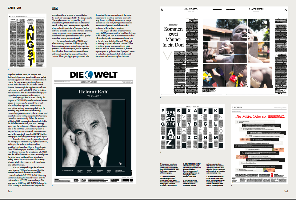
6. Die Welt (Germany)
Newspaper Design: “As early as 2012, WELT began to pursue a digital first approach and installed its online platform as the main hub for news production. Most articles are published online first and are later adapted for various print outlets.”
From Newspaper Design, Copyright Gestalten 2018
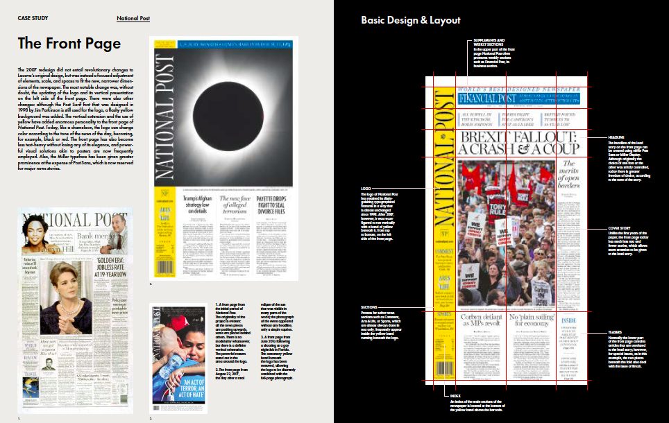
7. National Post (Canada)
Newspaper Design: “Today, like a chameleon the National Post’s logo can change colors according to the tone of the news of the day, becoming, for example, black or red.”
From Newspaper Design, Copyright Gestalten 2018
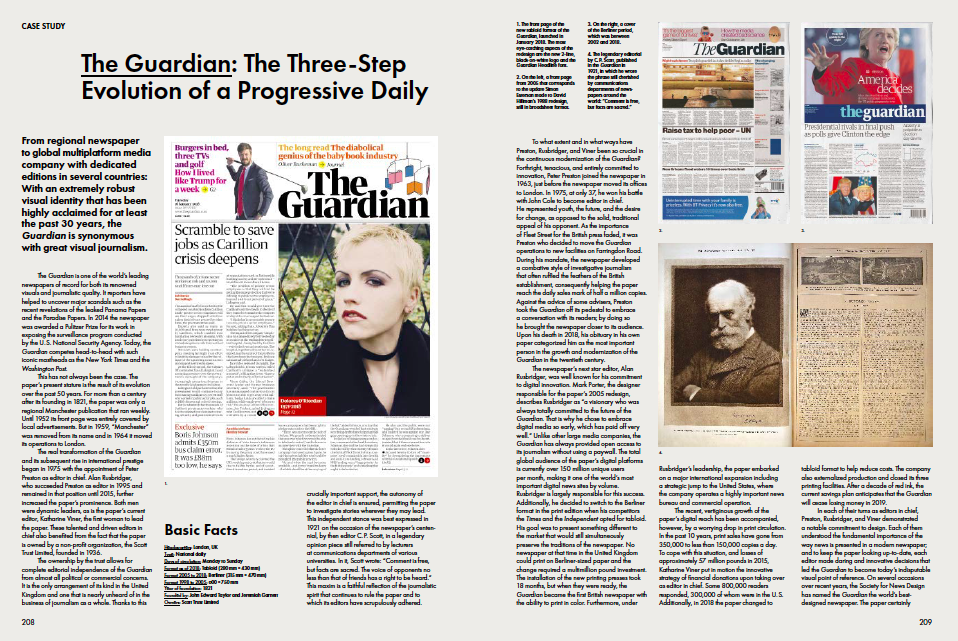
8. The Guardian (UK)
Newspaper Design: “The Guardian is synonymous with great visual journalism.”
From Newspaper Design, Copyright Gestalten 2018
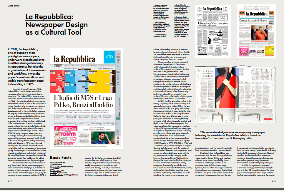
9. La Repubblica (Italy)
Newspaper Design:“For La Republic, innovation is a wonderful, natural consequence, because it is in our DNA.”
From Newspaper Design, Copyright Gestalten 2018
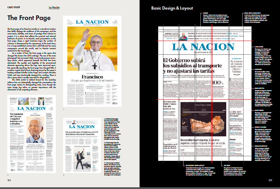
10. La Nación (Argentina)
Newspaper Design: “To speak about innovation in 2018 means talking about La Nacion.”
From Newspaper Design, Copyright Gestalten 2018
Thursday’s blog: Part two of this book review
Getting the book
Newspaper Design :Editorial Design from the World’s Best Newsrooms
Editors: Gestalten & Javier Errea
Format: 24.5 x 33 cm, 9-3 / 4 x 13 inches
Features: Full color, hardcover, stitch bound, 288 pages
Price: € 49.90 (D) / £ 50 / $ 69
ISBN: 978-3-89955-536-3
European Release: June 28, 2018
International Release: July 31, 2018
PREVIEW PAGES ONLINE
https://shop.gestalten.com/newspaper-design.html
The book can be obtained from the Gestalten webshop.
Product link:
https://gestalten.com/products/newspaper-design
Mario’s Speaking Engagements
August 2, Digital House (Facebook workshop), Buenos Aires

October 6, 20, 27–King’s College, New York City
The Basics of Visual Journalism seminars
Garcia Media: Over 25 years at your service
TheMarioBlog post #2864