This is the weekend edition of TheMarioBlog and will be updated as needed. As it is Memorial Day Weekend in the United States, the next blog post is Tuesday, May 30. Next week reporting from Germany.
As someone who often gets quoted saying that when it comes to designing for phones and tablets “we must keep the finger happy”–perhaps the most Tweetable phrase after any of my workshops and seminars—I was immediately taken by the title of the book Designing for Touch, by Josh Clark. I have read it in its Kindle edition and recommend it for anyone writing, editing and designing for mobile platforms. The book contains only five well packed chapters: A Physical Interface, The Unreliable Screen, Faster Fingers, Gestures, Discovery.
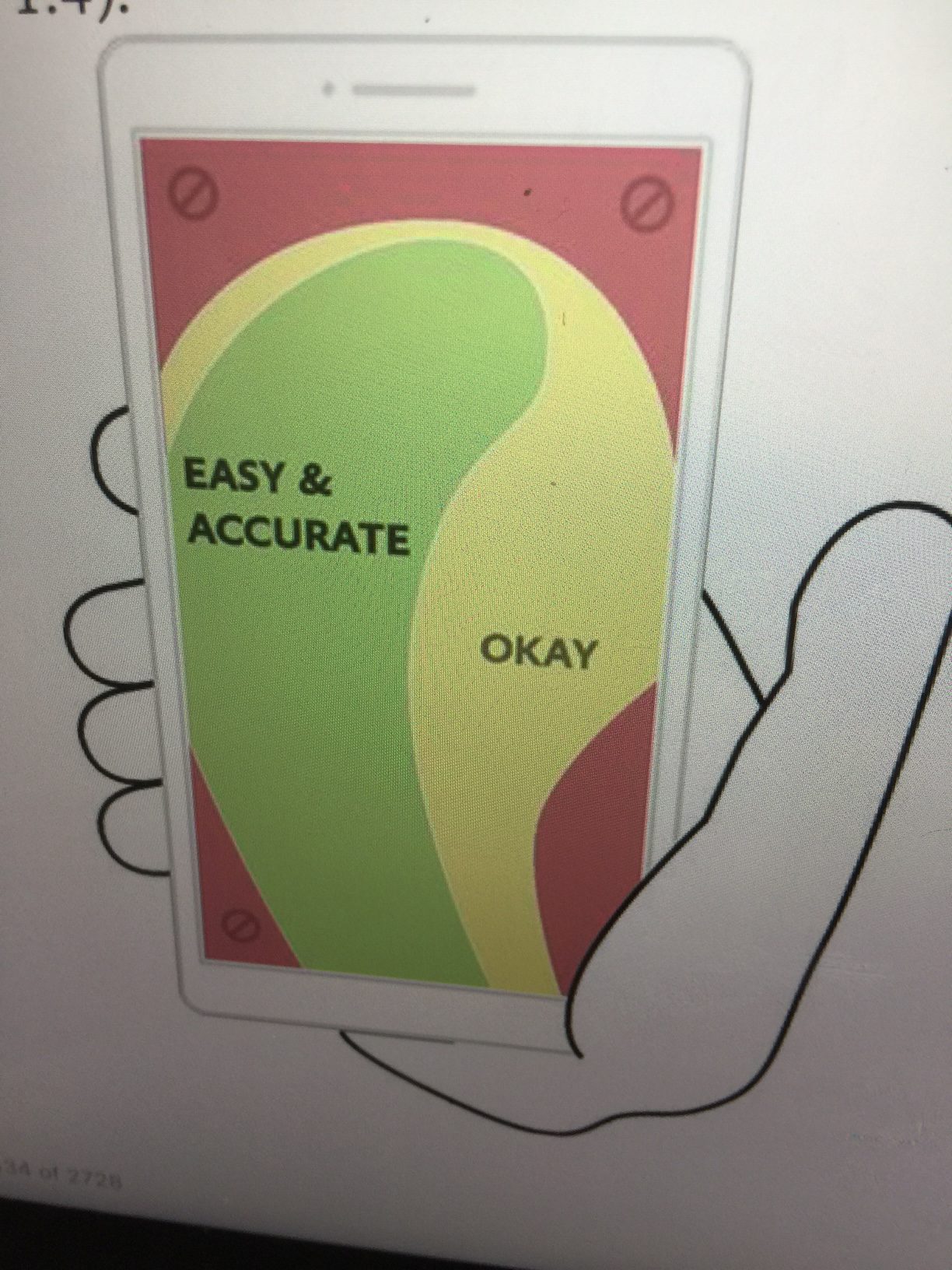
Keeping the finger active and showing us where the finger goes first, second and third, is part of what this informative book is about. Key to this book is something that I have mentioned repeatedly: For the first time digital designers have to ask themselves, How does this design feel in the hand?
Also, writes Clark:
Despite this inundation of touch devices, most websites remain stubbornly optimized for mouse and cursor. It’s past time for designers to catch up with a new generation of web-savvy gadgets.
Clark devotes the first chapter of the book to the physicality of a phone’s screen and :
While a thumb can sweet most of the screen on all but the most oversized phones, only a third of the screen is truly effortless territory: at the bottom, on the side opposite the thumb.
The book is full of useful tips, such as :
Hoober and Shank found that 88% of tablet use happens while seated, compared to 19% of phone use.
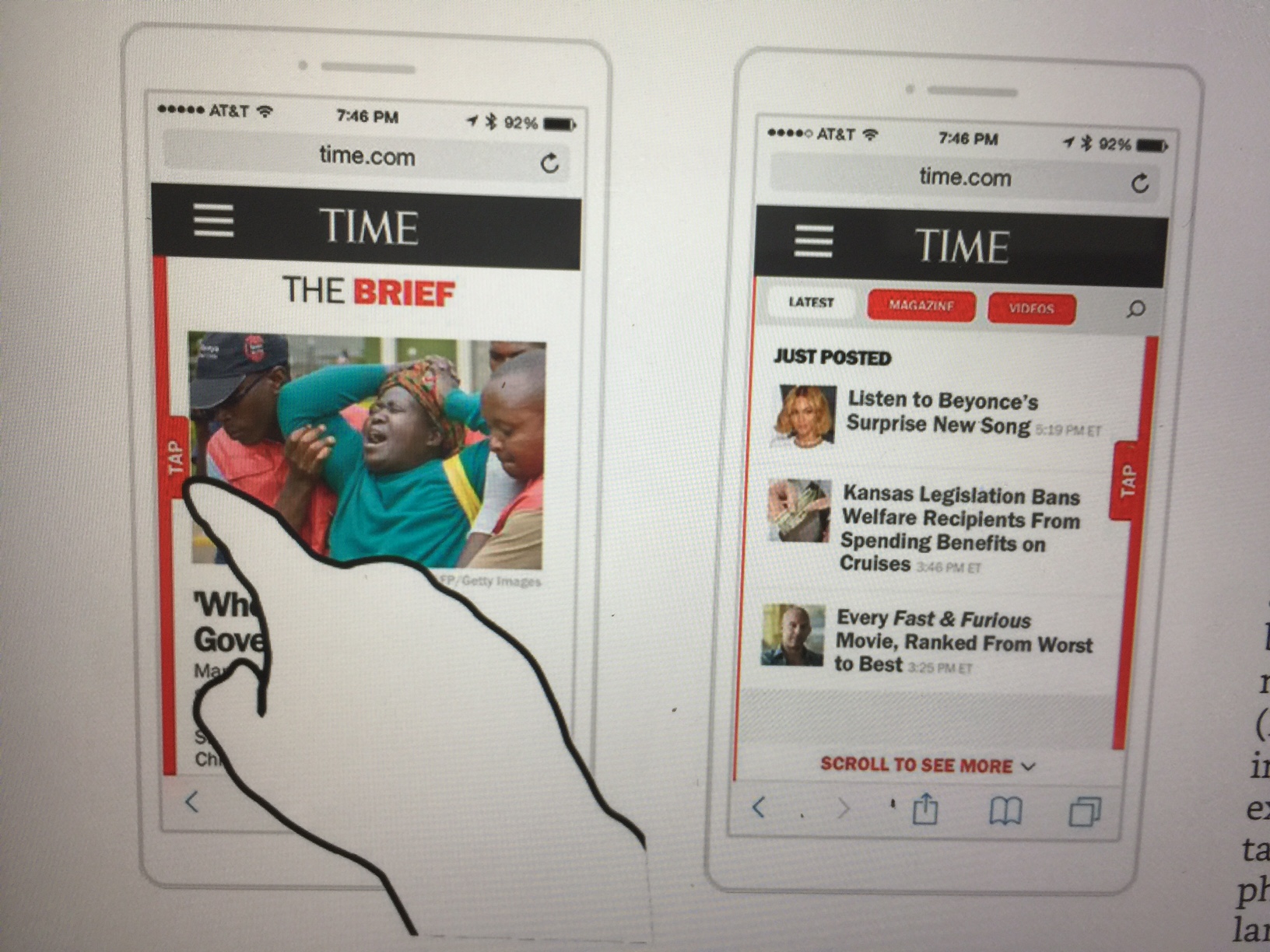
Clark likes “sliding panels” as an option to offer additional navigation, as opposed to crowding the already small screen of a phone with too many navigational tools at the top.
Screen size is a lousy way to detect touch
Clark not only tells us this, but also wants us to disregard the notion that if it’s a small screen, it’s touch. If it’s a big screen, it’s mouse driven. He adds: “It’s past time to stop conflating screen size with input type, but how?”
Assume every screen is a touchscreen. Because any device might be used for touch, we must assume it will be….and it’s our job to ensure that the layout is accessible to both cursors and fingers. Every web design-and the same goes for native desktop apps–should be finger friendly.
My two Amen moments
As someone who favors linear thinking for visual storytelling on mobile, I was happy to read Clark’s statements about scrolling, too.
“Scrolling in itself is not a bad thing–flicking through screens is part of a touchscreen’s charm…”
He does warn about very long screens that may “test your thumb and your patience.”
One of the highlights of the book is Clark’s discussion of of the use and abuse of carousels. “Carousels can be terrific in the right contexts, but they go awry in ill-considered ones, especially the homepage……
Unfortunately, carousels are more fool’s gold than silver bullet, because they demand those rarest of commodities: patience and attention.
My take: there is no place for carousels of swiping in effective linear visual storytelling.
I agree with Clark that carousels may work for casual browsing of like items: weather forecasts, for example.
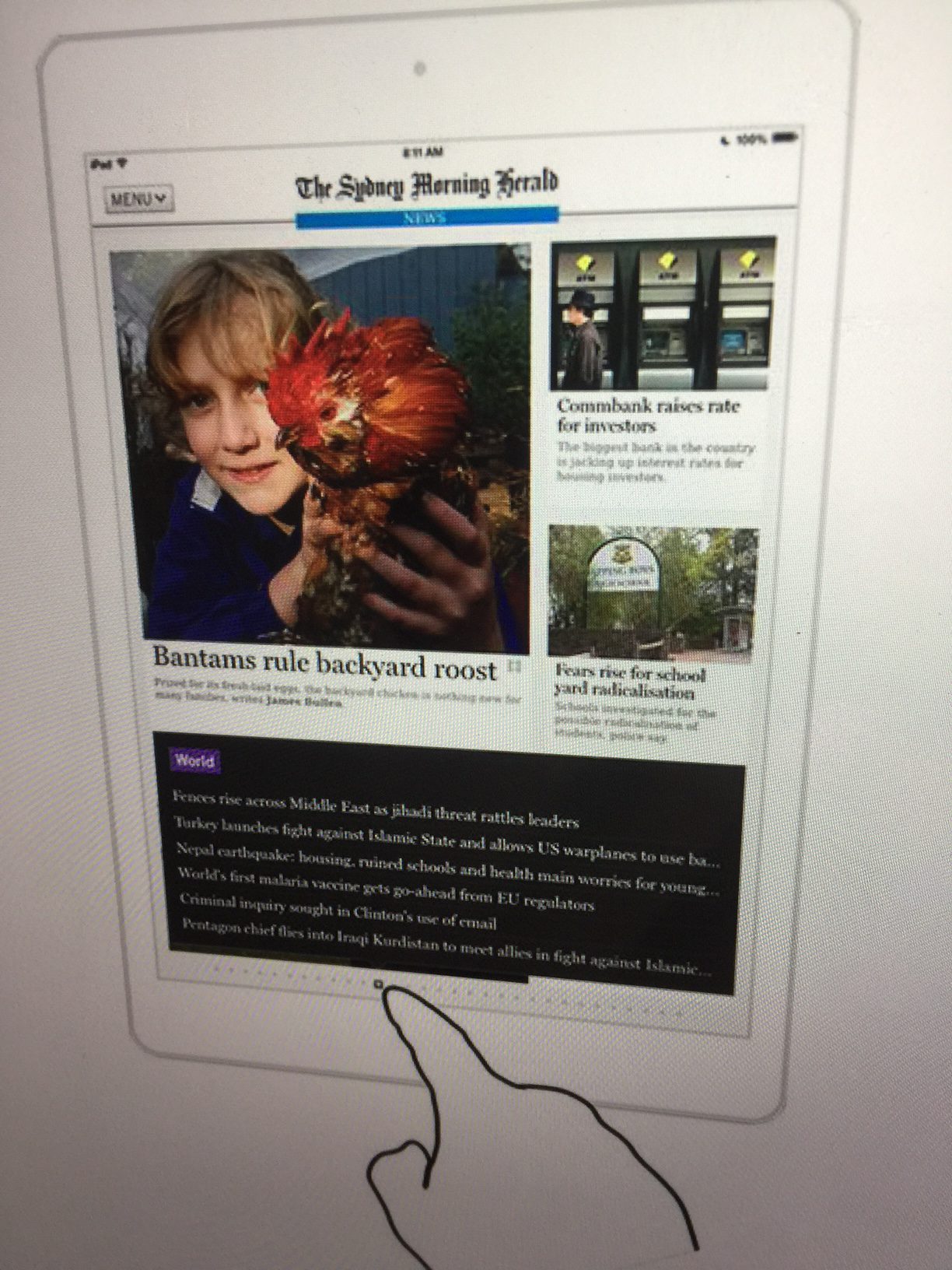
A second Amen moment for me was in the final chapter, Discovery, when Clark reminded us that when a design becomes too tied to the physical truth of its interface, it risks losing “digital opportunities”. Thinks the first tablet newspaper, The Daily, which, like many other publications in 2011 when the iPad first emerged, hewed so closely to the behavior of print products that they failed to explore the potential that the tablet offered. It is happening with the way we transfer desktop design to phones today.
“Let your interfaces do things humdrum physical objects cannot……At first glance, the Sydney Morning Herald iPad app looks and behaves like the paper version. Tap the page indicator dots at screen bottom, however , and you see a quick reference list of every headline on that page…..”
The ultimate tips:
Save people time and elbow grease by reducing the number of taps and interactions needed to move through your design.
Clark emphasizes the importance of designing for efficient finger motions throughout the book. In the Faster Fingers chapter he reminds us that when it comes to making the user experience effortless “build for comfort and speed.” And he is right when he writes that the best practices we have inherited from the desktop era are “out of touch with touch.”
A good reminder: there are quality taps and bad taps. Tap quality is more important than tap quantity, Clark writes.
“As long as each tap delivers something—new info, a completed task, or even a smile—that’s a quality tap that maintains momentum.”
The enemy, he writes, is a garbage tap, one that you can avoid with a more thoughtful display of content or a more efficient gesture.
The takeaways:
Less is best.
Design for both touch and cursor: assume all screens are touch screens
Don’t crowd me , says the user.
Compact presentations in one screen are better than sending the user all over the place–reduce the number of taps.
The finger is the cursor.
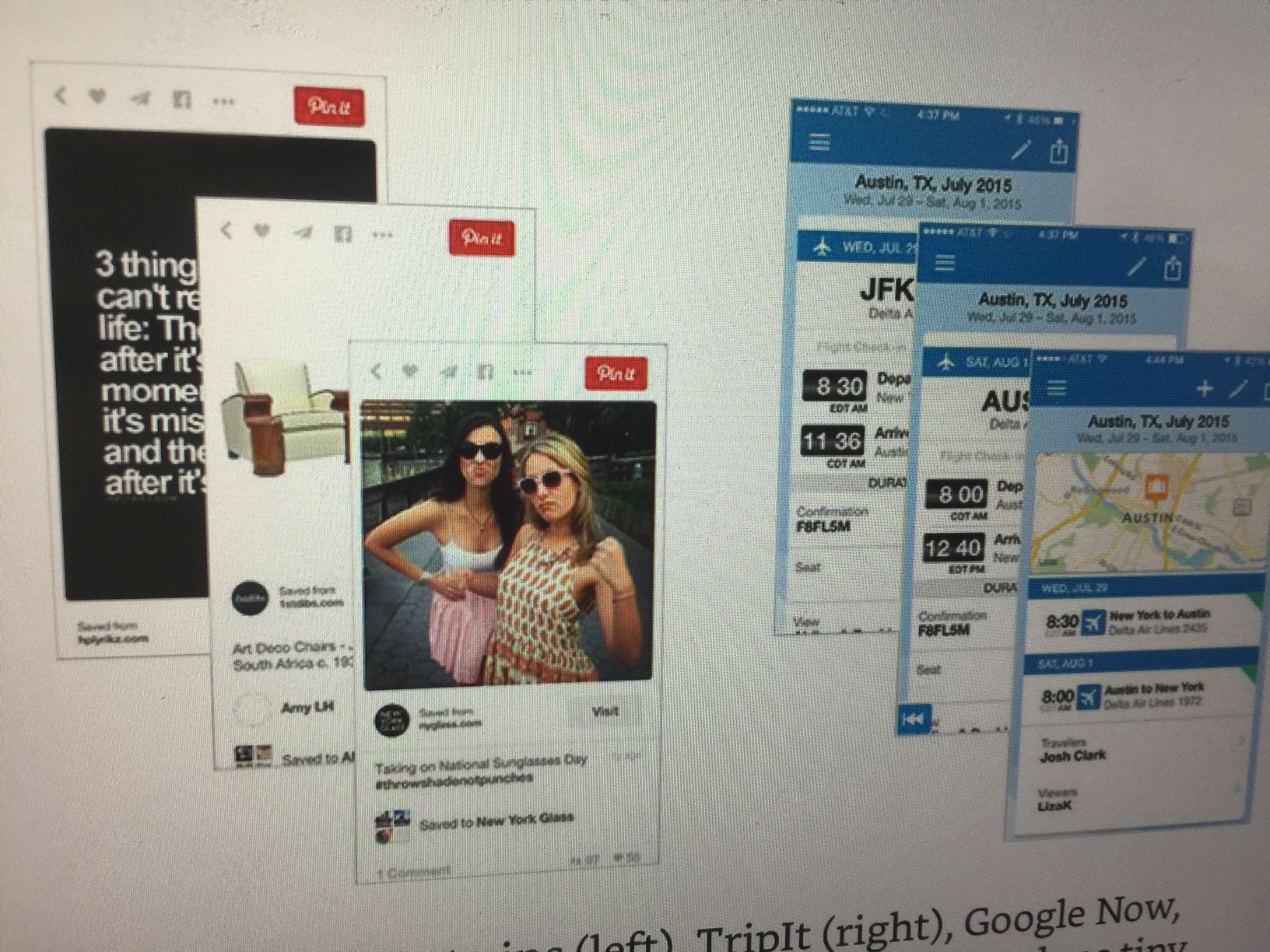
Cards are powerful visual metaphors–useful to represent individual data objects: a photo on Facebook, a coupon, a Google Now reminder. Snack sized, portable formats that convey information at a glance.
If your product requires too much instruction to operate, then you scare the user away. Complex instructions suggest that an app is anything but intuitive.
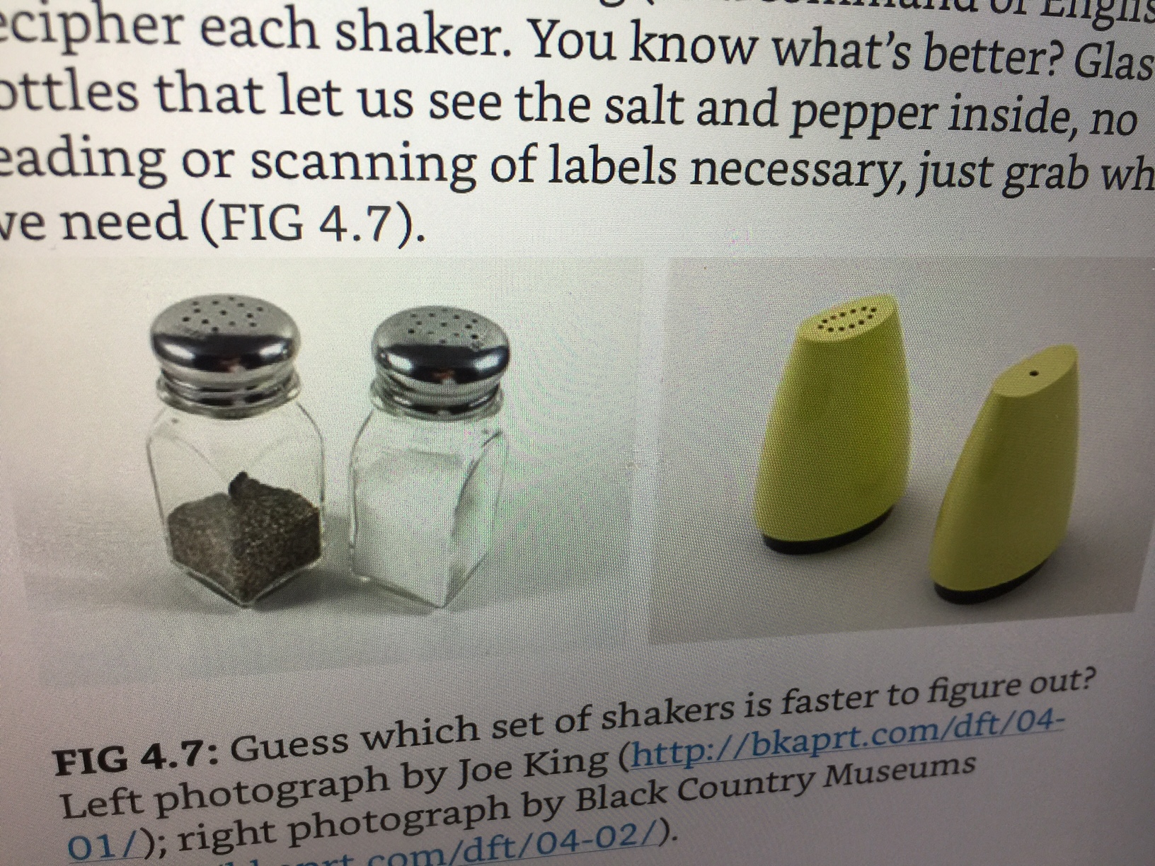
Finally, the best user experience is based on less effort, in letting “the real world be your guide,” with the obvious, the common sense and the intuitive, and Clark’s example says it all. Take a look: which set of shakers here tells you what you need to know sooner?
If you are an editor and/or designer working with the creation of content for mobile devices, Designing for Touch is a reference you should consult. It’s easy to read, full of explanatory illustrations and the author practices what he preaches: show, don’t tell!
For more information and to order a copy: https://abookapart.com/products/designing-for-touch
Marketing for the Wall Street Journal
Newspapers continue to conduct marketing campaigns based on the current theme of “fake news” versus “real news” versus, yes, “alternative facts”. It is all part of the Trump era and how journalism is perceived and how it sells itself.

Speaking Engagements Coming Up

SIPConnect 2017, to be held in Miami June 21-23, is a program of the Inter American Press Association, IAPA, or SIP (Sociedad Interamericana de Prensa). The venue will be the Hilton Miami Downtown Hotel.
Details:
Join us at the SIPConnect Hemispheric Conference 2017. Organized by the IAPA, SIPConnect is a gathering of media and digital businesses to encourage more audiences and higher revenues. It’s a laboratory for new ideas and successful experiences for the digital transformation. As in the 2016 successful meeting that was attended by media from the US, Latin America and the Caribbean, experts in digital businesses and representatives of innovative companies will participate in this event.
For more information: http://www.sipiapa.org/notas/1211078-llamado-sipconnect-2017