It’s always a nice experience to get to the airline lounge anywhere and see the “press counter” full of newspapers and magazines—the printed variety.
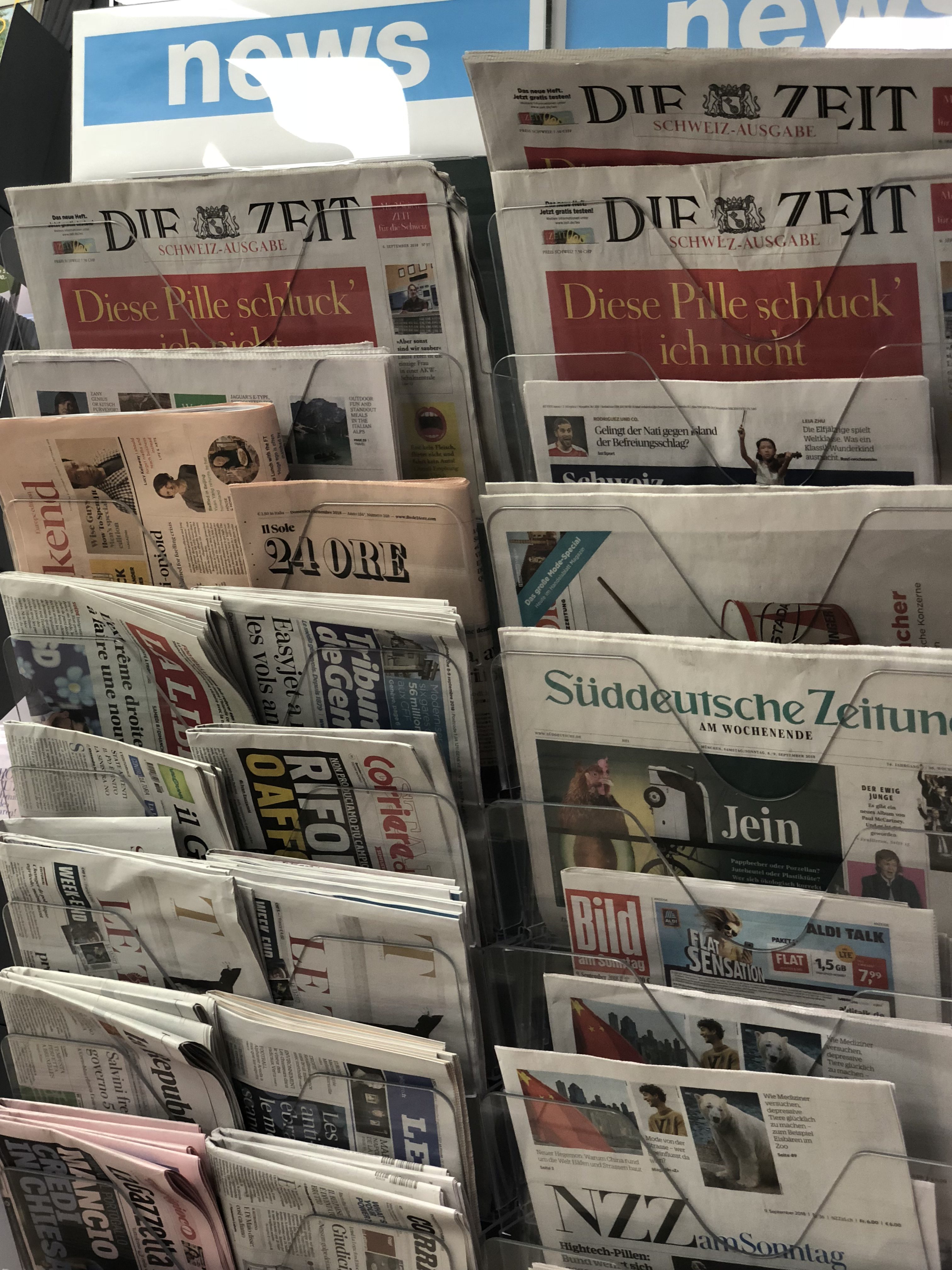
I realize that travel time means getting acquainted with print editions. The old newspaper designer in me can’t keep from making observations and annotations of things I like or not like. I remember a time in my life when I would also “re-do” pages on a napkin or whatever paper was near me. If I did not like how a page had been approached by the designer, I would do the quick exercise of rearranging the elements in a quick sketch, something I still consider a marvelous exercise. The gymnastics of the visual storyteller. The workout of the eye and the brain coming together to solve a problem, or to see a page from a different perspective.
Of course, I now do this with screens on the phone that I may feel could have a different design. Doing the simple napkin sketch is a way of flexing those visual muscles.
As I constantly remind my students at Columbia University:
If you like what you see, don’t simply look at it. Instead, make mental notes of why the solution for that page or screen worked. You learn from it. If, however, you don’t like what you see, then reach out for a piece of paper, grab a pencil or pen, and rethink the original, offering what you would consider better variations. This exercise will always advance you as a designer.
My observations today:
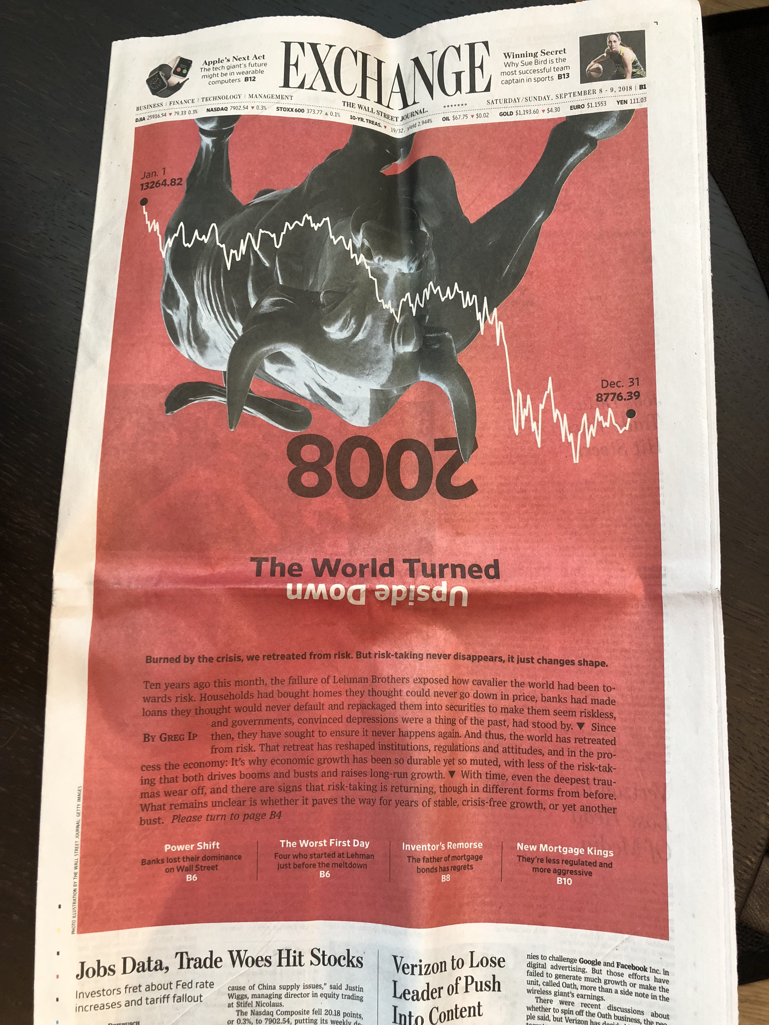
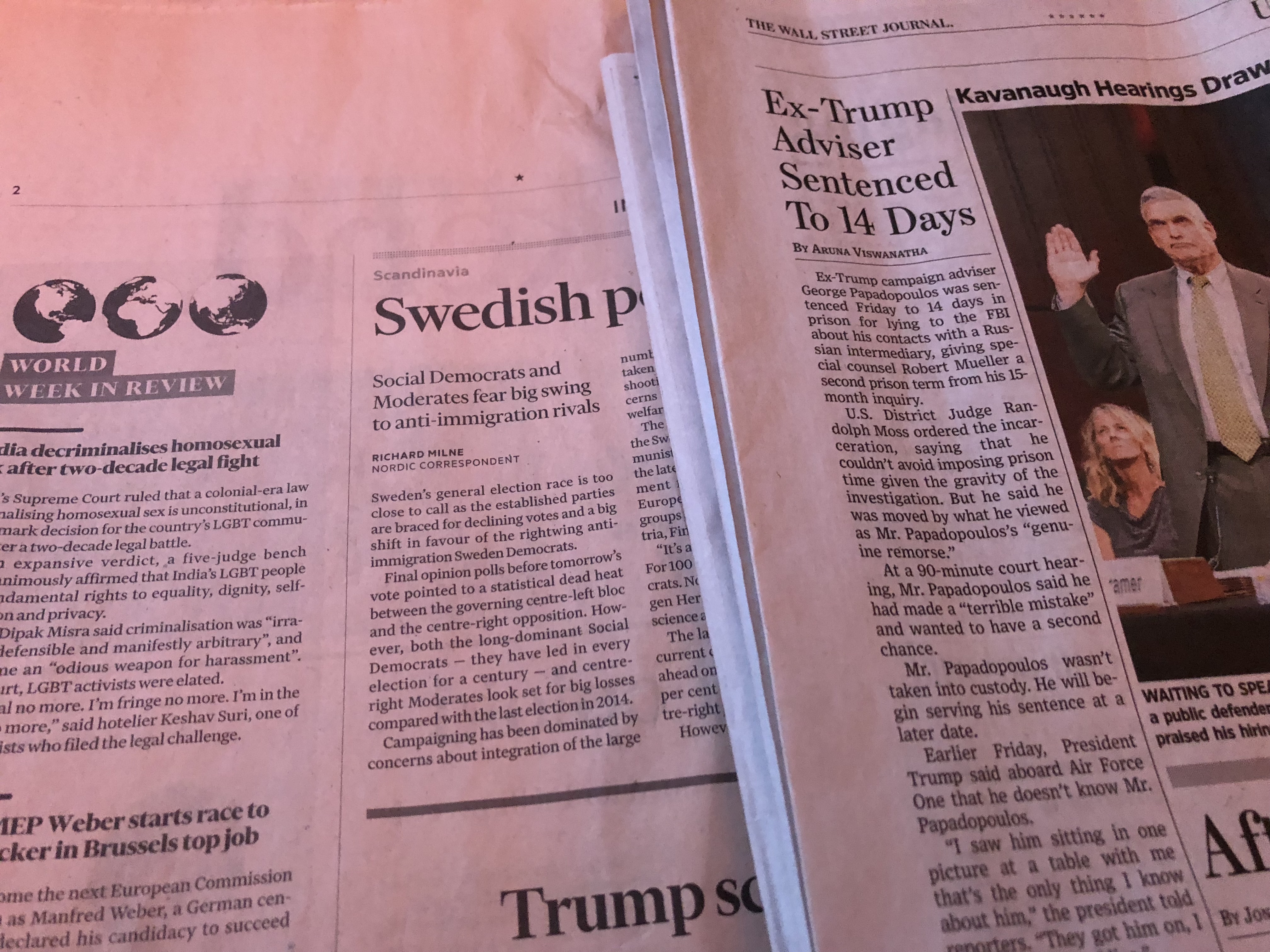
The power of red
Without a doubt, red can give a page (or screen) that extra kick, as we see on this page from The Wall Street Journal.
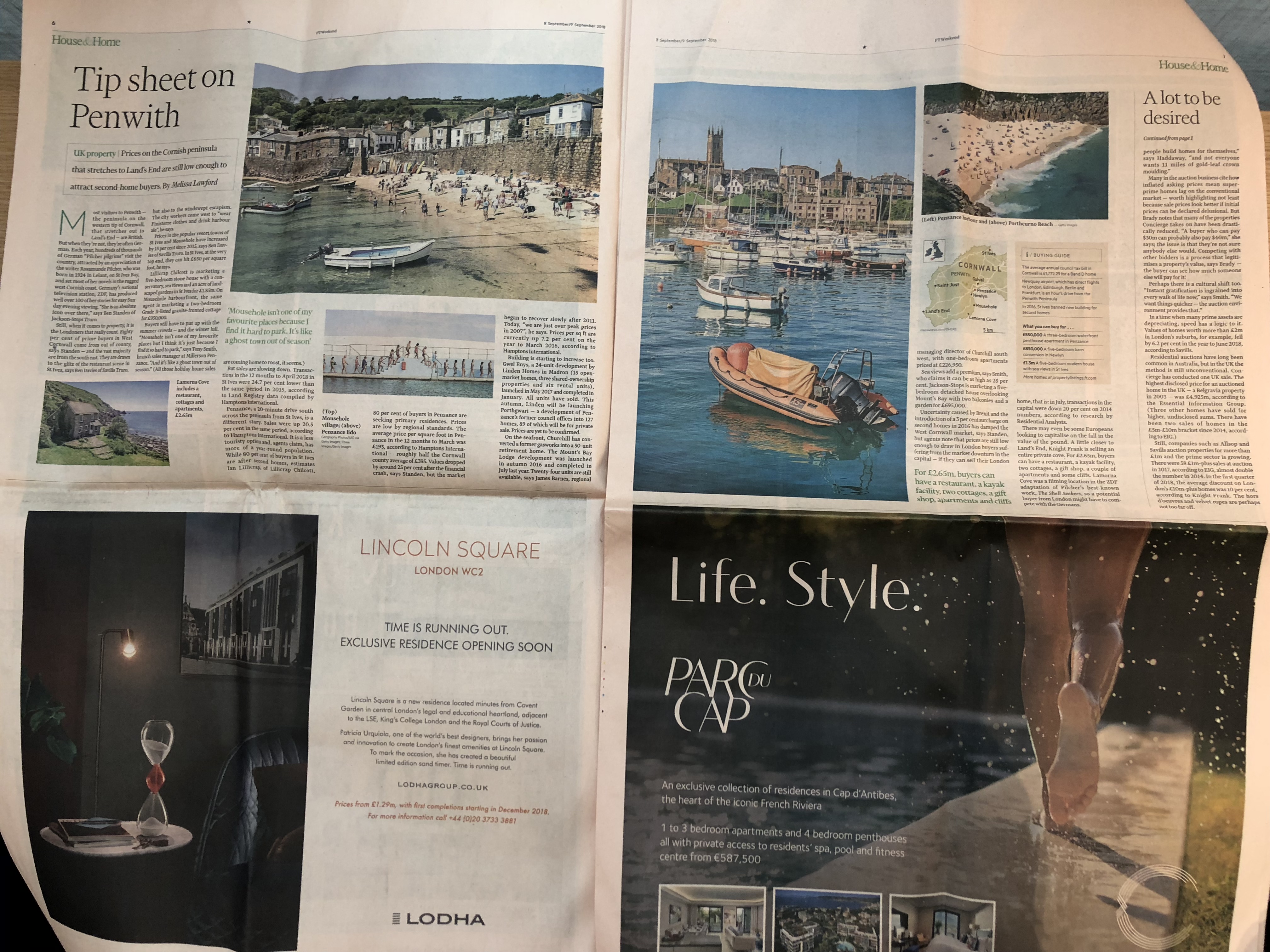
Use that double page spread
While I have always liked the robust visual opportunities that a double page of a broadsheet newspaper can offer, it is not something that is exploited as much as it should, which is the reason I was so happy to see this double page treatment at The Wall Street Journal:
….when text type is hard to read
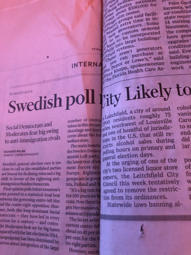
I guess I am a broken record here when I mention that I find it almost impossible to read stories in The Financial Times, where the text type is set so small that a man of 71 simply gives up. Today, as I had both The Financial Times and The Wall Street Journal, the proof was in the fact that I read several WSJ stories but could not get through one in the FT. Repeat question: Am I the only FT reader who complains about the size of their body type? I assume the FT counts with many readers my age or older. What’s the feedback? Please FT designers: bump up your body type by at least two points.
Your content is superb, for sure, but the hardship of reading your stories in print sends me immediately to your online edition, to consume the stories. Is that your strategy to increase digital subscribers, FT? Not too far fetched, but somewhat unfair for those who enjoy reading in print.
Here is a close up of two columns of type side by side (FT on the left, WSJ right):

The navigation bar on the printed page
I maintain that we bring some of our digital reading habits to print. So, it is no surprise to see this navigation bar atop the supplement of the Financial Times, weekend edition.

First results
TheMarioBlog post # 2909