This early part of the week reporting from San Antonio, Texas, where I attend and speak at The Seminar, a gathering of communication experts from across the United States.
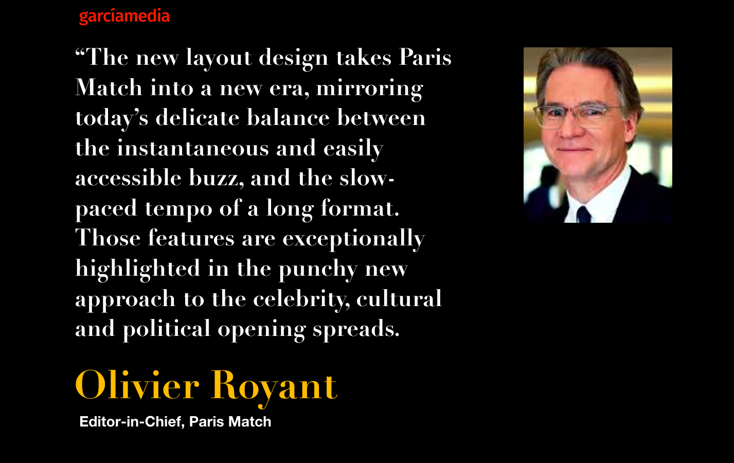
It was late 2017 and I received a call from my friend Olivier Royant, editor-in-chief of the legendary French magazine Paris Match.
“Mario, I think it is time for us to refresh the maquette of the magazine.”
And so I started my conversation with Olivier and his team in what was described as a “design retouch and update” of the magazine that has now turned 70 years old.
We had previously completed a redesign of Paris Match in 2008 as the magazine turned 60.
In our initial briefing for this new update, we already knew that the changes would be applied to the print edition of the weekly magazine.
Now, two issues of have already appeared incorporating the changes we made. Take a look at the key points of this “design refresh”. Here is how Olivier summarizes this new design for Paris Match:
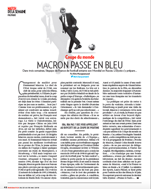
Design strategy: The cover
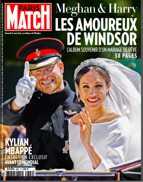
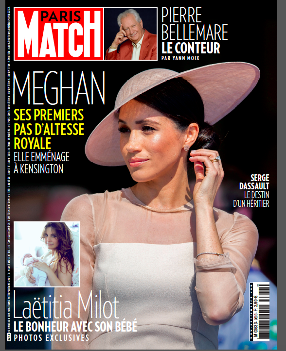
–We discussed the idea of fewer story promos on the cover. Here are the two first covers since the new design was launched.
Design strategy: Content reorganization
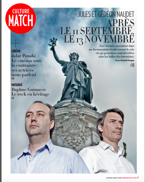
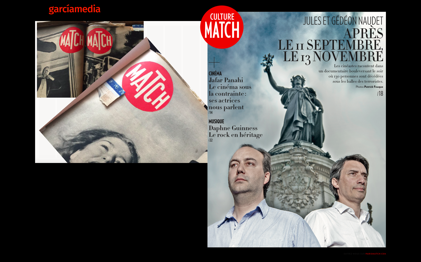
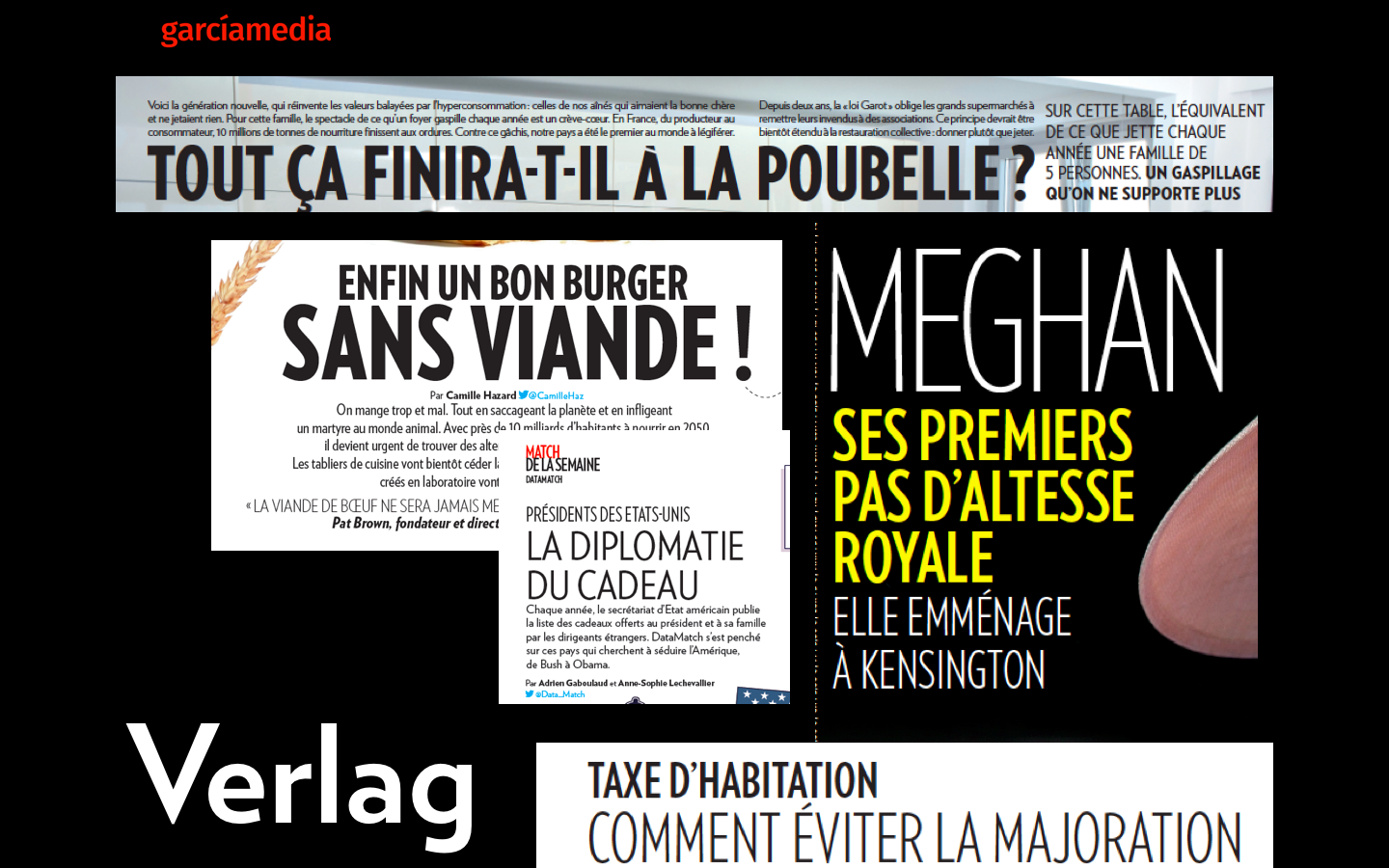
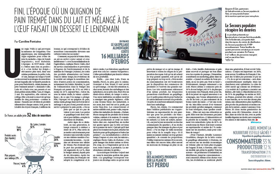
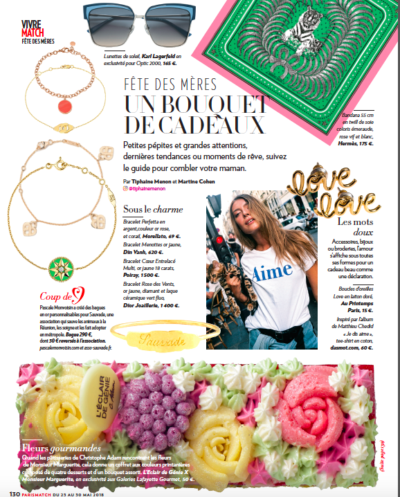
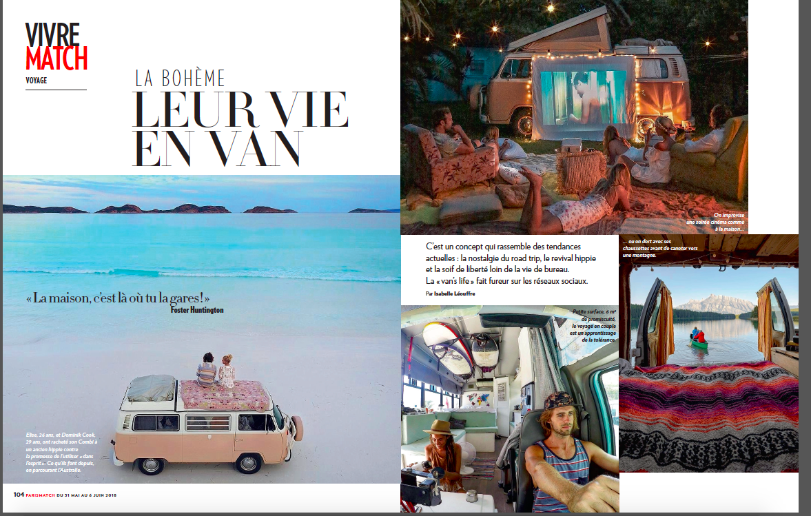
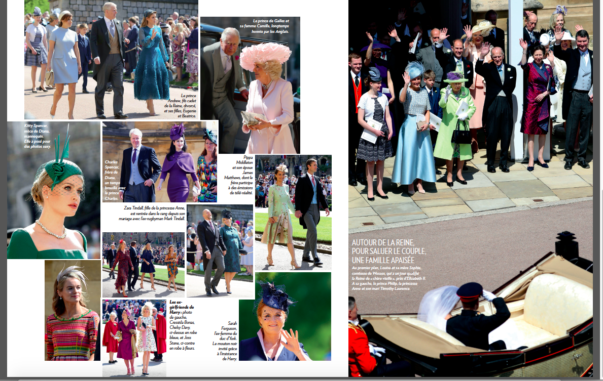
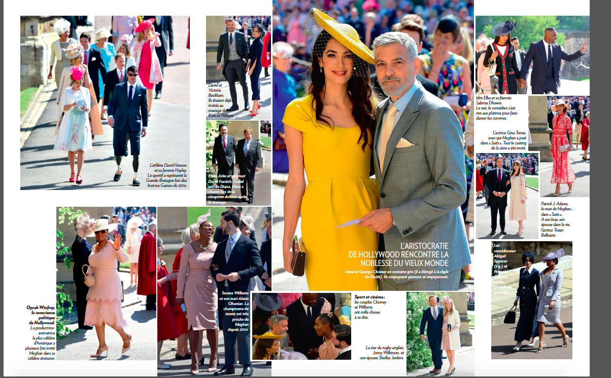
–The main idea was to provide for content reorganization, so that the start of the magazine, which is the Culture section, would move a bit faster and more animated, with shorter pieces. Take a look at these pages from culture.
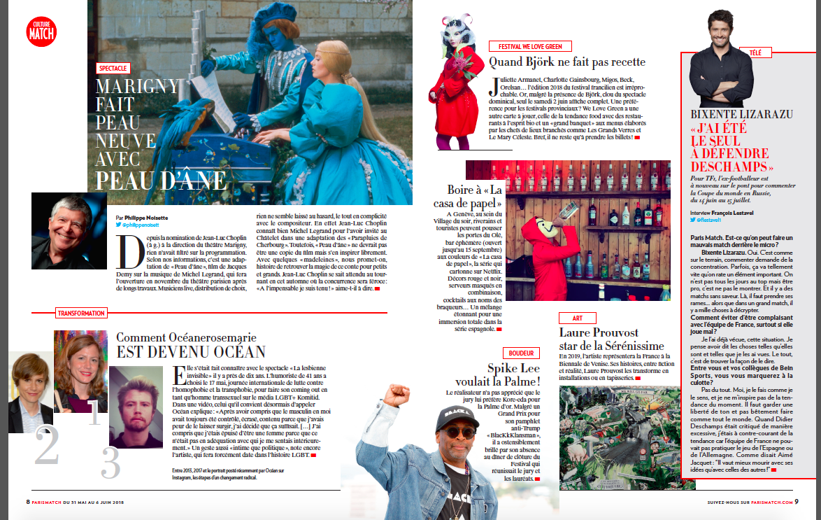
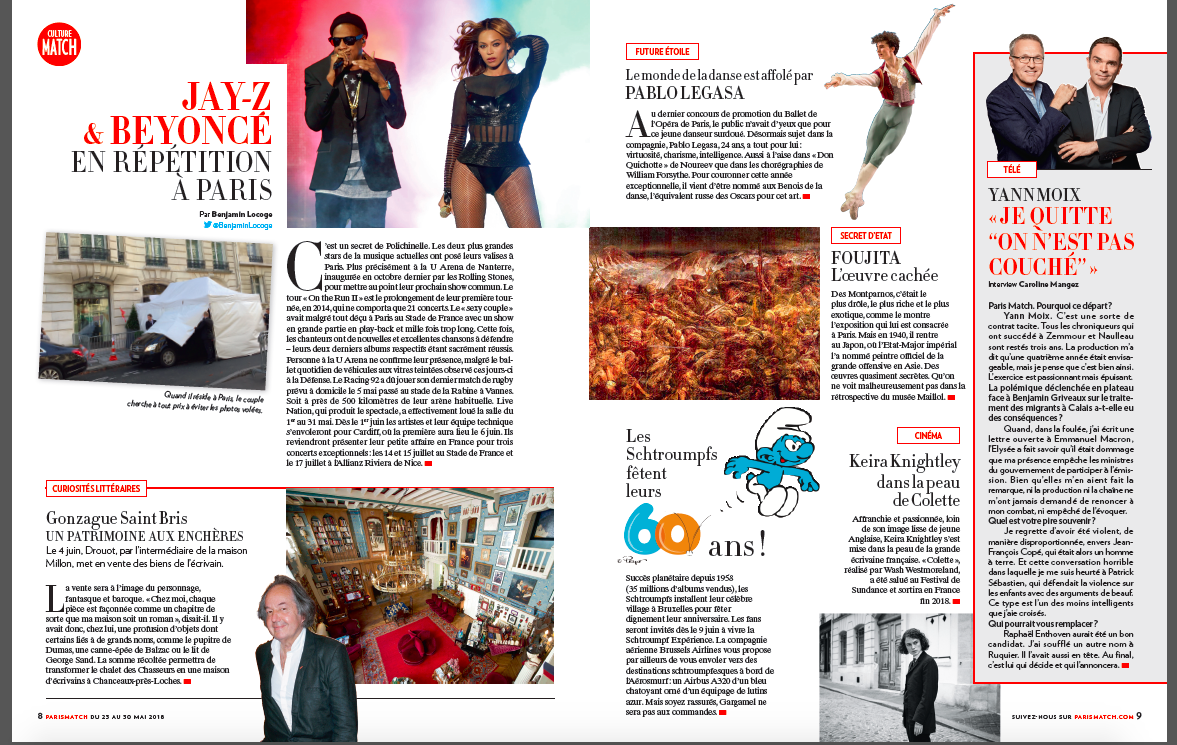
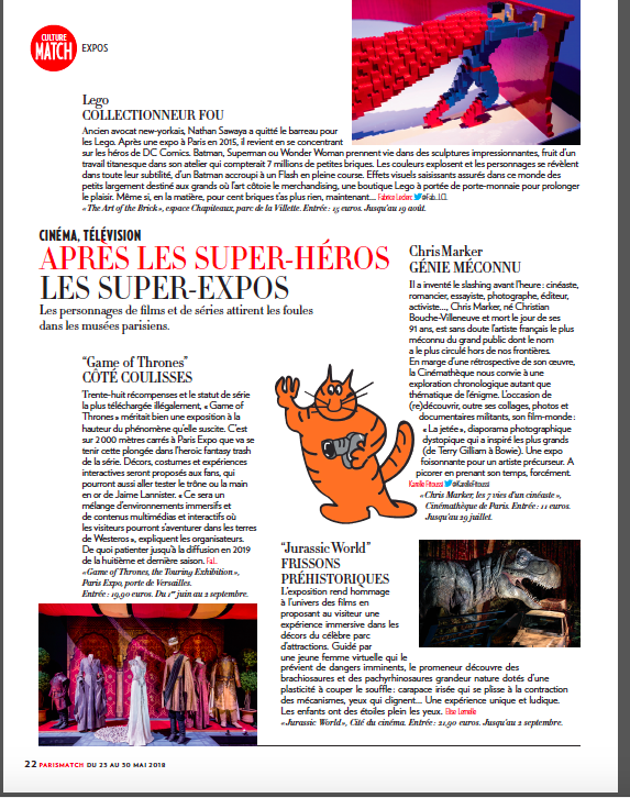
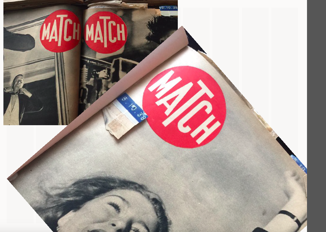
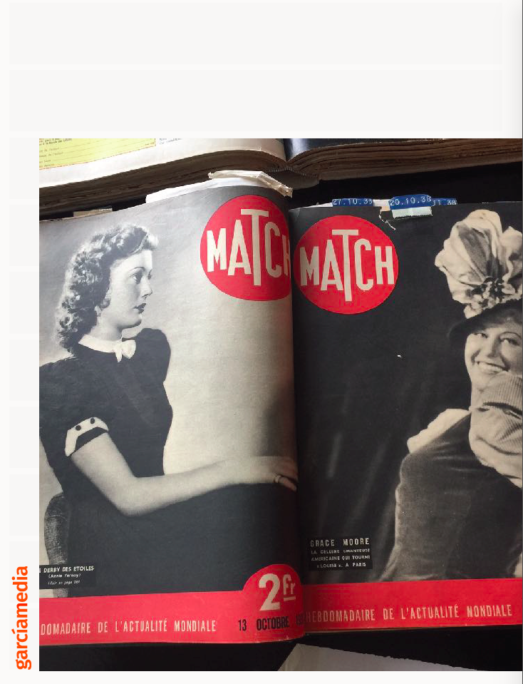
Saluting the visual past of Paris Match
–Notice that the Culture section brings back the circle, which was, as I discovered, the original logo concept for Paris Match in 1938.
The Typography
—Typographically, we wanted to emphasize the powerful sans Verlag as opposed to mixing other fonts with it. And, of course, we wanted to do more with the elegant Didot. Both of these fonts we had used in our previous Paris Match redesign of 2008.
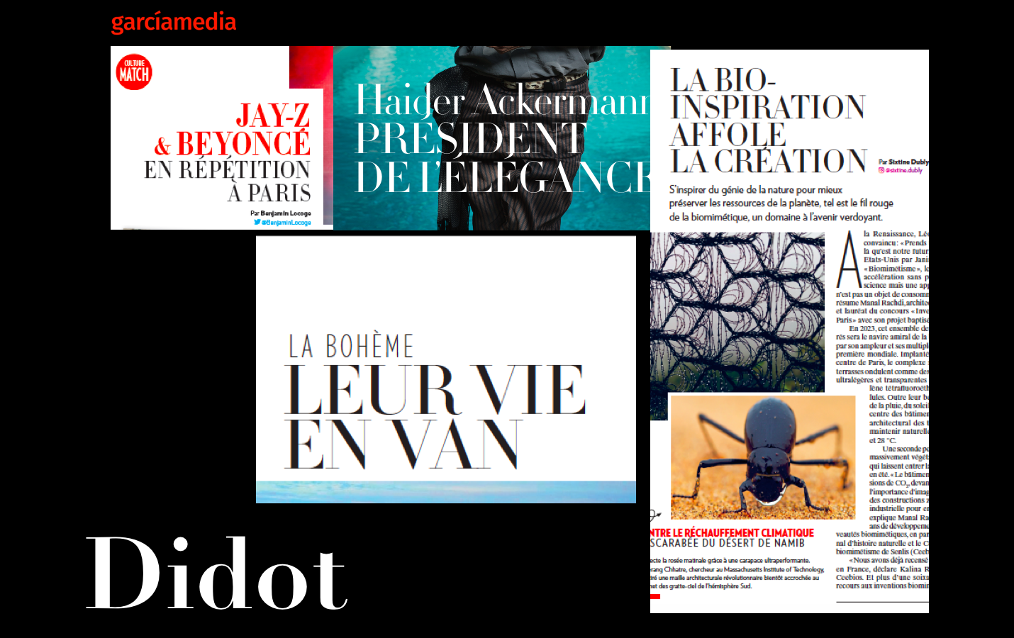
Take a look at these pages, especially when Didot and are combined: an elegant combination that is an integral part of Paris Match typographic identity.
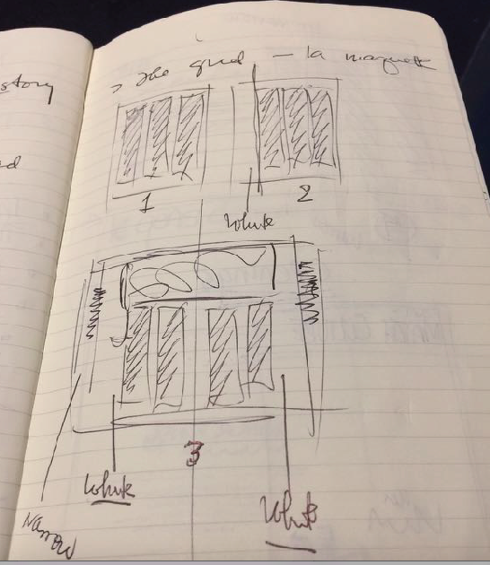
The grids
–For grids, we decided that we would make the three column grid the sort of default position, as you can see here in one my sketches.
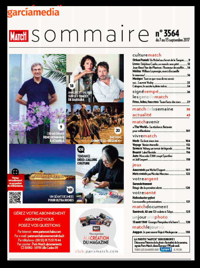
The Table of Contents page
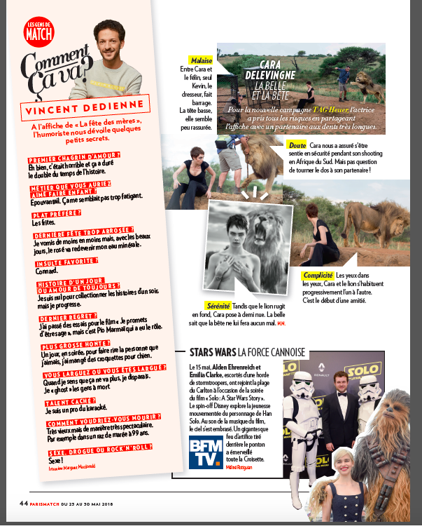
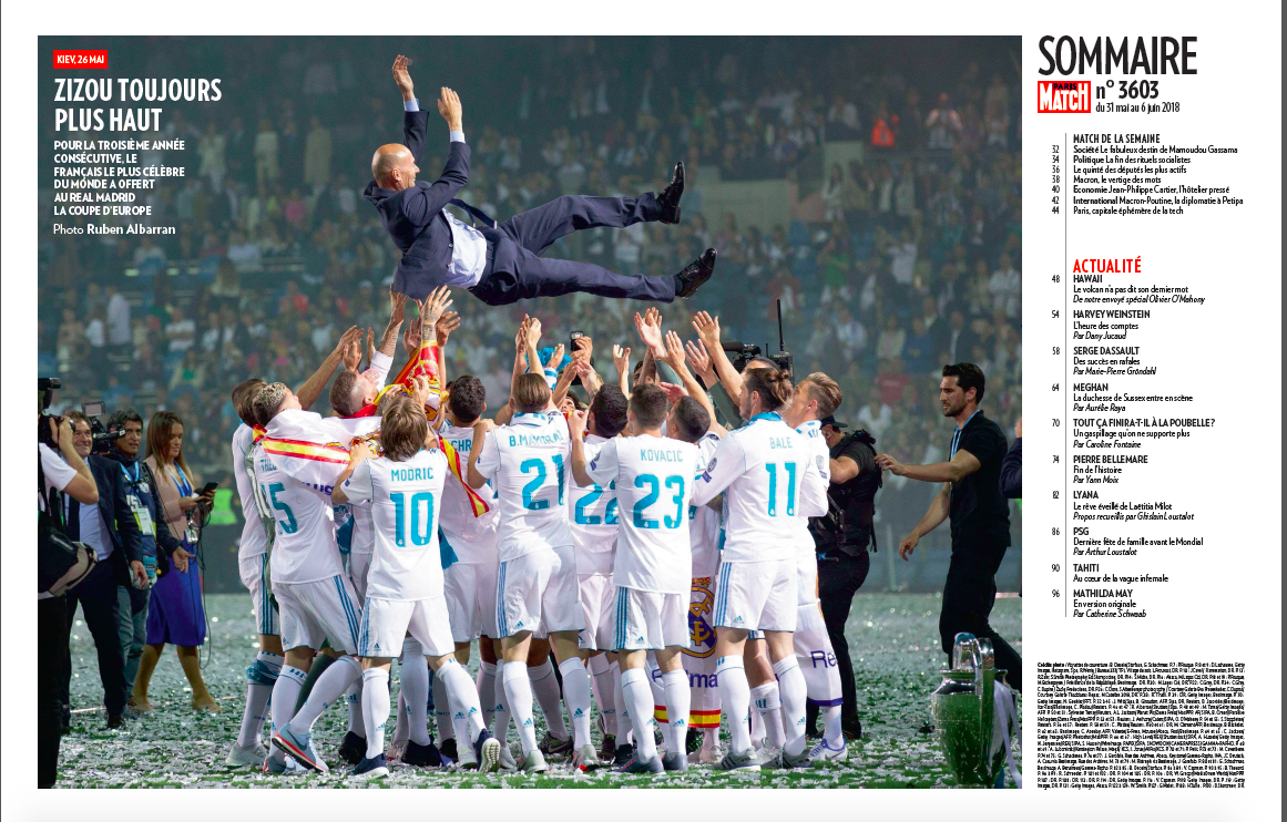
-We thought that the summary page of was too crowded and difficult to follow, as you can see here in this example of the old style.
The old summary page
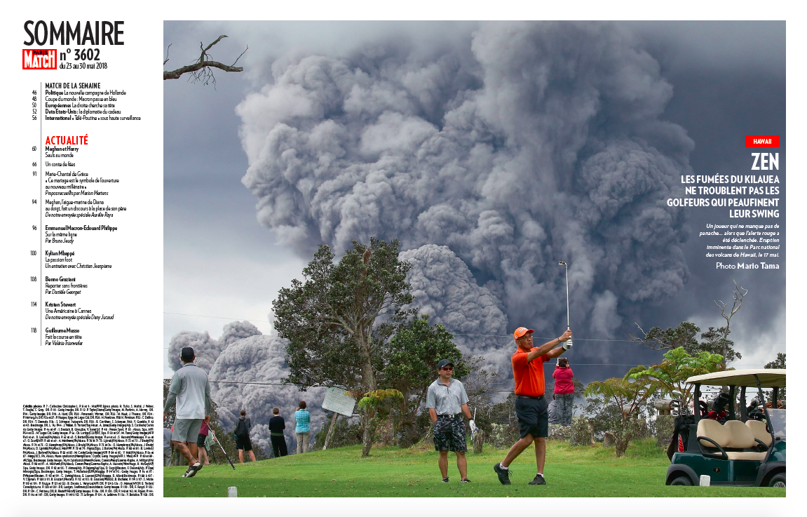
So we simplified it, and here is the new version, more visual and appealing.
The new summary page
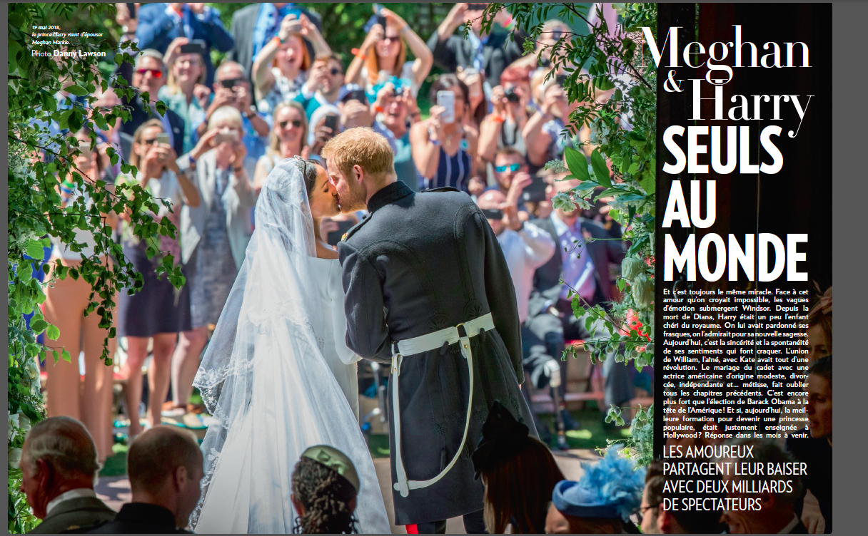
Here the emphasis has been on the good photography that is a trademark of Paris Match, a point with which Olivier Royant agrees:
“The design also highlights the unspoken power of photography unleashed with a remarkable new approach that accentuates the visual impact of the magazine’s traditional double-page photo-spread. “
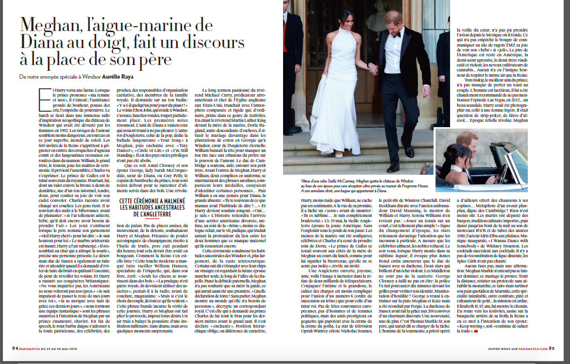
Story structures and storytelling
Storytelling is a key element of any redesign. At Paris Match, we are emphasizing more stories told in non traditional ways, through segmenting as we see in this example:
A variety of pages
For more about our previous work with Paris Match
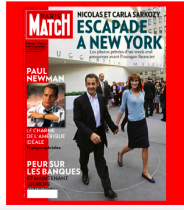
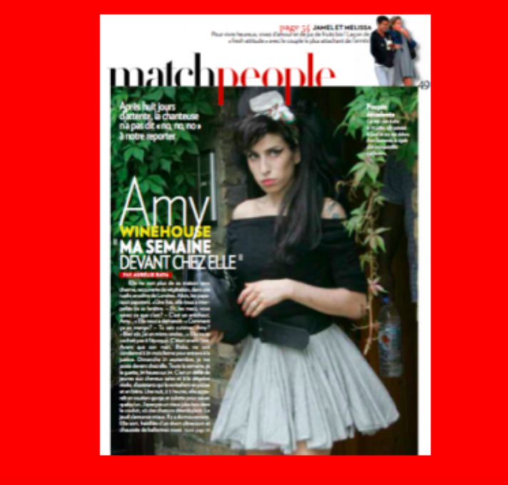
Here are two images showing pages from the 2008 redesign:
The creative team
For this project, we at Garcia Media worked closely with Paris Match creative director, Michel Maiquez, and his team:
Cyril Clément and Thierry Carpentier ran the operation in house.
With the help of designers:
Caroline Huertas-Rembaux
Franck Vieillefond
Flora Mairiaux
Ludovic Bourgeois
Paola Sampaio-Vaurs
Alain Tournaille
Devrig Plichon
Anne Fèvre
Alban Le Dantec
Linda Garet
From Garcia Media, I worked closely with Paula Ripoll, senior art director based in our Garcia Media Latinamerica office in Buenos Aires.
Paris Match : la historia en español
http://www.garciamedia.com.ar/paris-match-y-su-eterno-encanto/
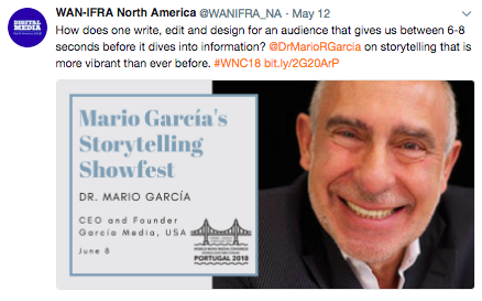
Preview of my WAN IFRA Congress talk
Appealing to the senses via mobile storytelling;
https://blog.wan-ifra.org/2018/05/30/appealing-to-more-senses-with-mobile-storytelling
Mario’s Speaking Engagements
June 7-8—WAN-IFRA World Congress, Lisbon, Portugal
For more: http://events.wan-ifra.org/events/70th-world-news-media-congress-25th-world-editors-forum
June 12-14, CUE Days , Aarhus, Denmark
http://www.ccieurope.com/news/6738/Video_What_is_CUE_Days_2018
August 2, Digital House (Facebook workshop), Buenos Aires

October 6, 20, 27–King’s College, New York City
The Basics of Visual Journalism seminars
Garcia Media: Over 25 years at your service
TheMarioBlog post #2852