TAKEAWAY: Starting today, it is a compact format and lots of new design and storytelling details for the Sydney Morning Herald and The Age. Here are highlights of the project!
Going the compact way Down Under
<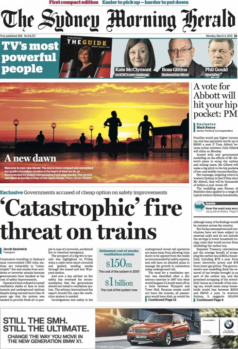
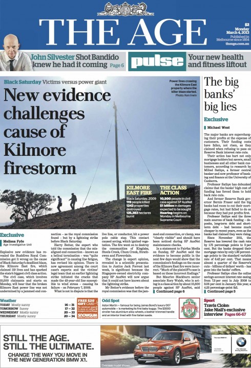
Here are the front pages of today’s Sydney Morning Herald and The Age
Here are models of the prototype we created together, with much less text on the front page
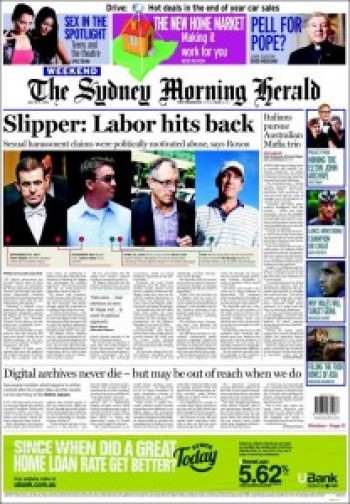
Here is front page of the Sydney Morning Herald before it switched to the compact format
Two more of those traditional broadsheet newspapers are going tabloid—-or, as the teams at Fairfax in Australia prefer to call it: compact.
Yes, as of today, March 4, 2013, Australia’s Sydney Morning Herald and The Age (Melbourne) appear in smaller packages, with new design touches and strategies. It is all part of a project that aims to make the newspapers more accessible to readers.
I am honored to say that one day last fall I had a call from Matt Martel, the talented national presentation editor, inviting me to come to Sydney—that always stunning city—- to take a look at the prototype he and his team had just completed and tested.
It didn’t take me too long to tell Matt that I would definitely accept his invitation. Who could say no? What, with Sydney among my top favorite five cities in the world, and already imagining those magic runs around the Sydney Opera House, right on that magnificent harbor!
A few weeks after this invitation I took to the air and the marathonic trip that a Florida to Sydney trek entails and spent a week with Matt and his team conducting workshops and helping craft a new prototype which led to the newspapers readers get to see today.
What constitutes my project #658 had started.
First impressions of the in house prototype
I took a look at the prototype and liked a lot of what I saw, but suggested some small changes here and there. Perhaps my strongest recommendation was for a front page that would be less text driven and more photo/navigation oriented—-as in a Flipboard or carrousel style (thinking digital).
“Capitalize on the great real estate that is the front page of the newspaper,” I told Matt and the team. They immediately jumped into action, creating some great prototypes that are shown here.
Together, we built a variety of front and inside pages with this visual theme in mind.
Some of those ideas are in the pages readers of the SMH and The Age will see starting today. Some of those ideas did not make it beyond internal discussions, however.
“But,what will those loyal readers say?”
As happens often in these conversions, top management fears to alienate “loyal” readers who may not like too radical a change. Have you heard that before? I have, hundreds of times.
With all my respect, and aware of what the focus groups have said (here in Australia and elsewhere), I do believe that readers of all ages are always more prepared for effective change that editors give them credit for. And, indeed, if focus groups reveal differently sometimes, it is because, we all form opinions based on the familiar, on what we know, and it takes time to get used to new things.
So, as the management team followed focus groups here to a T, there is much more text on the front page that I would like, but the overall new compact front page is energetic, vibrant and does lean towards Flipboard navigation, with the intrusion of some body text type that, I hope, will begin to get less as less as the new design evolves.
I am honored to have been invited to participate in the change of the SMH and The Age, and I like a lot of what I see.
As we know, the first day and week of introducing a new look—-especially a change of formats—-is only the beginning. Evolution is the key.
I am hoping that some of those early prototypes we did will find their way as loyal readers offer their support. Let’s continue to monitor progress for these two well known Australian dailies.
For now, let’s look at some of the details that make this conversion from broadsheet to tabloid (our 23rd at Garcia Media) interesting.
Prototype samples from various pages
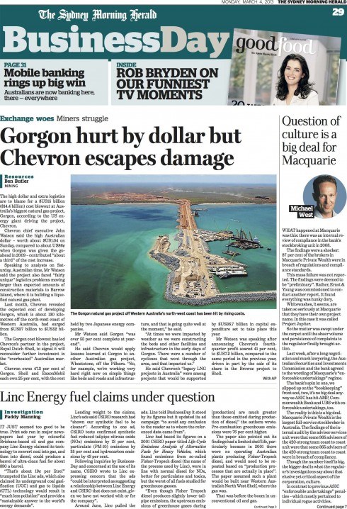
Business section opener
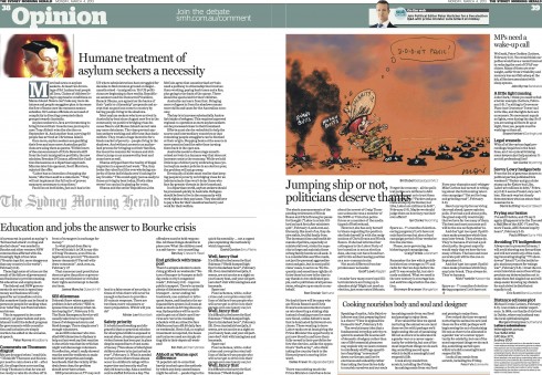
Opinion/editorial page: introducing white space to make the page more aesthetically pleasing
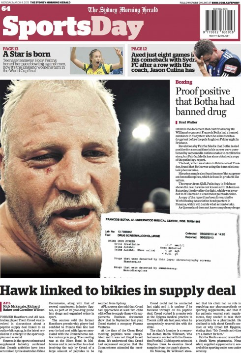
Sports section opener
World section double spread
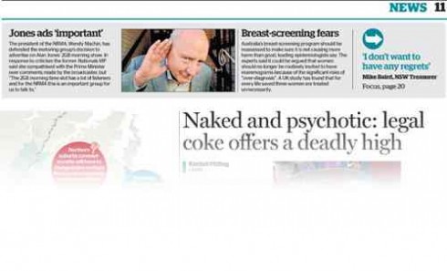
What’s new with the SMH and The Age?
Typography: If there is one thing that we all dread on the day a new look launches for a newspaper is what we know will happen for sure: many calls from readers who believe the body type got smaller and more difficult to read. Well, says art director Matt Martel:
Our body type is about 10% bigger than in the old paper. It is a noticeable improvement. Space between the lines has also increased by 10%.
Body type: With the new look comes a change for body text from Utopia, set at 8.8pt on 9.5pt leading, to Benton Text Grade 3, in 9.5pt on 10.5pt.
Headlines –
Sydney Morning Herald retains Miller Display.
The (Sydney Morning) Herald’s headline face in news, Miller Display, works really well and we have left it alone.
Body text is set in Benton Text
Color palette and navigation: With the new format and look also comes a color-coding system to help with navigation. Page elements such as the straps that say “News”, as well as bylines and other key elements, now take a specific color. See the color palette below.
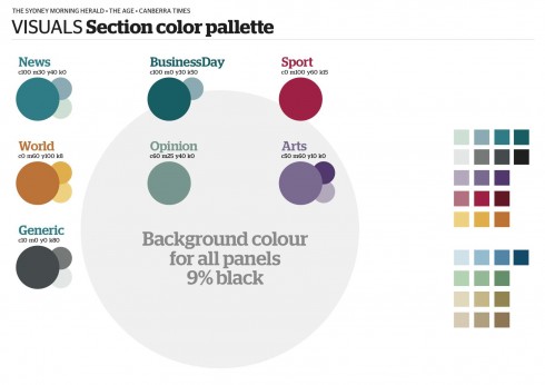
Color palette guides the new design through section color coding
The balcony:
Look at those top of the page balconies that we all agree generate interesting traffic and allow editors and designers to present facts, numbers, quotes and other “finger reading” material while making them prominent.
Here’s how Matt describes the use of balconies:
From our research, we know that people read the top of the page first and that they like briefs, snippets, big numbers. But we also wanted to keep the number of stories high, as with the length of stories. To enable us to do that, we are running this sort of “finger reading” across the top of many internal pages.
Here is an example of the balconies that will run through many inside pages, allowing for finger reading
Weekly sections:
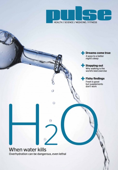
The various sections of the newspaper have also been carefully rethought and redesigned. Readers will be happily surprised with these sections, which include: The Guide, Money, The Shortlist and Pulse. Good Food was relaunched late last year and remains unchanged.
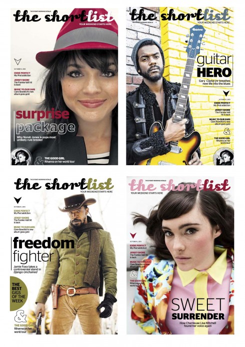
The newspapers carry an assortment of special sections during the week, each covering specific content areas and with its own look & feel.
Reader reaction so far?
I asked Matt Martel for some early feedback from readers, and this is what he wrote me:
Reader reaction has been largely fantastic for the print edition. Few little things to fix, but nothing that has crushed my soul yet.
Who is who?
During my visit to conduct workshops for this project in Sydney, I worked closely with Matt Martel, national presentations editor, as well as with Bill Farr, senior lead designer for The Age of Melbourne.
Editors:
Garry Linnell,editorial director
Sean Aylmer, Editor in chief of The Sydney Morning Herald
Andrew Holden, Editor in Chief of The Age
Mark Fuller, weekday print editor of The Age
Richard Woolveridge, weekday print editor of the Herald
Michael Howard and Dionne Gain, joint art directors of the Herald
Matthew Absalom Wong and Richard Giliberto, joint art directors of The Age
Mary Louise Brammer, sections and magazines art director
But Matt Martel adds:
…and thanks also to the many who contributed to making this project possible.
Of related interest:
Take a look at the new websites for both papers:
www.smh.com.au
www.theage.com.au
Two of Australia’s most noted newspapers go tabloid: will the content follow suit?
http://www.niemanlab.org/2013/03/two-of-australias-most-noted-newspapers-go-tabloid-will-the-content-follow-suit/
Lamenting broadsheet but daily ritual lives
http://www.smh.com.au/comment/lamenting-broadsheet-but-daily-ritual-lives-20130228-2f957.html
The shrinking newspaper may be just what the doctor ordered
http://www.smh.com.au/comment/the-shrinking-newspaper-may-be-just-what-the-doctor-ordered-20130302-2fd94.html
Highlight:
Fairfax has taken a conservative approach to its change of format, rejecting a more dramatic reworking of page one suggested by guru Mario Garcia. As a result, apart from downsizing, The Age and The SMH will look pretty familiar when they come out on Monday – headline fonts are largely unaltered and the body type has a similar look, but is slightly larger and easier to read. The papers’ approach to journalism will also stay the same – readers have been assured it will be serious and thoughtful. Hence the company’s preference for the word ‘‘compact’‘.
Brand campaign and info is here
http://forevercurious.theage.com.au/
http://knownoboundaries.smh.com.au/
Blog posts from Matt Martel, SMH national presentations editor:
The Age:
http://forevercurious.theage.com.au/blog/compact-design/
The Sydney Morning Herald
http://knownoboundaries.smh.com.au/blog/compact-design/
The Impact of the Compact
If you are considering taking your newspaper to the compact format, download and read my white paper, The Impact of the Compact, available free, here:
Of interest today:
Americans falling out of love with full sized iPad, analysts say
http://www.bizjournals.com/sanjose/news/2013/03/01/americans-falling-out-of-love-with.html?ana=twt
Where’s Mario until March 21, 2013?
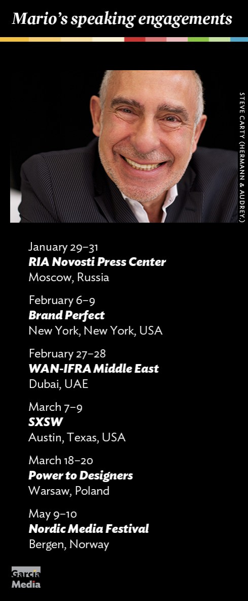
Mario’s upcoming speaking engagements
Take advantage of our iPad Design/Ad Lab workshops
Do you want to take your brand to the next level by creating a tablet edition? Garcia Media can help. We now offer one- to two-day iPad Design Lab workshops on demand to jumpstart your presence on this exciting new platform. We also offer iPad Ad Lab workshops to develop engaging advertising models for your app. Contact us for more information.

Purchase the book on the iBookstore