Black on white works best
I am not one for very precise rules when it comes to design. I have seen many so called “rules” totally abandoned with much success. Yes, in the hands of skilled designers and art directors things can work even when the designer does not adhere to the rules.
However, if there is a universal truth is that it is easier on the eyes to read black type on a white background, the opposite, especially in long texts does not contribute to effective reading.
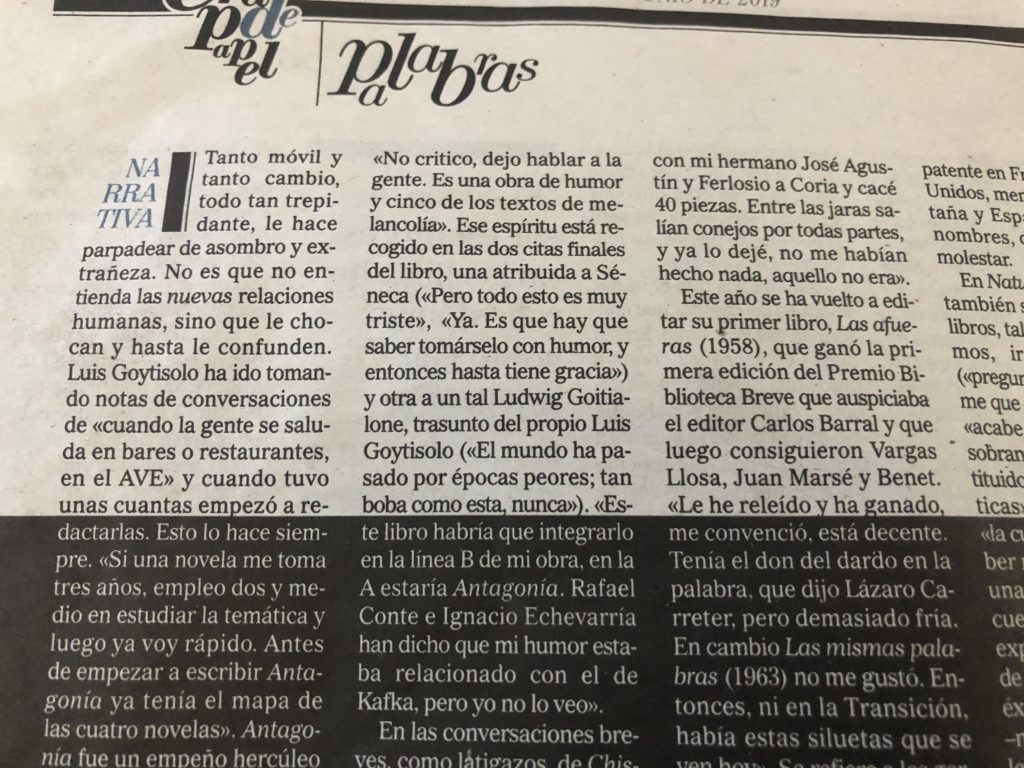
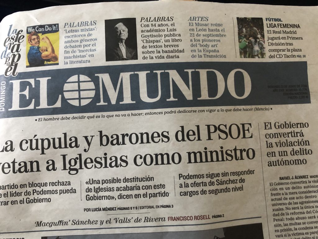
Such was my frustration this weekend while trying to read a story in El Mundo, of Spain. This is, of course, among the best designed newspapers in the world, so we are not addressing here the universality of El Mundo’s design and art direction. This is about one specific example, the page you see below, where one begins to read the story in normal black type over white, but suddenly there is a bridge into what appears a dark cave of white type on a black background. The story goes mid sentence from light to dark. I stopped reading right there. Tell me what you think:
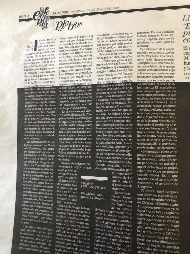
Notice below how the type goes from background of the page goes from light to dark in mid sentence. Not good.
One more time: why can’t the FT make text type bigger?
I may sound like a broken record, but maybe someone at the FT will hear my lament. I like the FT. I especially like the FT Weekend, which I usually get at the airport lounge and carry with me on the next flight. While the headlines seduce me, the moment I try to read the story, it is a struggle, so I turn to the digital edition where I can read it more comfortably.
In today’s environment, with readers already flocking to digital for a variety of reasons, why would we push them in that direction by making type difficult to read?
It does not make sense that this situation persists. Take a look here:
Am I the only over 65 reader who notices how difficult it is to read the FT’s text?
Anyone listening?
Previously in the blog about FT:
The Financial Times needs to make text type bigger
Caring for the language
I am always fascinated by how newspapers and magazines in Spain make it a part of their regular coverage to publish stories about the language. Frequently, I find myself reading about changes in the Spanish language, specifically new Anglicized words that drop into common usage, such as Tuitear, for To Tweet for example.
My point is that I don’t see this type of language coverage in many of the English-language publications I read. I believe that the general public has an interest in new developments in the language they use daily. I am not referring to articles about grammar, but more about the words we choose to use. This is what Spanish language newspapers do so well.
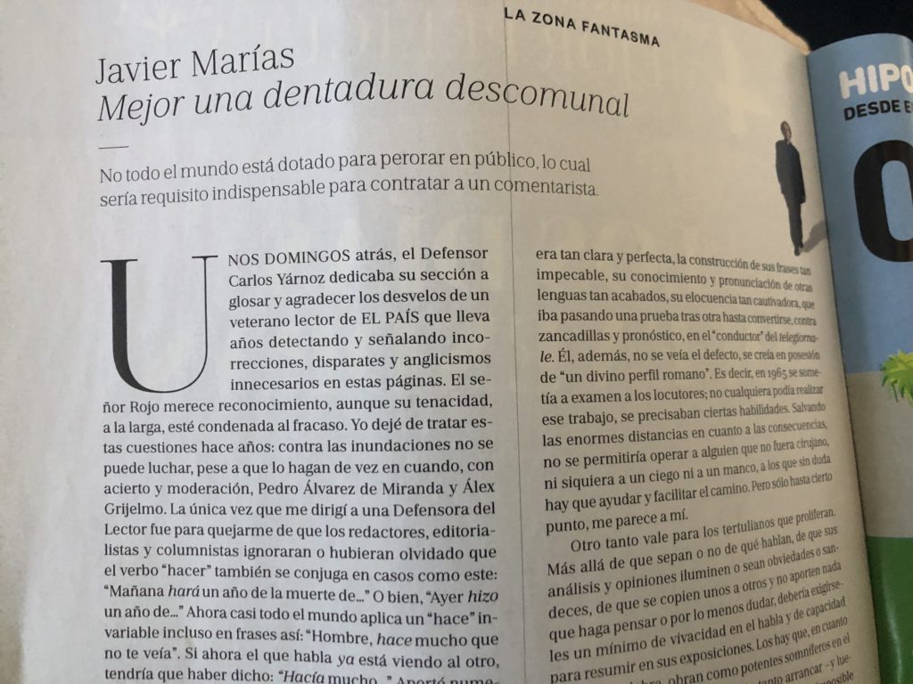
In this column that appeared in last weekend’s El Pais Semanal, the Sunday magazine of El Pais, the writer advocates better use of a past tense for the ver to make, and cites how frequently the verb is misused in daily conversation. Bravo to El Pais for offering space for such articles.
Then there is a President who can’t spell
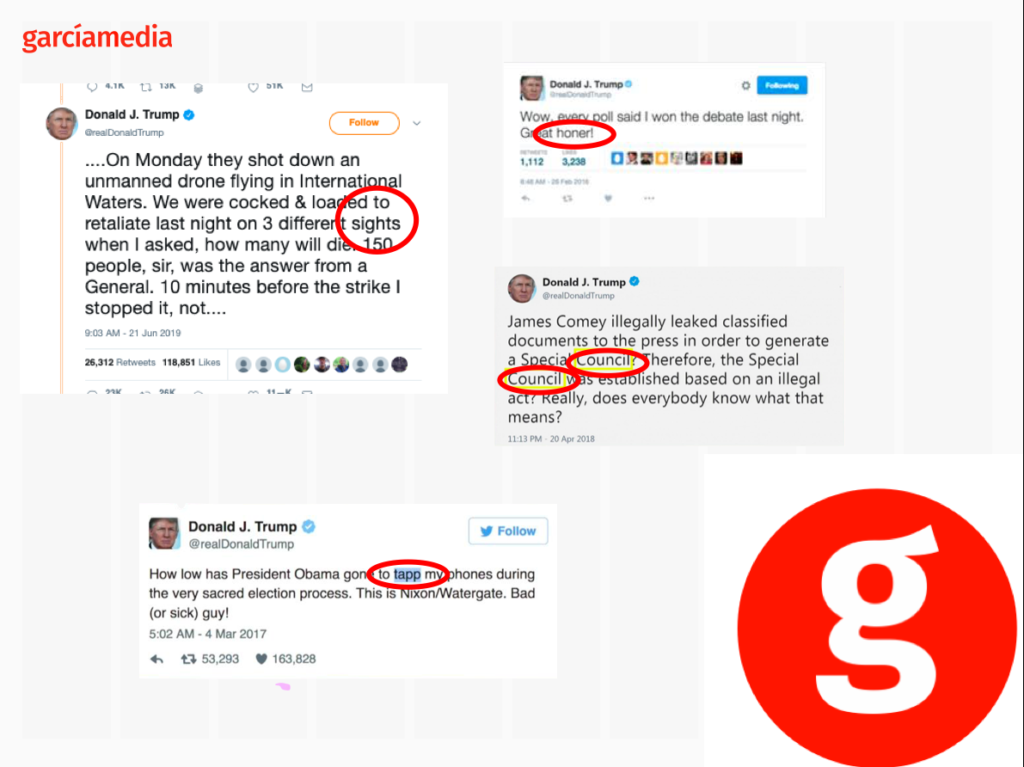
This has nothing to do with partisan politics and everything to do with proper spelling. I have to say that it is quite a spectacle to see our President of the United States, Donald Trump, misspelling words in so many of his Tweets. I see them, shake my head and, like many Americans, wonder if there is someone minding the store, looking over the President’s shoulder with a copy of Webster’s Dictionary.
I don’t think the media pays enough attention to this phenomenon, and I wonder what those editors in Spain would do if their Prime Minister would trample the Spanish language and misspell words the way our President does.
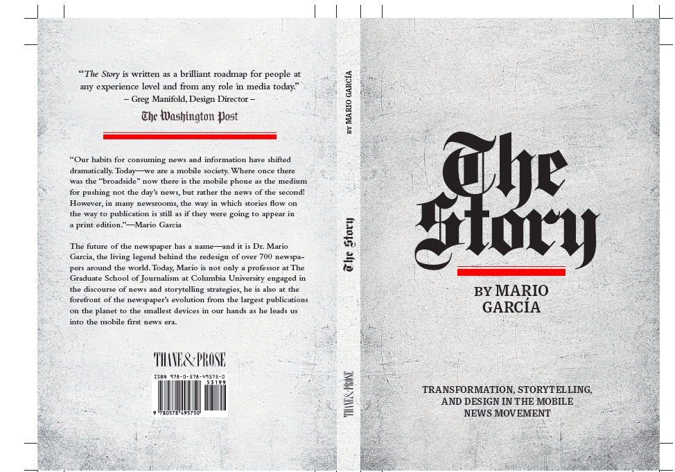
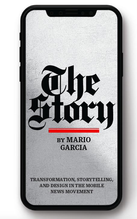
Now a print edition of The Story
I am happy to announce that we will, indeed, have a print edition of my mobile storytelling book, The Story. I thank you for expressing your interest to our publisher, Thane Boulton, of Thane & Prose. Now the print edition will be a reality, and you can already see the cover and back cover here:
Here are a few examples:
Pre-order here:
https://thaneandprose.com/shop-the-bookstore?olsPage=products%2Fthe-story
Mario’s speaking engagements
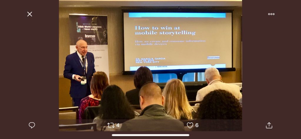
Here are places where I will be taking the message of mobile storytelling in the weeks ahead:
July 11, Florida Media Conference, St. Petersburg, FL, Keynote for editors: The mobile first newspaper strategy.
Mario’s weekend rituals…..
Monocle interviews me about what I do on a typical weekend (is there such a thing? Not for someone like me who is seldom in the same location twice. But I gave it my best shot, for what may come as a normal weekend, when I am home in New York! Enjoy.
https://monocle.com/minute/2019/04/27/
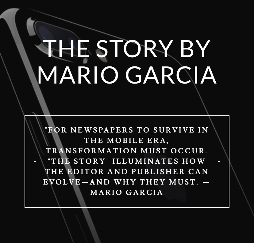
Pre-order The Story
The newspaper remains the most powerful source of storytelling on the planet. But technology threatens its very existence. To survive, the Editor must transform, adapt, and manage the newsroom in a new way. Find out how, pre-orderThe Story by Mario Garcia, chief strategist for the redesign of over 700 newspapers around the world.
Order here:
https://thaneandprose.com/shop-the-bookstore?olsPage=products%2Fthe-story
An interview of interest
http://www.itertranslations.com/blog/2019/3/11/fd60ybflpvlqrgrpdp5ida5rq0c3sp
TheMarioBlog post #3082