Last August I blogged about my shock when I picked up a copy of USA Today’s print edition and was faced with long (and wide) columns of just text. Fewer graphics. Fewer photos. And, overall, no attempt to disguise that apparent lack of interest on the part of the USA Today designers to make the pages more attractive.
Here is what I wrote then:
Whatever happened to the vibrant USA Today? Whatever happened to the newspaper that set the trends for the use of infographics to enhance stories? Whatever happened to secondary readings that expedited the process of getting information? And, yes, whatever happened to subheads, pulled quotes, and many of the other visual elements that made USA Today the darling of editors and designers everywhere, or which prompted others to call it the McPaper?
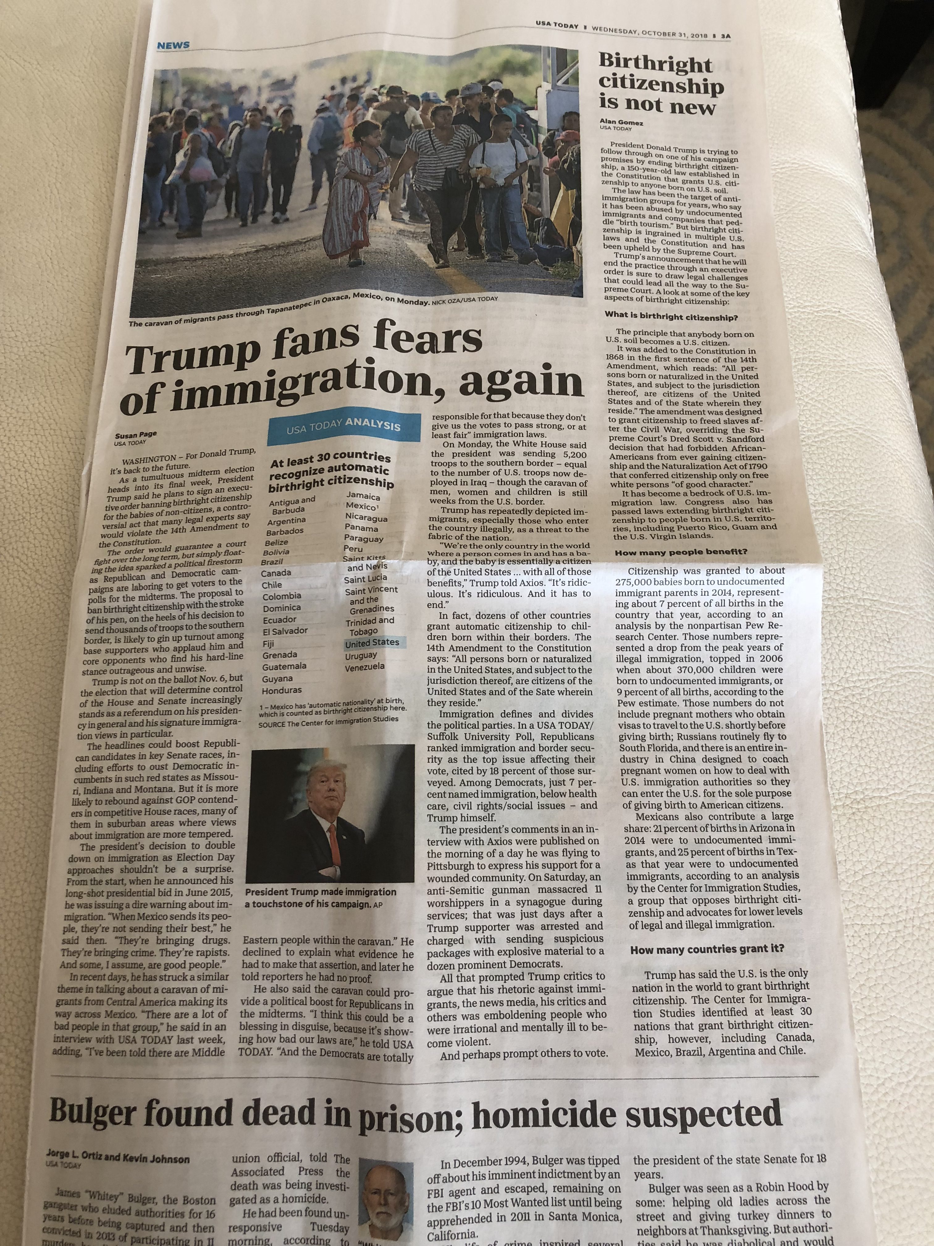
Well, I was passing through Atlanta last week and, again, found an unrequested copy of USAT delivered to my hotel room . I sampled it and, again, I wondered if we have robots doing the layout of the pages. It is sad that this degree of design neglect has come upon one of the most visuals of newspapers ever. This is the front page of that edition. By the way, as a formerUSAT staffer reminds me:
The “USA TODAY SPECIAL REPORT” story looks like any other story on the page –the story below it also has a two-line, three-column headline — except for the label. I wonder why the presentation of a special report doesn’t look more special, more inviting?

But, to the specifics:
Why a three-column format?
There seems to be a tendency to emphasize a three- or four-column grid.. This makes those columns wider and the blocks of text create more gray on the pages, as we see here.

…Or four columns?

By the way, the 1982 USAT used a 7-column grid on section fronts, and did so for nearly 20 years, as by the original and innovative Richard Curtis design.
Even templates can make pages look better
Is there anyway to break those masses of gray? Ironically, it was the USAT of its early days that taught the rest of us how to make newspaper pages more enticing, with the inclusion of graphics, short takes and snippets of information. That Styleguide has apparently been dumped on the Potomac, or wherever these USA Today pages are put together—definitely NOT designed— today.
Yes, I am aware that it is a different time, and that now there are hubs where pages are produced in an assembly-line fashion. Still, templates should be created that make the experience of reading in print more palatable.
The “jump page” below includes two jumps. USAT formerly jumped only one story per section front: The branded “Cover Story” (an enterprise effort that was abandoned something during the last 10 years). I remember my admiration for USAT for avoiding multi story jumps. That, too, appears to be abandoned in the new print editions.
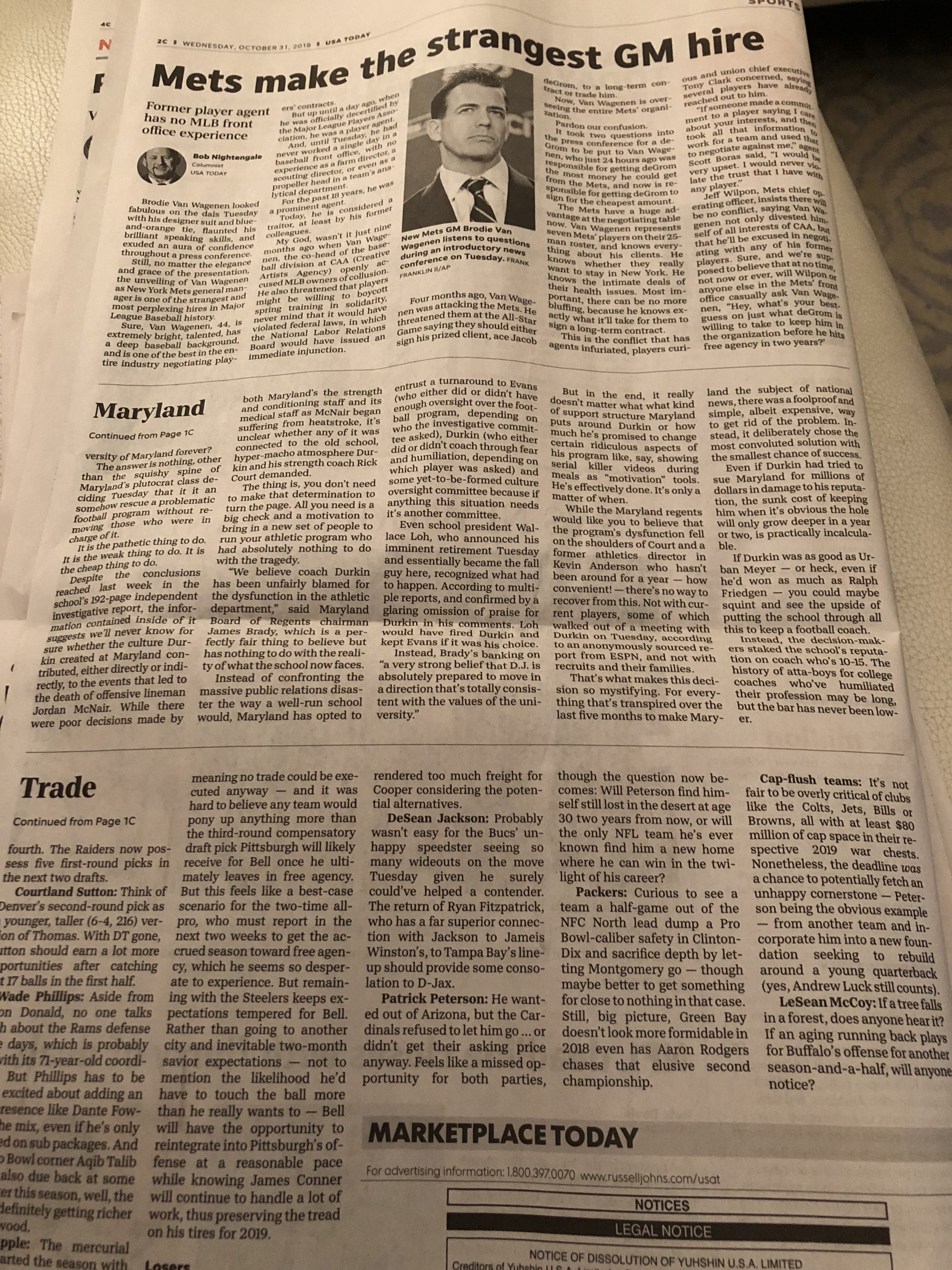
Here is a page using the four-column format in the edition I reviewed which is effectively designed. So perhaps this is not so much a matter of the four-column grid itself, but the care and attention that the designer gives the page. This one I like because there is contrast between the visual elements, the size of headlines, and a breakout to offer additional information at a glance for the main story. Notice also subheads in the text. Why can’t USAT do more pages like this? Is the design of the print edition now left to the will and moods of the designers doing it?
It’s a recurring theme

The decline of good, functional page design at USAT has evolved over the last two years. Take a look at this August 20, 2018 front page, sent to me by a designer friend with this comment:
I’m attaching a photo I shot of USAT copies displayed on a table at a hotel in New Bern, N.C., in August. I was shocked: Except for the pop-out photos in the nameplate the only “art” above the fold is a pair of head shots.
The LIFE department folks try
You can tell that if the old style guide lives somewhere, it is probably seating on the desk of the designers who do the LIFE pages, which still show a bit more life than the rest.


Doing Print Happily
This is one of the themes in all of my workshops: that you can pay attention to print, that it does not have to be abandoned to its own luck.
USAT used to be the flagship of the Gannett group. Perhaps it isn’t anymore. I suggest you take a look at this piece about how Gannett steps away from printed election results for today’s Midterm Elections in the USA.
It is all right for usatoday.com to be the new flagship. I am all for that, but one does not have to neglect one of the brand extensions to the degree that it appears to be happening here.
As I wrote just now to a good friend who happens to be a Gannett executive:
I am a friend and fan of USA Today from the get go. It hurts to see these pages looking like this. Why not kill the print edition and put it out of its misery? I bet the ads bring in money. Either you do print happily, giving it its place in the overall multi platform environment that is a modern newsroom, or else.
I like USA Today. I have always championed (and loudly) the influence that the design of this newspaper has had on visual journalists globally. I know I have learned much about what is possible visually on the pages of a printed newspaper via USA Today. I am hoping that my blog posts on the subject of its visual deterioration will be red flags—maybe some will hear my voice as that of a friend that hopes helps is on the way to put some life back into a newspaper that is nothing short of newspaper design legend.
If newspapers ended up at a hospice, the print edition of USA Today may be at the door of one, in my view.
It doesn’t have to be.
Anybody listening?
Our other blogs on USA Today
Tomorrow in this blog
How The Wall Street Journal manages to keep its print design lively and close to the 2002 redesign. It can be done.
TheMarioBlog post #2942