TAKEAWAY: It is, by all standards, an iconic newspaper: USA TODAY has inspired a generation of journalists and designers globally with its color, use of graphics and short stories. Now, 30 years later, it unveils its major redesign of consequence Sept. 14. This week, TheMarioBlog, will take a look back and reminisce about USA TODAY and how it has forever changed our idea of newspaper design. Part 2 today: We chat with a variety of industry experts about how USA TODAY impacted our craft and their work. AND: Suzy Parker, senior illustrator at USA TODAY reminisces and shows her favorite stuff.
Update #3: Tuesday, Sept. 11, Kuala Lumpur, 09:42
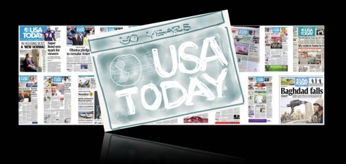
USA TODAY is planning a major relaunch of its newspaper, website and mobile platforms, complete with a new logo this Friday, September 14, the day before the newspaper turns 30.
In anticipation, I have decided to devote TheMarioBlog this week to highlight the impact that USA TODAY has had on the way we look at newspaper design and visual storytelling. To that effect, I am talking to those who were directly involved with its creation, as well as people in our industry, veterans and newcomers, for their assessment of how this iconic and game changing publication carved a line in the timeline of newspaper design history: before and after USA TODAY.
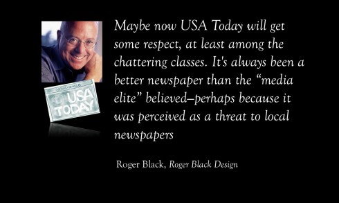
Roger Black, Roger Black Design
Roger: Restore some of the brightness of the original design
Maybe now USA TODAY will get some respect, at least among the chattering classes. It’s always been a better newspaper than the “media elite” believed—perhaps because it was perceived as a threat to local newspapers, perhaps because they didn’t read it. I was at The New York Times when it arrived.
At the top of the newsroom, just outside the executive editor’s office there were three big ring binders with the recent back issues of the Times, the Washington Post, and the Wall Street Journal. Abe Rosenthal ordered that a fourth binder be added to contain USA TODAY. When it appeared, you would have thought he had put Pravda out there. There was genuine outrage. “Television you can wrap fish in,” became the mock motto repeated by news folks who liked to think that the paper was dumbing down the news.
But what they did was to make the news more accessible. Their innovative ideas were widely imitated. Pop culture content of the “Life” section —absent from most papers in the 80s—is now a staple. Information graphics were widely adopted.
If the redesign had been assigned to me, I would look to restore some of the brightness of the original design. You could start with those primary-color section flags, and add a bit more sophistication. As an exercise, compare a 1982 Buick to a 2012 model. (The question is, is it still a Buick?) The early typography was a bit generic (Times and Helvetica for crying out loud!) but before changing typefaces I would try to re-stage the current font, Gulliver. For example, the text would be more readable if it were smaller, with more space between the lines.
Suzy Parker reminisces: Getting over “page fright”
Suzy: Here is one of those early mechanical drawings with amberlith
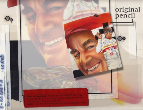
Suzy: This one was an award winning illustration and one of my favorites
Suzy: These rank high up there among my favorites through the years
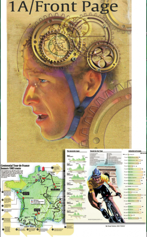
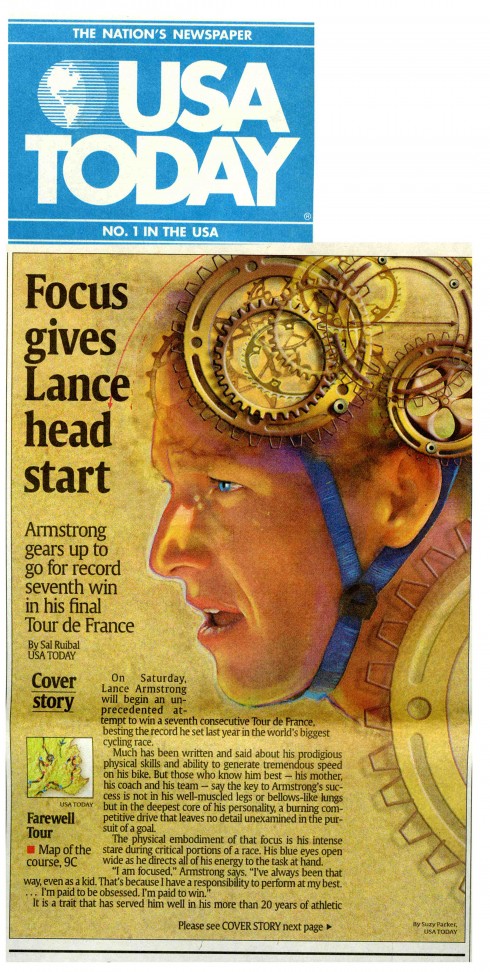
Here is how the Suzy Parker illustration of Lance Armstrong appeared on Page 1 of USA TODAY. J Ford Huffman, former deputy managing editor of USA TODAY, remembers it well:
Thanks to Suzy’s sending me her Lance portrait I remember its genesis: We were trying to communicate the inner Lance: His obsession with details when riding and when preparing to race.
The other Lance piece that I recall is Bob Laird’s: Lance as a saint in America’s eyes (back then, anyway). With a wheel and spokes as his halo.
Suzy Parker , a senior illustrator with USA TODAY, has been in the trenches of the multi colored newspaper since the beginning.
I first interviewed with Richard Curtis six months after the first paper so I was not here for the launch. But this is how it started for me,” she says.
“When I arrived for an appointment with Richard I was dismayed to find the building’s interior unfinished and the elevator didn’t yet go to the floor I needed to get to. But after finding Richard in the graphics office on the 15th floor I presented my portfolio. He thought it looked great ( I was happy) but he said the staff was already filled for the next two years ( I was crushed). I left feeling miserable, thinking I had missed my calling. But within a few months I was called back and finally hired in October 1983.
“Richard gave me a deadline right away to get over what he called ‘page fright’. It was an eye opener for me. What had once been 3-4 day deadlines became 3-4 hours and what had been full page cover art for magazines became 3 columns. It was also not all full color. In the beginning, only front news section pages were 4 color and the rest was spot color. So the many covers I did for the Life section were pencil halftones with spot blue acetate overlays. Many overlays. There was a lot to learn and little time. I decided this job would be temporary.
“The desk I inherited belonged to a former artist who had moved on. When I opened the drawers I discovered my future in news. They were filled with Excedrin and Pepto Bismol. Those staples remain today and for the next 30 years.
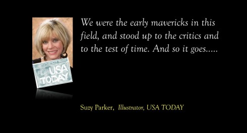
“We’ve witnessed, shared and reported so much history here as a team and as a family. We were the early mavericks in this field and stood up to the critics and the test of time. And so it goes……..
Jeff Goertzen, Jeff Goertzen Media Design
Jeff: USA TODAY’s people created the complicated on deadline
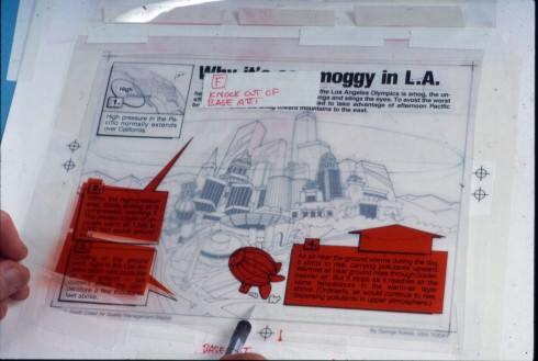
Jeff: George Rorick used mechanical color flaps to be able to do sophisticated color on deadline.
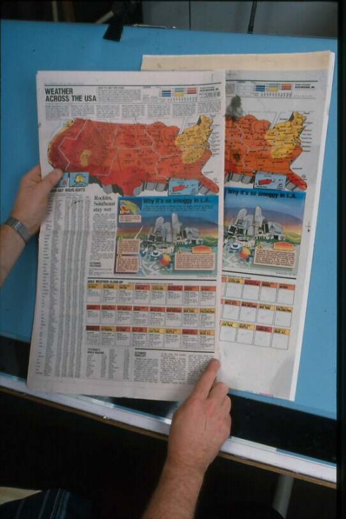
Jeff: here is that famous USA TODAY weather map
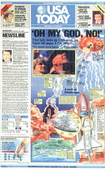
Jeff: This graphic of the Space Shuttle Challenger explosion was a perfect example of how quickly this staff could produce a very complicated, informative graphic on deadline
Jeff: Web Bryant’s collage-style of blending human subjects with images of their work environment was a trademark for USA TODAY front-page illustrations. I still admire that style.
I can’t think of any other newspaper that has influenced me more than USA TODAY. As a young graphic artist back in the late 80s, I was always inspired by their graphics and illustrations. Their graphics department was a “dream team of sorts” — George Rorick, Sam Ward, Suzy Parker, John Sherlock and Web Bryant — their work was phenomenal, and would leave all of us scratching our heads wondering how such great work could be produced on deadline. And this was before Mac computers!
This graphic of the Space Shuttle Challenger explosion was a perfect example of how quickly this staff could produce a very complicated, informative graphic on deadline. Their secret was to work as a team. Researchers and artists divided the graphic into sections and then assembled it as one graphic. It was an assembly-line concept that would be soon be the standard for deadline projects.
George Rorick was notorious for creating the famous color-coded weather map that has been copied by countless newspapers and television stations around the world. When George left USA Today in 1986 to work for The Detroit News, he hired me as a graphic artist. The knowledge he gleaned from USA Today, he passed on to me. That knowledge has always been the foundation of what defines me as a professional to this day.
George Rorick used mechanical color flaps to be able to do sophisticated color on deadline. Another trick of the trade for producing complex color on deadline.
In 2003, I had the pleasure to chat with USA Today artist, Web Bryant who shared with me his illustration techniques. His collage-style of blending human subjects with images of their work environment was a trademark for USA TODAY front-page illustrations. I still admire that style.
The short time I spent working as art director for this department was the highlight of my career. There isn’t a designer, journalist or graphics artist in my generation that wasn’t influenced by the innovative concept of USA TODAY. Let’s see if this redesign repeats history.
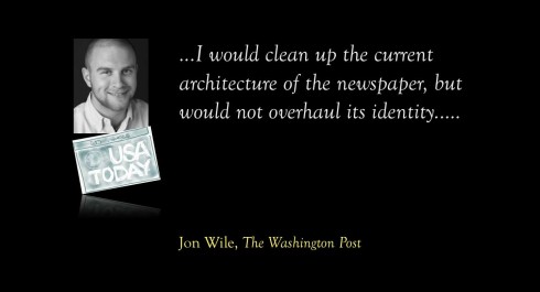
Jon Wile, senior news designer, The Washington Post
Jon: I equate USA TODAY from my childhood with travelling
Jon Wile is one of the most talented news designers around. He was a young child when USA TODAY appeared in 1982, so I asked him two questions about the impact of this newspaper on him and his career.
Mario:
You were a child when USAToday came out, but perhaps you remember seeing it growing up, since your interest in newspaper design was probably keen at an early age.
Not surprisingly, I remember the color pages and graphics from USA Today. I always enjoyed the sports section because of the graphic at the bottom of Page 1 (I loved that content!), plus they offered more statistics than my local paper. I equate USA Today from my childhood with travelling. It was always at hotels I would stay at, so it felt more important to me because it was a national newspaper.
Mario:
Did USA Today have an impact in terms of career decision?
It did not have an impact on my journalism career.
Mario:
If you were in charge of the redesign today: what would you do?
I would not dramatically alter who we are. The USA Today brand is a strong one, especially the nameplate with its color and look. I would clean up the current architecture, but wouldn’t overhaul the identity of the paper (nameplate, rails on section fronts with tidbits, etc.). The biggest area I would focus on is typography. I would try to find a more modern face for headlines and figure out a way to improve readability throughout all sections (ex: a new body copy that works well with the shrinking paper web).
Our previous blog posts about USA TODAY:
USA TODAY turns 30: Part 1—Looking into the attic for those early sketches
https://www.garciamedia.com/blog/articles/usa_today_turns_30-part_1-looking_into_the_attic_for_those_early_sketches
Chatting with Tyler Brulé on Monocle Radio’s new show, The Stack
Listen to my chat with Tyler Brulé about future of print in Monocle Radio’s The Stack here:
http://www.monocle.com/24/shows/stack/
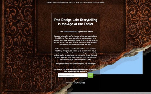
Sign up to get information on my new digital book
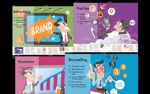
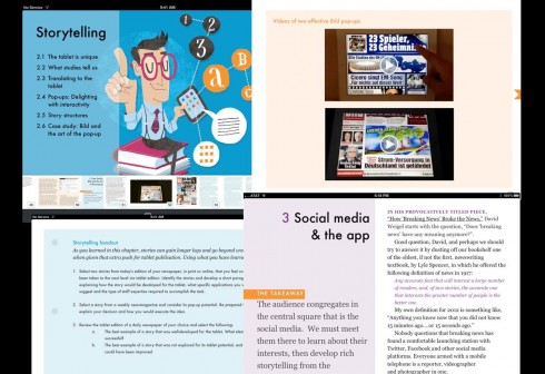
Assorted screens from the book: top, chapter openers all of which are color coded and carry illustrations by Luis Vazquez, of the Gulf News of Dubai; second image, opener of Storytelling chapter, and two inside screens.
As we get closer to publication date for The iPad Lab: Storytelling in the Age of the Tablet, we are now set up so that you can give us your email address and you will automatically be informed when the book is ready for download.
Now you can leave your email address so that you will be updated and informed the moment the book is read for download.
Simply go here:
http://ipaddesignlab.com
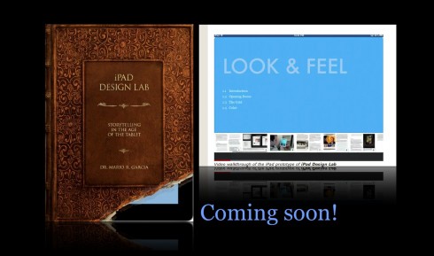
Video walkthrough of the iPad prototype of iPad Design Lab
SND Scandinavia Space 2012 conference
Still time to get a spot to attend the SNDS conference in Copenhagen, Sept. 27-29;
For more information:
SNDS workshop ever. Read all about SPACE 2012 here:
Mario Garcia’s upcoming speaking engagements:
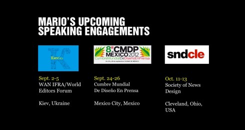
Cumbre Mundial de Diseño en Prensa 2012: Mexico City; September 24-26
http://www.cmdprensa.com/mx2012/
SND (Society of News Design) Cleveland; Oct. 11-13
http://cle.snd.org/
1st Middle East News Design Conference
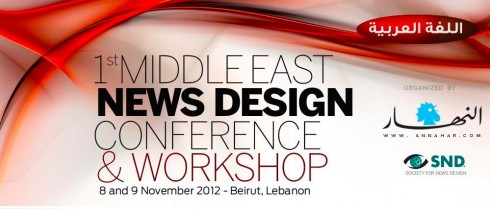
It promises to be a great program, and a historic one, too: the first SND Middle East gathering. Put it on your calendars: November 8 & 9, in Beirut, Lebanon. Sponsored by An-Nahar and SND.
For more information:
http://www.snd20events.com/conference/