Perhaps not many give much thought to what a printed daily newspaper should look like in the mobile era.
However, it is good to remember that there are plenty of newspaper print editions around the globe, and, according to WAN-IFRA’s recently released 2019 World Press Trends report print in newspapers still dominates, accounting for 85 percent of their revenue worldwide (down from 89 percent last year). When an editor proudly announces that “print is the cash cow” now he has the facts to back her up. Of course, and not surprising, the same 2019 World Press Trends reminds us that digital revenue is increasing.
But back to print and the design of a newspaper.
I am involved in three projects at the moment, all of which include redesigning the print edition of the newspaper. In each case, readers participating in focus groups flat out reject attempts at incorporating too many pages with what art directors tend to favor as the “magazine look”. This is not to say that a weekend edition can’t be more magazinish, but I am somewhat alarmed and surprised at the number of beautifully designed pages that are perceived as not belonging in a daily edition of a printed newspaper.
What is even more surprising, even the youngest readers, the so-called digital natives, tend to have an idea of what a printed newspaper should look like: more stories, more headlines and few, if any, “artistic” excesses, which they say should be reserved for magazines.
The specifics
Here are two sketches that show the type of pages that readers appreciate:
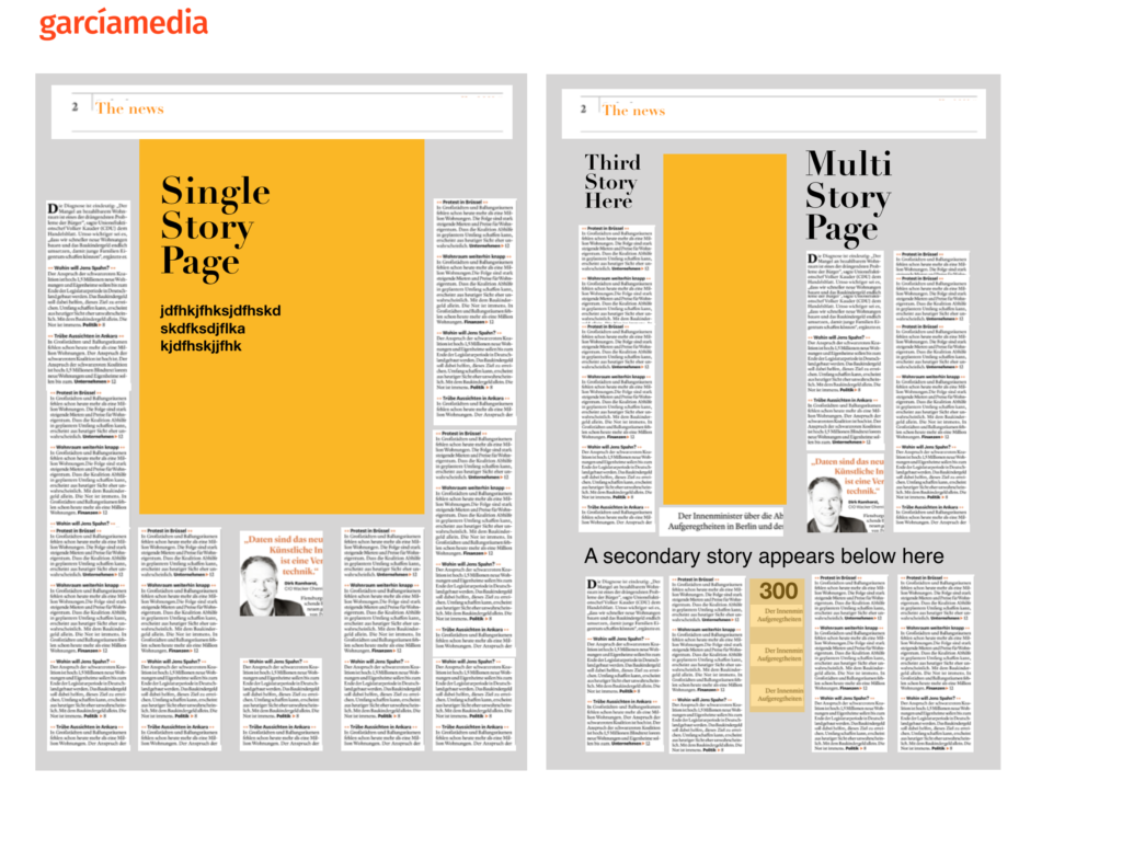
- Readers prefer single page treatments for news, as opposed to an overabundance of double pages.
- Readers can’t see the purpose of gigantic drop caps at the beginning of a news article. A 3-line cap will do, thank you.
- Readers consider excessive rivers of white space a nuisance as if the editors are cheating them from additional content.
- Readers like pages with two or three articles, not just a single topic.
- Readers favor opening pages of section with texts, not just a giant photo.
- Readers expect the pages of a printed newspaper to be clean, preferably in rectangular modules .
Indeed, for art directors this is reason enough to go and hide. I know, I hear them tell me so. Some art directors refuse to accept this reality and push ahead with artsy hedonistic design, in spite of the results that the focus groups present as evidence.
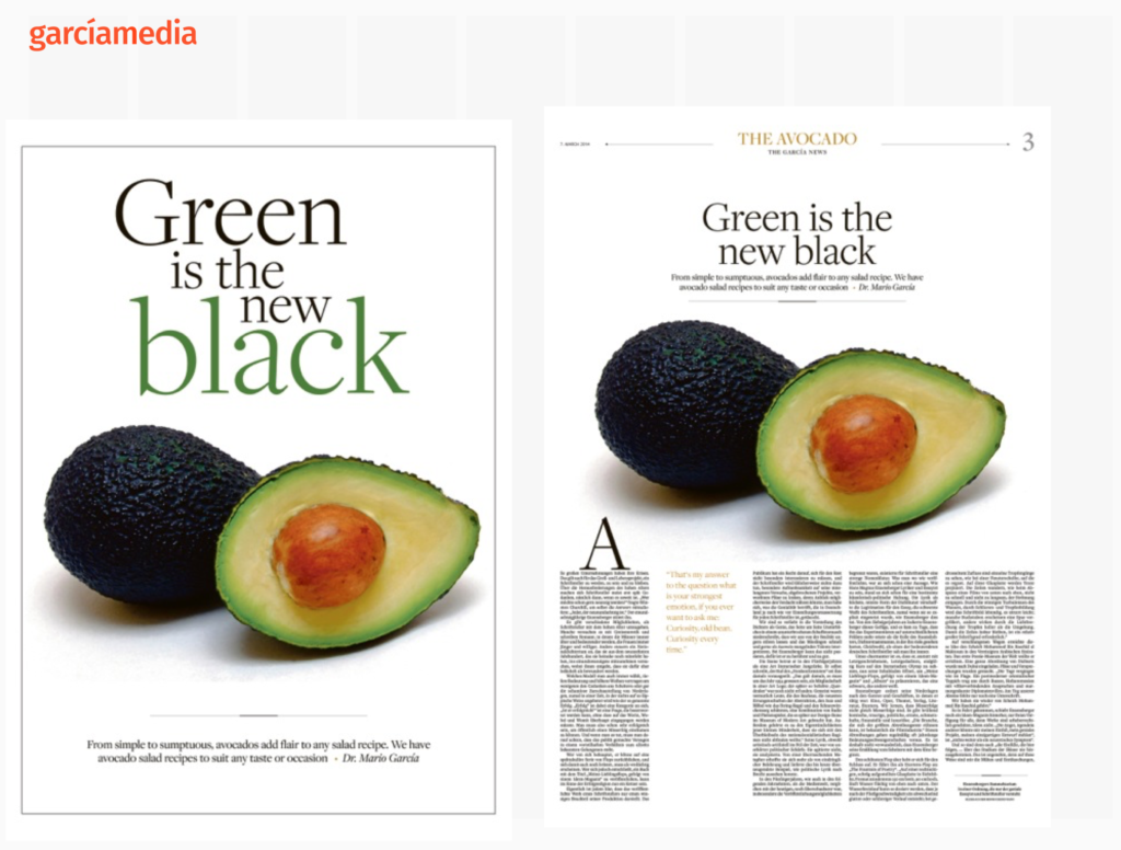
Let’s take a look at the examples below: Mind you, these are examples from the 1980s when I was already “making fun” of the so called avocado page during seminars at The Poynter Institute for Media Studies. The avocado page is a symbol of the excesses that some art directors indulge in. It was the same in the 1990s and today: readers prefer a page in which they can sink their teeth into the story, as opposed to a full poster. Look here:
The perception that so many readers have of what a newspaper should look like is nothing like many of the pages that win accolades from various design organizations around the globe. I am sorry to burst that festive balloon!
In 2020, as the mobile first era pushes ahead even more aggressively than it did in 2019, we are likely to see more traditional looking editions, sort of like when Coca Cola returns to its vintage bottle, the one I remember buying for 5 cents during school recess during my elementary school year. That’s how many of us perceive a Coca Cola product.
Back to the roots. A return to basics. Printed newspapers that honor traditions and simplicity more than becoming objects of art.
While we as media designers may have our own ideas of how the products we create should look, so do readers, too.
We live in interesting times.
Listen to my chat with Tyler Brulé in Monocle 24 Radio’s The Stack
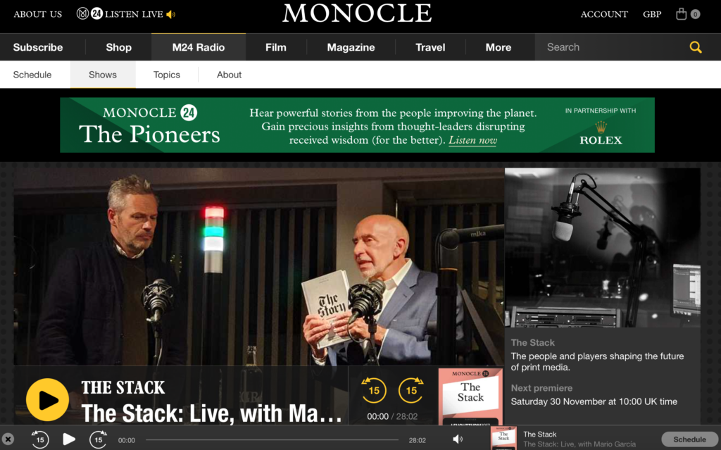
This episode of Monocle’s The Stack was recorded live during the launch of my book, The Story, in Zurich, November 20 before a live audience. Tyler Brulé and I talk about the state of the media today, the makings of The Story, as well as the meaning of doing print happily in the mobile first era. Tune in here:
https://monocle.com/radio/shows/the-stack/378/play/
From Monocle Weekend
THE INTERROGATOR / EDITION 30
https://monocle.com/minute/2019/09/21/
Mario García
Editorial consultant Mario García has advised the most important newsrooms in the world on design – and how best adapt to a digital transition. More than 700 publications, from The Wall Street Journal to the South China Morning Post, have received his strategic steer. Other than being an adjunct professor at Columbia University’s School of Journalism, he also runs his own consultancy firm: García Media. Nowadays his speciality is how digital devices influence narrative structure and consumption; his latest book, The Story, was written specifically to be read on a phone. Here, though, he confesses to a few analogue pleasures.
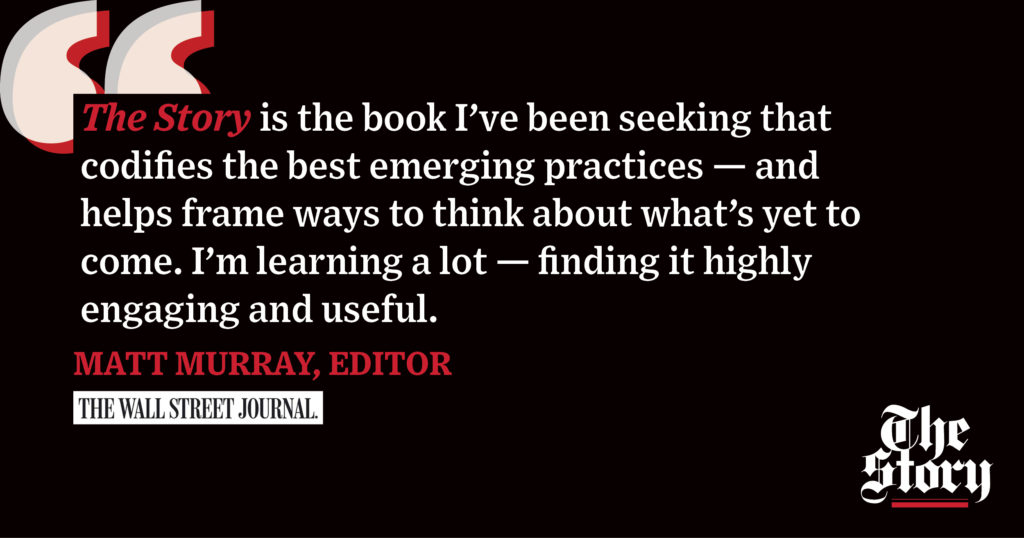
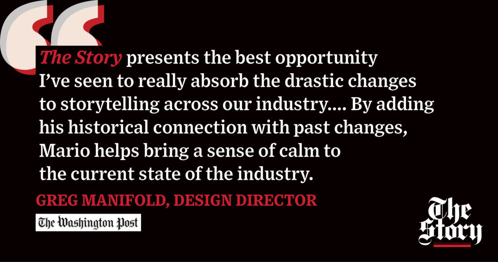
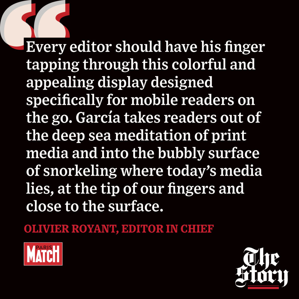
What they are saying about The Story!
The Story is here!
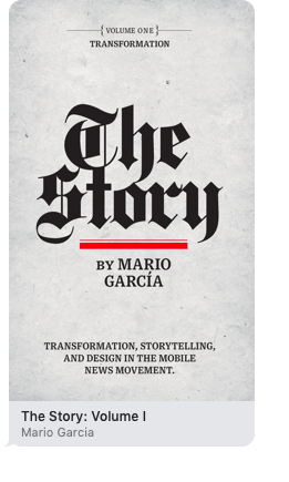
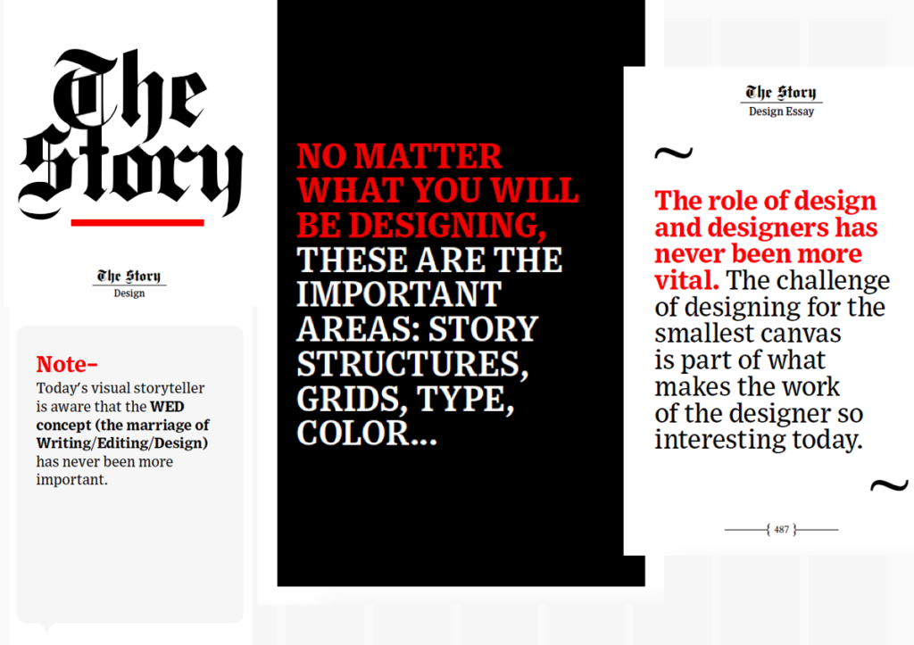
You can now download my new mobile storytelling book, The Story, from Apple Books at $6.99
This is Book 1 of a Trilogy! The other two books coming soon.
https://books.apple.com/us/book/the-story-volume-i/id1480169411
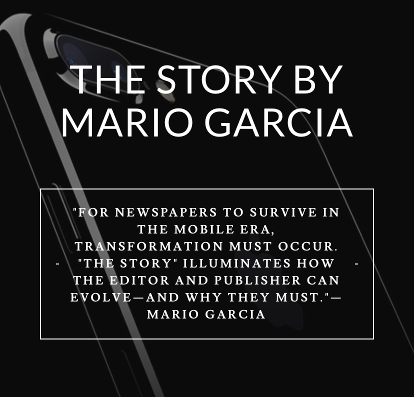
The newspaper remains the most powerful source of storytelling on the planet. But technology threatens its very existence. To survive, the Editor must transform, adapt, and manage the newsroom in a new way. Order The Story by Mario Garcia, chief strategist for the redesign of over 700 newspapers around the world.
My chat with in Monocle Radio
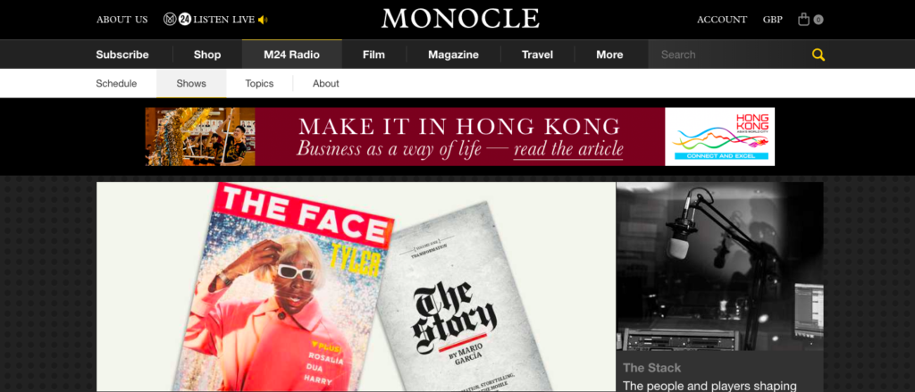
Listen to my chat in Monocle Radio’s The Stack: Latest episode‘The Face’ and ‘The Story’:We welcome the return of the print version of ‘The Face’ and talk to legendary newspaper designer Mario Garcia about his latest book, ‘The Story’.
https://monocle.com/radio/shows/the-stack/368/play/
My interview with CNN en Español
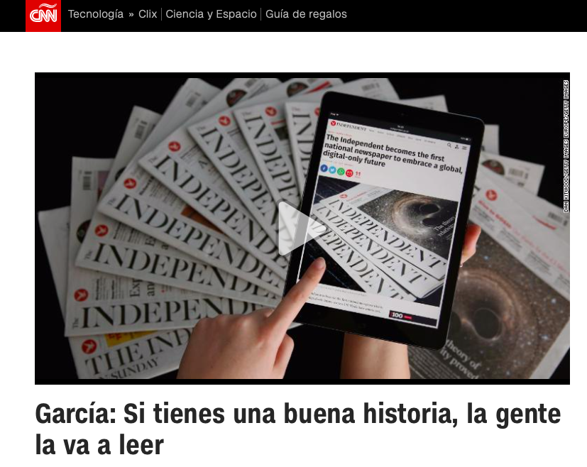
I was a guest in the program Encuentro, hosted by Guillermo Arduino daily at CNN en Español. The interview was about how we read on mobile devices and my introduction of my new mobile storytelling book, The Story, to a Spanish-language audience.
Mario’s speaking engagements
March 13, 2020
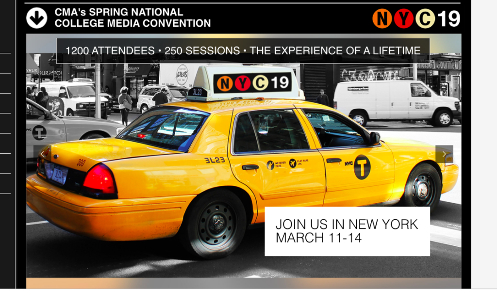
Keynote presentation at the National Media College Association Spring Convention, New York City, NY>
Order print edition of The Story
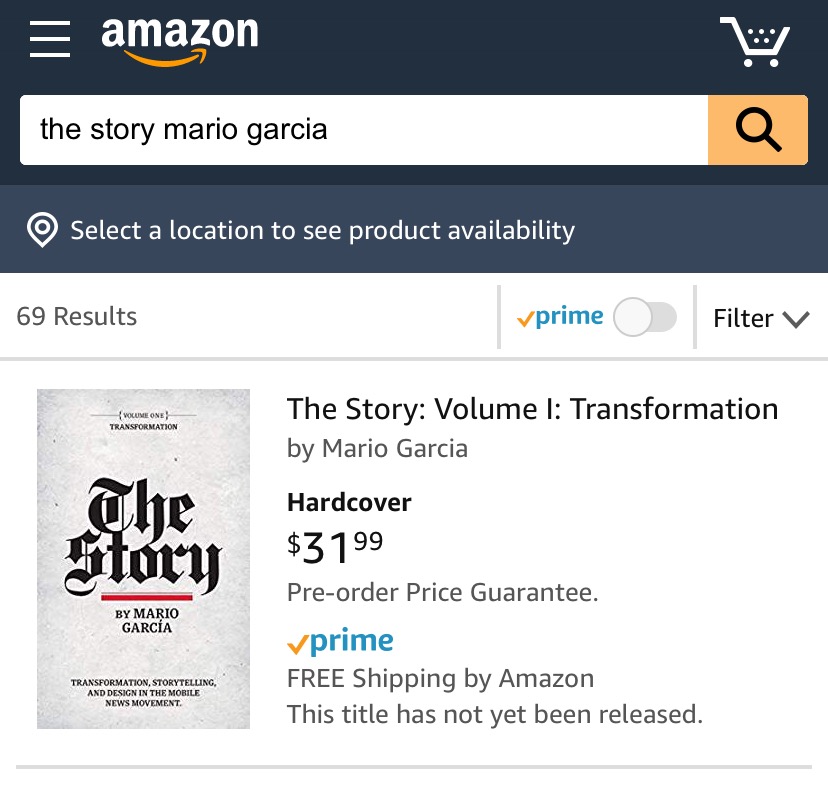
You can order the print edition of my new mobile storytelling book, The Story, from Amazon already here:
An interview of interest
http://www.itertranslations.com/blog/2019/3/11/fd60ybflpvlqrgrpdp5ida5rq0c3sp
TheMarioBlog post # 3172