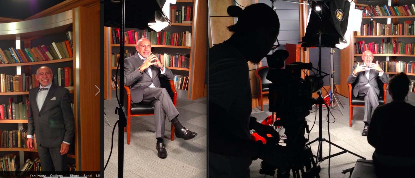
Photos taken during taping of my segment for Al Jazeera’s Listening Post (at the Columbia University Schooll of Journalism’s TV studio)
I am honored to be part of a conversation about type that will be part of The Listening Post, a media critique program. This specific segment will air sometime in November (will announce specific date in the blog here).
“The elements that make up the news media are almost endless – but one we have not touched upon is fonts. The cultural history of fonts and journalism, the history of typefaces in the move from traditional print to the internet, the different demands of print/internet/tv screens and how fonts have developed around these media,” says Marcela Pizarro, Al Jazeera producer for this show.
I have taped my segment at the Columbia University School of Journalism TV studio. It was a lively exchange exploring a variety of topics and questions.
Here are three of the topics discussed during my own 30-minute interview :
— For most people reading or watching the news, fonts are ubiquitous yet invisible. Yet fonts are a key part of storytelling. How can fonts sway perception in MODERN NEWS and JOURNALISM?
Preview short answer: The font one selects creates that first impression the reader/user gets about the content.
—You yourself have had an incredible career. You have overseen the redesigns of papers such as The Wall Street Journal, The Washington Post, South China Morning Post (Hong Kong), New Straits Times (Malaysia) to name but a few. Walk us through the one commission where you feel the FORM most impacted the CONTENT of news output.
Preview short answer: Each project is different. I believe that The Wall Street Journal and Die Zeit posed the biggest challenge, as they are well established iconic newspapers with very defined typographic palette. In both cases, we kept the fonts that existed.
-From internet to TV. Fonts and news screen furniture – fonts on screen are a different game altogether. Can you talk to us about how different channels need to reflect different tones on their screens?
Preview short answer: Part of my answer dealt with how different platforms have different requirements. I believe that for “at a glance” storytelling, as what we do with smartphones (and soon with watches), you need a bolder, perhaps sans serif, font that fan be quickly read and grasped.
For more about Al Jazeera’s Listening Post program
http://www.aljazeera.com/programmes/listeningpost/http://www.aljazeera.com/programmes/listeningpost/