MARIO: What was the greatest challenge in the redesign of Sunday Times?
AL: Modernizing the paper and introducing full colour without alienating any of
its core readers. And most importantly it was trying to rescue some of the
innovative visual journalism brought to paper years ago by pioneers as Peter
Sullivan and Edwin Taylor who made it a very influential content driven
design newspaper.
MARIO:Every redesign project has a highlight—a decisive moment or detail of
the design—that is both personally satisfying and contributes to make the
project unique. Which one was this moment for you here?
AL: There are two important highlights. Back in March, the day the Editor, John
Witherow, approved all typefaces proposed—most specially the new Sunday
Times Modern, designed by Eduardo Manso. And also four weeks ago when we got
the final colour test from the new print presses.
Actually, there is a third higlight, when Tristan Davies joined the Sunday
Times late in February. His inputs and his keen eye to spot good design made
me felt I had the best companion for what it had been a solo and rough
journey until then.
MARIO: What is reader reaction so far?
AL: It is still too early judge the changes but so far media buyers and readers
welcome them all. Readers find colour in every page enjoyable and helpful
and mostly all of them say it’s easier to navigate. Some really like the
energy and the mix of graphics and pictures. Just a few letters raised the
flag that perhaps the body copy is small. We are working on that and on
some other formatting inconsistencies that will help to deliver a better
paper.
————-
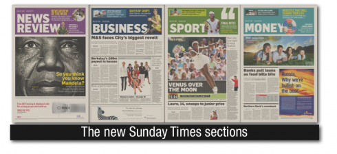
OF SPECIAL INTEREST:
The Sunday Times includes nine sections. Here is how the various fonts are utilized::
———
Broadhseet sections:
News: Sunday Times Modern (secondary Flama)
Business: Flama
Money: Flama
News Review: Flama
Appointments: Flama
Sport: Flama
———
Tabloid sections:
Travel: Flama Condensed + Flama Ultracondensed
Ingear: Flama
Home: Flama
REED SENDS US: Our well informed intern, Reed Reibstein, shares this interesting bit of information concerning the typography of the Sunday Times. Reed writes: I am loath to intrude on your vacation, but since you have been blogging about the Sunday Times redesign, I thought that I should mention that there is also an active thread on Typophile about the typography, especially Sunday Times Modern: http://typophile.com/node/47105 . Both Eduardo Manso and Mario Feliciano have commented on the thread and made some interesting observations, as have David Berlow, Nick Shinn, Alejandro Paul, Kris Sowersby, and others.
Thanks, Reed!
WE SEND YOU:
http://www.visualeditors.com/jackson/2008/06/the-times-of-london-redesign/
WHERE IS MARIO: Back to work, in Paris.