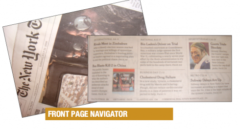
I continue to study the Page Two navigator—-or table of contents—-of The New York Times with great interest. Have done so since they introduced the feature to which all of page 2 and 3 are devoted. The two pages are well organized, aesthetically quite pleasing, and the use of a stand-alone photo there brings hierarchy and interest to what could be a boring combination of elements.
However, my question is about the validity of such an extended navigator INSIDE the newspaper. I am convinced that Page One is the real diving board to the newspaper—-that place where we linger a while, decide whether to jump or not to jump, or simply get a sense of the surprises inside, so that we either hurry up and find what the teaser has promised us, or decide to read the piece later when we have more time.
The Times’ navigator on Pages 2 and 3 may be too much, too late. However, the concept is fantastic, and I could envision a Times front page that picks up most of those elements and places them right on Page One. Of course, for that to happen, the Times will have to have less text to read on their front page, turn it into a map to the journey inside the newspaper, and change the upper half of the page.
The Times’ navigational concept is right on the money, the placement is not.
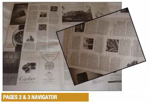
The ideal Pages 2 and 3 are the big story of the day. If there is a prime position past the front page, it is those two pages. Advertisers know it. Editors do too. Advertising and content can coexist on those pages very well.
Maybe we will see that happening at the Times in the future
OUR OWN EXPERIENCE: When I worked with the team of La Tribune, a financial daily published in Paris, France, we created a two-page navigator, titled 360 degrees, on pages 2 and 3. It was a comprehensive summary of what was on each of the four sections of the newspaper. One year later, pages 2 and 3 went back to the original concept of the News of the Day, as focus groups found out that readers were skipping right through that summary, which consumed so much space. I find myself designing La Tribune again, and, this time, it is page one that has an all inclusive What’s News style summary, with development of lead stories on pages 2 and 3.
WHERE IS MARIO?: In Oklahoma City, where the temperature is close to 100 degrees Farenheit. We finalize details of the final prototype of The Oklahoman as we ready for launch of new look in September.