Update #6: Saturday, Jan. 14, Amsterdam, 11:16. This is the weekend edition of TheMarioBlog and it will be updated as needed. Next blog post is Monday, January 16. I will be reporting from Hong Kong all of next week
TAKEAWAY: It is 2012 and it may very well be “the year of the template”. Am I the only one hearing that word uttered more often than ever before? ALSO: Weekend Reads, new fonts, and the Mercedes Benz-Che marketing campaign
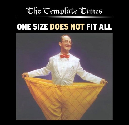
Image: (Micky Aldridge via Flickr)
OK, we all have built templates.
Of course, we all have. One completes a design—for whatever platform—and it is the template that takes us to the finish line, guarantees continuity and provides sustainability by expediting production.
So far so good.
But, it is 2012, or about 13 days into it, and I have been approached at least three times already by organizations that ask:
“Can you and your team build us some templates that we can use with various titles?”
Does it matter that one title is in an industrial city, the other in an area of high income earners, and a third in a region heavily populated by newly arrived immigrants?
Not really, I am told. Usually the person with whom I am having this discussion has a good argument: We must save money, hope you understand.
Yes, I do understand.
However, I find it difficult to strip a title of its personality and, instead, give it a generic, one-fits-all look based on a series of abstractly prepared templates.
I know that templates can be life savers. Templates can give one specific design its foundation, provide designers and editors with a formula on which to build, and allow them more time to apply on the creative aspects of newspapering. When I say that a newspaper is 60% formula and 40% surprise, it is those templates which guarantee the systematic formula from day to day.
However, I believe in a template specifically designed to compliment a look, for a brand, for a specific title, and NOT as economic remedies that ignore the one thing that gives newspapers anywhere a reason to be, and a reason to survive: their uniqueness, their sense of their community/environment.
A newspaper with a chaotic—-but authentic—-look is ten times better than one with a sanitized, decaffeinated design based on a template which compensates with systematic coolness what it lacks in individuality.
Let’s not make 2012 the year of the template, please.
Newspapers are in trouble, but I doubt that we will alleviate the situation by stripping them of their souls, too.
New fonts worth a second look
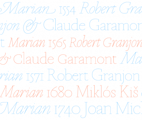
Our Garcia Media art director/project manager, Reed Reibstein, calls our attention to the new font family Marian, above, described as “a series of faithful revivals of some of the greats from the typographic canon: Austin, Baskerville, Bodoni, Fournier, Fleischman, Garamont, Granjon, Kis and van den Keere. The twist is that they have all been rendered as a hairline of near uniform weight, revealing the basic structure at the heart of the letterforms. Together they represent a concept: to recreate the past both for and in the present.”
I find them attractive, quite suitable for headers and probably quite good to try on tablet design.
For more go here: http://commercialtype.com/typefaces/marian
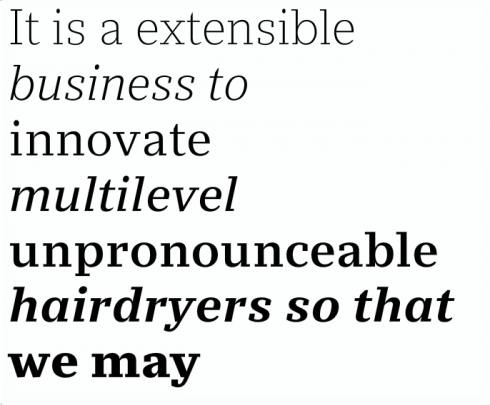
Reed also feels quite enthusiastic about this other new release, Stan from OurType:
Reed’s take: A nice hard-edged slab, geometry with a dollop of humanity—and its relatively high contrast (combined with the lengthened extenders in its Plus version) makes it more useful for body text than the norm.
For more: https://ourtype.com/#/try/pro-fonts/stan/
Che and Mercedes: not a marriage made in heaven
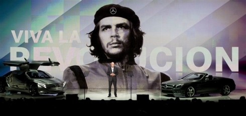
I have always liked those Mercedes Benz cars. In fact, I still drive one, and I love it, my C300, black, elegant and reliable.
So I am a little disappointed that my favorite car brand has gone a little too far with their latest marketing campaign, using the image of Che Guevara. I know I am not the only one who dislikes Che and Mercedes associated in any way.
The image of Che appeared briefly Tuesday during a presentation by Dieter Zetsche, head of Daimler’s Mercedes unit, at the International Consumer Electronics Show in Las Vegas. It reproduced a famous Alberto Korda photo of Guevara, the Argentine communist who spearheaded the revolution that brought Fidel Castro to power in Cuba. The photo became a symbol of communist revolutionary movements during the 1960s and ‘70s. To Cuban Americans, the image is not at all romantic or positive. Instead, it is a reminder of someone who might be better forgotten.
We associate Mercedes Benz with quality automobiles, we associate Che with subversion.
Now Mercedes Benz has offered an apology for using the altered image after outrage over the use of the revolutionary’s likeness, saying the image was ‘one of many images and videos in the presentation.’
Read more:
http://www.dailymail.co.uk/news/article-2086040/Viva-la-gaffe—Mercedes-Benz-apologises-using-image-Che-Guevara-promote-revolutionary-car-sharing-programme.html#ixzz1jKKGnWKs

Illustration: http://www.trendir.com
Page: Digital first? Not so fast
http://www.newsandtech.com/whats_new/article_4022e34c-3aeb-11e1-9f55-0019bb2963f4.html
First paragraph: Shakespeare suggested we kill the lawyers and let’s hope the same fate awaits the newspaper cognoscenti who see a terminal disease in every printed newspaper.
My own take: And the author, Douglas Page, is right when he advocates, among many recommendations, the compact formats.
“Reformat to a tabloid, or a compact broadsheet. They’re both more tightly edited than a traditional broadsheet and thus, a faster read. This change also allows you to continue selling print advertising – where the major ad bucks remain – and remind readers you’re available online.”
-New Nieman-Berkman Fellowship announced for research in journalism innovation
http://knightcenter.utexas.edu/blog/new-nieman-berkman-fellowship-announced-research-journalism-innovation
First paragraph: For more than 70 years, the Nieman Foundation for Journalism has been bringing journalists from around the world to train at Harvard as part of the prestigious Nieman Fellowships. Now, the Nieman Foundation has partnered with the Berkman Center for Internet & Society to launch a new fellowship aimed at journalism innovation and the digital transformation of the field, the two organizations announced Thursday, Jan. 12.
iPad 3 in production now with high-res display and LTE, says Bloomberg
http://www.theverge.com/2012/1/13/2705576/ipad-3-production-lte-high-res-display-rumor-bloomberg
Highlight: Bloomberg is reporting today that the iPad 3 has gone into production ahead at Foxconn of a planned March debut — manufacturing will apparently be running at full-tilt by February. The new tablet is said to have a quad-core processor, a high-res display, and LTE — all specs we’ve heard in the past, but Bloomberg says it has three sources confirming the news. Apple’s said to be okay with the increased power draw of the LTE chipset because of the iPad’s larger battery, and the display is said to look like “printed material,” which lines up nicely with the 2048 x 1536 resolution that’s been rumored forever — that would be a pixel density of 253dpi, which isn’t quite up to Apple’s Retina Display standard of 300dpi, but still much higher than the current iPad 2’s 132.