TAKEAWAY: A 14-year-old middle high school student proposes a change of font for the government—-with considerable savings as a result. Could this be the return of Garamond?
Let’s put it this way, Garamond the type font has had its day on the page, but it is not necessarily a font that rolls out of art directors’ tongues these days.
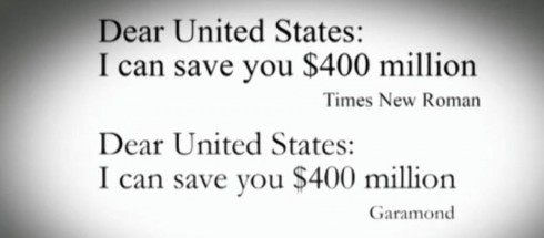
Definitely not the way that Suvir Mirchandani does. Suvir’s school science project leads him to believe that the US government could save some serious cash by simply switching from the venerable and reliable Times New Roman, to the more economical Garamond. Right now, Times New Roman is used on all printed government documents.
And, since Suvir suggests that switching to Garamond would save taxpayers $136 million a year, I think we are likely to see someone in Washington taking a second look at Garamond.
A little history
The font was created by Claude Garamond, who died in 1561. He cut types for the Parisian scholar-printer Robert Estienne in the first part of the sixteenth century.
After Garamond’s death, the Garamond punches made their way to the printing office of Christoph Plantin in Antwerp, where they were used by Plantin for many decades, and still exist in the Plantin-Moretus museum.
Today, modern versions of Garamond are available, including from Adobe.
Not everyone agrees on the money saving benefits of Garamond
Not so quickly
They guy behind the Phinney on Fonts blog disagrees that Garamond is the answer to saving millions.
While acknowledging that Garamond lowercase is about 15% smaller than the average of the fonts they compare it to, while its caps are only about 7.5% smaller, Phinney insists that setting any font 15% smaller would save 28% of its area coverage.
“Of course, there are some caps in the texts as well, which would make the savings a bit less. Interestingly, this is pretty exactly much what the study found,” he writes.
“So, you could just as easily save ink by setting the same font at a smaller point size. But either of those changes, swapping to a font that sets smaller at the same nominal point size, or actually reducing the point size, will result in slightly less legible text. Printing everything smaller is likely a bad idea, as the % of Americans with poor eyesight is skyrocketing as our baby boomers (and even their children, like me) age.”
What makes Garamond special?
I remember using Garamond in projects some 3 decades ago.
There is something old world and elegant about Garamond. I like it more for magazines and feature treatments than for news. I have never considered it robust enough to carry the big headlines of the day. However, if there is such a thing as a “lean back” font, Garamond might qualify.
Perhaps the US government will lean forward and listen to the student’s proposal.
Of related interest
Ask a designer: why switching fonts won’t save the US government millions