
TAKEAWAY: Our team is in Bogotá for the launch of the new El Tiempo Sunday Oct. 3, perhaps a historic day in Colombian journalism, but also a project that I am hoping publishers worldwide will pay attention to: a major national newspaper that dared to think differently. El Tiempo: proud of its rich history, but embracing the future optimistically, with the tools of the modern newspaper.
Promotional video now appearing in Colombian media: in Spanish
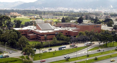
Here is El Tiempo’s building in Bogota: modern facilities and latest technology
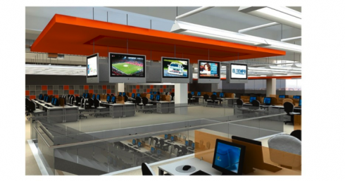
Here is the newly revamped newsroom of El Tiempo: a true multi-platform environment
Creating the concept
If I sound too over the top enthusiastic about this project at El Tiempo, it is because I am, and I hope you will be too.
I was telling my colleagues here at lunch yesterday that usually, when it comes time to launch a new project, my only concern is how the readers will receive it. If there are any colorful butterflies flying inside my stomach it is usually: Will the readers like it? How many will we offend with the changes?
This time is different: I want our readers to love it, of course, but I also want to make sure that people in our industry take a look. Not that you have to necessarily like it, or approve of it, but one of the reasons I will be writing about El Tiempo the next five days as we introduce it to readers is that this, to me, is the one newspaper that I am aware of that has taken such a deep look at itself, while preparing to celebrate its 100th birthday, and decided to go for Change, yes, with a capital letter.
How it all began……
It was a morning in October 2009. I arrived in Bogotá to start what would have been my fourth redesign of El Tiempo, the dean of Colombian newspapers and one of the most respected in Latin America .
I remember that I had two cups of that wonderful Colombian coffee——two “tintos” as the locals call the little demitasses with the robust brew of Juan Valdez’ best. The art director, Beiman Pinilla, with whom I have worked on every single one of those redesigns, put seven days of El Tiempo on a table in front of me.
That was it. That was all I needed to see to tell myself the following: Mario, you don’t want to redesign this newspaper one more time. Being there, done that. It really looks good. We just did it five years ago, why change it?
I remained quiet sitting in front of the pile of newspapers and then stunned the three or four designers around me, including our own Garcia Media senior design director, Rodrigo Fino, when I said:
You know, guys. I don’t want to redesign El Tiempo, but it would be wonderful if we could pretend that this newspaper does not exist and that we have assembled here today to create a new newspaper for Colombia, a modern newspaper that would have to survive in a multi platform world!
Not one response from anyone in that room, although I can only imagine what they thought.
Next step: telling the CEO
Within minutes I decided to go see Luis Fernando Santos, the CEO of El Tiempo at the time. He welcomed me in his spacious office overlooking a very green patch of the beautiful city of Bogota.
Another “tinto” later, I started my narrative:
Luis Fernando, I have always enjoyed working with El Tiempo. It is like family here. But I think the paper looks nice as it is. But I also think it has too many sections, too deep rooted in the content flow of a newspaper of another era. I was thinking that perhaps I would like to step into the sandbox and pretend that you brought me here to create a new, non existant newspaper for 2011 and beyond. Start from scratch, new ideas, new concepts…….
It was one of those memorable moments. The visionary Luis Fernando looked at me, smiled (not at all surprised, I guess) and then said: Go ahead, Mario, I don’t promise you we will go all the way, but you and the team create how you envision this newspaper.
One of those “what if?” moments where the person in charge said: “why not?”.
The new El Tiempo is born
I went through all seven days of El Tiempo, and then I remember sketching the flow of how pages would go in the newspaper I was envisioning: three daily sections.
Thinking like a reader, I decided that this is what is important: What you must know, What you must read, What you must do.
In Spanish: Debes saber, Debes Leer, Debes Hacer
Every bit of content that we put into a newspaper fits into one of those areas. But here is the catch: we no longer would have most of the sections of the newspaper as we know them.
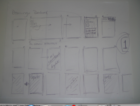
Here is my first sketch for sequencing: how the different topics would appear, an exercise in information architecture
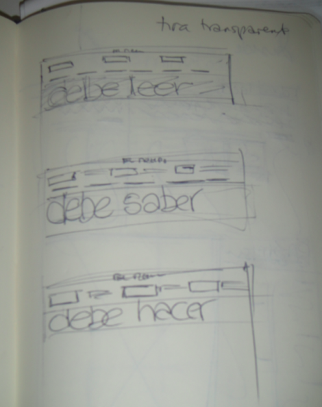
Sequencing was followed by sketches of how the three major “books” would look
This is what the team had produced by the end of that one day of creating the concept. We had no idea about the color coding, nothing more than just content sectioning
By the end of our first week of work, the headers started looking closer to what they are like now
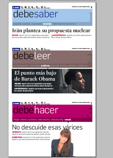
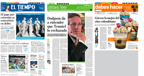
Debes Saber (What you must know)
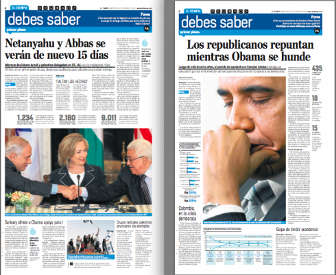
The opening section of Debes Saber, blue, active, combines Bogota, nation, world, business, politics. These two pages were executed during the training sessions leading to the Oct. 3 launch
Debes Saber (What you must know) would be the first section, the one part of the newspaper you would read with your morning coffee. Texts not too long, but comprehensive enough. We would assign a color to this section——it ended up being BLUE.
Content flow: Debes Saber includes Bogota, World, Business, Nation, Politics.
Those areas still have their editors, of course, but they no longer have a guaranteed space when they come to the morning meeting. One of those areas would produce the Debes Saber lead story of the day. Editors have to pitch their stories; the best one wins.
I would draw the analogy of a room in the house. Debes Saber is the kitchen: the gathering place, a little nervous, busy, everyone going about his business.
Debes Leer (What you must read)
Here is a section to read patiently; opinion, commentary, in depth, analysis
This is the depth section: opinion, analysis, and interpretation, along with columnists. Sometimes a story that merits four paragraphs in Debes Saber gets a full analysis in Debes Leer. This section is green and the reader knows that this is going to be the more leisure read of the day, and may opt to read this during a lunch break or in the evening. Green indicates meditative reading.
Debes Leer is the living room, where you kick off your shoes and lie down to read your favorite column, editorial or indepth report, with not a care in the world.
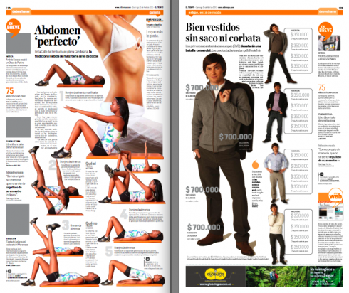
Debes Hacer (What you must do)
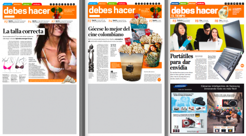
Three different openings of Debes Hacer done during the training sessions
Inside page treatments for Debes Hacer
Debes Hacer is all about activity. The color orange incites you to move, to get out of the house, go for a job, walk your dog, or go shopping for a new computer, or get tips on how to take a vacation with the kids, or a romantic one with your partner. This was a fun and easy one to plan: health, fitness, relationships, food, wine, beauty, fashion, it all fits here.
Debes Hacer is the outdoors, or the home gym, or the swimming pool area.
Sports, People—-no change
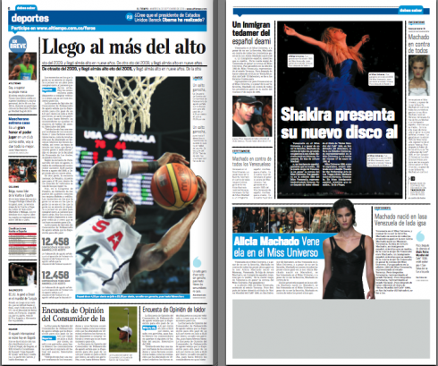
Sports (left) and People: pages done for training purposes. These sections remain their traditional identity.
For obvious reasons, Sports continues to be a self contained section, but it appears under the Debes Saber (What you must know) blue section; People (Gente) is also in this section, and appears under the header Gente. It would have been very difficult to mix them or take them elsewhere.
Using blue labels
Notice the blue labels (under circles) which in this page mix stories about the nation, justice, and the world.
In the new reorganization of content at El Tiempo, it is possible for a business story to appear next to a city police story. Indeed, strange bedfellows, so blue labels are used to indicate subject matter.
The labels are not intrusive and simply say: Bogota, Business, World, etc.
During focus groups readers liked them and had no trouble whatsoever reading the stories without any sense of confusion. In fact, I must say that the focus groups for this project, which involved 600 readers and non readers through major cities of Colombia, must rank among the most thorough and with most satisfying results in my career.
Editors who thought the lack of traditional headers for content would hit readers the wrong way were very happily surprised with the results.
The front page
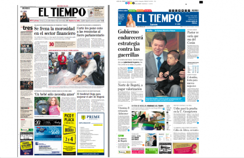
Here is a comparison of the existing front page till Oct. 2, and one of the practice front pages in the style the newspaper adopts Sunday, Oct. 3
Digital icons

Icons appear as part of the newspaper’s nameplate
![]()
Icons as seen as the top of a section opener
The new El Tiempo is a newspaper that is part of a multi-platform environment. We incorporated digital icons at the top of all the sections fronts and front page. These symbols move to the bottom of stories if we wish to refer readers to a digital platform related to that story, i.e. photo galleries, video, chats, blogs.
Here is how the daily El Tiempo will look with its three distinctive sections, color coded to facilitate identification.
Interested in reading about our redesign of El Tiempo in 2006?
http://www.newsdesigner.com/archives/002457.php
Tomorrow: We will continue this case study, incorporating more pages from our training sessions; preparing for the Sunday relaunch of El Tiempo