TAKEAWAY: The new Greta Sans has been launched this week, and we designers now have an elegant and classy sans serif to consider for our projects. We do a mini interview with its creator, Peter Bilak, and our Reed Reibstein takes a look at Greta Sans and gives us his take on it.
See this video where Peter Bilak introduces his new font Greta Sans
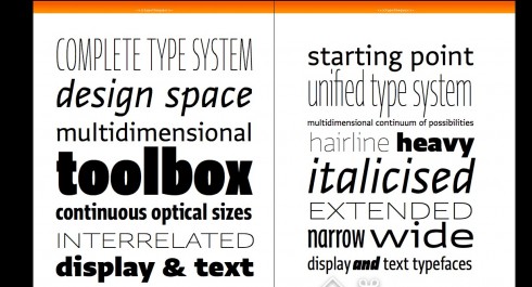
It is a new highly legible, multi faceted and elegant sans serif font available for us as of this week.
Peter Bilak has launched Greta Sans, which he describes as the largest type system his Typoteque group has undertaken. Indeed, Greta Sans has 80 styles and 9 different numeral styles.
“Greta blurs the boundaries between text and display fonts, and offers continuous optical sizes,” Bilak says.
“I think this is one of the largest type releases in many years (in a decade perhaps). Especially as there will later be Arabic, Greek and Cyrillic versions, and there have never been such complex type families for those writing scripts,” he says.
A chat with Peter Bilak
On the occasion of the launch of Greta Sans, I have taken this opportunity to talk to Peter about his creation. So here are two questions for Peter Bilak:
Mario:
Peter, in one of the documents you have sent me, you describe in detail your thoughts about type, and you do salute those great sans fonts as Univers, Helvetica and Frutiger, fonts that all of us have used with great success through the years; now Greta Sans arrives on the scene. What would you tell designers is the greatest characteristic of Greta Sans that would make it an ideal font for the 21st Century?
Peter:
Type design, by its very nature, is about creating systems. Many type designers create internal systems of relationships between letters – this is how type design works, making sure that letters share their visual attributes, at the same time differ considerably, to increase their legibility.
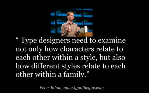
Greta looks beyond these internal relationships. In terms of typeface innovation there is much more room for originality than when you only look at the individual letter shapes. Thus to create truly useful new typefaces, type designers need to examine not only how characters relate to each other within a style, but also how different styles relate to each other within a family.
Greta Sans is exploring these relationships, so the user can solve even the most complex typographic situation. It comes with 80 styles, 9 different numeral styles, advanced OpenType features, integrated symbol sets, extensive language support. You don’t find these features in fonts developed in the 1950s-70s, this is addressing the needs of 21st century.
Greta Sans is also work in progress, it will expand to cover other writing scripts, Cyrillic, Greek and Arabic, and for those languages, systems like this never existed. It is the focus on global communication and our interest in language that fuels development of non-Latin fonts, that support large but also marginal languages anywhere in the world.
Mario:
Peter, today we edit and design for a multi platform world, how do you see the potential of Greta Sans for digital publications?
Peter:
Part of the reason why we included 9-11 weights of Greta Sans is to anticipate the rendering in various devices. On low-resolution devices fonts usually tend to look heavier, on the latest iPad 3 with retina screen, the same font appears too light. We give designers choices, so they can deliver consistent results in various platforms. In it just as when you work on uncoated paper, designer needs to consider the ink-spreading, and adjust his designs.
We’ve made extensive testing of the fonts on paper and on screen and feel that Greta Sans gives you the versatility contemporary designers needs to get most of their projects. Therefore, Greta is available as traditional fonts and webfonts, and we offer also embedding licenses for apps and eBooks.
Reed Reibstein’s two-tweet perspective on Greta Sans
Love how Greta Sans from @typotheque compensates for extremes of weight & width: a smart system ensuring each face stands on its own.
Not sure whether I’m more excited that Greta Sans is a massive & consistent family across multiple scripts or has ten weights of icons!
For more on Greta Sans:
Designing Type Systems by Peter Bil’ak
– UK: Guardian moves into journalism training business
http://www.pressgazette.co.uk/story.asp?sectioncode=1&storycode=49090&c=1
– UK: Amazon will review Kindle newspaper submission after all
http://paidcontent.org/2012/04/10/amazon-will-review-kindle-newspaper-submission-after-all/
First paragraph:
Days after it told one publisher it had indefinitely suspended the programme to approve its Kindle newspaper edition submission, Amazon has suddenly relented.
USA: A Newspaper Buying Spree
http://www.ajr.org/Article.asp?id=5286
First paragraph:
In the not so distant past, the more valuable newspapers became, the more eager sellers and buyers became to do deals. Today newspapers are far less valuable — by half or more — yet sellers and buyers are once again finding each other in great numbers.
Stop Calling It A Blog, Please
http://www.andymboyle.com/2012/04/02/stop-calling-it-a-blog-please/
First paragraph:
News organizations, can we all do ourselves a favor? We should stop calling things “blogs.” I know, that probably stings a little, but let me try and explain why.
– USA: Embracing the Future – Visits to 50 newspapers in 50 states find an evolving industry launching new initiatives in an effort to survive and thrive in the digital era
http://www.ajr.org/Article.asp?id=5295&
First paragraph
Is the newspaper industry dying or is it “managing through a transition of consumer habits” en route to a successful new business model? Christopher Mayer, publisher of the Boston Globe, believes the latter is true. And his view is widely embraced in the profession.
– USA: Gannett expects paywall ‘will be worth $100 million to us in 2013?
http://www.poynter.org/latest-news/business-news/the-biz-blog/169338/gannett-expects-paywall-will-be-worth-100-million-to-us-in-2013/
First paragraph:
If you look past last year’s numbers, good things are starting to happen in the industry, Newspaper Association of America president and CEO Caroline Little said, opening last week’s conference in Washington.
– USA: More than twice as many mobile users prefer news orgs’ mobile websites over apps
http://www.knightdigitalmediacenter.org/news_blog/comments/20120404_more_than_twice_as_many_mobile_users_prefer_news_orgs_mobile_websi/
Highlight
Many news organizations still put most of their mobile budget into developing native apps for smartphone and tablet platforms. But new research shows that mobile users are vastly more likely to prefer getting news via the mobile web, rather than through apps provided by news organizations…
Coming Thursday