Updated, Nov. 22, 10:20 am EST
TAKEAWAY: It is the first image that users of your iPad app see when they come to visit your newspaper or magazine. We study how others do it as we try to conduct our own work.
First impressions
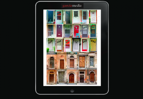
We are all fascinated by doors, and they are an indication of what we will find behind them, including those who inhabit the place. The same applies to iPad app door screens, they give us dozens of tips as to what we may find in the app.
Enter Laughing is a play by Joseph Stein, based on an autobiographical novel by Carl Reiner.. Somehow, I kept remembering this catchy title as I put together today’s blog.
How do you enter a newspaper/magazine app?
I have said repeatedly that a newspaper app is NOT a newspaper, an online edition, television or film. It has ingredients of all of these, but it is also its own platform, and when it comes to that first impression, the first ten seconds are as important as when our eyes land on a newspaper front page or a magazine cover, except that our expectations are different, and our hands are not totally occupied, our finger is. And it wants to move and to discover.
I admit that there is no research on the topic we are discussing here, that I am aware of.
To that effect, I spend considerable time in what I call the Mario laboratory, examining apps, X-raying them, and trying to draw conclusions.
If we go back to the Enter Laughing title, I think in the case of the iPad app we need to enter simply, elegantly, and with a reminder of the familiar—-which, in most cases, happens to be your brand.
Let’s take a look at several popular websites and see how they enter.
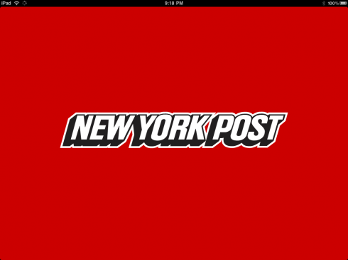
I have divided the “doors” in four categories: logo doors, ambience doors, photo doors, animated doors.
At the end of this blog, I pose the questions to myself as I draw early sketches for a 1.5 version of the South China Morning Post app.
![]()
![]()
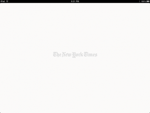
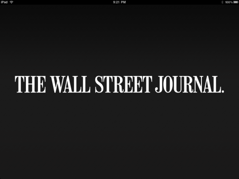
Logo doors: Perhaps the most popular of all entrance doors into newspaper apps. The benefit: they are easy to use, identify the brand in a second, and urge the user to move on to the news of the day. No fanfare. They usually apply the color we associate with the brand of the newspaper and often hint at the mood. For example, The New York Times entrance barely makes the logo visible. It is icy, steely. Surprised? Some, like ABC News, allow for a catchy phrase attached to the brand.


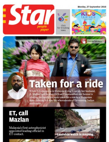
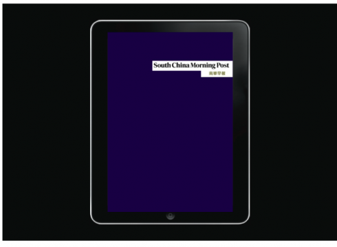
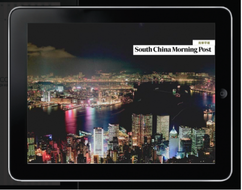
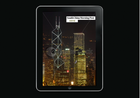
Ambience doors: These are newspaper apps that place you there. The city, the environs of where the newspaper appears becomes part of how you enter. Suddenly, you may be in Australia, but if you are reading The Washington Post app, you see a familiar building. Nice touch, I think. Warmer than just a logo. With apps giving us a global audience, it is not a bad idea to mark your territory and remind users of your location. But, can we change the monument from time to time? We can look at a logo forever and half ignore it, half be happy it is there, but I am not sure I wish to see the same building or post card of even the most beautiful city 500 times a year.
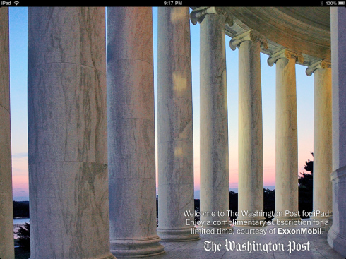
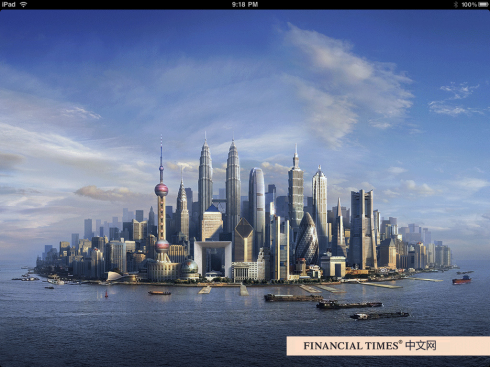
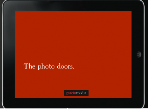
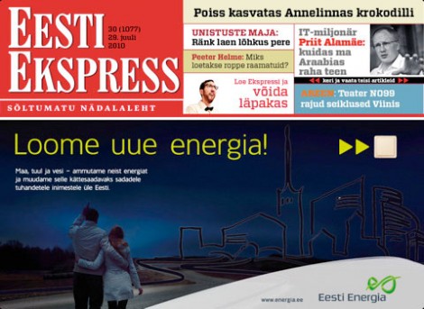
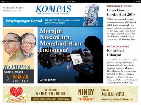
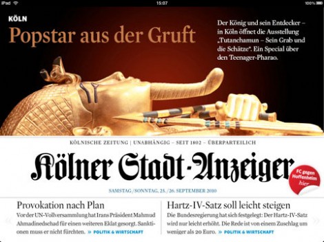
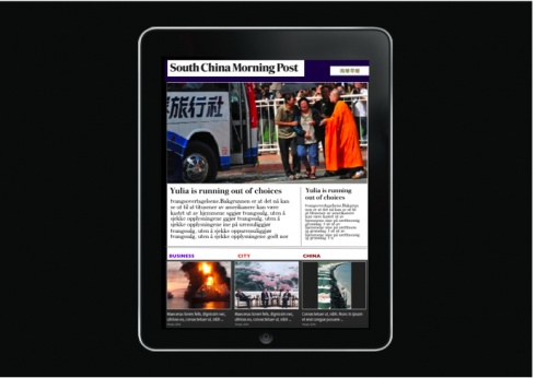
Photo doors: We hurry to open those, don’t you? And if you have the photos of Vogue magazine, go ahead, and put those doors and their knockers up front. For newspapers, and we see several here, the photo of the day attraction is too much to keep for a second screen, so up front it goes.


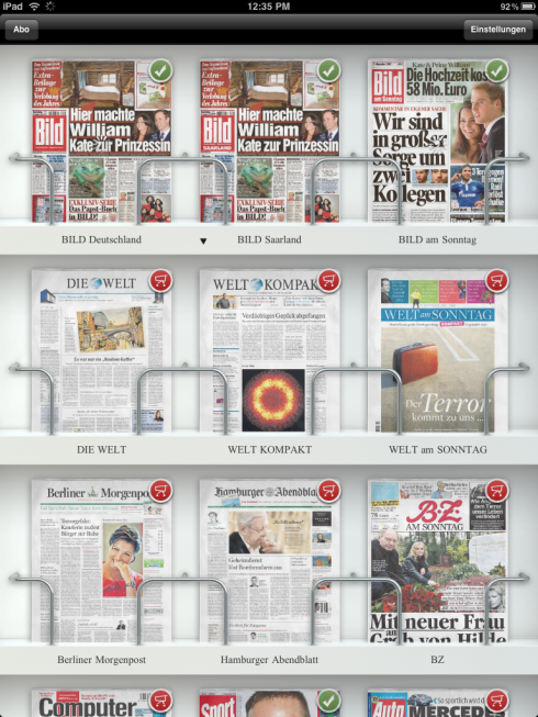
Axel Springer Group of Germany offers a Kiosk entrance: users click on whichever title they wish to read, as in Bild below

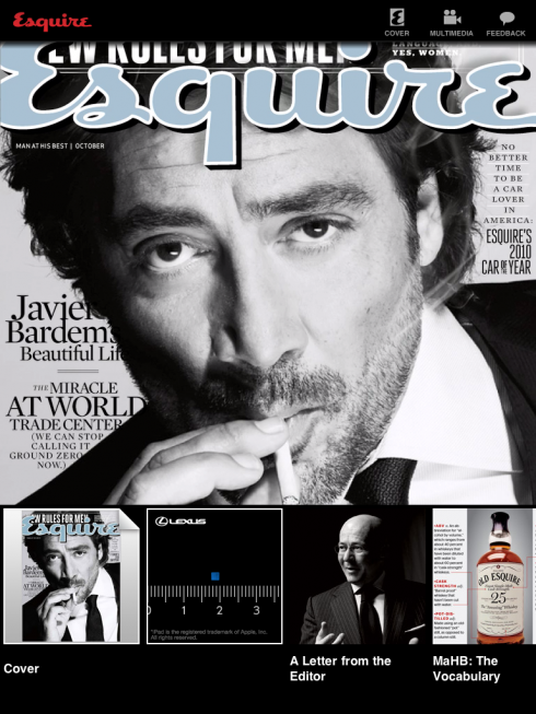
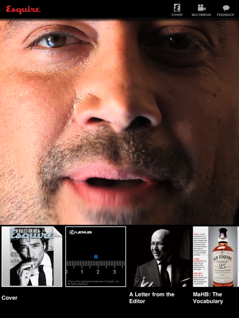
Animated doors: Not seeing much in newspapers, and not recommended, either. But, if you are a magazine like Esquire, and if you convince Spanish actor and Oscar winner, Javier Bardem, to step up to the camera, and say hello to the users, be my guest. Once a month we can handle it. Daily, not feasible, not needed. The New Zealand Herald(below) has an animated ambience sequence that it runs before it settles into its logo door, but, the question is: do users get tired of the same photos rushing in everytime?

Deciding on a door at the South China Morning Post
So, we use the laboratory to look at all the options available, then we roll up our sleeves and get to try different approaches on a real project.
Right now, the SCMP app opens with a page very similar to that of the newspaper. However, we are rethinking the printed newspaper, and so as we do that, it is a perfect opportunity to look at the next edition of the SCMP app.
Should we start with a title door? Simple, clear, and minimalist?
Or, should we capitalize on the scenic skyline of one of the world’s most beautiful cities, Hong Kong, and place the user right into it at the start?
And, maybe it is best to get right down to the business of offering the news?
Of special interest
Rupert Murdoch creates ‘iNewspaper’ – with the help of Steve Jobs
http://www.guardian.co.uk/technology/2010/nov/21/ipad-newspaper-steve-jobs-rupert-murdoch
It was bound to happen, the alliance between two giants: Murdoch and Jobs. What their product will look like?
Well, even though I have tried hard to get an idea, it has not been possible. Like all things involving Apple, this is a major secret.
My former student and friend, Al Triviño, the creative director for News Corp, is very involved and spending considerable time in New York City these days, where the project is incubated.
But other than friendly exchanges about life on the road, Al is not telling me, or anyone, much about what he is doing.
We will have to wait and see. We know it will be a digital daily, and will be called Daily. What I find fascinating about the information made public is that this new digital publication will not have print NOR online editions. It is tablet only. Enough about multiplatforms for this one.
And because it is created in the world of Murdoch, but in the city where two very distinct members of the News Corp empire live—-The New York Post and The Wall Street Journal—-this new product will
display “a tabloid sensibility with a broadsheet intelligence”, This means that my Daily may bring me video clips of the Cher/Christina Aguilera new movie Burlesque, while at the same time offering me an analysis of the economic drama in Ireland. Why not?
In fact, the venerable New York Times has just done that for me in the past few days, and I imagine readers of the Times do not resent that their newspaper has moved into that blurred circling which involves the coverage of popular culture and substantial more serious news fare.
Of related interest:
What should an iPad newspaper look like?
http://seekingalpha.com/article/238081-what-should-an-ipad-newspaper-look-like?source=yahoo
– Why the Daily, Murdoch’s “tablet newspaper,” will be DOA
http://www.wordyard.com/2010/11/21/why-the-daily-murdochs-tablet-newspaper-will-be-doa/
Other iPad design discussions in TheMarioBlog
iPad: the design discussions begin
https://garciamedia.com/blog/articles/ipad_the_design_discussions_begin/
iPad design for news: Primer 1
https://garciamedia.com/blog/articles/ipad_design_for_news_primer_1
Basic ingredients for iPad design: stay close to the basics
https://garciamedia.com/blog/articles/basic_ingredients_for_ipad_design_stay_close_to_the_basics_plus_more_times_