Updated Monday, Nov. 1, 19h, Genoa, Italy
TAKEAWAY: So I spend most of the weekend busy sketching the concept for a newspaper iPad app. In the process, I am reading about iPad design and reviewing the new entries in the field. Join me for some Monday reflections.
Just posted at the Nieman Journalism Lab
Getting lapped by innovation abroad? Mario Garcia’s path to better designed newspapers
Here’s the link:
http://www.niemanlab.org/2010/11/getting-lapped-by-innovation-abroad-mario-garcias-path-to-better-designed-newspapers/#more-24616.
All about an iPad inspired weekend
It’s iPad Monday for TheMarioBlog, and we are inspired by three different events:
1. I have spent most of my weekend doing the initial sketching for a newspaper client’s iPad app.
2. I have read Khoi Vinh’s piece titled “My iPad Magazine Stand”, which I recommend.
3. I have checked two new entries into the world of publication apps: The Oklahoman, and Il Sole 24 Ore’s La Vita Nóva
Let’s start with Khoi Vinh’s piece. Khoi, former design director of NYTimes.com ,offers us an honest, smart appraisal of how magazines transfer to the iPad, and, although he does not like a lot of what he sees in his “newstand”, I truly appreciate Khoi’s honesty and the touches of guarded optimism that are sprinkled throughout his article, particularly about the prospect of advertisers taking to the new platform.
Actually, in conversations with people I know at various publications, I’ve been quite surprised by stories of strong advertiser interest in these apps. Anecdotally, publishers report heavy demand for advertising space, and in some cases apps have sold out of their ad inventory through the end of the year or even further.
Perhaps there is too much reality here for some.
For sure, I’m confident that many, many more people will be buying tablets within the next few years, and so there will be a much richer market for a more diverse crop of content. But even with an Apple-operated newsstand, I’m just not sure I believe these people will turn to publishers’ apps to occupy their tablet time
More importantly, one reason his piece carries such authority——in addition to Khoi’s own successful trajectory with the Times—-is that he confesses what I consider the first step for any of us discussing the subject of iPads and engaging in its practices: we don’t know enough, it is still anyone’s guess what will really happen with these magnificent tablets. This is only the infancy of this new platform.
To start, I think it’s too early to say anything definitive about whether these apps will become lasting delivery mechanisms for print content and brands. There’s still a lot that we don’t know about the iPad and its forthcoming competition, particularly about how user behavior will evolve as these devices become more integrated into daily life
Where I think Khoi truly nails the main point of his piece is in his belief that the future of publishing, regardless of platform, seems to be quite intertwined with social networking sites:
The concept of a magazine will be replaced in the mind — and attention span — of consumers by something along the lines of Flipboard. If you ask me, the trajectory of content consumption favors apps like these that are more of a window to the world at large than a cul-de-sac of denial. Social media, if it’s not already obvious to everyone, is going to continue to change everything — including publishing.
This is a point I remind editors in every newsroom I work——and that includes “newspaper” editors, by the way. Editors who wish to reconnect need to take a look at the traffic and content of the social networking sites. It is, I believe, a good stop each morning with that first cup of coffee before heading out to the planning meeting, a fertile garden of ideas and themes that is truly what the people are talking about, and not just because an editor thinks it is so. The editor’s best “agenda for trends of the day” is one click away.
To read Khoi Vinh’s insightful piece:
http://www.subtraction.com/2010/10/27/my-ipad-magazine-stand
Sketching early thoughts
Now back to the less philosophical and more practical part of my weekend: sketching.
The newspaper wants to have an app. Many do, not all are currently engaging in its development, although they should.
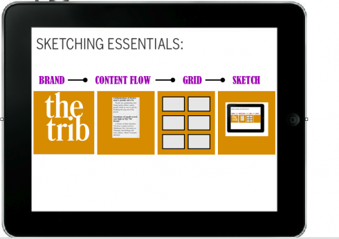
After a briefing, which is truly a workshop in concept development, content flow, how “we” wish to be seen as a tablet edition, it is time to get some sketches. Here, the process is NOT any different from print. One must do show and tell.
First, sketching is for the designer ONLY. We must see what is passing through our mind. Screens begin to show us what happens when you open the app, when you are in a reading mode, or in a looking mode, and, most importantly, strategies to keep the curious and impatient finger busy——but not too busy.
Those are the parameters.
Then comes the issue of branding. The brand of that newspaper or magazine is the one best foot forward. Salute it with a strong handshake, then see how the brand can cuddle up to the tablet with a certain visual twist of its own. Do not replicate the brand here 100%. Let users know that the brand adapts to a new and vibrant platform.
Eventually, ten years from now, there will be users who will only recognize that brand, and not the one that inspired it. Maybe earlier than that, by the way.
And so, let one screen sketch develop after the other. Create your storyboard as if you were a movie director planning your scenes, down to the last detail. Here we show a video, here we have a photo gallery, but, alas, the curious finger touches that photo and a related video appears.
Looking at the new entries
It is coincidental that two of our clients at Garcia Media, The Oklahoman, published in Oklahoma City, and Il Sole 24 Ore (Milan, Italy), have premiered apps in the last few days.
We at Garcia Media were not involved with the conceptualizing of these apps.
They are a welcome addition to the repertoire of apps, and we have taken a quick look.
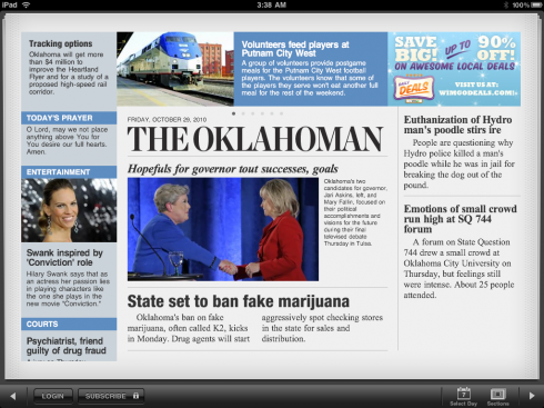
Opening screen for The Oklahoman’s app: a good start for the American daily. Instant recognition of the brand
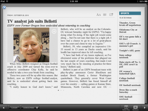
Inside screens emphasize a two-column grid, but have an excellent vertical navigator on the right to guide user to other stories
The Oklahoman: very loyal to the look and feel that we gave the newspaper when we redesigned it almost four years ago. A first impression is that this is The Oklahoman. The navigation is clean and clear, the grids are predictable but easy to follow. I like the running “list of headlines” constantly on the right of text, to guide the reader to other pieces. This is a beginning for The Oklahoman, I am sure, but a good one. We need to occupy the curious finger more, to engage it in a little ‘pop up” stuff from time to time. That, too, will come with time.
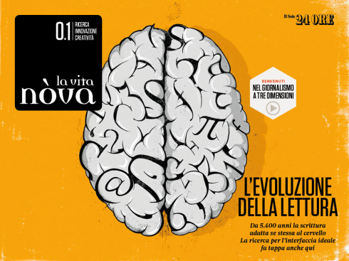
Entrance into the new La Vita Nóvs supplement of Il Sole 24 Ore, one of Italy’s financial dailies
Splendid visual presentation in all of these screens: layout taken totally from the printed edition
Il Sole 24 Ore: The Italian financial daily (Garcia Interactive was consultant to its online edition) premieres an app for its supplement, La Vita Nóva. This one is magazine territory, and quite visual. I find it appealing, easy to use, and, as in the case of The Oklahoman, still mostly a page by page flipping experience. Except that here the possibilities for the curious finger are greater, and we miss them more. A newspaper app may get away with flipping pages, looking at photos and reading text, but a magazine-inspired supplement must have “pop up” moments more often. We know they will come here, but not yet. My peripatetic finger kept touching, massaging and tapping like the raven on Edgar Allan Poe’s poem-—appropriate for a Halloween weekend of app contemplation——but nobody answered, or
‘Nevermore’
.
An observation: while the duplicating of printed newspaper pages is NOT one idea I applaud, it is a different story for the replicas of magazine/supplement pages, which are more visual and transfer better to the screen. But, once they land on the screen, and the user looks at them for 10 seconds, then the tablet-user in them takes over, and the finger becomes the weapon of choice. Let’s give it time and see what happens with this beautiful app that has all the potential to become a great one.