TAKEAWAY: All last week we presented a historical perspective leading to the new design of USA TODAY. Today we turn our attention to the newspaper’s website, and how it combines clever design with new ideas for advertising and marketing.
A new website, new approach to ads
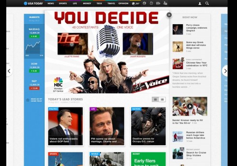
This video shows you the various ads discussed by David Payne during his interview below. Pay particular attention to the presentation of advertising here and how it engages with readers.
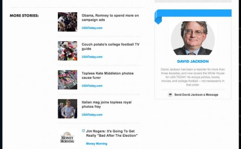
A nice feature of the new website: how reporters’ bylines and bios are presented
It is not just the print edition of USA TODAY that has introduced a new look and overall rethinking. The digital side of USA TODAY, too, has undergone major changes.
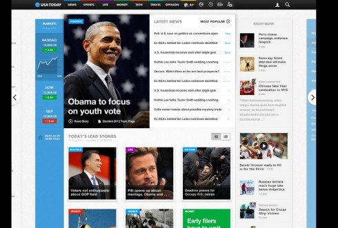
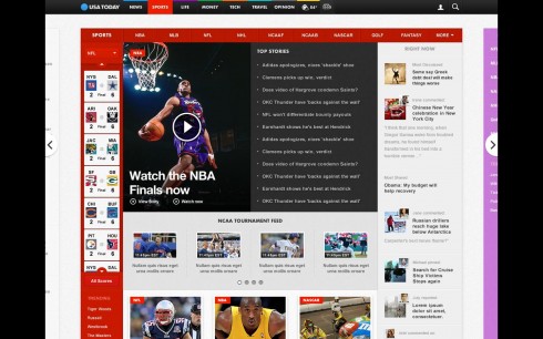
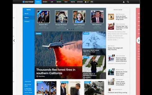
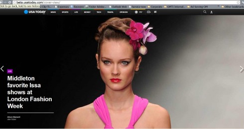
Those going to http://beta.usatoday.com/ will find that this is a totally revamped website, more visual, easier to navigate, and representing what seems to be a more tablet-oriented design that should delight many users.
If what users of a website want is quick access to the latest headlines, very photographic (Flipboard-style) navigation to sections within the website, and an easy to navigate, uncluttered environment, then this new USA TODAY website hits the spot.
In addition, there is more to this new USA TODAY website than just a new look. There is a total rethinking of the ad model, with ads that are more multi media and engage the user directly. The business side of advertising across platform has been a key element of this rethink.
To get more details about the launch of the new USA TODAY website, I have interviewed David Payne, chief digital officer, Gannett. Payne, who joined the company 18 months ago to drive this transformation, previously headed CNN Digital (2004-2008), and CNNSI.com.
He tells me that throughout his career, he has been “passionate” about building a better user and advertiser experience for media companies, which has been an important part of this latest project.
Mario:
What was the most major challenge for you and your team working on a rethinking of the USAT website?
David:
Rethinking the ad model. For news websites to be sustainable businesses, they are going to need to migrate from what is fundamentally a bottom-of-the-marketing funnel direct-response medium to a top-of-the-funnel marketing platform. The only way to do that is to create an experience where high-impact, sound-and-motion rich media ads can be trafficked across all platforms seamlessly. And the only way for consumers to tolerate that is to make the advertising part of the experience. Everything we did from a design and coding perspective was to create a story arc and flow that would allow for natural breaks in the experience where the advertising could feel more like a magazine page turn or TV advertising break. And as importantly, we moved every pixel out of the way (note the tiny snap nav), so marketers can use the entire browser canvas to do amazingly creative things. This is a transformational shift in thinking. Every other “big ad initiative†from IAB Rising Stars to Project Devil, requires a user to click on an ad to realize its full marketing potential. In the best case, that only happens 1-2 times out of a thousand.
Here’s the big insight: Every brand is a digital company. They all have websites, mobile apps, and a wide variety of social marketing. What they don’t have, is audience consuming their media experiences at scale. As a marketing platform, media companies have simply used little boxes on flat pages and hoped people would stop and click on them to go over to that great content. We have millions of people coming to our site every day. If we can port the marketers’ experience into our flow and put it elegantly in our environment, we make advertising part of the content.
Yes, you will see some standard IAB ads rotating through our site as we transition to a new world order, but it is the high impact transitional ads that are the core of what we are trying to do strategically.
Mario:
What role did the overall design of the brand, USAT, and the print product, play in your creation of the website?
David:
The brand colors are a huge part of the site. They anchor and provide a constant sense of orientation no matter what story or section you are in. Insofar as we started the website rebuild ahead of both the print redesign and new logo work, our work was symbiotic.
Mario:
It is a multi-platform world, not just for how content flows, but also for purposes of branding. Â Was this an important criteria for you guys?
David:
This was at the core of the strategy. We want to be able to provide marketers an easy way to serve synched, high-impact advertising across all platforms in a coordinated fashion. For instance, our high-impact ads (many of which will be built by our sister company PointRoll) are built in HTML5 so they can run across desktop, tablet and phone. (See attached Verizon ad.)
Who is who in the USA TODAY website team?
I asked David Payne to mention those involved in the project.
“Our product team is diverse and you will see many people’s fingerprints on this product. The very original design vision was provided by one of internal senior designers, Andres Quesada. Later we hired Augusta Duffey as our Executive Creative Director, and she oversaw a talented team of designers including Andres, Bill Thornton and others who partnered with Fantasy Interactive to develop the design, interactions, and UX. Can’t say enough about the quality of team at FI which included Anton Repponen, Irene Pereyra, Stephen Carpi, and Julia Prior. Our lead UX developer was Jonathan Hensley, ,who made the front-end come to life. None of it works, though, without the backend databases, which were engineered by Steve Kurtz and his team. Lastly, the whole team was quarterbacked by my head of digital product, Mitch Gelman, who has partnered with me in previously relaunching and running CNN.com and CNNSI.com.”
A very special thanks from me to Tom Foster, vice president of project management for Gannett Media Technologies International, a division of Gannett, who facilitated contacts for me to be able to gather information for this blog post today. Tom, by the way, was one of my students at Syracuse Universtiy’s S.I. Newhouse School of Public Communications.
This video was prepared by Fantasy Interactive to show the new features of the redesign introduced Sept. 14
Of related interest
USA TODAY innovates with horizontal experience information layers on new website
http://www.poynter.org/how-tos/newsgathering-storytelling/visual-voice/188575/usa-today-innovates-with-horizontal-experience-information-layers-on-new-website/
Reader reaction to changes in USA TODAY
http://beta.usatoday.com/story/opinion/2012/09/17/reaction-new-usa-today-redesign/1575487/
Our previous blog posts about USA TODAY:
USA TODAY turns 30: Part 1—Looking into the attic for those early sketches
https://www.garciamedia.com/blog/articles/usa_today_turns_30-part_1-looking_into_the_attic_for_those_early_sketches
USA TODAY turns 30: Part 2—USA TODAY turns 30-Part 2—-A newspaper that influenced all of us
https://www.garciamedia.com/blog/articles/usa_today_turns_30-part_2—-a_newspaper_that_influenced_all_of_us
USA TODAY turns 30: Part 3—USA TODAY turns 30-Part 3—-A weather map that created a global tsunami
https://www.garciamedia.com/blog/articles/usa_today_turns_30-part_3—a_weather_map_that_created_a_global_tsunami
USA TODAY turns 30-Part 4-The first newspaper to do that tango of the serious and the silly
https://www.garciamedia.com/blog/articles/usa_today_turns_30-part_4-the_first_newspaper_to_do_that_tango_of_the_serio
USA TODAY turns 30-Part 5-It’s a new look for USA TODAY today—its first major visual change
https://www.garciamedia.com/blog/articles/usa_today_turns_30-part_5-its_a_new_look_for_usa_today—its_first_major_vis
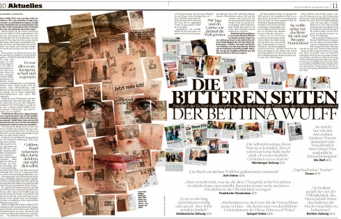
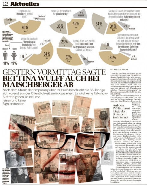
Pages we like
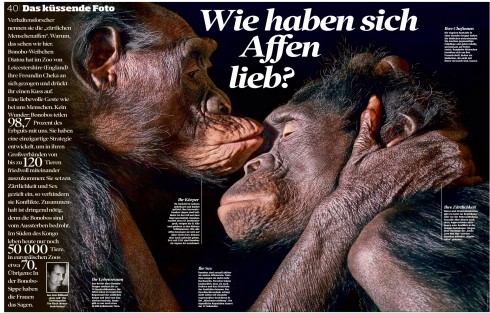
These are all great pages sent by Frank Deville from Sunday’s Bild, of Germany.
Chatting with Tyler Brûlé on Monocle Radio’s new show, The Stack
Listen to my chat with Tyler Brûlé about future of print in Monocle Radio’s The Stack here:
http://www.monocle.com/24/shows/stack/
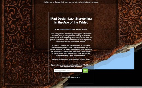
Sign up to get information on my new digital book
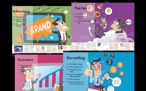
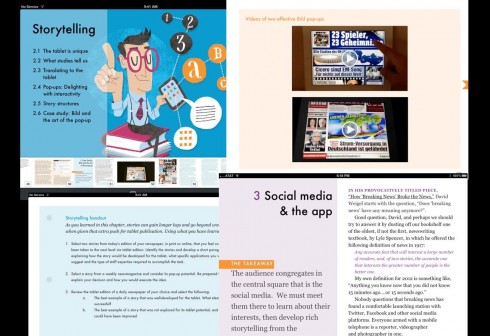
Assorted screens from the book: top, chapter openers all of which are color coded and carry illustrations by Luis Vazquez, of the Gulf News of Dubai; second image, opener of Storytelling chapter, and two inside screens.
As we get closer to publication date for The iPad Lab: Storytelling in the Age of the Tablet, we are now set up so that you can give us your email address and you will automatically be informed when the book is ready for download.
Now you can leave your email address so that you will be updated and informed the moment the book is read for download.
Simply go here:
http://ipaddesignlab.com
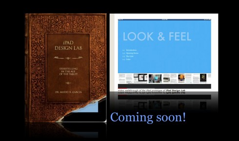
Video walkthrough of the iPad prototype of iPad Design Lab
SND Scandinavia Space 2012 conference
Still time to get a spot to attend the SNDS conference in Copenhagen, Sept. 27-29;
For more information:
SNDS workshop ever. Read all about SPACE 2012 here:
http://snds.org/get-your-own-space-guide/#more-1852
1st Middle East News Design Conference
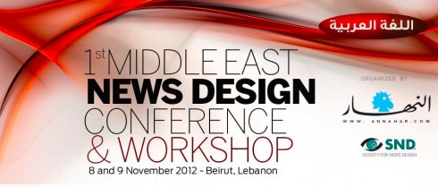
It promises to be a great program, and a historic one, too: the first SND Middle East gathering. Put it on your calendars: November 8 & 9, in Beirut, Lebanon. Sponsored by An-Nahar and SND.
For more information:
http://www.snd20events.com/conference/