Today we interview one of the most celebrated news designers of her generation, Lucie Lacava, whose work extends from Canada to Europe, Latin America and the Middle East.
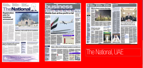
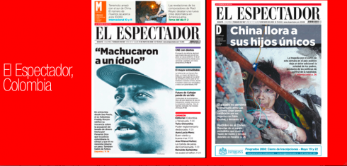
Elegance is her trademark, and here she shares two of her most recent projects with us: The National, the new newspaper of the United Arab Emirates, and El Espectador, of Bogota, Colombia, which went from weekly to daily with Lucie as chief design architect.
Mario: Lucie, you are known in the industry for your style and the sense of elegance and finesse that you bring to each of your projects. What inspires the great Lucie Lacava?
Today I find searching the web can be a great source of inspiration, it is an incredible pool of visual information.
I am inspired by esthetics from all visual disciplines be it architecture, photography, fashion, urban landscape, interiors, furniture design. Sometimes inspiration comes from unexpected sources.I just went to see the “O” by Cirque du Soleil, and it was a delight for the eyes and the senses. The colours, the costumes, were all extraordinarily beautiful. What inspires me most is the total experience, as walking into an environment and being overwhelmed by the sights and the sounds. How can this experience be applied to design? This is more about a state of mind, it is about being in tune with the times.
Mario: If you were to disappear in a deserted island, which three typographic fonts would you take with you? Your all time favorites, the ones you consider durable and able to adapt to whatever art directors and designers do to them?
I would take with me Bodoni, Futura, and Helvetica. I have always loved these fonts and always will.
Even though I hardly ever used the original version of any of these fonts on my projects, I am always looking for contemporary fonts that have similar qualities.
Bodoni is the most elegant and stylish font ever designed. It is no surprise that Bodoni and its infinite reinterpretations, has been a favorite of fashion magazines in the past and continues to grace their spread in the present.
I love Futura especially its bold weights, its hard edges and even strokes. It has a great presence event at small point sizes.
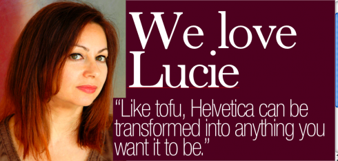
And then Helvetica for its ubiquitous quality, it does not call attention to itself. Like tofu, it can be transformed into anything you want it to be.
Mario: What are the major differences you see between designing newspapers for North America, and for the rest of the world?
In general terms I would say that the approach to newspaper design in North America is far more traditional than in other parts of the world.
However that might no longer be true in the near future. Faced with a declining readership, newspapers are more willing to experiment and take chances.
Having worked in Latin America and the Emirates recently, I found that in these emerging economies there is more openness to design and experimentation.
![]()
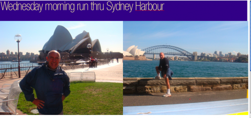
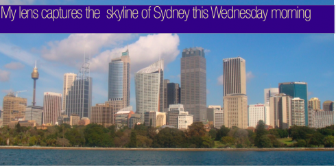
Now in scenic Sydney, Australia, running around the iconic Sydney Opera House, located at Bennelong Point in Sydney Harbour, close to the Sydney Harbour Bridge. The building and its surroundings are one of the best known icons of Australia. It is springtime here: sunny and cool. The waves on Bondi Beach are high and the water still too cold for swimmers. The view is spectacular from any angle here.
TheMarioBlog posting # 89