TAKEAWAY: The Denver Post unveils its new iPad app: it advances how news apps should look like, it does not pretend to look like a newspaper, and it does it all on the first day of August, a month when we don’t expect something as exciting as this to happen. PLUS: Some thoughts on The Daily as it announces lay off of one third of its staff.
A good start for the Denver Post’s app
Vertical landing page

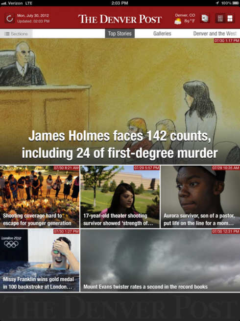
Landing page, horizontal, for launch day
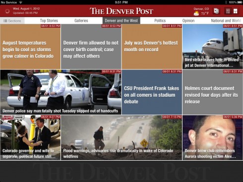
Navigator page for Denverland news
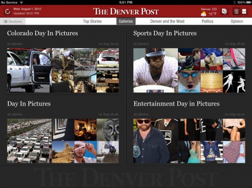
Navigator landing page to galleries
It is a new iPad edition for The Denver Post, it was announced by Digital First Media, which operates Media News Group and Journal Register Company.
As it should be, the official press release about the app mentions two key phrases: “our journalism and a better presentation of our photography.”
Those are two main centerpieces for any news app.
And the DNA of The Denver Post is clearly stated when the app opens: the logo of the newspaper and the phrase “we are Colorado”. Simple and direct and very necessary.
In the first five seconds, I am happy to see that the landing screen is more Flipboard than simply text and headlines (although such a choice landing page is available).
Bravo. It is 2013 and a news app appearing today does not need to remind us of the iconic newspaper look.
The navigation bar includes Top Stories, Galleries, Denver and the West, Politics, but touch Sections and a window nav—-rather simple and not very easy to read—-pops up with the rest of the categories, such as National and World, Sports, Broncos, etc.
There is an icon that leads to a printed version of The Denver Post, but one must fill out a subscriber’s form to read these editions in print.
The article reading screen is one wide column with ample white space around it: headline, photo, text. In terms of texture, there is not much developed here yet, but something that may come with time.
Galleries leads to Sports Day in Pictures, Entertainment, Day in Pictures, Colorado Day in Pictures, all following a Flipboard navigation style.
The new application marks the first release of Digital First Media’s company-wide iPad® relaunch which begins this month and continues through November. The second release, the Bay Area News app, supporting the San JoseMercury-News, is expected to launch later this month.
“The initial feedback has been terrific and we’ll continue to listen to users’ feedback,”said Greg Moore, Editor of the Denver Post and Digital First Media’s Central Editor.
An app with promise
Take a short tour of the new Denver Post app
While this app is barely 24 hours since it launched, I think that it promises to be a solid one that we should look at from time to time, as it evolves.
The best thing it does: it proclaims loudly and clearly that American newspapers can and should get iPad apps out there soonest (most are already late, anyway).
The second thing it does: it is designed for the tablet, not to mimic a printed newspaper. That was so 2010. For those who wish to see a headlines and text navigator, it is there, but, alas, the more visual Flipboard style nav is better and more visually intuitive. Newspaper editors everywhere will look at this and realize that they, too, can go this way.
The third thing it does: it has launched , I am sure, before it has checked out every item on the list of what the ultimate app should be like. Good for you, Denver Post. This is a great start, and now you can continue to evolve, one week at at time. When it comes to introducing a news app, don’t wait till you are 100% ready. Do your final rehearsal with a public that will be patient and support you along the way. Start with a 1.0, then move on to 1.5.
The Denver Post app at a glance
-Two home screens: The new Denver Post iPad® application features two new home screen layouts – a photo view and article view – as well as enhanced social media integration, continuous scrolling through articles or sections and the ability to refresh content on demand.
-Paid access to print replica: The Denver Post iPad® Edition will also include paid access to the full version of 30-days of print replica editions without leaving the app, as well as comics and other features not traditionally found in news iPad® apps.
-What’s to come: Future application upgrades include an interactive events listing with mapping ability, enhanced video galleries, a fully integrated commenting system that syncs with website articles and other smartphone applications as well as in-app polling for deeper user engagement and feedback.
Ironies: The Denver Post app launches; The Daily to lay off many
Irony #1: good things like this never happen in August—-the dog days of August, when our part of the world packs suntan lotion and umbrellas and heads for the beach. Nothing new ever happens in August (unless you were born this month!)
Irony #2: The Denver Post appears with its new and shiny app the same week that we read that The Daily is laying off a third of its staff. I must have answered at least 10 emails about this topic in the past 24 hours.
My colleagues in this industry and I want nothing more than for The Daily to succeed, for a variety of reasons that need not be mentioned here.
But our conversations about The Daily the past few days have led to the same conclusion: success in media begins with content. A publication, especially today, needs a great content product from the beginning to get and keep people interested.
As one of my colleagues, who did not wish to be identified, put it:
“When it comes down to it, it’s not the idea or the format that doomed The Daily, it’s the fact that the content is just not compelling or distinctive enough to keep peoples’ attention.”
I may add that there are often many good pop up possibilities missed. The finger wants more, but it does not get it. I have been hoping that it would happen with time, but…..
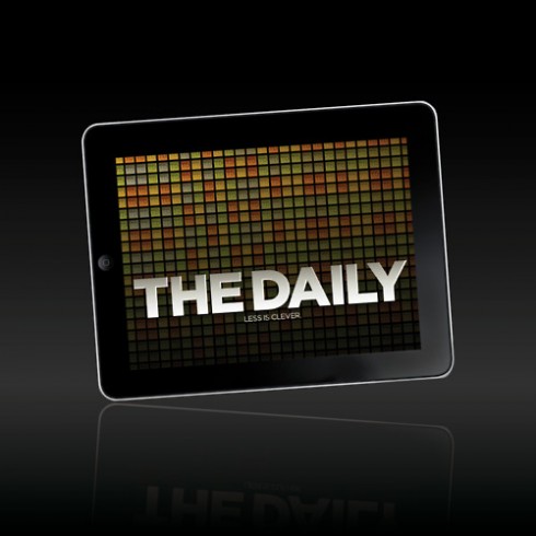
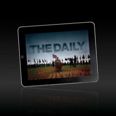
Above it all, The Daily, in spite of its pioneering efforts as the first newspaper exclusively designed for the tablet, sticks too close to its print cousins.
While it has made progress, and it performs a pure tablet summersault from time to time, it is 80% like reading a printed newspaper. Lots of wasted opportunities there. Having seen the functional and aesthetically marvelous prototype created for The Daily by that talented Alfredo Triviño, I will forever wonder why it was not adopted immediately. It was pure tablet in every way. No resemblance to print in any form. I have included it in my new digital book because it remains one of the most perfectly conceived examples of what a news app should be like.
Not too late for The Daily,to take a look at this abandoned prototype, I guess.
As for The Denver Post, congrats on a great 1.0 version of your app. You have started on the right foot. Let’s keep on swiping!
Here are some screen shots of the Alfredo Triviño prototypes for The Daily:
To see more of the Alfredo Triviño prototype for The Daily:
http://alfredotrivino.tumblr.com
Mobile logos on the go

How great for our Garcia Media Europe art director, Constantin Eberle, and I to step out of our hotel in Kuala Lumpur this Thursday morning and see the logos of our last two projects here, New Straits Times and Berita Harian, on the company car. It is nice to see how brands are used everywhere here, extensions of what the users see on print and digital platforms.
Our previous blog entries on New Straits Times and Berita Harian projects:
https://www.garciamedia.com/blog/articles/em
https://garciamedia.com/blog/articles/july_1
Pop up of the day

It is irreverent Bild again. This time, showing before and after of Baywatch actress Nicole Eggert. Headline reads: From Baywatch to Baysausage. Not too nice, Bild! But, as we have said repeatedly, when Bild is bad, it is good.
The iPad Design Lab: Storytelling in the Age of the Tablet
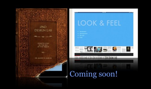
Video walkthrough of the iPad prototype of iPad Design Lab

Mario Garcia’s upcoming speaking engagements:

WAN-IFRA World Editors Forum, Kiev, Ukraine, Sept. 2-5
http://www.wan-ifra.org/events/64th-world-newspaper-congress-19th-world-editors-forum
Cumbre Mundial de Diseño en Prensa 2012: Mexico City; September 24-26
http://www.cmdprensa.com/mx2012/
SND (Society of News Design) Cleveland; Oct. 11-13
http://cle.snd.org/