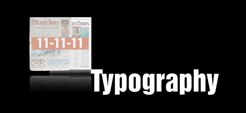
TAKEAWAY: As the countdown to 11-11-11 gets closer, we devote this week’s blog to the rethinking of the new New Straits Times of Malaysia. Today: the typographic scheme that readers will see starting Friday. Tomorrow: color palettes
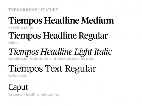
The fonts selected for New Straits Times
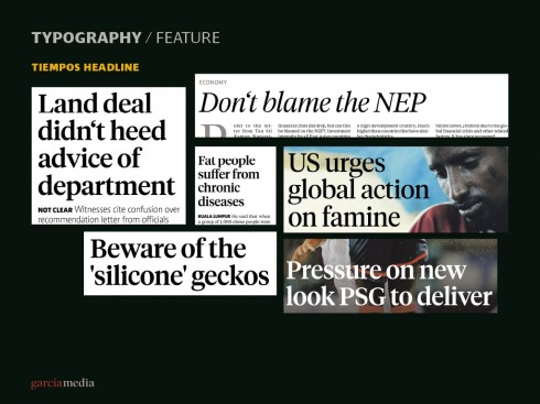
Here is how Tiempos appears for various uses, primarily headlines
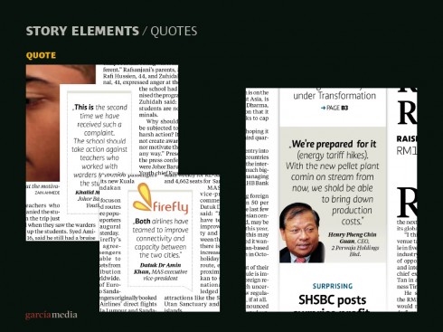
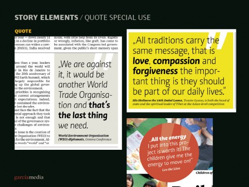
Caput is used for secondary elements, such as quotes and story billboard highlights
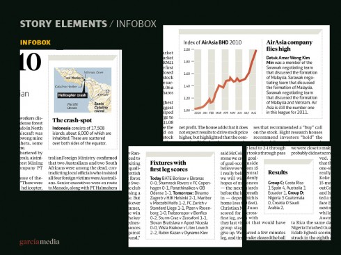
A combination of Tiempos and Caput for infoboxes, and infographics
There is more type in a newspaper than any other visual element, which makes the selection of fonts especially important when completing a redesign project. In fact, about 75% of the visual elements we see in an average newspaper edition is just that: type. This is a reason it is so important to select the right fonts.
Our Garcia Media Europe art director, Constantin Eberle, and I, have selected two fonts for the new look of New Straits Times.
Those fonts are Tiempos, which we use for headlines and text, and Caput, which is an auxiliary font, for accents and contrast.
For more information about our chosen fonts for the New Straits Times:
Tiempos Font Family
Designer: Kris Sowersby (http://klim.co.nz/about.php)
Tiempos Headline: http://klim.co.nz/tiempos_headline_info.php
Tiempos Text: http://klim.co.nz/tiempos_text_info.php
Caput Font Family
Designer/Vendor: Fontfarm.de; Natascha Dell and K. F. Oetzbach, Aix-la-Chapelle/Stolberg, Germany
Links:
http://www.fontfarm.de
Caput:
http://www.fontfarm.de/themes/fonts/caput/index.php
Our previous New Straits Times posts
Creating some basic pop up moments in your tablet
https://garciamedia.com/blog/articles/creating_some_basic_pop_up_moments_in_your_tablet/
Emphasizing the New in the New Straits Times: Part 3
https://garciamedia.com/blog/articles/emphasizing_new_in_the_new_straits_times_part_3_—a_new_tablet_edition/
Emphasizing the New in the New Straits Times: Part 2
?https://www.garciamedia.com/blog/articles/em
Emphasizing the New in the New Straits Times: Part 1
?https://www.garciamedia.com/blog/articles/monocle
Tomorrow: Creating the New Straits Times color palette