<
A FIVE-MINUTE INTERVIEW WITH MIGUEL DE LORENZI:
Mario: How do you see the role of illustrations in daily newspapers today?
Miguel: Not as good as I wish, although I have to say that the role of illustrators and designer has definitely grown in the last few years for Argentinean dailies. Fortunately, we are beginning to understand that graphics add emotional impact to the printed newspaper which is difficult to achieve on online editions. This is definitely a plus that printed newspapers have over their digital counterparts so far. I say so far, because sooner or later, online editors will realize that text with only a photo will rest interest to the information presented. Already programs are available to provide better use of illustrations, so that online editions are not merely columns of text, photos and links to video.
Printed newspaper editors have learned that an illustration is not merely a colorful island in the midst of a gray mass of text. More and more, we are seeing how illustrators, designers and infographic artists collaborate on the creation of pages where all these elements are integrated to enhance the information . From its origins, simplified journalism has been nothing more than the sum of communication plus emotion. We lost the way somehow, but, fortunately, we are now are getting it back both online and print.
Mario: Could you give us an overall panorama of the state of printed newspapers in Argentina?
Miguel: I would have to say that until February of this year, the design horizon of Argentinean newspapers was drawn by two great dailies, Clarin and La Nacion. The two are very different, with distinct graphic styles, but well adapted to the readers to whom they cater. Let’s say that this used to happen Monday thru Friday, and then on weekends, everything changed, as Pagina 12 appeared with tons of supplement such as the one for women (Las 12), or culture (Radar) both of the daily Pagina 12, with the genial imprint of Alejandro Ros.
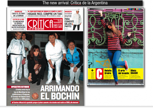
I say that this happened until February of this year. But on the 2 of March, the landscape of newspaper design in Argentina changed with the launch of Critica de la Argentina, with a very smart content strategy as well as a great design. Jorge Lanata, its editor, takes risks with a printed newspaper, of national circulation, at a time when all the voices around him form a choir to chant the disappearance of daily printed newspapers. The visual genius of this newspaper is under the careful eye of legendary art director Daniel Sueco Alvarez, and the infographics come from Norberto Baruch.
The good thing about Critica de la Argentina is that it has chosen a design that is far from that of the established dailies Clarin and La Nacion.
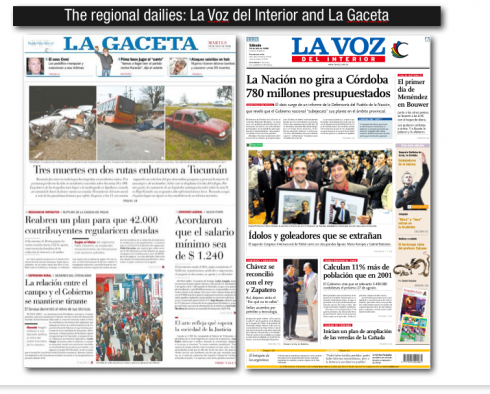
In the interior of the country, the two regional dailies that merit mention are La Voz del Interior (Cordoba) and La Gaceta (Tucuman), both designed to aim at their target audiences which encompass regional areas beyond the provinces in which they are published.
IN CASE YOU MISSED IT:
www.garciamedia.com/blog/articles/last_chance_to_see_argentine_art_directors_exhibit
WE SEND YOU:
http://picasaweb.google.es/nataliaspollansky/InauguraciNRecCholisCCEC19Jun08FotosPauloJurgelenas?authkey=nzSVfYBAv1I
www.lavozdelinterior.com.ar
www.lagaceta.com.ar
www.criticadigital.com/www.ccec.org.ar
www.emporiolibros.com.ar
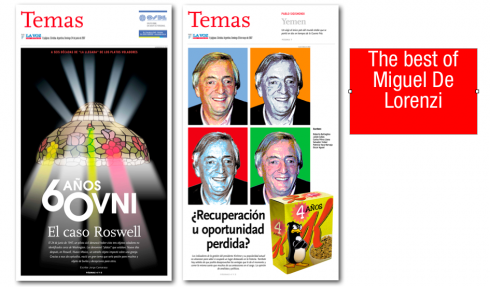
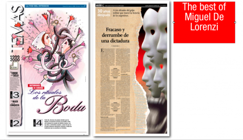
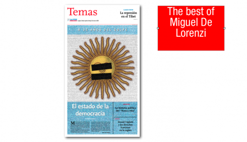
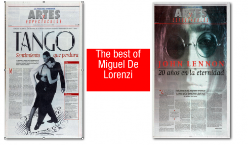
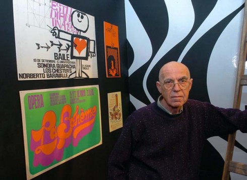
THE De LORENZI FILES: Some young designers may take a look at Miguel’s poster pages and consider them old fashioned; indeed, there is a retro feel about the way that couple steps into the tango on one page, or the Warholian composite of former Argentine president Kirschner. However, in every case, De Lorenzi’s page captures the attention of the reader; the eye gravitates to the illustration, which, in turn, begins to tell the story long before we dive into the text. My favorites are those where the illustration becomes the story . For example. the page about the state of democracy in Argentina, with patches covering the eyes and mouth of the sun that is part of the Argentinean flag, or the playfulness one finds in the page devoted to wedding rituals.
Everything retro comes back, and these pages are no exception.
When dailies become the mega weeklies, as I predict, the poster page that De Lorenzi has mastered may, again, become utilitarian and offer the visual surprises that online editions may not be able to afford their readers.
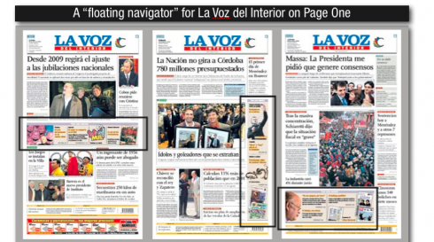
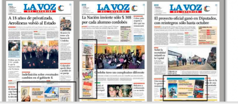
PUTTING WHEELS ON YOUR PAGE ONE NAVIGATOR; HOW LA VOZ DEL INTERIOR DID IT
The important thing is to have a good navigator on Page One to send readers to the inside of the newspaper. But the navigator does not have to be static. La Voz del Interior, in Cordoba, Argentina, shows us how to do it.
Here are examples of a navigator that can be vertical or horizontal, higher or lower on the page, and what makes it interesting is that it offers variety, not only for placement, but also in the images presented daily.
Created by Miguel de Lorenzi during his tenure as design director of La Voz, it is still a vibrant and important part of the newspaper’s Page One. It shows flexibility, and allows the editors freedom to utilize the canvas of the front page to react to the news content of the day.
Miguel offers the following comment:
“I sort of invented this navigator for our Page One so that we would have the ability to do something different each day. We call it the floating navigator. Its advantage is that it allows us total freedom with page one design, and, because it is not at the top of the page, it does not compete with the dominant image of the day. What is constant is the typography and the color used for the background. The only inconvenience presented by this navigator is that we cannot do build it on Quark, as we must use Illustrator due to the number of silhouettes and stylistic details included. This navigator is done by the infographics people daily. And it played very well in the focus groups, always capturing interest.”

Para mis lectores de habla hispana, aquí aparece el texto completo de mi entrevista con Miguel de Lorenzi, el veterano artista y ex director de arte de La Voz del Interior, de Córdoba, Argentina:
Pregunta: ¿Como ves el papel de la ilustración en el diseño de los diarios argentinos de hoy?
Respuesta: No tanto como sería deseable, la intervención de los ilustradores y diseñadores ha crecido en los últimos tiempos en los diarios argentinos.
Por fortuna los editores argentinos han ido comprendiendo que los elementos gráficos suman al diario de papel un impacto emocional que a los diarios on line les resulta más dificil de lograr. Es un plus que, por ahora, tiene el diario de papel frente a los medios digitales. Digo por ahora, porque tarde o temprano los medios on line deberán comprender que la noticia solo acompañada de una pequeña foto terminarán por enfríar el interés de los internautas. Los programas digitales pueden proveer ya herramientas para que el diseño de los medios electrónicos dejen de ser meras celdillas de tipografía, fotos y links a filmaciones.
En los diarios de papel se ha comprendido que la ilustración no es una mera isla colorida dentro de la masa grisácea del texto. Cada vez más ilustradores, diseñadores e infografistas se aunan en la concepción de páginas donde todo se halle integrado al servicio de la información.
Simplificando el concepto, se podría decir que desde sus orígenes, el periodismo ha sido la suma de comunicación más emoción. El camino se desdibujó en algún momento pero por fortuna, tanto en el papel como en lo digital se lo va retomando.
Pregunta: ¿Podrías darnos un panorama en general de la información en papel?
Respuesta: Podríamos decir que hasta el mes de febrero el horizonte del diseño de los diarios argentinos estaba dibujado por los dos grandes diarios nacionales: Clarín y La Nación. Los dos con muy distintos estilos gráficos, pero bien ajustados al sector de lectores a los cuales se dirigen. Digamos que esto ocurría de lunes a viernes y que los fines de semana el horizonte cambiaba y aparecía una nueva montaña: los suplementos dedicados a la mujer (Las 12) y a la cultura (Radar) de Página/12 con la genial impronta que les imprime el talento de Alejandro Ros.
Decía que esto ocurría hasta fines de febrero de este año. Pero el 2 de marzo el paisaje del diseño de diarios en la Argentina cambió con la aparición de Crítica de la Argentina con una audaz propuesta en los contenidos editoriales y visuales. Jorge Lanata, su director, se juega por la edición de un diario en papel, de circulación nacional cuando todas las voces cantan a coro la desaparición del papel para la información. Para su revuelta visual el nuevo diario cuenta con la dirección de arte del legendario Daniel Sueco Álvarez y las infografías de Norberto Baruch.
Lo bueno de Crítica de la Argentina es que se ubica lejos del eje de diseño que hasta ahora marcaban Clarín vía el estudio Toni Cases y la respetable corrección Bodoni de La Nación.
En el interior del país siguen destacándose La Voz del Interior de Córdoba y La Gaceta de Tucumán con propuestas originales de diseño adaptadas al target de grandes diarios regionales con un radio de alcance que va más allá de sus provincias.
WHERE IS MARIO?: In Hyderabad, India. Today while running in the hotel’s fitness club—-no way one can run outside in the street now, as India is in a high state of alert as a result of recent terrorist acts—-I could hear the music of the late Cuban singer Celia Cruz, the forever queen of salsa, singing her trademark song, La Vida es un CArnaval. Made me feel right at home, and, of course, with Celia in the background everyone runs faster.

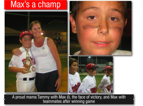

My grandson, Max Garcia, has just returned triumphant from Texas, where he and his teammates in the Tampa Wellswood Pinto (Age 7-8) All Stars won the Regional Championship beating teams from Georgia, Mississippi, Louisiana, and edging Texas 14-13 in an exciting championship game to win it all. Previously, they won the State Championship in Palm Beach.
Max had a tremendous run during All-Stars. 5 homeruns. And clutch hits when his team needed them. All the kids played inspired baseball. This is a special group of boys. They won the state championship once before as 5-6 year olds and have been playing together for four years now. Watching them turn double plays, make plays at the plate and hit the ball as hard as they do it’s hard to believe they’re only 8.
Already looking forward to seeing what they do as they get older and keep playing together.
Way to go, Max. We are all very proud of you and your contributions to the team’s victory. Abo loves you.

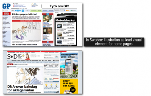

SURPRISES THAT WE ENJOY ALONG THE WAY:Check out the website for two Swedish dailies, Goteborgs Posten and Svenska DAgbladet. Both use a soft pastel illustration of a courtroom scene as their lead visual piece. Nice work. A change from the usual photograph in that spot of the screen.
www.gp.se
www.svd.se
COMING TOMORROW: Four thoughts on why American newspapers lag behind
COMING FRIDAY: In India: Why 7 million read the new daily Sakshi in Hyderabad