TAKEAWAY: More than three decades have passed since I first redesigned La Nueva Provincia. Now it is not just a redesign, but a total rethinking to adapt to the demands of the digital age and it will be introduced this week.
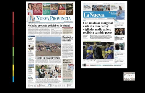
Before and after: a dramatic change from broadsheet to tabloid format
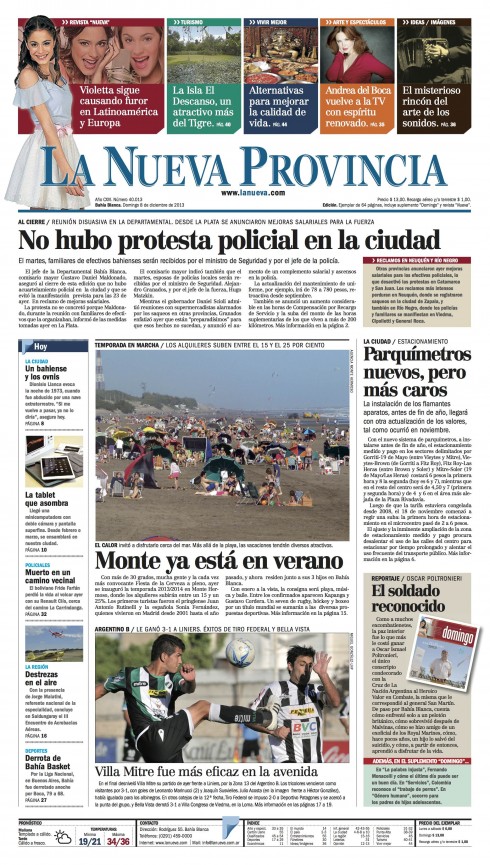
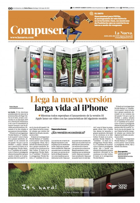
Here is the current front page for La Nueva Provincia.
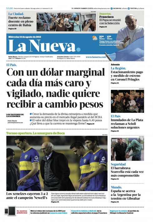
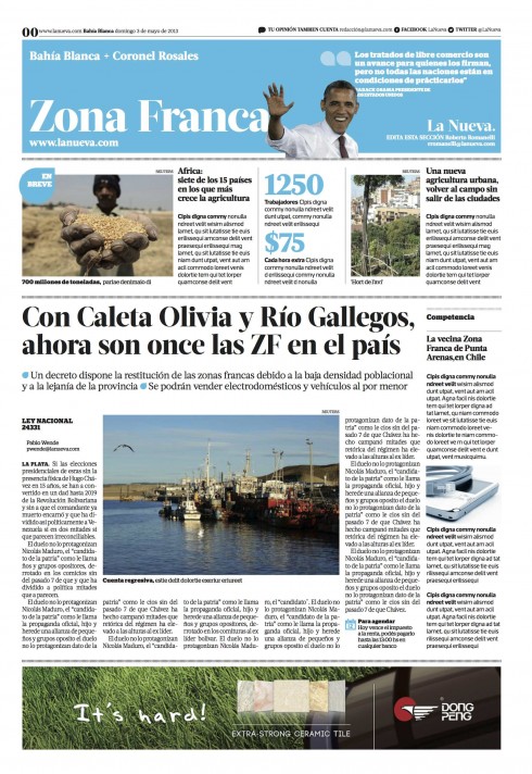
The prototype for the new design of La Nueva
There is a favorite song of mine and that Frank Sinatra sang so exquisitely, that I still listen to it from time to time when I run. It is called The Second Time Around. Remember it: Love is lovelier, the second time around.
Well, this is my second time around helping La Nueva Provincia, of Bahia Blanca, Argentina, to get a new look. This time, it is a new design across the media quartet: phones, tablets, online and print.
Before I tell you what we at Garcia Media Latinoamerica have done this time around, let me remind you that the redesign of La Nueva Provincia, in 1980, was my first project outside of the United States.
It was the end of my session on newspaper layout and design at the American Press Institute one day in May 1980. The young man approaching me was Federico Massot, whose family owned La Nueva Provincia.
He introduced himself, and went right into the invitation of a lifetime——one that would mark my career and opened new vistas.
“Mario, I want you to come to Bahia Blanca and redesign our newspaper. It has a lot of history. It has a lot of baggage. It needs your touch,“ he said and tapped me on the shoulder. Three months after that meeting, I made the 8000 miles trip to Argentina. I tell the complete story in one of my 40 Years/40 Lessons installments.
Rethinking La Nueva for a new generation
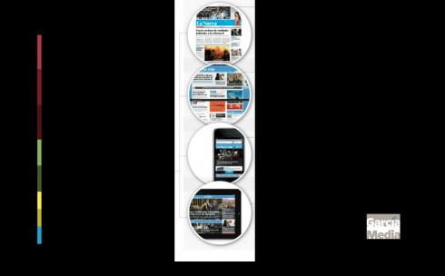
La Nueva extends its brand across four platforms
This week, on December 12, exactly 33 years later, La Nueva launches more than just a new look. It is change multiplied time various areas:
—The new format is tabloid (adios to the old broadsheet)
—The logo changes to a shorter name, La Nueva, as opposed to La Nueva Provincia. Most readers refer to the newspaper as La Nueva. We have also added a playful touch of a dot (that can change colors daily, based on a new color palette). The new logo font is Acta Display Black.
—Typographic palette: Acta Display is the family used for the logo and headlines. (More about this type choice below).
—The content of the newspaper has been analyzed and its flow revised.
—The new look extends across all the platforms: smartphones, online, print and tablet.
—Internally, each page has a sense of hierarchy and organization that will facilitate reading stories and navigating through the entire newspaper.
This time around, it all began in early 2013 when the late Federico’s brother, Alejandro Massot, called to invite me to revisit La Nueva and get it ready for the digital age, as he put it. I flew to Bahia Blanca to meet with Alejandro and his brother Vicente Massot, who is La Nueva’s director.
Working closely with our Garcia Media Latinoamerica team: Rodrigo Fino and Paula Ripoll, along with the La Nueva team, we have come up with some concepts that extend across all the platforms and that we hope you will like.
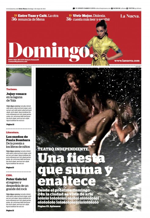
The images shown here are part of the prototype.
The new La Nueva premieres December 12. We will, of course, be present for the launch in Bahia Blanca and will report about it in TheMarioBlog.
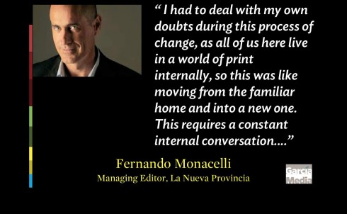
For Fernando Monacelli, managing editor, the two most important challenges have been: adapting to change and inspiring his team.
We all know that the technology is there, and we navigate it, more less, at different levels of comfort. Now, with this project, we had to think media quartet, to step out of our comfort zones, sort of like abandoning the familiar home we know well and moving to a new one. That requires a lot of internal dialog between the me who doubts and the me who takes a risk. But all along, in the midst of my worst doubts, I knew one thing: we could not stay in the place where we were at La Nueva Provincia. We had to move forward, we had to change.
About the new typography: Acta
http://typographica.org/typeface-reviews/acta-acto/ http://www.myfonts.com/fonts/dstype/acta-display/
Acta Display is part of the larger Acta super-family, including Display, Text, Poster (very black weights), Symbols, and the sans-serif complement Acto. It was designed by Portuguese designer Dino dos Santos of DSType in 2010, originally for the Chilean newspaper La Tercera. Acta Display is elegant, with very high contrast and sinuous curves. It could be categorized as a Didone like Bodoni and Didot, but is less rigid than most in that genre. Acta Display Black is the heaviest weight of Acta Display and makes a strong statement.
Watch the promotional video for La Nueva
The concept starts with the question: How is your day?
The star of this promotion is basketball star and Bahia Blanca native, Juan Espil , well known by all, and a good way of attracting those younger readers.