TAKEAWAY: Here are some key pages from The Styleguide prepared for La Nueva Provincia’s new design.
Perhaps the most important document to guarantee sustainability of a design is the Styleguide that is prepared just before the launch. Here we have the guide, masterfully executed by our own Paula Ripoll, senior art director. It includes a detailed presentation for everything from grid, typography, color palettes and how specific pages are to be executed.
What is the purpose of a Styleguide?
First, it is there to outline the most important design details of a redesign.
Second, it exists to guide the process, NOT to stamp out creativity. I see the Styleguide as a good map to the journey, but one that allows for an editor and art director to take occasional detours, as long as these are justified and evolve from what the original concept outlines.
A good Styleguide does not handcuff a creative design director, but it provides him/her with foundations to preserve.
Let’s take a look at this great Styleguide for La Nueva Provincia:
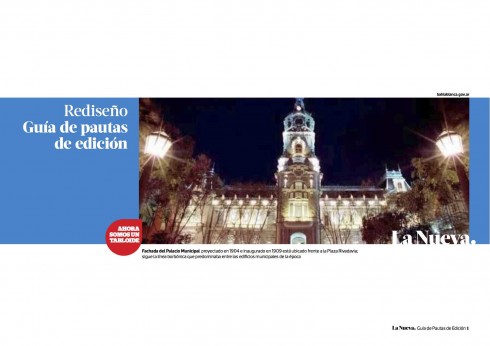
The Styleguide’s opening page
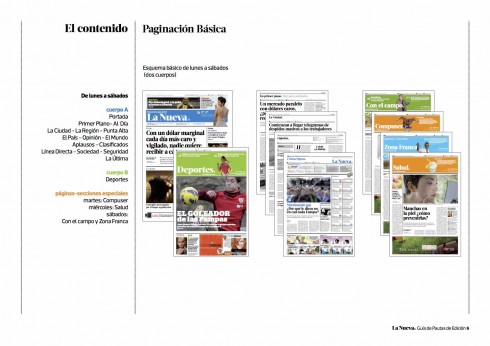
Here is how the basic pagination for the new tabloid format of La Nueva appears. It shows that the Monday thru Saturday set up is basically two sections, with special topics, such as Agriculture, Technology, Health, etc. appearing on different days of the week.
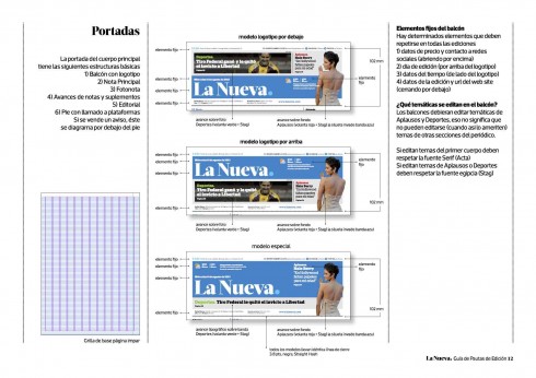
Here is how the front page can utilize the “balcony”to accomplish various things: surprise the reader, don’t become static.
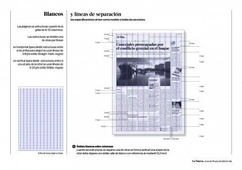
The grid is perhaps one of the designer’s most powerful tools, one that allows for space to be used functionally and wisely. The La Nueva’s grid can be six or 12 columns. The page to the right shows the most minute details about spacing.
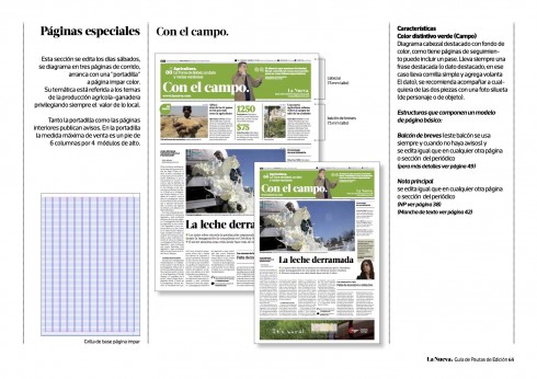
How a typical opening of the Agricultural section would appear
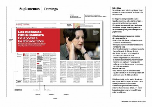
Here is the template for an in-depth interview as it would appear in the Sunday supplement.
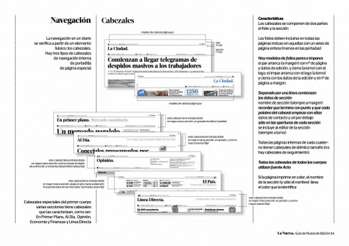
Various levels of navigation exist within the design of a newspaper. Here is the complete guide.
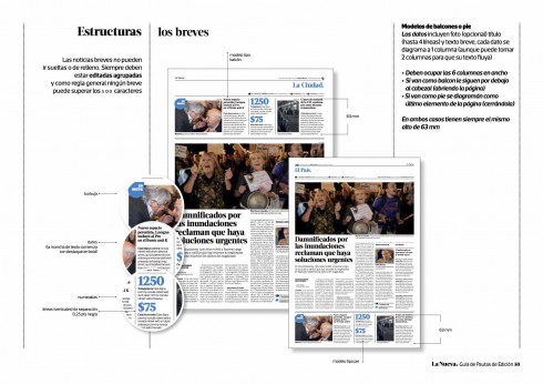
How to handle those important briefs.
img src=“https://garciamedia.com/assets/uploads/blog/LNPStyle11_sups_thumb.jpg” style=“border:0;” alt=“blog post image” width=“490” height=“346” />
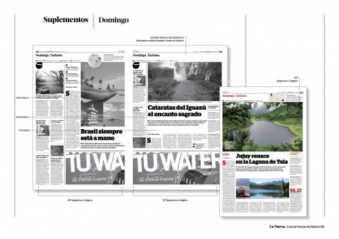
How to design those Sunday supplements
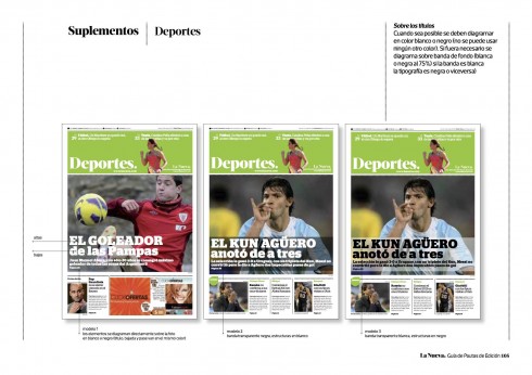
Concept for opening of Sports.
Inside pages of supplements
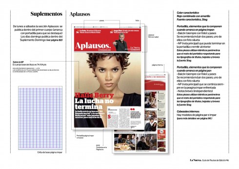
The Aplausos (Entertainment) section concept
How colors will change on that dot on the logo
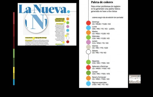
One of the new features for La Nueva is a dramatic change for the logo, with the name shortened to La Nueva (from La Nueva Provincia).
That dot will change colors each day of the week, but not just any colors. The dot will change daily to a color found in the color palette seen here.
Of related interest
I tell the complete story of my first visit to La Nueva Provincia in one of my 40 Years/40 Lessons installments:
https://garciamedia.com/blog/articles/40_years_40_lessons_7._abroad
About the new typography: Acta
http://typographica.org/typeface-reviews/acta-acto/ http://www.myfonts.com/fonts/dstype/acta-display/
Acta Display is part of the larger Acta super-family, including Display, Text, Poster (very black weights), Symbols, and the sans-serif complement Acto. It was designed by Portuguese designer Dino dos Santos of DSType in 2010, originally for the Chilean newspaper La Tercera. Acta Display is elegant, with very high contrast and sinuous curves. It could be categorized as a Didone like Bodoni and Didot, but is less rigid than most in that genre. Acta Display Black is the heaviest weight of Acta Display and makes a strong statement.
Watch the promotional video for La Nueva
The concept starts with the question: How is your day?
The star of this promotion is basketball star and Bahia Blanca native, Juan Espil , well known by all, and a good way of attracting those younger readers.
http://es.wikipedia.org/wiki/Juan_Alberto_Espil
Our previous posts on importance of style guides
Gulf News: the design style guide as iPad app
https://garciamedia.com/blog/articles/gulf_news_the_design_style_guide_as_ipad_app
Earlier about La Nueva’s redesign:
Monday: Argentina’s La Nueva Provincia: it’s a new look across platforms
https://www.garciamedia.com/blog/articles/pargentinas_la_nueva_provincia_its_a_new_look_across_platforms_p