TAKEAWAY: Today we turn to one page we like and tell you why. Welcome to this poster page design from Canada’s Ottawa Citizen.
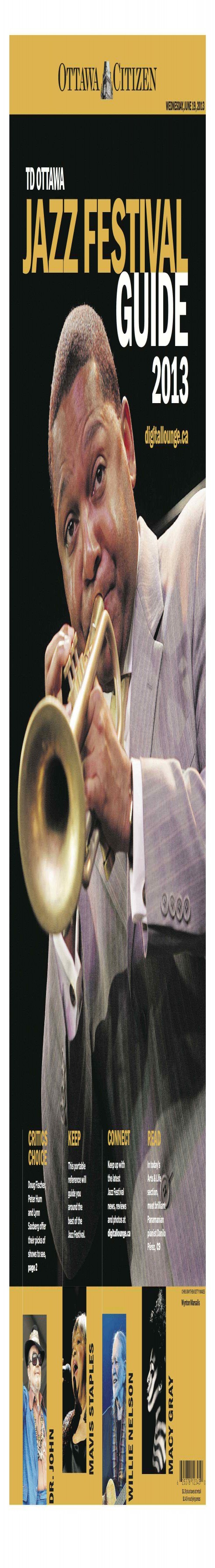
From time to time we see a page that captures it all: elegance, functionality, and that seduces in those first 10 seconds.
My friend and colleague, Pegie Stark Adam, has sent me this beauty of a page she designed to celebrate the upcoming Jazz Festival in Ottawa, Canada.
The Ottawa Citizen is part of Postmedia, a group that we are currently working with to unify the brand as well as storytelling across all the newspapers in the group. More on that as we advance with the project.
“What makes this page special?”, you may ask.
It has the three things that make design work well for a page:
– It attracts you to its contents in 10 seconds.
– It is simple and easy to follow: remember, less is best
– It fulfills the two important functions of visual impact and functionality.
Three questions for designer Pegie Stark Adam about her page
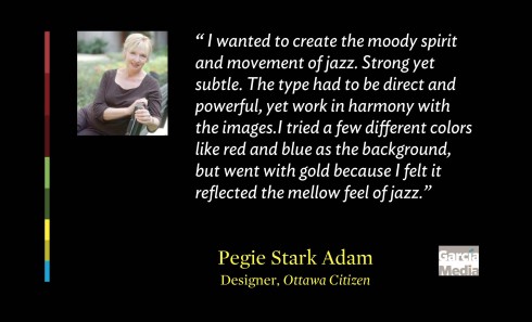
Mario: Was this your first idea?
Pegie:
I did a few sketches, knowing that the editor wanted the Wynton Marsalis image to be dominant. I wanted to create the moody spirit and movement of jazz. Strong yet subtle. The type had to be direct and powerful, yet work in harmony with the images.
I tried a few different colors like red and blue as the background, but went with gold because I felt it reflected the mellow feel of jazz. It worked nicely with the black background in the photo and highlighted the golden trumpet.
The bottom of the page: Although subtle, I chose to stagger the images to reflect musical notes, or the trumpet buttons, moving up and down.
Mario: Did you work side by side with an editor?
Pegie:
I was working in Hamilton Ontario at our Postmedia hub, while Peter Robb, Deputy Editor, Features, was in the Ottawa Citizen newsroom. We communicated through email and sent pages back and forth for discussion. Yesterday I went into the newsroom to work side by side with him and Deputy Editor Carl Neustaedter as we put the finishing touches on the cover and the whole section.
Mario: What was the most difficult part?
Pegie:
The hardest part was to make sure the color and type presented just the right feel and spirit for the event. The gold could not go muddy and the type had to work in harmony with the images, and not take away from the high impact of the main photo.
The other challenge was to create something that looked ‘special’ and different from the every day because this was a wrap around the whole paper, and a guide to the event.
We also had to figure out how to tease to the rich online listings and content that the Citizen provided for the event, so designing a way to highlight that content was also a balance act, making sure the teasers were the right size and color, and were placed prominently.
The editors’ take on how the page came to be
Peter Robb, Deputy Editor, Features:
“In the past these sections have tended to be too busy in my opinion, with various elements competing for attention and none getting that attention. This time I wanted impact; I wanted immediate meaning and understanding and I wanted simplicity.
Hard to beat what Pegie produced.
“You should see page 2 and three. . .”
Carl Neustaedter, Deputy Editor
“We have a tradition at the Citizen to kick off the city’s major summer festivals and events, such as Jazzfest, Bluesfest and Canada Day, with a guide that wraps around the front section of the paper. Because this is what our readers see first on newsstands and doorsteps
instead of our traditional A1 with news storiesit has to pack a punch and make people look twice. Pegie more than delivered with this high-impact poster page that instantly captures the spirit of jazz. Like a good piece of jazz itself, her attention to detail in the high notes (big type and big photo) are in perfect harmony with the quieter notes at the bottom of the page.”
The myth about text on the cover
I may add that the fact that these editors did not insist that the designers put a lot of text on the cover is what saves the day.
For many editors, a page loses “gravitas” without some text to read on it. Nonsense, I say. Many different factors determine gravitas—-or the lack of it—-on a page such the photos chosen, the typography used, the page architecture and, of course, and extremely important, the colors. Without a word anywhere, these things provide us with a perception of the page and its contents.
This Ottawa Citizen page shows us how it can be achieved.
Thanks to Pegie, Peter, Carl and their team for sharing not just the wonderful page, but the strategy that led to it.
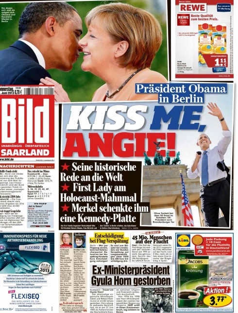
Another page we like today
Our European blog correspondent, Frank Deville, sends us this page from Germany’s Bild, with another one of their interesting headlines, this time even in English, to celebrate the visit of President Obama to Germany and his meeting with Chancellor Angela Markel. It is this tongue in cheek attitude that keeps Bild a favorite with more than five million daily readers.